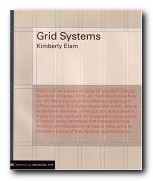
the principles of organising type on page and screen
Well-designed pages – on screen or in print – are built on the structural basis of grid systems. That’s the hidden network or mesh underlying the page design which helps to keep all its parts in close and logical relationship. This book tells you how to understand and create grids. The approach is that of a tutorial – showing the good and not-so-good results of arranging a set of basic elements on a 3 x 3 grid.
 There’s a lot of visual repetition, and the writing is rather stiff, but the upside is thoroughness. The same page is shown over and over again, with endless variations in layout, text position, alignment, and reading direction. These tutorial sections are punctuated by analyses of successful and famous examples of the use of grids.
The illustrations come from classics such as Jan Tschichold’s advertising brochure for his revolutionary study Die Neue Typographie, a Bauhaus catalogue designed by Herbert Bayer, and modern designs such as a an architectural web site and a Nike product catalogue.
The really interesting feature of this book is that the pages used to illustrate its ideas are prefaced by a semi-transparent skin which shows the grid on which the base design has been built. It’s a superb use of modern print technology.
This is a well-produced book which illustrates its point very clearly and is a very attractive production in its own right. It comes from the same series as Ellen Lupton’s Thinking with Type which we also reviewed recently.
© Roy Johnson 2005
Kimberly Elam, Grid Systems, New York: Princeton Architectural Press, 2004, pp.130, ISBN: 1568984650
More on design
More on media
More on web design