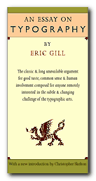
classic study of the aesthetics and morals of good design
This is Eric Gill’s memorable and engagingly dogmatic work on unchecked commercialism, moral living – oh, and on typographic design too. An Essay on Typography is where Gill firmly established what he believed type design should be, what it should do, and how it should be done. I read Gill’s Essay from cover to cover, then I immediately read it again. It’s short, (133 pages, plus an introduction and afterword) but quite enjoyable.
 The unassuming size of the book does not affect its flow as it is set in Gill’s own face, Joanna. Although the use of some odd contractions and word breaks may take a little warming up to, the book is a testament to book design and layout concerns as discussed in sections The Procrustean Bed and The Book.
In the section entitled Lettering, Gill lends his views on letter form history and follows their evolution from Trajan’s Column in Rome to the printed page of the 1930’s with his own engravings presented to illustrate the walk-through.
At times Gill is somewhat idealistic but many of the arguments he makes are timeless and most of his advice is practical- consisting of basic truths which will apply to the craft no matter what tools or level of technology are employed in the creation and implementation of letter forms.
In Typography, a clear line is drawn between mechanized industry, seen as the work of many as opposed to fine craftsmanship, being the work of the individual. With his focus more on the social aspect of these ‘two worlds’ of typography, Gill explores and defines the limits inherent to each:
…the commercial article at its best is simply physically serviceable and, per accidens, beautiful in its efficiency; the work of art at its best is beautiful in its very substance and, per accidens, as serviceable as an article of commerce
The exceptions to its usefulness are the occasional segue into what seems a little like preaching (this essay is thoroughly peppered with religious references) and some ideas he proposes, such as letter-spaced italics for emphasis, that have thankfully fallen by the typographic wayside. Or perhaps when he coyly proposes to abolish lettering as we know it in favor of what he calls ‘Phonography’ (a form of shorthand), in But Why Lettering. I would equate this to today’s practice of flame-baiting online.
© Delve Withrington 2000
Eric Gill, An Essay on Typography, David R. Godine [1993], pp.144, ISBN: 0879239506
More on typography
More on design
More on media
More on web design