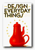
classic design principles using everyday objects
Donald Norman is a product design and usability guru who has teamed up recently with Jakob Nielsen to form the influential Nielsen-Norman Group. They specialise in advising businesses on the usefulness of their web sites. The Design of Everyday Things is the latest edition of what has become a classic in usability principles in the short time since it was first published. Norman discusses the problems we all have with the results of bad design in everyday life – doors which open the wrong way; telephone calls you can’t put on hold; washing machines with spaceship control panels. He clarifies the rules of good design as he goes along. These turn out to be – visibility, good conceptual model, feedback, and natural mapping.
 What this means is that the controls should be visually obvious, they should feel part of a natural process,they should tell you that an action has been performed, and they should reveal the connection between action and results. Every point of his argument is illustrated with practical examples and anecdotes drawn from the problems of normal life. These range from the trivialities of taking the wrong turn when driving, to the disastrous consequences of aircraft engine and nuclear reactor failure. One of the reasons this is such a charming and interesting book is that it’s written by an expert who admits to his own weaknesses and problems. This is the professor from MIT who can’t program his own video recorder, who says so, and who convinces you its not the user’s fault but that of the designer.
 He’s also good at explaining the function and limitations of memory, and gives a clear account of one concept on which he relies heavily – mapping. This is the ability of good designers to arrange their controls, buttons, and switches in a way which corresponds to something we already know and have mentally internalised. He also offers interesting analyses of mistakes, breakdowns, and disasters – relating them to issues of both design and the relationship of humans to machines.
Donald Norman is a ‘usability’ guru who puts the user first. This is a witty and humane approach to the issues of good design – and it rightly deserves its reputation as a modern classic. You will never interact with the physical world in quite the same way again.
© Roy Johnson 2001
Donald A. Norman, The Design of Everyday Things, London/New York: MIT Press, 2000, pp.257, ISBN: 0262640376
More on design
More on media
More on web design
More on information design
I agree with what you say Steve – and should add that it’s quite an amusing read too. Don’t miss his follow-up book in which he becomes a little more tolerant towards style as distinct from function. It’s here – https://mantex.co.uk/2009/07/12/emotional-design/
I absolutely loved this book and have shared it with all the team members I have worked with. At Opreie, we designed the interface so as much information as possible is available to the agents from their homepage, it relates to their current work habits, and provides a logic mental map for their information management workflow.
If you build things and haven’t read this book, you should!
Steve Kenway