essays on design, typography, and bibliography
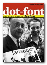
John Berry is the former editor and publisher of U&lc (Upper and lower case) the prestigious and influential typographical journal, and he has won awards for his book designs. (Lowercase) dot-font is a collection of short articles on graphic design he wrote for the portal web site Creativepro.com. I first came across this book when it was announced that, in common with many other authors in the digital age, John Berry was giving the book away free of charge as a PDF download. Why not re-cycle your own work and give it away free? This was the new economics
 I grabbed a copy, saw it was an attractive production, and immediately ordered a printed version from Amazon. By the time I had finished reading the first few chapters, I also ordered its sister production dot-font: Talking About Fonts. The original articles were basically his responses to exhibitions, lectures, and presentations he had attended. It sometimes feels a little odd to be reading about an event that took place some years ago and cannot be recalled. But his analyses and observations are those of a seasoned practitioner, and they retain their original value. Similarly, the formula of reproducing web essays as a printed book is quite successful. The original pages contained web links: those are missing here, but the structure remains, as well as illustrative graphics in the form of marginal thumbnails.
We get a lively introductions to design theorist Rick Poyner, then French book designer Massin, and a comparison of the signage in the underground rail systems of New York, Paris, and London.
There are a couple of chapters on the design and typography of American government ballot papers. These are offered as examples of bad design which have led to several disputed elections. So design really does have very practical consequences in the real world.
The central section of this collection comprises three chapters on book design and typography – from the shape and layout of the printed page, through the many choices that confront designers for presenting body text, even through to such details as the manner in which titles can appear on the spine of a book.
It’s a beautifully designed and illustrated production in its own right. The text is set in MVB Verdigris, the display in HTF Whitney, and there are generous page margins. Yet it’s not just a glamorous design portfolio: John Berry digs into some fundamental issues of design theory. It’s a book that is pleasing to the eye – but also one that will make you think.
© Roy Johnson 2010
John D. Berry, dot-font: talking about design, New York: Mark Batty Publishers, 2006, pp.128, ISBN: 0977282716
More on typography
More on design
More on media
More on web design