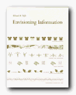
best-selling illustrated essays on presenting information
Over the last twenty years, Edward Tufte has published three impressive volumes setting forth his ideas on information design. The first, The Visual Display of Quantitative Information was designated as ‘pictures of numbers’ and dealt with statistical charts, graphs, and tables. This second volume deals with ‘pictures of nouns’, which is his metaphorical way of describing the ‘strategies for high-dimensional data, and how to increase information depth on paper and computer’.
To envisage information…is to work at the intersection of image, word, number, art
 He makes a persuasive case for layering, colour, and separation as a means of clarifying information when it is rendered in two dimensions – principally on the printed page. What he calls an ‘escape from flatland’ is illustrated in a series of wonderfully complex diagrams: a Javanese railway timetable shows departures and arrivals, distance, altitude, and even facilities at each station.
He explores the interesting notion that in a world of marks on paper, good presentation is affected by the rule that ‘1 + 1 = 3 or more’. That is, even two simple lines become three visual units because of the space between them – and he provides plenty of information to prove his case, illustrated with such diverse materials as old maps, musical notation, and even medical records.
His argument that small multiple images are the best way to reveal differences is beautifully illuminated by photographs of Chinese calligraphy and nineteenth century engravings of fly fishing lures, but it doesn’t seem altogether convincing – and as in the other volumes of this trilogy, some of the bad examples are just as visually attractive as the good – which appears to spoil the point he’s trying to make.
He’s much more persuasive on the use of colour to impart information, although at some points, even if the prints and engravings are stunning, the reading is not easy:
Transparent and effective deployment of redundant signals requires, first, the need – an ambiguity or confusion in seeing data display that can in fact be diminished by multiplicity – and, second, the appropriate choice of design technique (from among all the various methods of signal reinforcement) that will work to minimize the ambiguity of reading.
For somebody who claims to be aiming for clarity in communication, this reads like a bad example out of a writer’s style manual.
He keeps coming back, as do many other theorists of two-dimensional spatial design, to one of the most interesting challenges of all – the notation of dance. Cue eighteenth-century engravings of dancing masters with fancy hats and weird hieroglyphics trailing out of their feet. Other examples in the book range from flight schedules from Czech airways to Japanese railway timetables, rowing contests, and even a diagram of Wagner’s operas.
If we want to take a robust line on someone who is obviously very successful, it’s possible to argue that Tufte designs more successfully than he writes. Much of the time, his text reads as if it has been badly translated from German; yet if ever he issues his books in paperback, they are so attractive he’ll be able to retire on the proceeds.
© Roy Johnson 2002
Edward Tufte, Envisioning Information, Cheshire, CT: Graphics Press, 1990, pp.126, ISBN: 0961392118
More on information design
More on technology
More on digital media