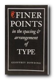
advanced topics in type design and good page layout
As the title implies, this is not a beginner’s book on typography. Most of the techniques discussed by Geoffrey Dowding, although sound and well presented, may not be beneficial to the reader without a working knowledge of design and type. Experienced designers, be forewarned; Dowding is unavoidably influential in this tome – the result of his lifetime of experience in the typographic arts. At the same time, he cannot escape that experience. He is an unabashed traditionalist, a master of the craft.
 So if you think you might already be too sensitive to type and layout, don’t read this book. I’m kidding, of course, but let me explain: illustrating with examples, Dowding discusses typographical layout solutions which often suffer from lack of attention to detail, then provides corrected versions for comparison. This method combined with a concise writing style and his authoritative voice, will undoubtedly heighten your typo-senses.
You will begin to see mistakes where you read in blissful ignorance before. You will know why a given passage is harder to read than another (and no, it’s not necessarily the writer’s fault). And you’ll begin to realize – there are lots of layouts floating around out there that could use more than a little tweaking.
I don’t think that everything he proposes is necessarily right. For example, in the context of setting type for text – the omission of spaces after full points when followed by the capitals A, J, T, V, and Y. Although this is still logically consistent with his other principles, a possible sacrifice of legibility for color defeats what he wanted to achieve.
Still, I enjoyed reading this book and can safely say I will never look at another paragraph, sentence, or word, quite the same again. Having never seen the previous editions of this book, I cannot compare them, but this revised edition suits me just fine. The pages were faithfully composed employing Dowding’s own principles, which makes ‘Finer Points’ a pleasure to behold.
© Roy Johnson 2000
Geoffrey Dowding, Finer Points in the Spacing and Arrangement of Type (Revised edition), Vancouver: Hartley & Marks, 1995, pp.96, ISBN 0881791199
More on typography
More on technology
More on digital media
[…] Geoffrey. Finer Points in the Spacing & Arrangement of Type (Revised ed.). Vancouver, BC: Hartley & Marks Publishers. […]