1. Once you have managed to produce a web page full of text, the next thing you usually want to do is add some graphics.
2. You add the graphics using the simple tag –
<IMG SRC=”filename.gif”>
This is inserted into the page at the place where you want the graphic to appear. And the graphic file would need to be saved into the same folder as your filename.htm page.
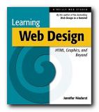
 3. But the graphic will simply appear on the page with text before it and after it. You would probably prefer the text to wrap round the graphic, in the same way that the text is doing here – wouldn’t you? This makes for a neater and more interesting page. Incidentally, your graphic can also be a link. If you click the book cover here, you will be taken to Amazon, where you can order the book. Here’s how to wrap the text around the graphic.
4. Add the following INSIDE the tag
align=”left” [or right]
hspace=”x” [where x=number of pixels]
vspace=”x” [where x=number of pixels]
So the tag should look like this:
<IMG SRC=”filename.gif”align=”left” hspace=”10″ vspace=”5″>
5. This creates a 10 and 5 pixel gap around the side and the bottom of the graphic – to stop your text bumping into the picture.
6. Experiment with the x=number to see the effect.
7. If you want to add another refinement, you can add a border.
border=”x” [where x=number of pixels]
8. And you should set x=0 for no border.
9. You can also add a title:
alt=”Picture courtesy of Media-Pics plc”
10. This will show up on screen when you move your cursor over the graphic. It is NOT a caption to the picture.
11. And you might wish to add the size of your graphic file.
width=”x” [where x=number of pixels]
height=”x” [where x=number of pixels]
12. You find these dimensions by opening the graphic file in your graphics editor and looking at the size or dimensions.
13. Adding the dimensions will help your page download faster – because the browser knows how big a space to leave for the picture before it starts loading.
14. So – here’s an example of all these features in one tag. The items are on separate lines to make them easier to read.
<IMG SRC=”../graphics/hafner.gif”
align=”left” hspace=”7″ vspace=”5″ border=”0″
alt=”The Origins of the Internet”
width=”90″ height=”140″>
© Roy Johnson 2002
What if you want text to show over graphic as opposed to left or right?
In such a case, you would need to use cascading style sheets (CSS) and layers.