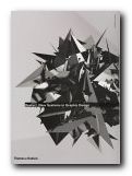
contemporary international web design
This portfolio presents a body of new systems in design work for the Web that is seeking to redefine the nature and scope of design practice. It is based on the productions of more than thirty-five international studios, and is presented in three categories.
 The first – Code – shows how designers are using the computer as a tool to become creative programmers. The second – Generic – shows designers manipulating objects from the ordinary and everyday world to produce projects that are off-beat and refreshing. The third part – Disjunction – features work that aims to provoke, to question, and to advance a designer’s particular agenda, whether political, social, or even personal.
It is mainly composed of screenshots from avant guard web sites, samples of distressed modern typography, and reproductions from the pages of contemporary graphics display books. You may not be surprised to hear that this often means banal subjects, retro styling, and unreadable text.
There are also examples of architectural plans and sketches, maps, street signs, posters, fashion photography, book design and public signage, commercial advertising, and photography.
It represents what seems to me like a masochistic school of graphic design. In most cases, every effort seems to be made to alienate rather than to charm or please the viewer.
And yet just occasionally a gem shines through – such as the pictures of beautiful pleated garments created by the Japanese designer Issey Miyake, and the examples of public signage in Rotterdam.
It will probably appeal to young designers and those people who want something provocative for the coffee table.
© Roy Johnson 2001
Christian Kusters and Emily King, Restart: New systems in graphic design, London: Thames & Hudson, 2001, pp. 176, ISBN: 0500282978
More on design
More on media
More on web design