Grafik Design After the End of Print
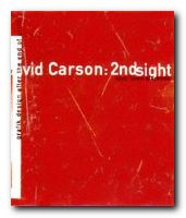
There is a product which food companies use to make their products thicker. It’s the gum agent you can read about on an ordinary bottle of syrup or a jar of not-so-authentic salsa. The thickener doesn’t really have a flavor, it’s just there to add content when all other things fail to blend or aren’t full enough to make that product enticing. No one likes to have thin and runny syrup on their waffles or salsa that doesn’t stick to their chips. David Carson: 2nd Sight: Grafik Design After the End of Print is a mouthful and more of what you’d expect from a graphic designer on a quest to clarify his methods and intentions, though it seemed spicier the first time around.
 There’s a sea of graphic designers who either love Carson’s methods or dislike them. For those who love his methods, you have another book to smile about. Another book to discuss with your fellow designers, another book to justify your methods. In fact, you now have another book that tells you why you do the things that you do. For those who dislike his methods, this is another book to mock. Another book to further your own theories on design.
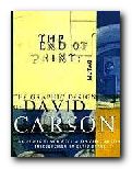
Intuition played a key roll in the development of the second book by Carson and Blackwell. Those four syllables seem to be the reason behind a lot of what David Carson does in life. Unlike The End of Print, 2nd Sight is more about text than it is about pretty images (although there are plenty of images). There are no popups, but there are a few quotes which serve as some sort of artistic justification or reasoning behind what he and others in the decontructionalist movement supposedly feels deep within.
2nd Sight isn’t trying to intellectualize anything – well it is, but it doesn’t succeed. It’s kind of like a second course in an eight course meal. It’s handing out a little bit of insight into the designers’ creative explorations and it’s putting David Carson’s life into yet another round of syndication. How many times do we need to read about the fact that he was a surfer and has no classical training in graphic design or typography?
In fact, if I had to make a guess, I’d say that by the end of this book Carson was a little bored. The popularity of this subject has dwindled and much of the content of 2nd Sight should have been said in Carson’s first book, The End of Print.
But laying all of that aside, the book hits upon an important point – that intuition plays a crucial role in what any good designer or artist does. You can be classically trained, but if you haven’t got the intuition to go along with that training, then you’ve got nothing. To put it bluntly, you’ve got skills in desktop publishing rather than skills in graphic design.
Visually, 2nd Sight is appealing. There are vistas from hotel rooms at sunset, Carson expounding at workshops, chic and trendy warehouse gigs, and yet more over-populated lectures. The book hangs together well. Unfortunately, the text is not as fully baked. Carson, the pied piper of intuition, fails to realize that not all intuition is good, nor is it enough. In 2nd Sight there is plenty of scenery but no roadmap.
Nonetheless, I’m glad I read this book and am pleased to see its spine on my bookshelf. Anything bearing Carson’s name, whether chunky or smooth, thick or runny, is likely to stimulate your own creative juices. On that basis, I can recommend 2nd Sight to any designer or typographer.
© Tracy Pickle 2000
Lewis Blackwell and David Carson, Carson, David: 2nd Sight: Grafik Design After the End of Print, Universe Publishing, 1997, pp.176, ISBN: 0789301288
More on typography
More on design
More on media
More on web design
