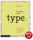
critical guide for designers, writers, editors, students
Ellen Lupton’s new design guide is in three parts. The first of Thinking with Type deals with the range, choice, and nature of the typeface you can use; the second shows how it can be squeezed, adjusted, and re-arranged for effect; and the third deals with the underlying structures upon which good page design is built. Actually, there’s a fourth as well – an appendix offering a list of hints on editing and punctuation, plus a comprehensive bibliography.
 Each part is accompanied by an essay explaining key concepts, and then a set of practical demonstrations illustrating that material. Part One delivers an excellent tutorial in the history and analysis of moveable type – from its origins in the Renaissance printing houses through to the designs for digital type which have arisen in the last twenty years. She writes in a light, rapid, and elegant style which packs a lot into a small space. What she has to say has obviously been distilled through many years teaching the subject.
Letters gather into words, words build into sentences. In typography ‘text’ is defined as an ongoing sequence of words, distinct from shorter headlines or captions. The main text is often called the ‘body’, comprising the principal mass of content. Also known as ‘running text’, it can flow from one page, column, or box to another. Text can be viewed as a thing—a sound and sturdy object—or a fluid poured into the containers of page or screen. Text can be solid or liquid, body or blood.
Part Two enters the semi-philosophic realm of the relationships between text and space. Here she explains how layout is used as an aid to comprehension, navigation, and structure. She also extends this discussion to include hypertext and human interface design.
This is followed by solidly reliable advice on the basic techniques of type kerning, line spacing, text alignment, and creating structure and hierarchies of significance in a text by spatial placement and visual emphasis.
Part Three deals with grids – the hidden systems for arranging content within the space of a page or a screen. In fact grids are shown in use in the presentation of information in a variety of media magazines and books, catalogues and newspapers, and she even quotes Edward Tufte’s example of railway timetables.
The book itself is beautifully designed and produced. Each topic is covered in a single or double page spread; marginal notes point to the sources of quotations and suggestions for background reading; and almost every other page includes a colour graphic illustrating the issue in question.
© Roy Johnson 2004
Ellen Lupton, Thinking with Type: A critical guide for designers, editors, and students, New York: Princeton Architectural Press, 2004, pp.176, ISBN: 1568984480
More on typography
More on design
More on media
More on web design