hand drawn type on walls – contemporary trends
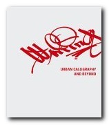
Those kids who spray graffiti on the sides of trains and motorway underpasses sometimes take their graphic inventiveness to amazing lengths. I’ve often admired the way they distort letter-forms into chubby round-shouldered block caps running into each other and overlapping so much that a name becomes more like a logo. Markus Mai’s Writing: Urban Calligraphy and Beyond explains the aims of these ‘writers’ as they call themselves – but he also goes on to show how the more creative of them turn their typographic designs into works of abstract sculpture.
 Well, not quite abstract, because some of the more inventive actually become a three-dimensional typography.’Writing’ is the general term given by these spay painters to the graffiti, signatures, and logos they create. It’s an activity which has gone from illegal defacement of walls and railway carriages into the legitimate world of fashion houses. Agnes B and Calvin Klein now employ these former vandals as calligraphic designers.
The chapters of Mai’s fascinating book are organised in ascending order of complexity. First come the ‘tags’, the personalised name design which is shaped into a distinctive logo. Next come fully fledged alphabets which demonstrate the remarkable typographic skills of these felt tip artists. There are alphabets which are almost unrecognisable yet curiously beautiful.
Many of them produce letter forms which are distorted and elaborated so much that you would hardly recognise them as letter forms at all unless they were seen alongside others from the alphabet.
A major influence clearly visible is Asian and Islamic art. Many of the forms of urban graffiti look just like the elements of classical Arabic scripts. It’s logical enough in a culture which puts emphasis on typography and bans realistic representation. Yet it’s difficult to believe that the kids in trainers and baseball caps who spray rolling stock and motorway underpasses spend their time studying the Koran. Yet the influence must come from somewhere.
The most amazing examples in this handsomely illustrated study are single letters viewed from several perspectives, and it’s interesting to note that no matter how far the process of abstraction is pursued, the results always somehow retain an organic form. It’s as if the typographic and the human share some basic genetic material. And that’s all the more so since the same phenomenon is apparent in the case of Latinate, Arabic, or Asian scripts.
Next comes the fleshing out of these letter forms into another dimension. Shading and perspective are added, and the logos start jumping off the garage walls and the elevator doorways. But as this move towards abstraction and an extra dimension continues, the jumbles of letters begin to take on an architectural appearance. They become like abstract structures.
The next stage is the logical development of this process. The letter forms are actually realised as three dimensional objects in their own right. The graffiti ‘writers’ seem to be influenced by both architecture and organic forms, so it is no surprise that some of their more advanced work is realised in the form of abstract sculptures and three 3-D ‘objects’. Many of these are shown taking their place quite logically in art galleries or as public installations.
There’s also an element of socio-political activism at work her – but it’s not that important. What really counts is the stunning depth of invention in the designs illustrated, and the admirable presentation values of the book itself.
© Roy Johnson 2005
Markus Mai, Writing: Urban Calligraphy and Beyond, Berlin: Die Gestallten Verlag, 2005, pp.207, ISBN: 3899550625
More on typography
More on design
More on media
More on web design