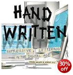
modern hand-produced lettering and typefaces
In an age which presents designers with the software to create any number of computer-generated fonts, design historian Steven Heller considers the lasting strength of typefaces produced by hand. He has a good track record in writing on graphic design, and Handwritten is an excellent example of his work. He divides his chapters into different hand-scripted styles – sleight of hand, scrawl (letterforms that are raw, splotchy, and untidy) scratch (scraped, cut, and gouged fonts) script (type that is sinuous and ornate) stitch (letters that have been sewn, sutured, and embroidered) shadow (dimensional, voluminous, and monumental letterforms).
 These are followed by suggestive (forms that imply the metaphorical, surreal, and symbolic) and sarcastic (the ironic, comical, and satirical in lettering). This seems a reasonable enough approach: these categories represent the attitudes of the designers, though sometimes there is overlap between them.
It’s also a handsomely designed and beautifully produced book – packed with hundreds of coloured, well-presented examples. The sources are amazingly wide-ranging: theatre posters, record albumn covers, comics and graphic novels, book designs, posters, ephemera, and original art works.
The visual range is also good – hand scrawled letters, painted typefaces, words scratched into surfaces, stitched into fabrics, or written onto surfaces (including Stefan Sagmeister’s body – an illustration which turns up everywhere these days).
He features and obviously has a soft spot for the work of Robert Crumb, the American freehand artist who designed lots of, ahem, alternative comics in the 1960s and 1970s. Crumb drove his sex-obsessed vision to very amusing and visually interesting limits – though it has to be said that although the subject matter of his cartoons is very radical, the essence of his visual style is essentially nostalgic. He gets its striking effects from linking psychologically modern subject matter with a quaint folksy visual idiom. This is what Heller categorises as ironic lettering.
There’s a fashion at the moment for adding hand-crafted type to digitally photo-realistic graphics, so as to play one off against the other. These are well represented here. However, I was surprised not to see more examples of freehand design translated into pixellated typography, but the book does end with examples of digital comic books which suggest that more is to come.
Having just taught on a course where students have to learn the discipline of writing descriptive picture captions, I was impressed by the manner in which his are consistently both succinct and imaginative. Each section of the book is prefaced by an essay, and the origins of the examples are meticulously sourced. Artist, designer, photographer, and client are all named on every example.
His explanation is all the more vigorous for being conducted across continents. There is nothing parochial about this compilation. Examples range from the UK and USA, to Mexico, the USSR, France, and Germany. The selections are witty, bitter, satirical, inventive, and sometimes quite violent.
If you are at all interested in typography, graphic design, or even print production values, this is well worth seeing. Serious students and professionals will want to own it.
© Roy Johnson 2004
Stephen Heller and Mirko Ilic, Handwritten: expressive lettering in the digital age, London: Thames and Hudson, 2004, pp.192, ISBN: 0500511713
More on typography
More on design
More on media
More on web design