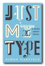
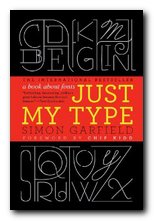
essays on the appreciation of fonts and their history
Just My Type is a book about fonts – an appreciation of their aesthetics and an explanation of how they come to be designed and used. It’s also a work of deep love and homage to humanitarian craftsmanship. Simon Garfield starts with the observation (which might be a surprise to anyone under forty) that prior to the introduction of the Apple Mac, computer users had no choice of fonts at all, except for the barest minimum, which almost always included the much reviled Courier. This is a font some people claim was designed for deep-sea divers to be legible under water.
 The book is a series of wittily written sketches on typographical history and principles, The main pieces are essays on the stories of the people behind fonts – the typographists who shape them, and the graphic designers who use them. These stories are underpinned by an amazingly wide-ranging and deep sense of printing history, and they are punctuated by shorter pieces celebrating individual fonts such as Gill Sans, Frutiger, Optima, and Vendôme. They also include potted studies of famous designers such as Paul Renner, Hermann Zapf, and Neville Brody.
The book itself pulls off a very dangerous strategy of printing every mention of a typeface name in that font itself, as well as varying the body text between a serif and a sans-serif font for alternate chapters (Sabon and Univers Light). This could easily have resulted in a visual mess – but the book has a strong and consistent design which helps make it visually interesting and coherent.
Garfield’s topics are amazingly diverse. He deals with font classification, variations on the ampersand, and Mrs Eaves – an Australian girl typographist who displays elegantly written letterforms on her own body, and he offers all sorts of amusing gossip and oblique items – such as Eric Gill having sex with his pet dog.
There are fascinating tales such as a beautiful typeface (Doves) which was lost by drowning, thrown into the Thames by its owner to spite his business partner. Garfield is also well informed on the background stories , the economics, and the design studio politics behind fonts which have become recently popular – such as Luc de Groot’s very successful Calibri, designed for Microsoft.
 His in-depth analyses come into their own when distinguishing between the very similar Helvetica, Univers, and Frutiger – all of which have become internationally popular, particularly for the signage in major travel systems such as railways and airports. You might not think that font selection could breed serious conflicts, but the choice of typeface for Britain’s motorway system in the 1960s led to angry letters to the Times and a ‘fonts duel’ between the two principal contenders for the commission.
Garfield has a loving and nostalgic chapter on what might be called ‘intermediate technology’ – the systems of home-made printing which preceded digital type, including the John Bull Printing Outfit, Dyno-Tape, and Letraset. It’s strange (for those of a certain age) to be reminded just how recent these make-do systems were. Also covered are font plagiarism and piracy, a type and printing museum in Lambeth, and a selection of the worst possible fonts.
The font designers are meticulously given credit in the appendices, and there’s a useful selection of further reading plus a list of videos, blogs, typefaces libraries, and font discussion sites. It’s a wonderfully entertaining read. However, here’s a word of warning. The book is best sampled one short chapter at a time. If you read it continuously you’ll get font-indigestion and forget where Giambattista Bodoni ends and Frederick Goudy begins.
© Roy Johnson 2011
Simon Garfield, Just My Type, London: Profile Books, 2010, pp.352, ISBN: 1846683025
More on typography
More on technology
More on digital media