illustrated guide to new digital typography techniques
This is a stunningly attractive book. It jumped off the shelf first time I saw it, and after reading it, I’m more in love than ever. Part One offers a history of digital typography and shows how it works. Bob Gordon discusses the features that go into the design of type – the anatomy, rendering, technology, and fine tuning. This is a quick history lesson and a valuable tutorial in basic typography. He gets through the basics quickly, then concentrates on type in the digital age – how it is rendered on screen, in print, and even how it is created, down to pixel level.
 This part also explains those terms you have seen mentioned but never quite understood – such as bitmap, antialiasing, and rasterization. He clarifies all the complexities of font technology in a very straightforward manner – showing how tracking, kerning, and hyphenation can be used to good effect.
What makes this book such a visual treat is that every double-page spread is a work of exquisite design in its own right. The pages are designed on a consistent grid; they are deeply ‘layered’ and colour-coded by subject; the colouring is elegantly restrained; and every detail is illustrated with beautifully-chosen examples.
Part Two shows a a range of classic and contemporary font designs. These range from Bembo and Bodoni to Rotis and ITC Stone. Each font is described, illustrated, and shown with hundreds of examples of styles and setting values. There are also tips on how to set each font to best advantage, using tracking and kerning.
 Part Three looks at display type – both on the printed page and the computer screen. He discusses customised font design – making your own font sets using software such as Fontographer and Pyrus. There is a thorough round-up of how the latest font technology is being used on the Web. This involves font-embedding, which is now much more easily achieved than it used to be. Then he concludes with a review of the most innovative font foundries and contemporary designers – such as Neville Brody, Matthew Carter, Zuzana Licko, and Adrian Frutiger.
The really successful feature of this book is that it will appeal to beginners and professionals alike. For those new to typography it offers a visual masterclass of design examples, and for the seasoned practitioner, it is a technical guide to the latest techniques. For anybody interested in good design, it is an example of book production raised to the level of an art form.
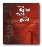
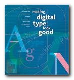
NB: The UK and the US editions have different jacket designs and different ISBNs.
© Roy Johnson 2001
Bob Gordon, Making Digital Type Look Good, London: Thames and Hudson, 2001, pp.192, ISBN: 0500283133
More on typography
More on design
More on media
More on web design