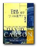
illustrated guide to popular US avant-garde typographist
David Carson designs jarring and visually chaotic magazine spreads, posters, and print ads which have consistently challenged the boundaries of legibility and typography. His modest San Diego, California, studio has become the epicentre of a new graphic anti-aesthetic that has stirred ongoing debate among fellow designers such as Neville Brody, who observed that his work prophesies ‘the end of print’. This comment inspired the title of Carson’s new book, the first comprehensive collection of his decade-long output of graphic imagery.
 In past lives, Carson was a top-ranked competitive surfer and a high school sociology teacher. However, during a two-week workshop on graphic arts he discovered his calling. He landed his first major design assignment as art director of Transworld Skateboarding in 1983, and he later moved on to Surf magazine. In 1990, Carson headed the much-praised Beach Culture.
This is where his irreverent but often ingenious layouts consistently pitted editorial substance against graphic style. Carson’s creative vision came out on top – in its six-issue stint, Beach Culture won over 150 design awards. As the art director of Ray Gun, his unconventional look has been shamelessly emulated by a slew of similar start-up magazines.
Recently, Carson has shifted from spokesman for Left-Coast subculture to the corporate arena, taking on larger projects that include print ads for Nike and a television commercial for Citibank, as well as collaborations with musician David Byrne and photographer Albert Watson.
The End of Print was designed by Carson, and ironically, this proves to be the most disappointing aspect of the book. For those designers and readers who want to learn more about Carson’s graphic work and philosophy must do so on his terms. The text of the book is presented in the confusing and often incoherent typography typical of a Ray Gun layout. Those not willing to read the garbled introduction and inarticulate essays may surrender in frustration. However the book manages to stand on its own as a purely visual document, a fascinating chronicle of David Carson’s creative mind.
Like the collage artist Kurt Schwitters, who collected his materials from curbside rubbish, Carson finds much of his inspiration in the visual garbage of modern-day living. Handlettered signs, torn and layered poster kiosks and the eroded storefronts encountered in city streets serve as backdrops which Carson equates into the digital realm. Many of these found objects and photographs are reproduced in the book and they offer insight into Carson’s design approach.
One page reproduces a Carson ad selling a Beach Culture T-shirt sight unseen, with the premise that “if you like the look of the magazine, you probably would like the shirt.” Likewise, if you like the design of David Carson, you probably will like this book.
© Philip Krayna 2000
Lewis Blackwell and David Carson, The End of Print: The Graphic Design Of David Carson, Chronicle Books, 1995, pp.160, ISBN: 0811830241
More on typography
More on design
More on media
More on web design