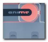
Showcase of the latest digital animation – print and DVD
Don’t be misled if you see this book in a shop. It’s a dazzlingly attractive publication – an elegant catalogue of full-colour screenshots housed in a translucent plastic case. But the heart of the production is a huge collection of animated graphics on the enclosed DVD. These are movie clips, motion graphics, linear narrative sequences, interactive web pages, and vector presentations – some as long as promotional videos. They range from avant-guard art-school productions – fuzzy, out-of-focus, and granular – to slick commercial projects by some of the best designers in this new field.
 Quite a few of the most stylish examples are rendered in the manner of French bandes dessinées and graphic novels – hard outlines, block colour, and a predominance of black and grey highlighted by occasional dark brown, blue, or citron. I’ve watched them over and over again, and I’m still amazed.
There’s lots of deliberately jerky editing, overlayering, jumpcuts, and out-of-focus images set to the rhythms of stripped-down, heavily sampled techno-music – sometimes drum-and-base dance style, and occasionally ‘ambient’ sound.
A lot of them are in what Web designer Curt Cloninger in his recent Fresh Styles for Web Designers calls ‘Drafting Table/Transformer’ style – the kind of things that look like docking station accidents in outer space. Others favour the ‘Mondrian poster style’ – screen filled with block colour in muted tones, and pared down text in lower-case sans-serif font.
There are lots of recurrent images and themes – architecture, motorways, metal fabrications, skyscrapers – and the spirit of Ridley Scott’s Bladerunner hangs over the majority. It’s a great pity there isn’t more technical detail on how these pieces were made – though Flash seems to be the prevalent technology.
Most of the movies seem to be from the ‘Yellow Submarine’ school of graphic design – lots of semi-surreal cartoon figures morphing in and out of each other. There’s also a popular streak of sci-fi comic book characters and their icons brought to life.
For me, the simplest and the shortest pieces are the best. There are two wonderful movie title sequences designed by YU + CO for ‘Mercury Rising’ and ‘Lost Souls’. These are in black and white, and they are largely composed of motion typography with a moody soundtrack. They show how a simple combination of image, movement, and music can create stunning effects.
This is not just a book with DVD attached, it’s an outstanding DVD gallery of motion graphics with a first rate printed catalogue. There is an amazing amount of visual stimulation material here for those studying or working in the digital arts. Anybody who is interested in graphic animation and the latest developments in Web technology should see these works.
© Roy Johnson 2001
Robert Klanten (editor), Anime, Die Gestalten Verlag, 2001, pp.192 pages ISBN: 3931126722
More on design
More on media
More on web design