classic design manifesto of the Modernist movement
Jan Tschichold [pronounced ‘Chick-old’] was a typographist and graphic designer whose life and work straddled two eras. He was born in Leipzig in 1902, and moved to Berlin to be part of the modernist (and left wing) artistic movement which centred round the Bauhaus in the 1920s. There he met and worked with all the important figures of the Modernist movement – Laszlo Moholy-Nagy, El Lissitzky, Kurt Schwitters – whose work in graphic design is used profusely throughout this book. In 1947 he emigrated to the UK and amongst other things designed the re-launch of the Penguin paperback series that became so successful.
 Die Neue Typografie was first published in Berlin when Tschichold was only twenty-six years old, yet it represented – as Robin Kinross explains in an elegant and scholarly introduction – “the manifestation in the sphere of printed communication of the modern movement in art, in design … which developed in Central Europe between the two world wars.”
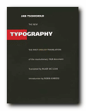
This is the first publication of an English language version. It has been reproduced in a physical form as closely as possible to the original – a square shape, black cover, glossy pages, sans-serif font, and greyscale illustrations with occasional red titles. Very futurist.
Tschichold looks at typography in a historical context, then explores the developments in twentieth century art and the rise of modernism. The principles of the new typography are then explained as a revolutionary movement towards clarity and readability; a rejection of superfluous decoration; and an insistence on the primacy of functionality in design.
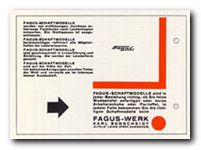
 There are chapters on the use of photographs; the standardisation of paper sizes [the origin of the DIN A4 we all use today] lots of carefully analysed examples of business stationery, and even film posters which evoke the visual ethos of the inter-war years. All this is illustrated by some crisp and still attractive reproductions of everyday graphics – letterheads, postcards, catalogues, and posters – in the red, black and white colour-scheme characteristic of the period.
Tschichold writes in the vigorous and ‘committed’ manner common to left-wing prose of the time – full of exhortations and generalisations, mainly focussed on the heroes of the New Age:
The engineer shapes our age. Distinguishing marks of his work: economy, precision, use of pure constructional forms that correspond to the functions of the object. Nothing could be more characteristic of our age than these witnesses to the inventive genius of the engineer, whether one-off items such as: airfield, department store, underground railway; or mass-produced objects like: typewriter, electric light-bulb, motor cycle.
Tschichold is also part-responsible for the Modernist ditching of capital letters in favour of all lower-case. Typographic novelty was perhaps sought more vigorously in Germany, because of their continued use of Blackletter or Fraktur (even into the post 1945 period).
The ornate yet corseted ugliness of European typography at the beginning of the twentieth century needed vigorous cleansing and exercise, and functionalist modernism appeared to be the goad and caustic required.
This edition contains not only examples of Tschichold’s revisions to the original text and a multi-language bibliography, but an excellent introduction by the translator Robin Kinross which puts the book in its historical perspective. This is a historic document, a manifesto, a key theoretical document of Central European modernism, and an important reprint. It’s a must-have for anyone with a serious interest in typography or design.
© Roy Johnson 2002
Jan Tschichold, The New Typography: A Handbook for Modern Designers, Berkeley: University of California Press, 1998, pp.236, ISBN: 0520071476
More on typography
More on design
More on digital media