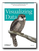
explaining data with the Processing environment
The doyen of data presentation is Edward Tufte, but even he has (so far) only dealt with the display of static information. Ben Fry’s new book combines similar aesthetic principles with the technical knowledge of how such presentations can be made dynamically. He uses a simple programming environment and API called Processing (which he developed as part of his PhD research). This is a free downloadable open source program based on Java (processing.org).
 He’s an excellent communicator, and introduces his topics in gradual stages. The first few chapters are a gentle introduction to presenting data, and then gradually he presents more technically advanced approaches. What he proposes embraces a number of disciplines – statistics, data mining, graphic design, and information visualization – but he insists at the outset that the most important thing is to ask interesting questions. It’s all very well having huge amounts of data, but you need to ask ‘What is meaningful about it?’.
The process of creating a visual presentation is a logical series of steps. First the data is acquired: (he uses the US system of zip codes as an example). Then the data is parsed: that is, changed into a format that tags each part with its intended use. Next, any unwanted data is filtered out, then the data is mined – in this case to show its maximum and minimum values.
The next stage is deciding how to present the results – as a table, bar chart, graph, or diagram. Then the results can be refined. And finally, because this entire process is conducted digitally, drawing on processing power which is now available on even a standard computer, the data can be interrogated interactively. We can zoom in on maps, or refine searches by name or size.
In the next part of the book he offers an explanation of how to use the Processing software to create your own displays and visualize your own data. This is done in a straightforward manner that even someone without programming skills could follow. He also provides guidance on the philosophy of designing this type of software. Keep your designs as small and re-usable as possible. Work with samples of your data to begin with. Don’t start by trying to build a cathedral.
Subsequent chapters deal with different types of exercise – showing data as a physical map (the population of the US in states) then a time series (national consumption of tea and coffee 1910-2000). Next comes data with complex inter-relations (national results of all baseball teams in a single season).
As he says in his introduction, he is not offering a series of ready-made programs for presenting data. Instead, he is demonstrating the general principles by which such design problems can be solved, and leaving you to create your own.
Tree maps and network graphs are shown displaying word usage in a literary text (Mark Twain) and he even shows examples of results which are not useful – in order to emphasise the point he makes over and over again: you must ask the right questions of the data you are interrogating.
He ends by returning to the earliest stages of his thesis with some quite advanced level guidance on the acquisition and parsing of data. If by this time you’re not convinced (as I was) that he knows exactly what he’s talking about, have a look at his stunning personal web site at www.benfry.com.
© Roy Johnson 2007
Ben Fry, Visualizing Data, Sebastopol (CA): O’Reilly, 2007, pp.366, ISBN: 0596514557
More on information design
More on design
More on media
More on web design