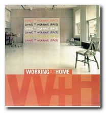
combining your office with your home – elegantly
Working at Home is the second book on the interior design of home office space I have recently consulted as research for a move to new office premises. Like the first, Working Spaces, it offers a powerfully stimulating set of examples, generated by people with imagination, flair, and in some cases, courage. If the selection of examples are typical of interior design today, the cities pushing this trend are New York, London, Berlin, Barcelona, and Tokyo.
 And the fashion is for old industrial spaces preserved for their high ceilings, big room spaces, and vast windows. In each case they have been transformed by adding luxury furnishings, yet the original features have been preserved – so that there at first appears to be a tension between domestic and commercial purposes. The examples show interior design solutions for writers, artists, musicians, architects, graphic designers, a printers, business people, and a textile designer. And in most cases the usual clutter which blights commercial offices has been purged – to good effect.
It has to be said that most of the samples illustrated are examples of minimalist design – plain walls and floors, no decoration, wood in teak or beech, lots of opaque tinted green glass, polished chrome fittings, simple halogen downlighters, chairs with tubular chrome legs, and giant settees in black leather.
There are architectural plans reproduced in each case which illustrate how the overall space has been used and how the parts relate to the whole.
One of the recurring features I spotted here was floors covered in epoxy resin – which results in a hard, shiny surface which is practical and easily cleaned. Not everybody would wish to settle down for a cozy evening in such surroundings – but the results look great.
What conclusions can be drawn from the examples on display? In almost all cases there are few decorations in the rooms: no pictures or shelves or decorative brackets. The rooms, with their pale walls and clutter-free surfaces are left to speak for themselves.
You might imagine that people working in the creative industries would want to decorate every inch of their surroundings with objects which expressed their tastes and cultural values. But the opposite appears to be the case. And these might indeed be shining examples illustrating Mies van der Rohe’s mantra – Less is More.
© Roy Johnson 2005
Aurora Cuito, Working at Home, New York: Loftpublications, 2000, pp.175, ISBN 0823058700
More on architecture
More on technology
More on design