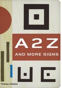
unusual alphabets, fonts, logos, symbols, and signs
This is a compilation of the best-selling albumns of quirky typography, 130 Alphabets and Other Signs and A B Z: More Alphabets and Other Signs, with new materials added. Basically, it’s a sample book of fonts, characters, trademarks, logos, dingbats, and alphabet designs. But what makes the book so attractive is that the collection is both eclectic and suffused with a period charm of the inter-war years. Many of the designs and fonts are drawn from that period – with a hint of colonial nostalgia in labels from products destined for Africa, China, and India.
 Even the pages are printed in a pre-faded manner and cut with rounded corners to enhance this effect. There are elaborate display fonts, shaded letters, monograms, a set called ‘Huxley Vertical’ which seem like a precursor to Neville Brody, a selection of ink blots, labels from Joan of Arc laxatives, labels for matches, cigarettes and drinks, a two-page spread of ampersands, examples of visiting cards, Japanese packaging labels, even a typographic book-cover design by Natalia Goncharova from 1920s Paris.
The materials are the products of the main centres of modernist design in the first third of the last century: largely French, German, Czech, and Russian. The selection of material comes from private collections in London, Paris, Amsterdam, Prague, New York, and Mexico City.
Many of the designs appear here for the first time since their first use. Some of the examples, such as Karel Tiegel’s photo-balletic alphabet of 1926 and a Spanish civil war manual for illiterate soldiers, have never been reproduced before since they first appeared.
The sources of this new collection are wonderfully assorted. There are plenty of straight font sets, but also monograms, letter headings, package labels, posters, shop signs, opticians’ eye test charts, book jackets, film posters, technical manuals, propaganda leaflets, and magazine covers. The selection reflects mainly European modernism, constructivism, and Art Deco – though there are also novelties from Mexican graffiti and Asian medicine labels.
Each large page is striking in its muted, silkscreened colours, and the book
itself is amazingly attractive, with rounded corners, pre-faded yellow edges, and splotchy endpapers.
It has to be said that the main charm of this book is its unashamed retro feel; but I would defy anyone not to be pleased with the result. It is beautifully designed and produced, well printed, and altogether a must-have for anybody interested in typography and graphic design.
© Roy Johnson 2006
Julian Rothenstein and Mel Goodwin, A 2 Z and More Signs, London: Thames and Hudson, 2006, pp.320, ISBN: 0500286043
More on typography
More on design
More on media
More on web design