Mantex

Tutorials, Study Guides & More

  • HOME
  • REVIEWS
  • TUTORIALS
  • HOW-TO
  • CONTACT
>> Home / Archives for Data presentation

Numbers, Tables, and Charts

May 24, 2009 by Roy Johnson

practical guidance on the visual presentation of data

Have you ever seen a document containing numbers, tables, and charts – and been unable to understand the information being displayed. Of course you have; and the fault is not yours. The data has simply not been presented effectively. This book deals with the data presentation skills required to show numbers, tables, and graphs in documents and presentations. Many people assemble their data honestly enough when writing reports and giving presentations, but they often do so without thinking how incomprehensible it might be to the audience.
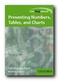
Numbers, Tables, and ChartsOxford University Press have just brought out a series of beginner’s manuals on communication skills. The emphasis is on no-nonsense advice directly related to everyday life. The authors show you how to present numerical data to make its outcomes more self-evident and more easily digestible. This is done by putting figures into a logical order, adding focus to the data, and using layout to guide the reader’s eye towards what is significant.

They cover how to design tables. It’s amazing how much clearer these can be made by removing unnecessary grid lines, aligning numbers and column headings, creating clear titles and headings, and removing any ‘chart junk’.

Graphs should be uncluttered, simple, non-misleading in terms of scale and numbers, and used to illustrate a clear message.

They show how to construct graphs and bar charts so that they immediately reveal the significance of the data they contain. There are also examples of when to use pie charts, scattergrams, and pictographs (small icons)

There’s also useful writing skills advice on how to integrate numbers and statistics into the text of documents. For instance, don’t start sentences with figures or digits, and how to mix the use of words and digits to clarify meaning, as in nine 6-inch rulers and three 5-a-side football matches.

Most presentation of data is these days done using office software packages, so it’s good that they give this a mention, with tips for creating good handouts.

They finish with a case study which tracks the raw data of some school exam results from gathering to final presentation. The grades and numbers can be presented in different ways, and the head teacher must choose the best way for a meeting with the governors.

The chapters of this book are short, but almost every page is rich in hints and tips. The strength of this approach is that it avoids the encyclopedic volume of advice which in some manuals can be quite frightening. This is a book which will reassure those who need it.

The all-time star in this field is Edward Tufte, on whose work they draw substantially. I was glad to see him listed in the bibliography. This is a cheap and cheerful version of the same layout principles he promotes in his beautifully designed books.

© Roy Johnson 2003

Numbers, Tables, and Charts   Buy the book at Amazon UK

Numbers, Tables, and Charts   Buy the book at Amazon US


Sally Bigwood and Melissa Spore, Presenting Numbers, Tables, and Charts, Oxford: Oxford University Press, 2003, pp.144, ISBN: 0198607229


More on information design
More on design
More on media
More on web design

Filed Under: Information Design, Study skills Tagged With: Charts, Communication, Data presentation, Information design, Numbers, Presenting information, Tables, Writing skills

Visualizing Data

June 19, 2009 by Roy Johnson

explaining data with the Processing environment

The doyen of data presentation is Edward Tufte, but even he has (so far) only dealt with the display of static information. Ben Fry’s new book combines similar aesthetic principles with the technical knowledge of how such presentations can be made dynamically. He uses a simple programming environment and API called Processing (which he developed as part of his PhD research). This is a free downloadable open source program based on Java (processing.org).

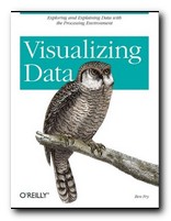
Visualizing DataHe’s an excellent communicator, and introduces his topics in gradual stages. The first few chapters are a gentle introduction to presenting data, and then gradually he presents more technically advanced approaches. What he proposes embraces a number of disciplines – statistics, data mining, graphic design, and information visualization – but he insists at the outset that the most important thing is to ask interesting questions. It’s all very well having huge amounts of data, but you need to ask ‘What is meaningful about it?’.

The process of creating a visual presentation is a logical series of steps. First the data is acquired: (he uses the US system of zip codes as an example). Then the data is parsed: that is, changed into a format that tags each part with its intended use. Next, any unwanted data is filtered out, then the data is mined – in this case to show its maximum and minimum values.

The next stage is deciding how to present the results – as a table, bar chart, graph, or diagram. Then the results can be refined. And finally, because this entire process is conducted digitally, drawing on processing power which is now available on even a standard computer, the data can be interrogated interactively. We can zoom in on maps, or refine searches by name or size.

In the next part of the book he offers an explanation of how to use the Processing software to create your own displays and visualize your own data. This is done in a straightforward manner that even someone without programming skills could follow. He also provides guidance on the philosophy of designing this type of software. Keep your designs as small and re-usable as possible. Work with samples of your data to begin with. Don’t start by trying to build a cathedral.

Subsequent chapters deal with different types of exercise – showing data as a physical map (the population of the US in states) then a time series (national consumption of tea and coffee 1910-2000). Next comes data with complex inter-relations (national results of all baseball teams in a single season).

As he says in his introduction, he is not offering a series of ready-made programs for presenting data. Instead, he is demonstrating the general principles by which such design problems can be solved, and leaving you to create your own.

Tree maps and network graphs are shown displaying word usage in a literary text (Mark Twain) and he even shows examples of results which are not useful – in order to emphasise the point he makes over and over again: you must ask the right questions of the data you are interrogating.

He ends by returning to the earliest stages of his thesis with some quite advanced level guidance on the acquisition and parsing of data. If by this time you’re not convinced (as I was) that he knows exactly what he’s talking about, have a look at his stunning personal web site at www.benfry.com.

© Roy Johnson 2007

Visualizing Data   Buy the book at Amazon UK

Visualizing Data   Buy the book at Amazon US


Ben Fry, Visualizing Data, Sebastopol (CA): O’Reilly, 2007, pp.366, ISBN: 0596514557


More on information design
More on design
More on media
More on web design


Filed Under: Information Design Tagged With: Data presentation, Information design, Visualization, Web design

Get in touch

info@mantex.co.uk

Content © Mantex 2016
  • About Us
  • Advertising
  • Clients
  • Contact
  • FAQ
  • Links
  • Services
  • Reviews
  • Sitemap
  • T & C’s
  • Testimonials
  • Privacy

Copyright © 2025 · Mantex

Copyright © 2025 · News Pro Theme on Genesis Framework · WordPress · Log in