illustrated critical survey of contemporary masterworks
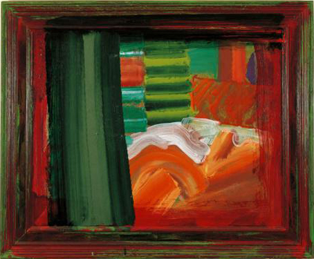
I’ve been a long time fan of the work of Howard Hodgkin. (So much so that I opened a gallery devoted to his work here.) He has a great sense of form, uses luscious colours, and produces semi-abstracted compositions which are like rich food for the visual sense. The problem in interpreting his work is that there’s a tension between the degree of abstraction of the image and its ostensible subject, usually stated in its title. Hodgkin claims that he is a ‘realist’ painter, but it’s sometimes difficult to understand how a couple of deep blue brush strokes across the centre of a green stippled canvas whose frame is dripping in blood red gloss represents ‘An Evening with Kevin’.
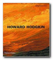
 Andrew Graham-Dixon’s study is an attempt to solve this problem. He presents a historical survey of Hodgkin’s work which is beautifully illustrated in the full colour it deserves. It’s an approach to art criticism which is well informed (in biographical terms) which pays attention to the details of what appears on the canvas, and yet which seems to stop short of interpretation.
He does his best to make the case for representation by suggesting that Hodgkin paints memories, feelings, and moods; but when it comes to evaluating individual works he hides behind a smokescreen of supposition and conditionality. His argument goes something like this, in
this painting may have some connection with … it recalls someone else … it might have affinity with …. it can also evoke …and it might be said to represent something …
He describes almost every brush stroke in gushing prose, but he hasn’t got any hard evidence to offer. And whilst he’s getting his critical knickers in a twist, he doesn’t address glaringly obvious issues such as the fact that Hodgkin paints over the frames of his pictures. Why does he do that? What’s the significance of such a bold gesture?
It’s interesting to note that after running out of meaningful things to say about the paintings, he’s quite prepared to go on talking about their titles. And in the end, this might be the problem.
If a glamorous canvas of deep greens splashed against a black border, with red and yellow dots in the background were called Composition #9 there might be less fuss than if it were given the title In the bedroom . Andrew Graham-Dixon would be less preciously strangulated, and we could just enjoy some more coloured paint on canvas.

But Hodgkin does give his paintings apparently descriptive titles – such as Nick 1977 which looks like two windows covered by Venetian blinds, You Again 2001 which is three interlocking pyramids, and Learning About Russian Music 1999 in which a red and ochre frame surrounds blue, green, and brown brush strokes. So the problem remains.
There is the merest smidgeon of representation still present in his work, but the acid test would be guess the subject if the paintings were not captioned. I doubt if Andrew Graham-Dixon or anyone else could do it.
Fortunately, I don’t think it matters in the end. Personally, I am quite happy to accept Hodgkin as a quasi-abstract painter whose sense of colour is simply ravishing. The reproductions of the paintings here are excellent, and this is a good-value survey of them.
© Roy Johnson 2005
Andrew Graham-Dixon, Howard Hodgkin, London: Thames and Hudson, (revised and expanded edition) 2001, pp.232, ISBN 0500092982
More on art
More on media
More on design