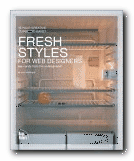
new web design strategies and techniques
So far, web design theory has been split between usability minimalism as urged by gurus such as Jakob Nielsen at one end of the spectrum, and the bandwidth-hogging graphic designs of David Siegel at the other. Now Curt Cloninger suggests we can combine the two approaches – and he shows how it can be done. This is one of those Web strategy guides which assume you know the details of designing pages.
 What it offers is a survey of new strategies in structure and graphic presentation – some of them on the edge of the avant garde. Cloninger takes the line that these are the early days of the Web, that there are severe limitations on what is possible, but that inventive designers will embrace the limitations and turn them into positives.
The reasons he offers are that not all sites are driven by e-commerce or a desire to maximise hits. Some are exhibition or display sites; galleries or individual portfolios of work – something like an elaborate visiting card. There is no reason why such sites shouldn’t indulge themselves with the sorts of glamorous graphics and ‘entry pages’ supported by designers such as David Siegel.
He categorises sites as ‘Gothic’, ‘Grid-based’, ‘Grunge’, ‘Mondrian poster’, ‘Paper Bag’, and ‘HTMinimaLism’ – and despite his post-hippy approach these distinctions do eventually make sense. Designers in these camps treat the page design, the Web strategy, and the visitor experience in significantly different ways.
One of my favourites was the minimalist style – sites from the competition www.the5K.org which feature pages of games, puzzles and art collections the total size which must come in under five kilobytes. [Try it!] The other was the sci-fi look of what he calls ‘Drafting/Table Transformer’ style led by Mike Young, whose work is featured in the recently published book of animated graphics.
Each chapter describes the features of one style. It then analyses examples, with well-produced screenshots of sites which are often private and experimental. Then he tells you how to achieve these effects. It’s a very good formula – no matter what you think of the sites.
He’s quite keen on distressed backgrounds and the grunge typography of designers such as David Carson – and he tells you how to create the effects. This will appeal to those who want to make a visual impact. He has favoured designers who he claims have been influential – Mike Cina, Miika Saksi, and a Chicago design group 37signals.
There’s a lot of detailed instruction on how to achieve special effects – most of them done in Photoshop. The general strategy is to maximise visual effects whilst minimising download time. And it has to be said that all the effects are beautifully illustrated, with full pages of elegantly presented coding.
© Roy Johnson 2004
Curt Cloninger, Fresh Styles for Web Designers, Indianapolis IN: New Riders, 2001, pp.211, ISBN: 0735710740
More on design
More on media
More on web design