rigorous examination of 50 big commercial websites
This is the latest broadside from usability guru Jakob Nielsen – well known for his radical and uncompromising views on Web design. It’s a follow-up to his best-selling Designing Web Usability. What he does in Homepage Usability is spell out the basic principles of what makes a Web page efficient – then he applies these principles to fifty commercial sites.
 The first part of the book analyses the basic elements of a home page – its name, shape, content, links, navigation, and graphics. His statement of general principles (established with co-author Marie Tahir) includes information design, typography, and navigation, as well as consistency and logic of categorisation.
He makes all this seem perfectly reasonable and almost beyond doubt. This establishes Nielsen’s ‘Guidelines’ – which he then uses as a benchmark against which to dissect a collection of sites – ranging from amazon.com to yahoo.com. In other words, he aims high, and he doesn’t pull his punches.
The analysis is detailed and unsparing – and any Web designer who stays with him through the process will learn a lot. He is keen on simplicity, clarity, minimalism, overt navigation, and lack of visual clutter.
Everything is served up with Nielsen’s customary brio. If you score below 50% on his usability test, he shows no mercy. “Most likely, you should abandon [your] entire current site and start over from scratch”.
There have been criticisms of this approach – for instance, that he assumes an aggressive commercial model as the norm. But what if your site is a walk-through gallery, or a portfolio of work, rather than an e-Commerce site like Ford or Amazon. Surely the same ‘guidelines’ would not apply.
In each analysis he shows the client’s home page and describes it across a double page spread. Just occasionally he might even sprinkle a few words of praise. Then he pulls it apart bit by bit – showing where the designers are going wrong. The secret of his approach is attention to fine detail. He looks at the small print (literally and metaphorically) checking even the font, its size, its colour, and its position on the page.
I think you could argue with some parts of his methodology. For instance, in his statistical breakdown of screen real estate (how much space each topic occupies) he puts portal listings and niche product details into the same category. Then in some cases a list of category links might be rated lowly, whereas in others blatant advertising copy might be rated highly. I don’t think that is consistent, and it doesn’t correspond to the real user experience.
He’s good on conventions for naming. For instance, ‘site contents’ is not the same as ‘site map’ – because web users have quickly got used to certain conventions – the site name at top left, Help top right, and so on. Homepage links to ‘Forum’ for instance don’t mean much – even though the information beneath them might be quite valuable. These are valuable insights.
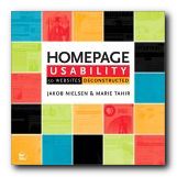
This is an attractive and well-illustrated book. Don’t be put off by the front cover – which makes it look like a home improvements catalogue. It’s is a serious workbook for Web designers at all levels. Anybody who wants to keep abreast of Web design and e-Commerce should read Nielsen – even if it’s to disagree with him.
© Roy Johnson 2003
Jakob Nielsen and Marie Tahir, Homepage Usability: 50 websites deconstructed, Indianapolis, (Ind): New Riders, 2002, pp.315, ISBN: 073571102X
More on web design
More on digital media
More on technology