short essays on the finer points of book design
Jan Tschichold [pronounced ‘Chick-old’] is probably best known in the UK for his work in designing Penguin paperbacks in the late 1940s. He was a German refugee who had made his mark as a radical modernist in 1928 with the publication of Die Neue Typografie. The collection of short and elegantly written essays in The Form of the Book are however largely arguments in favour of traditional, hard-earned craftsmanship, artistic self-effacement, and typographical restraint. As Robert Bringhurst puts it with characteristic elegance in his introduction: ‘Like Stravinsky, after making his reputation as a rebel, [Tschichold] entered on a long and productive neo-classical phase.’
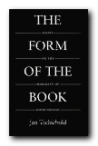 Written between 1937 and 1975, these essays discuss every element of the traditional printed book. Tschichold ranges from its shape and size, its cover and title page, via its typeface, margins, paragraphs and section headings, through to footnotes, its index, colophon, and even the blank pages before its final covers. This is the work of a master craftsman sharing a lifetime’s experience, and it’s a delight to read. The German tradition out of which these observations spring is betrayed by his habit of formulating arguments in the imperative mode as a series of abstract absolutes. He also sometimes poses his arguments as quite witty aphorisms:
Comfortable legibility is the absolute benchmark for all typography … Good typography can never be humorous … a truly beautiful book cannot be a novelty. It must settle for mere perfection instead.
It’s interesting that Tschichold, the author of the modernist New Typography, should take such a traditionalist line, with his concern for harmony, proportion, tact,balance, and good taste. This collection includes an essay on ‘The Importance of Tradition’ which is effectively a refutation of his own ideas written in 1928. He also has essay titles which are almost amusingly didactic: ‘Why the Beginnings of Paragraphs Must Be Indented’, and he has firm views on book design, page proportions, title pages, house rules, indentation, footnotes, punctuation marks, and even the colour of paper.
On the subject of the book page and its type area, there are some pages of quite mathematical minutiae, but this supports the overall impression one gains that the secret of typographical success – as with so much else – lies in the details. He loves the finer points of design and book production, and there are eloquent passages on the spacing of ellipses, the thickness of an em-dash, the positioning of illustrations, and – two of his pet hates – white paper and the design of book jackets.
For those with a serious interest in typography, this is a ‘must have’. It belongs alongside works such as Robert Bringhurst’s Elements of Typographic Style as a modern classic. Even if it’s out of print – order it, or keep looking. It’s worth the effort.
© Roy Johnson 2002
Jan Tschichold, The Form of the Book: Essays on the Morality of Good Design, Vancouver, BC: Hartley & Marks, 1991, pp.180, ISBN: 0881791164
More on typography
More on design
More on media
More on web design
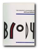
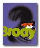 There are pop adverts, albumn and magazine covers, corporate logos and design, fashion magazine plates, book dust jackets, letterheads, and even humble business cards amongst the designs illustrated here. The accompanying text by Jon Wozencroft is enthusiastic without being sycophantic, and there is a good scholarly apparatus which gives full details of sources. However, the principal value of these two volumes is that they are beautifully designed books, full of good page layouts, vivid illustrations, and well-chosen typography. If they are out of print by the time you read this, make the effort to track them down. You will not regret it.
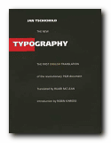
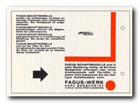 There are chapters on the use of photographs; the standardisation of paper sizes [the origin of the DIN A4 we all use today] lots of carefully analysed examples of business stationery, and even film posters which evoke the visual ethos of the inter-war years. All this is illustrated by some crisp and still attractive reproductions of everyday graphics – letterheads, postcards, catalogues, and posters – in the red, black and white colour-scheme characteristic of the period.
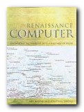
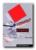
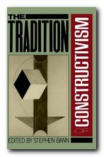
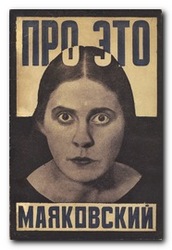 However, it should perhaps be remembered that many visual artists, from art-college onwards, come badly unstuck when it comes to expressing their ideas in words. That’s why theories of constructivism and any other movement should be founded on what is produced, not what is said. This is one of the weaknesses of extrapolating aesthetic theories from documents such as those reproduced here. Much huffing and puffing can be expended on whatever artists said about their art, rather than what they produced. But these are theories based on opinions rather than material practice.
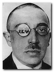 Taking a sympathetic attitude to the early efforts of these artists to develop a revolutionary approach to art, it’s interesting to note that they thought subjective individual expression ought to be replaced by collective works. They also fondly imagined that the working class would unerringly prefer the most imaginative and original works over traditional offerings. This was a period in which the term ‘easel painting’ was used in a tone of sneering contempt. The fact that they were largely ignored by the class for whom they thought they were fighting this aesthetic war in no way diminishes their achievements.