Mantex

Tutorials, Study Guides & More

  • HOME
  • REVIEWS
  • TUTORIALS
  • HOW-TO
  • CONTACT
>> Home / Design

Design

design history, graphic design, information design, product design

design history, graphic design, information design, product design

design history, graphic design, information design, product design

Understanding Comics

July 8, 2009 by Roy Johnson

the techniques, philosophy, and interpretation of comics

Whenever there is a discussion or an exchange of messages concerning comics or visual narratives, one name crops up again and again – Scott McCloud. Understanding Comics is his now classic work on the comic designer’s art. It’s presented in the form of a comic itself – but don’t let that fool you. He could just as easily given his book the sub-title ‘The Philosophy of Graphic Narratives’. He starts with a chapter defining what comics are (sequential visual art) and shows something of their history, going back as far as Egyptian wall paintings in 1300 BC.
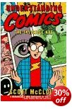
Understanding ComicsIf at first this seems rather obvious or over-simplified, two or three pages into chapter two, he is discussing the theory of visual perception and the nature of iconic language. Next comes the sequencing of action and the decision of what goes into (and what can be left out of) each visual panel of a comic. There’s a very interesting comparison of American and Japanese techniques in which he argues that some of the special effects of the Manga comics arise from different traditions of perception in the East.

He explains the depiction of time and motion via the panel or frame. In fact after doing the same thing for emotion by the use of symbols, he extends his argument to claim that we are in an age where a whole new visual language is in the process of being invented.

The traditional modes of dealing with narrative via showing and telling are demonstrated by the same story being related via pictures and words, then re-combined to show the comic creator’s skill in offsetting one medium against the other to avoid tautology and maximise expressive density.

This is a book which will entrance any comic lovers or anybody who has an interest in media studies or how ideas and stories are transmitted.

Quite a lot of these issues of graphics, narrative, point of view, and are now an active part of online, web-based information. I’m sure he will be aware of that, and I’m sure he will take it into account in any future editions.

He ends with what is obviously a heartfelt plea that comics should be taken seriously as a cultural genre, and he extends this to claim that they haven’t yet even scratched the surface of what they are capable of expressing.

© Roy Johnson 2000

Understanding Comics Buy the book at Amazon UK

Understanding Comics Buy the book at Amazon US


Scott McCLoud, Understanding Comics, New York: HarperCollins, 1994, pp.217, ISBN 006097625X


More on art
More on media
More on design

Filed Under: Art, Graphic design, Media Tagged With: Comics, Design, Graphic design, Media, Media theory, Narratives, Theory, Understanding Comics

Visual Explanations

July 20, 2009 by Roy Johnson

best-selling illustrated essays on presenting information

Visual Explanations is Edward Tufte’s passionate manifesto for intelligent information design. He is concerned with the need for scale, accuracy, and truthful proportion in the visualisation of data. The book derives much of its charm from the beautiful reproduction of its illustrative materials. He includes engravings, photographs, maps, computer-generated images, and even built-in flaps showing motion and before-after effects. The diversity of his examples is just as impressive.

Clarity and excellence in thinking is very much like clarity and excellence in the display of data. When principles of design replicate principles of thought, the act of arranging information becomes an act of insight.

Visual ExplanationsThey are drawn from scientific papers, conjurors’ manuals, and even books designed to be read under water. In one stunning example, he uses video snapshots of his own two-dimensional yet dynamic visualisation of a thunderstorm. Tufte [pronounced “TUFF-tee”] makes his central argument in a chapter which has now become famous.

This discusses the mis-representation of data related to the 1986 Challenger space shuttle which resulted in a disastrous explosion and the death of all the cosmonauts on board. His dense technical analysis of data-presentation and bad practice is used to argue that the fatal accident could have been averted if charts and diagrams had been presented more intelligently, more accurately.

A chapter on conjuring tricks focuses on the clever representation of temporal progression in single illustrations from how-to-do-it books. However, it has to be said that sometimes it’s not quite clear what point he’s making, and he seems to be struggling with what is obvious: that it’s difficult to represent fluid motion in static, two-dimensional images.

Eventually it emerges that he wishes to compare magic with it’s opposite – teaching. One amazes by concealment, the other should inform by revelation. “Your audience should know beforehand what you’re going to do.” That’s a useful insight for some of us.

His attitude is enormously confident and persuasive. Yet if you can brace yourself as a reader, it sometimes seems that he doesn’t always follow his own theories in the presentation of materials – and this in a book which he wrote, designed, and published himself. On some pages, it’s difficult to link illustration to argument; some reproductions are disproportionately large for the point they are making; and he pursues the odd habit of crowding the generous page margins with bibliographic minutiae which would normally be reserved for chapter endnotes.

He writes in a cryptic, elliptical manner, and is much given to compressed generalisations and gnomic claims such as “to make verbs visible, is at the heart of information design” – though this approach can also be quite witty, as when he dismisses one of the bad examples as “better than nothing ([but] that’s all it’s better than”.

Despite these occasional oddities, there are thought-provoking ideas on almost every page. For instance, the idea that the public health warnings on US billboard cigarette advertisements are less effective because they are difficult to read, crammed as they are into boxed text, sans-serif fonts, in continuous capitals, and underlined – which makes four typographical solecisms in one.

SURGEON GENERAL’S WARNING: SMOKING CAUSES LUNG CANCER, HEART DISEASE, EMPHYSEMA, AND MAY COMPLICATE PREGNANCY.

Despite the graphic variety of his presentations, many of his arguments are amazingly orchestrated onto single or double-page spreads, and the book is an almost irresistibly beautiful production. What he’s actually talking about is visual rhetoric: “by establishing a structure of rhythm and relationships, [graphic] parallelism becomes the poetry of visual information”. We might wish to query some of his theoretical claims, but it’s very hard to be critically detached from such a seductive presentation of evidence – which paradoxically is the very point he’s warning us about.

© Roy Johnson 2002

Visual Explanations   Buy the book at Amazon UK

Visual Explanations   Buy the book at Amazon US


Edward Tufte, Visual Explanations, Cheshire, CT: Graphics Press, 1997, pp.156, ISBN: 0961392126


More on information design
More on technology
More on digital media


Filed Under: Graphic design, Information Design Tagged With: Displaying information, Edward Tufte, Graphic design, Information design

Visual Language for the Web

June 27, 2009 by Roy Johnson

Visual Language for the Web is a book about the language of icons, buttons, and navigational aids used in the design of graphical interfaces of computer software programs. The first chapter deals with Mayan hieroglyphs and Chinese ideograms – writing with pictures. This establishes how much information can be conveyed semiotically. Paul Honeywill then looks at how graphical icons are used in interface design – and how well we understand them, particularly on a multi-national level. Some, like the folder icon, have been successful and are now widely used.

Visual Language for the WebOthers seem to be understandable only within the context of the program for which they are designed. Next comes an explanation of the design of icons, taking account of the psychology of visual perception and the technology of rendering images on screen. He explains for instance why colours and font sizes are rendered differently on PCs and Macs.

He offers an introduction to digital font technology which will be useful for anyone who doesn’t already know how serif and sans-serif fonts are used for quite different purposes.

To illustrate the principles on which graphic icons best operate, he presents two case studies of designing business logos. He considers pictographic languages ranging from the natural Mayan hieroglyphics and Sumerian cuneiform, to recent experiments such as Elephant’s Memory. But he seems reluctant to acknowledge their limitations in telling anything but simple narratives.

However, the very absence of any individual authority on the Internet means that any graphic icons which become generally accepted will be those which are commonly understood.

The last part of the book looks at testing recognition of icons – and comes to the unsurprising conclusion that the most effective and best known are those such as the magnifying glass ‘Search’ icon which appears in lots of different programs.

It has to be said that all this is sometimes discussed at a very theoretical level:

the day sign for Manik when it appears without the day sign cartouche in a non-calendrical context is chi

But this will be of interest to anybody concerned with the study of writing systems, as well as graphic designers, usability experts, and information architects.

© Roy Johnson 2000

Visual Language for the Web   Buy the book at Amazon UK

Visual Language for the Web   Buy the book at Amazon US


Paul Honeywill, Visual Language for the World Wide Web, Exeter: Intellect, 1999, pp.192, ISBN: 187151696X


More on information design
More on design
More on media
More on web design


Filed Under: Information Design, Theory, Web design Tagged With: Computers, Product design, Theory, Web design

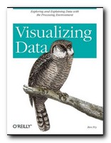
Visualizing Data

June 19, 2009 by Roy Johnson

explaining data with the Processing environment

The doyen of data presentation is Edward Tufte, but even he has (so far) only dealt with the display of static information. Ben Fry’s new book combines similar aesthetic principles with the technical knowledge of how such presentations can be made dynamically. He uses a simple programming environment and API called Processing (which he developed as part of his PhD research). This is a free downloadable open source program based on Java (processing.org).

Visualizing DataHe’s an excellent communicator, and introduces his topics in gradual stages. The first few chapters are a gentle introduction to presenting data, and then gradually he presents more technically advanced approaches. What he proposes embraces a number of disciplines – statistics, data mining, graphic design, and information visualization – but he insists at the outset that the most important thing is to ask interesting questions. It’s all very well having huge amounts of data, but you need to ask ‘What is meaningful about it?’.

The process of creating a visual presentation is a logical series of steps. First the data is acquired: (he uses the US system of zip codes as an example). Then the data is parsed: that is, changed into a format that tags each part with its intended use. Next, any unwanted data is filtered out, then the data is mined – in this case to show its maximum and minimum values.

The next stage is deciding how to present the results – as a table, bar chart, graph, or diagram. Then the results can be refined. And finally, because this entire process is conducted digitally, drawing on processing power which is now available on even a standard computer, the data can be interrogated interactively. We can zoom in on maps, or refine searches by name or size.

In the next part of the book he offers an explanation of how to use the Processing software to create your own displays and visualize your own data. This is done in a straightforward manner that even someone without programming skills could follow. He also provides guidance on the philosophy of designing this type of software. Keep your designs as small and re-usable as possible. Work with samples of your data to begin with. Don’t start by trying to build a cathedral.

Subsequent chapters deal with different types of exercise – showing data as a physical map (the population of the US in states) then a time series (national consumption of tea and coffee 1910-2000). Next comes data with complex inter-relations (national results of all baseball teams in a single season).

As he says in his introduction, he is not offering a series of ready-made programs for presenting data. Instead, he is demonstrating the general principles by which such design problems can be solved, and leaving you to create your own.

Tree maps and network graphs are shown displaying word usage in a literary text (Mark Twain) and he even shows examples of results which are not useful – in order to emphasise the point he makes over and over again: you must ask the right questions of the data you are interrogating.

He ends by returning to the earliest stages of his thesis with some quite advanced level guidance on the acquisition and parsing of data. If by this time you’re not convinced (as I was) that he knows exactly what he’s talking about, have a look at his stunning personal web site at www.benfry.com.

© Roy Johnson 2007

Visualizing Data   Buy the book at Amazon UK

Visualizing Data   Buy the book at Amazon US


Ben Fry, Visualizing Data, Sebastopol (CA): O’Reilly, 2007, pp.366, ISBN: 0596514557


More on information design
More on design
More on media
More on web design


Filed Under: Information Design Tagged With: Data presentation, Information design, Visualization, Web design

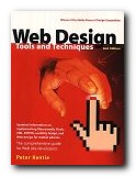
Web Design: Tools and Techniques

July 1, 2009 by Roy Johnson

design with emphasis on graphics and advanced effects

This is the second edition of a very successful Web design manual. It spells out the basics of good design, but then concentrates on the graphic design elements of building good pages and effective sites. Peter Kentie begins by outlining the principles of HTML and Web design. Then he explains the basics of coding – starting from text and graphics, then forms and tables, frames and style sheets. Those who wish to take the route of using a text editor will be glad to know that he discusses Front Page, HotMetal, BBEdit, PageMaker, and even Word. The later two thirds of the book are taken up with what is obviously his forte – ‘creative Web design’.

Web Design: Tools and TechniquesThis involves using intermediate graphics techniques and ‘advanced’ multimedia effects such as Flash, sound, video, 3-D, and Java Programming. All of which makes it very much a book which will appeal to graphic designers. He deals with colour adjustment, Gif and Jpg image manipulation, background effects, image maps, shadows, and 3-D effects. There’s lots of use of Adobe Illustrator and Photoshop, as well as the Macromedia Web tool programs.

The advanced section deals with making animated Gifs. He’s very enthusiastic about Flash, which allows you to create animations which are amazingly small in terms of file size. And if you feel very adventurous, you can even try his suggestions for Shockwave movies, Virtual Reality, or streaming video. He ends with the advanced possibilities now possible using XML, WAP, Java, and Active Server Pages.

These effects are explained clearly but quickly – so this book is most suitable for intermediate users. I think it will be most useful for those people with an existing web site who want to improve and develop it using the latest technologies. Those who are in the beginner stages of web design should try checking out a free website at webstarts.com. The book is very elegantly produced, and packed with both coding and screen shots, showing you what can be done.

© Roy Johnson 2002

web design   Buy the book at Amazon UK

web design   Buy the book at Amazon US


Peter Kentie, Web Design: Tools and Techniques, Berkeley (CA) Pearson/Peachpit Press, (second edition) 2002, pp.485, ISBN: 0201717123


More on design
More on media
More on web design


Filed Under: Graphic design, Web design Tagged With: Graphic design, Web design, Web graphics

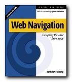
Web Navigation

June 18, 2009 by Roy Johnson

navigation, structure, and usability for web design

Web sites have sometimes been described in terms of ‘generations’. David Siegel for instance describes how first generation sites were rapidly thrown together with no greater ambition than to get pages of HTML code onto the Web. The second generation added graphics, started to be concerned with page layout [even though HTML code is not designed for that purpose] and often added eye-popping special effects. Third generation sites have brought some of these excesses under control, and are designed to make the user experience more meaningful. Web Navigation is emphatically third generation.

Web NavigationThere’s no doubt that clever designers have managed to produce some visually stunning Web pages – but many information architects are now beginning to ask questions such as “Can visitors find their way around the site?” and “Is this site achieving its purpose?” The eye candy effects of flashy graphics often mask a lack of content and an incoherent maze of links which visitors are glad to leave quickly via the nearest exit. Jennifer Fleming’s Web Navigation is a serious and articulate plea for intelligent Web site design, and it is based on principles which owe more to information theory and coherent structure than to the luminous-glamour school of graphics-based design.

Like most good designers, she insists on a user-centred rather than client-centred approach to web design. What’s the difference? you might ask. Well, intelligent designers are now beginning to realise that web sites are often created to impress the commissioning clients, rather than the people who will be using them. Men in suits will applaud spiffy graphics when a new site is revealed at a presentation – but they will probably never need to log on again.

The book’s structure reflects the clarity of her purpose. There are six chapters on the foundations of navigation design, then in the second part an analysis of successful sites. There are four appendices: technical tips, a glossary of navigational terms, a list of web resources, and a bibliography. The accompanying CD comes with trial versions of software (including the highly praised Dreamweaver) and it has a marvellous ‘netography’ with listings of articles, web sites, and online resources covering navigation, usability and testing, organisation of information, information design, document markup and scripting. [I loaded the disk, browsed the sites she recommends, and all the links were working.]

Her advice is to provide clear, simple, and consistent navigational aids – and she offers a particularly strong warning against using metaphors such as the office or the supermarket [though curiously, the CD uses icons]. Navigation that works should:

  • be easily learned
  • remain consistent
  • provide feedback
  • appear in context
  • offer alternatives
  • be economic in action and time
  • provide clear visual messages
  • use clear understandable labels
  • be appropriate to site’s purpose
  • support user’s goals and behaviour

Now that’s an important free lesson for you! She is in favour of any interactivity, such as rollovers (‘OnMouseOver’) which provide feedback, and is sceptical of the ‘Back’ button on the grounds that users might enter a site at any page. Where would they be going ‘back’ to? She also raises other interesting navigational questions, such as ‘where will you be when you’ve finished reading a page, and where will you wish or need to go?’

She recommends multiple navigational routes and aids, plus guidance. For instance, a site might have a framed and ‘no-frames’ version, a graphics and no graphics version. It will certainly have navigation hot spots at the top and bottom of every page, maybe a contents list in left-hand frame, plus icons, labels, and anything else which helps users find their way around.

One of the interesting features of her approach is that she illustrates her argument with detailed reference to the work of other ‘information architects’ such as Jakob Nielsen, Clement Mok, Edward Tufte, and David Siegel. The reader is thereby presented with a range of approaches to this relatively new subject. There are lots of bibliographic suggestions and URLs in side-bars on the page – and those I checked were all up-to-date, which is an important feature in such a fast-changing medium.

It’s a book aimed at professionals. For instance, her descriptions of the site design process assume that there will be teams of designers in sessions at a corporate level using flipcharts, video recordings, and even team-working software. There’s lots on brainstorming and chunking in what are now called ‘focus groups’. But these principles could be followed by what I suspect is more likely to be the average reader – somebody working in a spare room at home.

This is a book for people who want to take web design seriously. It’s significant that she spends so much time discussing the thoughtful planning, research, and testing of a site, rather than the creation of flashy effects and animated gimmicks which adorn so many KEWL sites. She has powerful and revealing arguments in favour of a consistent design process (so that the arbitrary element of success or failure can be removed). This is fairly obvious when you think about it – but that’s true of many good ideas.

She includes a full account of professional designers at work, with pointers to the resources they use – such as David Siegel’s free downloadable ‘profiling’ materials at www.secretsites.com for instance.

This is the business studies version of web design manuals, packed with thought-provoking information on determining user goals and expectations. She describes the use of personal interviews, people ‘shadowing’ users throughout the working day, and ‘disposable camera studies’ where users record what they find interesting. Not many individuals will have the resources to be so thorough, and sometimes the ‘feedback-usability-testing’ approach makes this all seem like a science rather than the sales-pitch that it is – as if we can predict how many people will come to our site to buy widgets.

In the second half of the book her notions are put to work analysing the navigational methods and structure at sites built for shopping, entertainment, learning, and community services. This struck me as slightly less interesting than the first part, but still worth reading for the revealing tips and guidance notes embedded in her analysis. The observations, as before, are that successful sites are customer-oriented, and that they give extra consideration to online customers because they lack the navigational support provided during comparable user experiences in libraries, airports and shopping malls.

If there is a weakness in her examinations, it’s that these are often not much more than descriptions of sites – though they are nevertheless well-illustrated mini-lectures, with plenty of screen captures. For instance, she heaps praise on Amazon.com for their search facility and one-click ordering system. However, this doesn’t take into account that the company, despite its multi-million dollar turnover, hasn’t actually made a profit so far.

It’s worth noting that a lot of what she says about helping users through the layers of a site is based on the US-centred assumption that people are going to spend a lot of time browsing – because they have free local telephone calls. But European (certainly UK) users will not have such luxuries. They’ll hit a site, search for what they’re looking for, then disconnect quickly. This economically-driven difference in user behaviour should be taken into account by anyone theorising about navigation, browsing, and web design.

But there are many good tips offered en passant – including some which might seem obvious, but which are often ignored by site designers. For instance, I’ve noticed that in the UK, quangos and government departments are very often reluctant to display their postal address [possibly reflecting the arrogant nature of these organisations].
But she insists that

Making your street address, phone number, and email address easily available is not only about completing an online sales pitch…It’s about other elusive qualities: trust and community.

Similarly, many UK universities would do well to heed her advice on making themselves more accessible and well-presented. How many times have you visited a university site and found no lists of courses on offer or staff who teach them? She points to the short-sightedness of this approach:

A large percentage of visitors to a university site are applicants for admission, or are thinking of becoming applicants…If a university can answer their questions fairly easily, it bodes well for the entire process. A positive experience on the Web – especially for college applicants, who tend to make decisions on gut feelings – is a powerful factor in decision-making.

It’s good that she chooses different (and challenging) types of sites to analyse. Searching for information is quite a different matter to being entertained or pushing round a virtual shopping trolley. The section on information sites [Lycos, Computers.com] is particularly interesting, because she forces us to think about different types of questions which might be asked of a site, and the different approaches to searching users develop.

Until recently, just providing information via the Web was a laudable pursuit. It was enough to be one of the forward-thinking few who recognised the power of the Web for mass communication. Those days are gone, replaced with a new challenge: providing increasingly complex layers of information, and making it all seem simple.

Very near the end of the book she presents a simple formula for successful sites. Aspirant site designers would do themselves a favour by writing her tips on Post-It notes and sticking them on their monitors:

  • keep every page below 20K
  • recycle headers
  • keep graphics small and simple

Jennifer Fleming has a background in library and information science, and her advice and observations strike me as more seriously well-founded than most of the web design manuals I have ever seen. This is a wonderfully rich and thought-provoking study which anybody analysing or building web sites should put on their list of essential reading.

© Roy Johnson 2000

Web Navigation   Buy the book at Amazon UK

Web Navigation   Buy the book at Amazon US


Jennifer Fleming, Web Navigation: Designing the User Experience, Sebastopol: O’Reilly, 1998, pp.253 plus CD-ROM, ISBN: 1565923510


More on information design
More on design
More on media
More on web design


Filed Under: Information Design, Web design Tagged With: Experience design, Information architecture, Information design, Navigation, Usability, Web design, Web Navigation

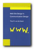
Web Site Design is Communication Design

June 19, 2009 by Roy Johnson

“This book is not a book about web technology … [it’s] about the design of web sites, studied as a communication process” Thea van der Geest makes it plain from the start that her approach is focussed on information architecture and communication design issues. In fact her work is an academic summary of ten case studies based in the Washington area of the US – an interesting mix of public services, local government, and state transport – as well as local web giants such as Amazon and Microsoft (who she refers to as ‘the Internet Bookstore’ and ‘The Software Corporation’).

Web Site Design is Communication Design What the reports offer is first-hand accounts from the designers of these sites, indicating the development of their policies, strategies, and techniques. After a couple of ground-clearing chapters dealing with the advantages of using the Web as a communications medium, she gets down to the heart of the book. This is a detailed breakdown of the stages of the design process – from the original conception of a web site, through to testing, revision, and maintenance. Here there is a wealth of information for information architects, web designers, project managers, and anybody else who needs an organisational overview of the design process.

She points to the unpredictable effects which the establishment of a web site can have on individuals and organisations – changes to job descriptions, increased costs, shifts in policy, the sudden need for response to new customers.

The last part of the book is concerned with evaluating web site effectiveness by analysing log files and the information from cookies. There is not much detailed technical information here: she is more concerned with larger strategic issues – such as the fact that once data on user profiles reaches a certain size, it becomes part of marketing strategy. She also discusses the problems of dealing with email feedback, focus groups, and questionnaires.

The final chapter is a series of checklists which are process-oriented. They cover all the stages of web design. They assume a large-scale organisation, with lots of personnel resources, but the principles she illustrates will be of use to anybody who wants to make a web site efficient and maybe even profitable.

This study is mainly aimed at communications professionals. It’s a web design manual without a single line of HTML code, but it should be on the reading list for anyone involved in a serious web project.

© Roy Johnson 2001

Web Site Design   Buy the book at Amazon UK

Web Site Design   Buy the book at Amazon US


Thea M. van der Geest, Web Site Design is Communication Design, Amsterdam: John Benjamins, 2001, pp.165, ISBN: 9027232024


More on information design
More on design
More on media
More on web design


Filed Under: Information Design, Web design Tagged With: Communication, Information design, Web design

Wordless Books

May 24, 2009 by Roy Johnson

the original graphic novels

Wood engravings, linocuts, and, copperplate engravings have all existed for centuries, but it wasn’t until the early years of the 1900s that artists began to use them for creating book-length ‘stories without words’ which aspired to be the equivalent of novels. These are what we now call graphic novels. These illustrators were closely associated with the visual world of German expressionism, particularly that of Oskar Kokoshka and Ernst Kirchner. The two most prominent figures in this movement were Frans Masereel and Lynd Ward, though David Berona, in this thoughtful and well-informed work of homage to the genre also includes examples by Otto Nuckell, and the more recent Willam Gropper, the American Milt Gross, Giacomo Patri, and Laurence Hyde.

Graphic NovelsHe quotes the celebrated comic-book theorist Scott McCloud as observing that these woodcut stories were an important bridge between the nineteenth century and the modern day comic. He includes extracts from a number of Masereel’s wordless books – almost all of them dealing with the de-humanising effect of capitalism on the common man. His best-known work, The Passionate Journey (1919) was the nearest Masereel came to creating a novel in pictures – a story of Everyman at the start of the last century. It’s a tale very close in both substance and mood to Doblin’s later Berlin Alexanderplatz (1929).

Berona gives an account of Masereel’s other wordless novels, illustrating their somber black and white pages and describing their stories. He doesn’t go in for any profound analysis, which given the youthfulness of this art form at the time might even be a good thing.

The American artist Lynd Ward actually used the graphic novel form to explore issues of slavery and race in US culture, as well as the oppression that common people felt as a result of the Great Depression.

It has to be said that many of these ‘novels’ are often not much more than extended adolescent fantasies of the kind that are thrown up time and again in ‘creative writing’ classes. But what makes them very different is that they are executed dramatically and with visual finesse via these authors’ control of a two-dimensional visual medium.

It’s a world of tilting skyscrapers, menacing shadows, vertiginous perspectives, drink and debauchery, children born out of wedlock, and people set against sunrises with outstretched arms.

Almost all of these illustrators were on the side of the small, common man, and against the might of the capitalist, the owners of the means of production.

Some of the later examples, produced in the late 1920s and 1930s by American artists such as Milt Gross and Myron Waldman are very close to the comic book tradition which was emerging around the same time.

There are also lots of original book jacket covers reproduced here, as well as fully documented details of the artists, their works, and other publications related to this neglected niche of visual narratives.

It’s strange to note that apart from minor differences which arose from working with wood, lino, or even lead, the styles adopted by these artists were all remarkably similar. The graphic novel is now a thriving genre in its own right, with many distinguished illustrators working in the medium. But this is a valuable collection of the work of pioneers.

© Roy Johnson 2008

Wordless Books   Buy the book at Amazon UK

Wordless Books   Buy the book at Amazon US


David A. Berona, Wordless Books: The Original Graphic Novels, New York: Abrams, 2008, pp.255, ISBN: 0810994690


More on design
More on media
More on web design


Filed Under: Graphic design, Media Tagged With: Design, Graphic design, Graphic novel, Literary studies, Wordless Books

Writing: Urban Calligraphy

July 5, 2009 by Roy Johnson

hand drawn type on walls – contemporary trends

Those kids who spray graffiti on the sides of trains and motorway underpasses sometimes take their graphic inventiveness to amazing lengths. I’ve often admired the way they distort letter-forms into chubby round-shouldered block caps running into each other and overlapping so much that a name becomes more like a logo. Markus Mai’s Writing: Urban Calligraphy and Beyond explains the aims of these ‘writers’ as they call themselves – but he also goes on to show how the more creative of them turn their typographic designs into works of abstract sculpture.

Urban CalligraphyWell, not quite abstract, because some of the more inventive actually become a three-dimensional typography.’Writing’ is the general term given by these spay painters to the graffiti, signatures, and logos they create. It’s an activity which has gone from illegal defacement of walls and railway carriages into the legitimate world of fashion houses. Agnes B and Calvin Klein now employ these former vandals as calligraphic designers.

The chapters of Mai’s fascinating book are organised in ascending order of complexity. First come the ‘tags’, the personalised name design which is shaped into a distinctive logo. Next come fully fledged alphabets which demonstrate the remarkable typographic skills of these felt tip artists. There are alphabets which are almost unrecognisable yet curiously beautiful.

Many of them produce letter forms which are distorted and elaborated so much that you would hardly recognise them as letter forms at all unless they were seen alongside others from the alphabet.

A major influence clearly visible is Asian and Islamic art. Many of the forms of urban graffiti look just like the elements of classical Arabic scripts. It’s logical enough in a culture which puts emphasis on typography and bans realistic representation. Yet it’s difficult to believe that the kids in trainers and baseball caps who spray rolling stock and motorway underpasses spend their time studying the Koran. Yet the influence must come from somewhere.

The most amazing examples in this handsomely illustrated study are single letters viewed from several perspectives, and it’s interesting to note that no matter how far the process of abstraction is pursued, the results always somehow retain an organic form. It’s as if the typographic and the human share some basic genetic material. And that’s all the more so since the same phenomenon is apparent in the case of Latinate, Arabic, or Asian scripts.

Next comes the fleshing out of these letter forms into another dimension. Shading and perspective are added, and the logos start jumping off the garage walls and the elevator doorways. But as this move towards abstraction and an extra dimension continues, the jumbles of letters begin to take on an architectural appearance. They become like abstract structures.

The next stage is the logical development of this process. The letter forms are actually realised as three dimensional objects in their own right. The graffiti ‘writers’ seem to be influenced by both architecture and organic forms, so it is no surprise that some of their more advanced work is realised in the form of abstract sculptures and three 3-D ‘objects’. Many of these are shown taking their place quite logically in art galleries or as public installations.

There’s also an element of socio-political activism at work her – but it’s not that important. What really counts is the stunning depth of invention in the designs illustrated, and the admirable presentation values of the book itself.

© Roy Johnson 2005

Urban Calligraphy   Buy the book at Amazon UK

Urban Calligraphy   Buy the book at Amazon US


Markus Mai, Writing: Urban Calligraphy and Beyond, Berlin: Die Gestallten Verlag, 2005, pp.207, ISBN: 3899550625


More on typography
More on design
More on media
More on web design


Filed Under: Graphic design, Typography Tagged With: Graphic design, Typography, Urban Calligraphy, Writing

  • « Previous Page
  • 1
  • …
  • 9
  • 10
  • 11

Reviews

  • Arts
  • Biography
  • Creative Writing
  • Design
  • e-Commerce
  • Journalism
  • Language
  • Lifestyle
  • Literature
  • Media
  • Publishing
  • Study skills
  • Technology
  • Theory
  • Typography
  • Web design
  • Writing Skills

Get in touch

info@mantex.co.uk

Content © Mantex 2016
  • About Us
  • Advertising
  • Clients
  • Contact
  • FAQ
  • Links
  • Services
  • Reviews
  • Sitemap
  • T & C’s
  • Testimonials
  • Privacy

Copyright © 2025 · Mantex

Copyright © 2025 · News Pro Theme on Genesis Framework · WordPress · Log in