basic principles of effective page design
 Good page layout
More and more people today are using computers for essay and project writing. The advantages for improved presentation are dramatic. Once most people have started to enjoy the facilities computers offer for editing, rewriting, and presentation, they often wonder how they ever managed without them. Typewriters become a thing of the past.
Editing
The main advantage of the computer is that you can rewrite and edit what you produce. You might start out with just a sketchy outline, but you can add extra examples, delete mistakes, and move paragraphs around. You can build up to the finished product in as many stages as you wish.
First drafts
At first you might want to carry on producing the first draft of your work in hand-written form. You type it into the computer’s memory or onto disk. Then you can edit what you have produced, either on screen or by printing out your document. This is quite common for beginners. Most people abandon the handwriting stage in a gradual manner.
On-screen editing
At first, you will probably want to see what you have written printed out as soon as possible. As you gain experience however, you will probably edit on screen and only print out the finished version of your work. WYSIWYG word-processors (What You See Is What You Get) allow you to see on screen what the finished document will look like.
Presentation
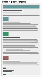
The most important element of presentation is the layout of the page. No matter what the content of your work, it will look better if is given plenty of space in which to ‘breathe’. You should leave plenty of blank space around what you write. Do not attempt to cram the maximum amount of text onto each page. If you are using any sort of pictures, tables or visually quoted material, let it stand well clear of the text.
Margins
Learn how to set generously wide margins. One inch minimum at the top and bottom of the page is normal. One inch or more at each side. If your work is going to be presented in a folder or binder, you should also allow at least 0.25″ ‘binding offset’ (also called a ‘gutter’).
Columns
If your piece of work is anything like a newsletter, a magazine, or a popular report, you might wish to use multi-column layout. On A4-sized paper, two columns will probably be appropriate, but you might choose three if you reduce the size of the left and right margins. If you find working in columns difficult, prepare your text separately first. Your final task will then simply be one of laying out the page.
Line spacing
The computer and printer will produce your work very neatly, but will probably do so by using single line spacing. Even though you are likely to be pleased by the neatness, learn how to set for one-and-a-half or double line spacing. This will give you more opportunity to create good layout.
Fonts
For the main text of your work, choose a font with serifs such as Times New Roman or Garamond. Avoid the use of sans-serif fonts such as Arial or Helvetica. These make continuous reading difficult. Unless your work is connected with fine arts, advertising, or graphic design, avoid using fancy display fonts (such as Poster or ShowTime) altogether: these are designed for advertising and shopfront display.


Fontsize
In general, the size of your chosen font should be eleven or twelve points. This will make your work easy to read, and the font will appear proportionate to its use when printed out on A4 paper. You might wish to use large font sizes of fourteen-point size for subheadings, and sixteen or eighteen point for main headings. Long quotations (where necessary) are normally set in eleven or ten-point size.
Font variety
Although you may have a wide range of fonts at your disposal, you should keep the number you use to a minimum. Two or at the very most three different fonts will be enough for most pieces of work. On this issue, graphic designers have an expression – “More is less” – which means that the greater the number of different fonts used on a document, so the less effective they become.
Justification
Most word-processors will produce your work with the text ‘fully justified’ – that is, with both left and right hand edges aligned. This will produce a neat overall impression. However, it can cause ‘rivers’ of white space to appear in the text, caused by irregular spaces between the words. You may wish to choose left-justification (like this paragraph). This will leave the right-hand edge ragged, but the spaces between the words will be regular. If in doubt, full justification usually offers more overall neatness on the page.
Indentation
If your work contains items such as numbered lists, columns of figures, or anything else which is set off from the left hand margin, always use the TAB key or the INDENT command to position the item. Never use the spacebar: this will not help you to achieve precise alignment. ‘The word-processor is not a typewriter’. Take full advantage of any facilities for indenting to regularise your presentation of quotations. Double indentation is for those longer quotations that would otherwise occupy more than two or three lines of the text in your work. Try to be consistent throughout.
Quotations
Long quotations (where necessary) should normally be set in the same font as the body of your essay. The size however may be reduced by one or two points. This draws attention to the fact that it is a quotation from a secondary source. Alternatively (and in addition) it may be set in a slightly different font – but don’t use too many different fonts.
Paragraphs
If you use double spaces between each paragraph, you do not need to indent the first line. [This is only necessary when there are no spaces between the paragraphs.] One good reason for having the double spaces, apart from its looking more attractive, is that it will help you to ‘see’ each paragraph as a separate part of your argument or discussion.
Page numbering
Learn how to switch on automatic page numbering for all your essays and projects. The numbers should normally be placed at the bottom of the page, either in the middle or in the right-hand corner. You may also place page numbers in page ‘footers’ – that is a piece of text which occurs at the bottom of every page.
Spelling
If your word-processor has a spell-checking facility, then use it before you print out your document. But remember that it is unlikely to recognise specialist terms and unusual names such as Schumacher, Derrida, or Nabokov. These will not be in the processor’s memory. You will have to check the correct spelling of these yourself, as you will any other unusual words. Remember too that a spell-checker will not make any distinction between They washed their own clothes and They washed there own clothes, because the word there is spelt correctly even though it is being used ungrammatically.
Grammar-checkers
If your word-processor has a grammar checker, use it before you finalise your document. These devices are very useful for spotting over-long sentences, awkward syntax, missing verbs, and all sorts of grammatical errors. You might find them annoying to use at first, but the best of them will offer you advice and potted lessons as well as corrections of any errors. Persist, but be careful: even machines can sometimes be wrong.
Book titles
Use the italics or the bold commands of a word processor to indicate the titles of books – but remember to be consistent throughout your document. A.J.P. Taylor’s The Origins of the Second World War is just as acceptable as Margaret Mead’s Coming of Age in Samoa though the former is more usual and preferable.
Footnoting
Advanced users may well be tempted to take advantage of automatic footnoting facilities. Word-processors can certainly remove all the headaches from this procedure. However, do not clutter your text with them just for the sake of showing off your command of the technology. Numbered endnotes are much easier to use and to control.
Hyphenation
If your word-processor automatically hyphenates words at the end of a line, take care to read through the work before you make your final print-out. Eliminate any howlers such as ‘the-rapist’ and ‘thin-king’. This needs to be done with extra care if you are using newspaper columns.
Widows and orphans
In laying out your pages, avoid creating paragraphs which start on the last line of a page or which finish on the first of the next. These are called, in the jargon of word-processing, ‘Widows and Orphans’. The solution to this problem is to control the number of lines on a page so as to push the text forward. An extra-large gap at the bottom of a page looks better than an isolated single (or even double) line of text.
Titles
Titles, main headings, or essay questions may be presented in either a slightly larger font size than the body of the text. They may also be given emphasis by the use of bold. You should not use continuous capital letters in a title, heading, or question. This looks typographically ugly. Do not underline headings: this makes them more difficult to read.
Emphasis
Although many people think it is good idea, there should be no need to underline something to give it emphasis. If you have a title, heading or a question at the head of a piece of work, then a larger font, and the use of bold and double spacing will be enough to give it emphasis and importance. Underlining any text makes it harder to read.
Italics
Italics are normally used to show emphasis – when something is very important. They are also used to indicate a word of foreign origin, such as ouvrier (French – workman) or nihil (Latin – nothing). Book titles should be shown in italics – such as War and Peace. Smaller pieces of work such as stories, articles, and poems are shown by putting the title in single quotation marks. For instance, ‘The Fall of the House of Usher’.
Print-preview
Use the print-preview facility to help you lay out the contents of a page before you print it. Get used to the practice of switching between draft mode and print-preview. In draft mode, you view the text in detail and you can make fine adjustments to what you have written. In print-preview, you have a one-page overview of your text. Make sure that your text is properly aligned and laid out on the page. Check the spacing of paragraphs and the appearance of your text. Ensure that your titles, subtitles, and any section headings are set at the correct fontsize and weight.
© Roy Johnson 2004
More on How-To
More on literary studies
More on writing skills

 You can improve your spelling skills by reading and writing as much as possible – and checking your written work.