© Roy Johnson 2002
Content Syndication with RSS
Sharing headlines and information using XML
Content syndication means making headlines and information from one web site available for distribution to any others that want it. This is done technically by using RSS, which stands for RDF Site Summary, Rich Site Summary, or Really Simple Syndication. If you need to go all the way, RDF stands for Resource Description Framework. Ben Hammersley first of all explains the separate standards which have arisen, taking them in chronological order.
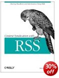 Then he describes the software which has been written both to generate RSS feeds, and to receive and read them on screen. There’s also a short XML tutorial, as well as a list of useful sites and resources. Unfortunately there are two camps of competing standards, each with two current versions – rather like the early days of the browser wars.
Fortunately he covers them all in his description of how to use RSS and what it does. The separate standards are complex in their differences, and he obviously belongs to one of the rival camps promoting them; but he is even handed in his treatment, and gives them all comprehensive coverage.
Much of the book is rather technical, with pages full of coding; but anyone familiar with HTML or XML will feel pretty much at home.
He gives fully written out examples of pages in each of the standards. As in strict XML, there is a complete separation of style and content. This is because the recipient might be reading the news feed as part of a blog, on on a PDA, or even as a text message.
RSS is sprouting all over the Web at the moment. Wherever you see one of the small buttons saying “News Feed” or “XML Feed”, you have the ability to receive information from that site. And of course it’s all free.
This publication is aimed at web developers and web site authors who want to share their site with others by offering RSS-based feeds of their content. It’s also for developers who want to use the content that other people are syndicating. As usual with O’Reilly publications, the presentation is impeccable.
© Roy Johnson 2003
Ben Hammersley, Content Syndication with RSS, Sebastopol, CA: O’Reilly, 2003, pp.208, ISBN: 0596003838
More on technology
More on digital media
More on online learning
More on computers
Create your First Web Page in a Weekend
well-planned tutorials on HTML design basics
Can it really be done in a weekend? Well, if you set some time aside and follow the tutorials in this clearly-written guide, it’s possible that you could have a few decent pages up within the forty-eight hours. Steve Callihan kicks off with some background explanation of Web matters, and information on what you’ll need. This is designated as what you might do as preparation on ‘Friday night’. On Saturday morning there’s a first step-by-step tutorial on HTML code basics. This is followed by tips and tricks which will help you to control the layout and appearance of your Web pages.
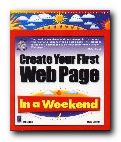 The Saturday afternoon tutorial covers graphics, wrapping text around images, and how to deal with the tricky issue of browser-safe colours. Everything is spelled out very clearly, strictly one topic per paragraph, and everything clearly labelled and well illustrated. Assuming that you don’t go out on Saturday evening, it is devoted to learning the mysteries of tables. Then during the rest of the weekend you put what you have learned into practice by making a small web site. There is quite a heavy emphasis on graphics, so this will appeal to people interested in such visual effects as drop shadows, decorated text, and creating your own 3-D buttons.
When that is done, he shows you how to get your site up onto the Web, and there are bonus extras on those items which seem to be popular with beginners – hit counters, guestbooks, image maps, and animated gifs.
This book is in its third edition – so the basic approach has obviously been successful. To be truthful and realistic, I would suggest spending at least a week reading it and absorbing what it has to say first. Then a weekend at the keyboard might yield decent results. And if you need extra help, there are plenty of page templates, plus lots of free software on the accompanying CD-ROM.
© Roy Johnson 2000
Steve Callihan, Create your First Web Page in a Weekend, (third edition) Rocklin, CA: Prima Publishing, 1999, pp.425, ISBN 0761524827
More on web design
More on digital media
More on technology
Design and Build the Coolest Website in Cyberspace
web design guidance manual – from start to finish
There are dozens and dozens of web design manuals on the market, so what makes this one any different than all the rest? Nick Nettleton has gone for a visually attractive layout. Every page in this guide is composed of densely layered graphics; every section is colour-coded; and every page is laid out in a very appealing manner. He takes web site design right from the simplest beginning – what equipment and software you need, how to get on line, and how to create your first pages.
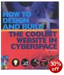 He assumes you are going to use an HTML editor such as Dreamweaver or GoLive, so there’s no detail about tags and coding. Some may see this as a good thing, others a weakness – especially since in his first site project he uses heavily nested tables. However he covers all the basics – fonts, screen colours, and graphics. Then its on to the special effects you can create by adding colour, outlines, shadows, gradients, and textures.
There’s plenty on the manipulation of graphics – enhancing images, creating thumbnails, buttons, and icons. Then there are more advanced issues such as using templates and library items, when and when not to use frames.
When it comes to animation, there’s a lot of sound advice on Macromedia Flash – with other programs mentioned but trailing in terms of features. The same is true for sound and video, though there are a larger variety of formats to choose from.
He also covers style sheets and making your site interactive using DHTML, ASP, or PHP. It’s likely that you’ll need other guidance manuals if you want to pursue any of these advanced features in any detail, but the good thing about his approach is that it gives you an overview of web design with plenty of jumping off points offering the addresses of further resources.
He even goes as far as showing you how you could make money from your site once it’s up and running. And once again the approach is simple. Here is a list of possibilities and site details. Here is some advice plus the pros and cons of these approaches – with screenshots. Now go and do it.
© Roy Johnson 2004
Nick Nettleton, How to Design and Build the Coolest Website in Cyberspace, Cambridge: Ilex, 2003, pp.224, ISBN 1904705065
More on web design
More on digital media
More on technology
Designing Computer-based Learning
practical design principles – from conception to evaluation
“This is not a ‘How to …’ book but rather one seeking to help you understand the different elements which go into computer-based learning.” Alan Clarke is offering general principles – and his advice is sound.
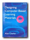 He kicks off with some observations on interactivity – and how to convert static web pages into a more dynamic experience. This is followed by a discussion of navigation, menus, structural metaphors, and the variety of forms in which questions can be posed. The next chapter deals with types of computer-based learning materials. He lists lots of general principles and learning systems – but a few practical examples would have been welcome at this point.
He discusses assessment methods and how one form of feedback is better than another. The best part of this section is how to construct multiple choice questions. He explains clearly how hypothetical tests can be very useful in situations where there is danger or impracticality – practising nuclear power station shutdowns or deep sea diving rescues, for instance.
His advice on the presentation of text-based learning materials is very good. Use lots of white space; break up text into small chunks; and breathe life into the project with graphics. Anyone following his advice will produce attractive pages. He also throws in some useful tips – such as the observation that people learn more efficiently if they see a structure diagram of a sequence of learning before going through the details.
It’s a pity that his discussions of colour and graphics are illustrated entirely in black and white, with only line diagrams. The publishers could have been more generous to him on this issue.
I was most interested to know what he had to say about hypermedia, since the linking of multiple resources from a variety of media represents possibly the most severe challenge to designers.
He has interesting suggestions on using linked graphics where video is not available – on subjects with a historical dimension for instance. He also makes the point that audio materials ought to be designed for listening, not reading – an easy thing for many writers to forget.
His overall message is that users should have access to as wide a variety of input as possible, and that they should be able to control their own choices.
He is also good on the basic design principles for web pages and screen layout – reminding us that for online learning materials, only a small proportion of the screen should be used – as distinct from a commercial web site – otherwise the user can easily becomes confused.
This book covers the whole of the design process – from conception to testing and evaluation. There are plenty of suggestions for scripts, templates, and storyboards, as well as tips for estimating the cost-effectiveness of what you produce. As a manual, it provides comprehensive guidance for any serious designer – or any department which is under orders to produce online learning materials.
© Roy Johnson 2002
Alan Clarke, Designing Computer-Based Learning Materials, London: Gower, 2001, pp.196, ISBN 0566083205
More on online learning
More on technology
More on digital media
More on web design
More on computers
Designing with Web Standards
XHTML + style sheets = creating ‘timeless code’
Jeffrey Zeldman is an evangelist for designing with web standards and browser compatibility. He suggests that we should embrace the latest technologies to design pages that everyone can view. And he shows how it can be done. The standards in this case are methods of what he calls ‘creating timeless code’. What he means by this is using HTML, XHTML, and style sheets to create pages which can be viewed in almost all current browsers. There are two possibilities – both of which combine XHTML and style sheets.
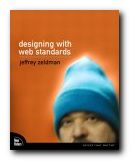 The first is ‘transitional’ and allows light use of tables for positioning page elements. The second is ‘strict’ and requires you to use CSS for all matters of appearance. There’s a lot about browser development and why Netscape and Internet Explorer from versions 1.0 to 6.0 caused the problems for which Web standards are a solution. Then he launches into an enthusiastic account of how XML will be the technology to finally end the browser wars.
After the theory and argument, the second part of the book shows you how to work in XHTML. This will be relatively easy for anyone used to dealing with HTML. The harder part is controlling the layout and appearance of pages using style sheets.
Zeldman adopts a realistic and tolerant line, knowing that most designers will take the transitional route from HTML to XHTML. He designs a sample site using a combination of XHTML, tables, and style sheets, showing how they can be combined and yet still pass the requirements of W3C validation.
His mission all the while is to reduce the amount of code required to render a page, to eliminate ‘bloat’, and make pages available in all browsers. The secret here seems to be that pages can’t be made to look the same, but they can be made to look acceptable.
As a website designer, I would much rather have my users say my web pages ‘look funny’ rather than saying they ‘don’t work’.
He explains style sheets in a simple and clear manner, then shows them in use as he designs an attractive-looking web site one step at a time.
En passant, he reveals an amazingly clever trick for dealing with older browsers which don’t fully support style sheets. It’s to create a second, simpler set of styles, and force old browsers to use them, leaving more recent browsers to pick up the first more sophisticated set.
He also has lots of useful advice about dealing with multiple browser support, though by the time he has explained all the potential difficulties, you begin to wonder how any web page ever gets published at all.
The latter part of the book deals with accessibility issues, and he ends by showing how the interface of his personal site at zeldman.com was re-designed using style sheets. All the code and the style sheets are available as free downloads at his site.
I was surprised that there was no bibliography, and I think the publishers should have treated him to full colour reproduction. This is intermediate to advanced level guidance, but Zeldman does everything he can to make it entertaining and accessible.
© Roy Johnson 2005
Jeffrey Zeldman, Designing with Web Standards, Indianapolis:IN, New Riders, 2003, pp.435, ISBN: 0735712018
More on web design
More on digital media
More on technology
Developing Feeds with RSS and Atom
web services for bloggers
What’s a ‘feed’? And what are RSS and Atom? Answer – a feed is the automatic distribution of information from someone’s blog or web site, and RSS (Really Simple Syndication) and Atom are the technologies which deliver this information to your desktop. A friend recently emailed me someone’s blog entry. It discussed in excited terms the emergence of Web 2.0 or the Semantic Web. This is the next development for the Web whereby computers will be able to understand the meaning of and the relationships between documents and other data. Automatic web ad blog feeds are one part of that development, and Ben Hammersley’s timely manual is an introduction to the technology involved.
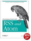 He is a very active technology journalist and blogger, and he knows whereof he speaks. First he explains the history of how there came to be two competing sets of standards – which is more interesting than you might imagine from that description. The advantages of accepting automatic feeds from others are fairly obvious, but why supply your own? Hammersley is in no doubt: it increases traffic to your site; helps with search engine rankings; improves relations with your users; and makes the Internet an altogether richer place, pushing semantic technology along and encouraging reuse.
For reading other people’s feeds, he describes both the available web-based readers and downloadable software. You can even receive feeds as email or on a mobile phone.
The central section of the book describes a variety of feeds and shows you the scripts you might need to implement them I say ‘might’, because for most people all this will be done for you using templates at sites like Blogger and Moveable Type. However, knowing the code gives you more control – and it isn’t all that complicated if you know some basic HTML or XML.
Assuming that you wish to publish a feed from your own blog or web site, he devotes a handy chapter to showing you how to maximise the chances it will be circulated and read.
He ends by offering a collection of recipes for creating and using feeds to do things such as keeping track of “404 Page Not Found” errors on your web site; downloading your favourite comic strip each morning; generating your own wish list at Amazon; automatically checking web pages are W3C valid; and receiving regular weather forecasts for your area.
He ends with what is one of the hallmarks of these O’Reilly publications – a comprehensive and annotated list of tools and resources. Most of these are free – so if you are interested in receiving or publishing feeds, you can start right now.
© Roy Johnson 2005
Ben Hammersley, Developing Feeds with RSS and Atom, Sebastopol: CA, O’Reilly, 2005, pp..253, ISBN 0596008813
More on technology
More on digital media
More on online learning
More on computers
Dictionary of Media and Communications
definitions and explanations of new media terms
Dictionary of Media and Communications is an attempt to solve an interesting problem. I once bought a dictionary of computer technology (as it was then called). It was huge, comprehensive, and was written by an expert. Twelve months later there were terms I needed to look up that simply weren’t in there. That’s how fast new language is being created in the field of information technology (as it is now called). The same is largely true for media and communications. But in the meantime publishers have realised that works of this type need their own web sites that are regularly updated.
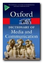 Does this mean that dictionaries in the form of printed books are obsolete? I think not – because for most people it’s still more convenient to reach a book off the shelf to solve a problem or look up a definition. And that’s quite apart from the secondary pleasure of reference books – making those serendipitous discoveries on adjacent pages.
With definitions of 2,300 terms this is without doubt the most comprehensive in its field. But its unique selling point is that terms are defined in a variety of contexts. Nuances of a term may vary depending on its use in semiotics, sociology, or film making. Entries run from aberrant decoding and above-the-fold via McLuhanism and male gaze, to yaw, zapping, and zoom. A typical entry reads as follows:
hypertext 1. A method, devised by Berners-Lee as part of his *World Wide Web software, of embedding omni-directional *links within a given digital *text (encoded in the form of an *HTML document and displayed on a *web browser) which connect to other HTML texts without the need for extra navigation. For example, a selected word of a text document or an area of an image document is defined as a *hyperlink which, when clicked on, loads the document at that address into the browser window. Hypertext is designed to be media independent (a text can link to a sound file, an image, or even a location in a *virtual world.) which makes it a *metonym for the versatility of *digital media generally. 2.2. A visionary concept of Ted Nelson (an American new media theorist, b.1937) for a *human-computer interface in which computers present a given text from multiple viewpoints, making it a malleable object that can be ‘played with’ in order to deepen a person’s understanding. For example, a hypertext version of Hamlet’s ‘To be, or not to be’ soliloquy might consist of a standard edition of printed text, a facsimile of the earliest known version, a video recording of a performance, critical notes, and articles – all of which could be expanded from or collapsed back into the original text by clicking on a series of bi-directional links.. 3. For Genette, literary works which derive from, relate, or allude to an earlier work see also INTERTEXTUALITY. 4. Any text structured in a way that is nonlinear or non sequential, having no clear beginning, middle, and end, or in which the reader has control over the sequence. Where such texts link to others through *hyperlinks, the boundaries of the text may be blurred or the text may be perceived as unbounded.
See web links – Project Xanadu
It also has a listing of micro-biographies of major theorists and practitioners, plus a bibliography of suggested further reading. The compilers deny the existence of ‘key entries’, but many of the important entries are cross referenced and linked to the book’s web site.
The fields of reference include literary studies, semiotics, digital technology, broadcast media, journalism, film studies, psychology, and cultural theory. It’s aimed at people studying in any of these disciplines, but the definitions and explanations are accessible to the general reader.
© Roy Johnson 2011
Daniel Chandler and Rod Munday, Dictionary of Media and Communication, Oxford: Oxford University Press, 2011, pp.472, ISBN: 0199568758
More on dictionaries
More on language
More on literary studies
More on writing skills
Dictionary of the Internet
Internet jargon and IT technical terms explained
Do you know what a ‘dongle’, a ‘sandbox’, and a ‘Ponzi scheme’ are? The Internet and its technology is expanding at such a blistering rate, that it’s difficult to keep up. Sometimes it’s even hard to understand the terms in which it’s all described. This Dictionary of the Internet explains the thousands of new terms which have come into use during the last few years. This includes the abbreviations of the newsgroups, the language of e-commerce, and the scientific terms used to describe the technical and organisational structure of the Internet.
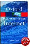 It provides terms on the Web itself, software technology, security, and the arcane language of hackers, whitehats, and alpha geeks. It gains its strength from concentrating in depth on the Internet and its infrastructure, rather than on general computing terms. Entries run from ‘above the fold’ – an expression taken from the newspaper industry which is now applied to Web design – to ‘Z order’ – the sequence in which layers are added to a graphic or a Web page.
In between, there’s a useful and very entertaining mixture of the language of bleeding edge technology [yes, that’s in] as well as the slang, vogue terms, and prolific coinings of newsgroups. Darrell Ince’s explanations are so thorough that some of them are like mini-tutorials. I read them through from first entry to last and learned something interesting on almost every page.
The book is issued with a CD which contains the full dictionary entries in a browsable format, with hyperlinks. There are also links to relevant websites. The dictionary is supported by a separate web site where updates for downloading are posted. This is a wonderfully rich compendium – as smack up to date as it’s possible to be.
© Roy Johnson 2003
Darrel Ince, Dictionary of the Internet, Oxford: Oxford University Press, 2003, pp.340, ISBN: 019280460X
More on dictionaries
More on language
More on grammar
More on technology
Digital Art
illustrated survey of contemporary digital art forms
Digital technology has revolutionized the way art is now produced and viewed. Traditional forms such as painting, photography and sculpture have been transformed by digital techniques. Entirely new forms such as software art, digital installations, and virtual reality have emerged, and they are now collected by major museums, institutions, and private collectors. Christiane Paul’s book surveys the developments in digital art from its appearance in the early 1990s right up to the present day. It’s difficult for books like this to keep up with what’s being developed on the Internet, but she makes a good stab at it. She starts out with a rapid survey of the period 1940-1990, in which the foundations were laid. Then came the world wide web, which opened up the Net to Everyman.
 After this comes her first main section, which deals with the digitisation of the two-dimensional surface. This yields computer-generated images which look like paintings, photographs which look like web sites, and collages which look like a combination of both – some of them even digital images which have been transferred onto canvass, to complete the illusion. There are lots of examples, all of them illustrated in full colour. It’s a visually rich book.
Most of the time her exposition is clear and straightforward, but now and again it does keep slipping into the style of Art School gobbledygook to which commentators on modern art seem irresistibly drawn:
Suggesting antagonisms, the project explores the concept of different poles in dataspace and the ways in which various forms of information can materialize in a dynamic matrix.
Whilst it is unfair to judge these complex works from a text description of them on the page, plus a screenshot, it seems that many of them go down tempting but false avenues of discovery and innovation.
Randomness, interactivity, or simultaneously viewing events from different points of the globe have no intrinsic connection with art – though it is understandable that people should want to exploit such possibilities. ‘Allowing the viewer to select/mix/choose’ is a false avenue.
Works of art are almost always the finished products of one person which we are invited to contemplate. Exploiting the possibilities of the Web and Flash animations seem much more promising routes to me. Time will tell.
Real artists will be grappling with these new digital possibilities right now – musicians making symphonies in their back bedrooms, Flash animators making the next generation of films.
The last part of the book deals with the various forms in which digital art is popularly manifest – artificial intelligence, telepresence and robotics, data visualisation and mapping, hypertextual narratives, and of course gaming.
She includes an excellent lists of artists’ web sites, digital arts organizations, networks, museums, and festivals, plus a select bibliography.
Despite any reservations I might have expressed here, this is an extraordinarily wide-ranging and thorough investigation of what is going on in digital art right now. She discusses all the key artists and works, as well as issues such as the collection, presentation and preservation of digital art, the virtual museum, and ownership and copyright. Very good value.
© Roy Johnson 2008
Christiane Paul, Digital Art, London: Thames and Hudson, revised edition 2008, pp.256, ISBN: 0500203989
More on art
More on media
More on design
- « Previous Page
- 1
- 2
- 3
- 4
- …
- 13
- Next Page »