Mantex

Tutorials, Study Guides & More

  • HOME
  • REVIEWS
  • TUTORIALS
  • HOW-TO
  • CONTACT
>> Home / Archives for Usability

Taking Your Talent to the Web

July 25, 2009 by Roy Johnson

guide to good usability and web design principles

Jeffrey Zeldman is one of the new generation of writers on web strategy and design. His new book Taking Your Talent to the Web aims to help traditional designers move beyond HTML into the new possibilities of style sheets and XHTML. But this isn’t a practical guide – full of HTML code and suggestions for page design. It’s a carefully structured essay of thoughtful reflections on how the Web actually works, and how you can enhance your designs. It’s aimed at those people with Web sites who want to improve them; at designers who want to offer more functionality to their clients; and at anybody who wants to engage with Web developments using the most advanced techniques available.
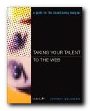
Taking Your Talent to the WebHis overall message is that designers must learn to work within limits, must accept compromise, must learn to accept constant change. He is a great believer in The Liquid Page – designs which can flow to fit any browser and screen size. His approach is very similar to Jeffrey Veen, whose The Art and Science of Web Design comes from the same stable.

After discussing the foundations of good design and usability, he spends the middle section of the book dealing with branding, marketing, and working in a design team. These chapters are not nearly so interesting as those in which he tackles the technology. Once he gets back to creating good pages, the temperature rises again.

He is very reassuring on the issue of making the transition from HTML via XHTML to XML. He offers a clear guide to style sheets, showing how to take advantage of this technology to control the appearance of pages – without running foul of browsers. He admits however that until browsers fully support style sheets, designers will continue to use tables to control layout.

There’s an extended discussion of font control. His advice is quite unequivocal – in style sheets the font size should be specified in pixels. This is followed by a short but reassuring introduction to JavaScript. I liked the fact that he puts his emphasis on practical applications, showing how it can be used. And he finishes with a quick review of Java, scaled vector graphics (SGV) and Flash.

It should also be said that he writes in a lively, amusing style which makes some of the more technical passages easier to digest. In fact I think he gets the balance of coding details and web strategies just right – giving you enough information to try out his ideas straight away. This is an attractive book which offers support and encouragement to designers who want to make their sites more usable and more effective.

Buy the book at Amazon UK

Buy the book at Amazon US

© Roy Johnson 2005


Jeffrey Zeldman, Taking Your Talent to the Web, Indianapolis (IN) : New Riders, 2001, pp.426, ISBN: 0735710732


More on web design
More on technology
More on digital media


Filed Under: Web design Tagged With: Taking Your Talent to the Web, Usability, Web design

The Design of Everyday Things

July 12, 2009 by Roy Johnson

classic design principles using everyday objects

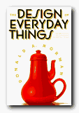
Donald Norman is a product design and usability guru who has teamed up recently with Jakob Nielsen to form the influential Nielsen-Norman Group. They specialise in advising businesses on the usefulness of their web sites. The Design of Everyday Things is the latest edition of what has become a classic in usability principles in the short time since it was first published. Norman discusses the problems we all have with the results of bad design in everyday life – doors which open the wrong way; telephone calls you can’t put on hold; washing machines with spaceship control panels. He clarifies the rules of good design as he goes along. These turn out to be – visibility, good conceptual model, feedback, and natural mapping.

Product DesignWhat this means is that the controls should be visually obvious, they should feel part of a natural process,they should tell you that an action has been performed, and they should reveal the connection between action and results. Every point of his argument is illustrated with practical examples and anecdotes drawn from the problems of normal life. These range from the trivialities of taking the wrong turn when driving, to the disastrous consequences of aircraft engine and nuclear reactor failure. One of the reasons this is such a charming and interesting book is that it’s written by an expert who admits to his own weaknesses and problems. This is the professor from MIT who can’t program his own video recorder, who says so, and who convinces you its not the user’s fault but that of the designer.

Click for details at AmazonHe’s also good at explaining the function and limitations of memory, and gives a clear account of one concept on which he relies heavily – mapping. This is the ability of good designers to arrange their controls, buttons, and switches in a way which corresponds to something we already know and have mentally internalised. He also offers interesting analyses of mistakes, breakdowns, and disasters – relating them to issues of both design and the relationship of humans to machines.

Donald Norman is a ‘usability’ guru who puts the user first. This is a witty and humane approach to the issues of good design – and it rightly deserves its reputation as a modern classic. You will never interact with the physical world in quite the same way again.

© Roy Johnson 2001

The Design of Everyday Things   Buy the book at Amazon UK

The Design of Everyday Things   Buy the book at Amazon US


Donald A. Norman, The Design of Everyday Things, London/New York: MIT Press, 2000, pp.257, ISBN: 0262640376


More on design
More on media
More on web design
More on information design


Filed Under: Product design Tagged With: Design, Donald Norman, Product design, The Design of Everyday Things, Usability

The Elements of User Experience

June 19, 2009 by Roy Johnson

concise guide to navigational and usability theory

Usability has so far been dominated by the work of Jakob Nielsen – but now there are new voices emerging. John Lenker recently set out his ideas on what he calls ‘flowpaths’, and now here comes Jesse James Garrett with The Elements of User Experience, which is his pitch on the essence of navigational clarity in web design. First he argues the case for user-centred design. All sites must be organised to make it easy for visitors to find what they want. He has had a diagram on his web site for some time now illustrating the point.

The Elements of User Experience This book is an amplification of that basic concept. It’s an idea that the user experience is enacted at five levels. These correspond to the way in which a site is constructed: Surface – Skeletal – Structure – Scope – Strategy. They represent each part of our engagement in a web site – from the buttons we press, the way they are arranged, the design of pages, the links between them, and how all aspects of a site are co-ordinated to deliver its essential purpose. He is wise enough to realise that everything does not easily fit into such convenient categories, but he then explores each level in depth.

First comes the strategy document – a concise statement of the project’s objectives. He’s very keen on clarifying aims, drawing up specifications, and making content inventories. The idea of all this is to prevent ‘mission creep’.

Interestingly he doesn’t pad his argument out with lots of examples, but concentrates on explaining each level of his basic concepts in depth. He has an easy style, and he avoids jargon.

He’s very good on making subtle distinctions – between for instance information architecture and information design. And like many recent commentators, he argues the case for having multiple navigation systems. After all, why not give visitors to a site a variety of routes for getting from one place to another.

It’s at this point that the book becomes most interesting – when he looks at the details of information architecture and shows how they must be related to what appears on the page. There’s some excellent advice on using wireframes here for instance. These are the outline plans which show the underlying structure of a given page.

This is a clear and refreshingly concise account of planning, organising, and thinking through the design of a successful Web site. It’s a book which gives an overview of site-building concepts, and it will appeal to site designers as well as to project managers and usability consultants.

© Roy Johnson 2003

User Experience   Buy the book at Amazon UK

User Experience   Buy the book at Amazon US


Jesse James Garrett, The Elements of User Experience, Indianapolis (IN): New Riders, 2003, pp.189, ISBN: 0735712026


More on information design
More on design
More on media
More on web design


Filed Under: Information Design Tagged With: Information design, Navigation, Usability, Web design

Universal Design for Web Applications

June 8, 2009 by Roy Johnson

an introduction to the study of sign systems

Universal design is a general principle, but it’s used here as something of a coded term for two topics which are discussed in detail. One is designing for accessibility (people with disabilities) and the other is designing for a variety of devices – PCs, laptops, PDAs, and most challenging of all, for mobile phones. The argument is that more people fall into the disability category than is generally realised, and that for huge numbers of users the mobile device is now the principal means of accessing Internet services.

Universal Design Fail to take these two factors into account, and you are automatically falling behind in providing what users want. The first important piece of advice these authors offer is that you should separate content from presentation in everything you design. This means using HTML in the way it was originally intended for use. Tables are for presenting tabular data, the <OL> feature for ordered lists, and so on. The <FONT> tag should now be abandoned altogether, and replaced by the use of cascading style sheets (CSS).

They are quite adamantly against using tables for layout, and think CAPTCHAs ought to be banned altogether: (those are the pictures of text you’re supposed to read to prove that you’re a human being, not a spambot).

If you’re using tables correctly however, they have a lot of useful tips for adding information in the form of captions and summaries. The same goes for making streamed video accessible for disabled users.

They explain the three different approaches to this issue: to offer audio or text transcripts, subtitles, or captions. These are time-consuming and therefore expensive to provide – but anyone who claims their web presence is designed for maximum usability to cater for all users needs to be aware of these features and incorporate them into their work.

I wonder how many of the self-righteous sites claiming full usability would pass scrutiny in this regard? Certainly not my local town council, whose site boasts full accessibility – but doesn’t even include email addresses and hides behind a general menu option telephone answering service. And after you’ve left your message, they ‘guarantee’ to get back to you within ten days. Some promise!

The latter chapters of the book cover working with scripts (Ajax) to produce dropdown menus that are accessible even for people using the keyboard for navigation – though when I went to look at an open source menu script they claim to have put on the book’s web site (http://ud4wa.com) there was nothing available.

They finish by explaining how most of these procedures can be pursued using a content management system (CMS) with templates and style sheets. Finally, as you might expect, they offer checklists for making sure your content matches up to what’s required, and resources for implementing features that cover magnification of text, scrolling, multimedia, screen readers, and full HTML validation of your output.

© Roy Johnson 2008

Buy the book at Amazon UK

Buy the book at Amazon US


Wendy Chisholm and Matt May, Universal Design for Web Applications, Sebastopol (CA), 2008, pp.179, ISBN 0596518738


More on web design
More on digital media
More on technology


Filed Under: Web design Tagged With: Technology, Universal design, Usability, Web Applications, Web design

Web Navigation

June 18, 2009 by Roy Johnson

navigation, structure, and usability for web design

Web sites have sometimes been described in terms of ‘generations’. David Siegel for instance describes how first generation sites were rapidly thrown together with no greater ambition than to get pages of HTML code onto the Web. The second generation added graphics, started to be concerned with page layout [even though HTML code is not designed for that purpose] and often added eye-popping special effects. Third generation sites have brought some of these excesses under control, and are designed to make the user experience more meaningful. Web Navigation is emphatically third generation.

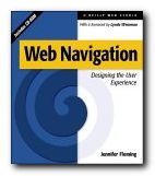
Web NavigationThere’s no doubt that clever designers have managed to produce some visually stunning Web pages – but many information architects are now beginning to ask questions such as “Can visitors find their way around the site?” and “Is this site achieving its purpose?” The eye candy effects of flashy graphics often mask a lack of content and an incoherent maze of links which visitors are glad to leave quickly via the nearest exit. Jennifer Fleming’s Web Navigation is a serious and articulate plea for intelligent Web site design, and it is based on principles which owe more to information theory and coherent structure than to the luminous-glamour school of graphics-based design.

Like most good designers, she insists on a user-centred rather than client-centred approach to web design. What’s the difference? you might ask. Well, intelligent designers are now beginning to realise that web sites are often created to impress the commissioning clients, rather than the people who will be using them. Men in suits will applaud spiffy graphics when a new site is revealed at a presentation – but they will probably never need to log on again.

The book’s structure reflects the clarity of her purpose. There are six chapters on the foundations of navigation design, then in the second part an analysis of successful sites. There are four appendices: technical tips, a glossary of navigational terms, a list of web resources, and a bibliography. The accompanying CD comes with trial versions of software (including the highly praised Dreamweaver) and it has a marvellous ‘netography’ with listings of articles, web sites, and online resources covering navigation, usability and testing, organisation of information, information design, document markup and scripting. [I loaded the disk, browsed the sites she recommends, and all the links were working.]

Her advice is to provide clear, simple, and consistent navigational aids – and she offers a particularly strong warning against using metaphors such as the office or the supermarket [though curiously, the CD uses icons]. Navigation that works should:

  • be easily learned
  • remain consistent
  • provide feedback
  • appear in context
  • offer alternatives
  • be economic in action and time
  • provide clear visual messages
  • use clear understandable labels
  • be appropriate to site’s purpose
  • support user’s goals and behaviour

Now that’s an important free lesson for you! She is in favour of any interactivity, such as rollovers (‘OnMouseOver’) which provide feedback, and is sceptical of the ‘Back’ button on the grounds that users might enter a site at any page. Where would they be going ‘back’ to? She also raises other interesting navigational questions, such as ‘where will you be when you’ve finished reading a page, and where will you wish or need to go?’

She recommends multiple navigational routes and aids, plus guidance. For instance, a site might have a framed and ‘no-frames’ version, a graphics and no graphics version. It will certainly have navigation hot spots at the top and bottom of every page, maybe a contents list in left-hand frame, plus icons, labels, and anything else which helps users find their way around.

One of the interesting features of her approach is that she illustrates her argument with detailed reference to the work of other ‘information architects’ such as Jakob Nielsen, Clement Mok, Edward Tufte, and David Siegel. The reader is thereby presented with a range of approaches to this relatively new subject. There are lots of bibliographic suggestions and URLs in side-bars on the page – and those I checked were all up-to-date, which is an important feature in such a fast-changing medium.

It’s a book aimed at professionals. For instance, her descriptions of the site design process assume that there will be teams of designers in sessions at a corporate level using flipcharts, video recordings, and even team-working software. There’s lots on brainstorming and chunking in what are now called ‘focus groups’. But these principles could be followed by what I suspect is more likely to be the average reader – somebody working in a spare room at home.

This is a book for people who want to take web design seriously. It’s significant that she spends so much time discussing the thoughtful planning, research, and testing of a site, rather than the creation of flashy effects and animated gimmicks which adorn so many KEWL sites. She has powerful and revealing arguments in favour of a consistent design process (so that the arbitrary element of success or failure can be removed). This is fairly obvious when you think about it – but that’s true of many good ideas.

She includes a full account of professional designers at work, with pointers to the resources they use – such as David Siegel’s free downloadable ‘profiling’ materials at www.secretsites.com for instance.

This is the business studies version of web design manuals, packed with thought-provoking information on determining user goals and expectations. She describes the use of personal interviews, people ‘shadowing’ users throughout the working day, and ‘disposable camera studies’ where users record what they find interesting. Not many individuals will have the resources to be so thorough, and sometimes the ‘feedback-usability-testing’ approach makes this all seem like a science rather than the sales-pitch that it is – as if we can predict how many people will come to our site to buy widgets.

In the second half of the book her notions are put to work analysing the navigational methods and structure at sites built for shopping, entertainment, learning, and community services. This struck me as slightly less interesting than the first part, but still worth reading for the revealing tips and guidance notes embedded in her analysis. The observations, as before, are that successful sites are customer-oriented, and that they give extra consideration to online customers because they lack the navigational support provided during comparable user experiences in libraries, airports and shopping malls.

If there is a weakness in her examinations, it’s that these are often not much more than descriptions of sites – though they are nevertheless well-illustrated mini-lectures, with plenty of screen captures. For instance, she heaps praise on Amazon.com for their search facility and one-click ordering system. However, this doesn’t take into account that the company, despite its multi-million dollar turnover, hasn’t actually made a profit so far.

It’s worth noting that a lot of what she says about helping users through the layers of a site is based on the US-centred assumption that people are going to spend a lot of time browsing – because they have free local telephone calls. But European (certainly UK) users will not have such luxuries. They’ll hit a site, search for what they’re looking for, then disconnect quickly. This economically-driven difference in user behaviour should be taken into account by anyone theorising about navigation, browsing, and web design.

But there are many good tips offered en passant – including some which might seem obvious, but which are often ignored by site designers. For instance, I’ve noticed that in the UK, quangos and government departments are very often reluctant to display their postal address [possibly reflecting the arrogant nature of these organisations].
But she insists that

Making your street address, phone number, and email address easily available is not only about completing an online sales pitch…It’s about other elusive qualities: trust and community.

Similarly, many UK universities would do well to heed her advice on making themselves more accessible and well-presented. How many times have you visited a university site and found no lists of courses on offer or staff who teach them? She points to the short-sightedness of this approach:

A large percentage of visitors to a university site are applicants for admission, or are thinking of becoming applicants…If a university can answer their questions fairly easily, it bodes well for the entire process. A positive experience on the Web – especially for college applicants, who tend to make decisions on gut feelings – is a powerful factor in decision-making.

It’s good that she chooses different (and challenging) types of sites to analyse. Searching for information is quite a different matter to being entertained or pushing round a virtual shopping trolley. The section on information sites [Lycos, Computers.com] is particularly interesting, because she forces us to think about different types of questions which might be asked of a site, and the different approaches to searching users develop.

Until recently, just providing information via the Web was a laudable pursuit. It was enough to be one of the forward-thinking few who recognised the power of the Web for mass communication. Those days are gone, replaced with a new challenge: providing increasingly complex layers of information, and making it all seem simple.

Very near the end of the book she presents a simple formula for successful sites. Aspirant site designers would do themselves a favour by writing her tips on Post-It notes and sticking them on their monitors:

  • keep every page below 20K
  • recycle headers
  • keep graphics small and simple

Jennifer Fleming has a background in library and information science, and her advice and observations strike me as more seriously well-founded than most of the web design manuals I have ever seen. This is a wonderfully rich and thought-provoking study which anybody analysing or building web sites should put on their list of essential reading.

© Roy Johnson 2000

Web Navigation   Buy the book at Amazon UK

Web Navigation   Buy the book at Amazon US


Jennifer Fleming, Web Navigation: Designing the User Experience, Sebastopol: O’Reilly, 1998, pp.253 plus CD-ROM, ISBN: 1565923510


More on information design
More on design
More on media
More on web design


Filed Under: Information Design, Web design Tagged With: Experience design, Information architecture, Information design, Navigation, Usability, Web design, Web Navigation

  • « Previous Page
  • 1
  • 2

Get in touch

info@mantex.co.uk

Content © Mantex 2016
  • About Us
  • Advertising
  • Clients
  • Contact
  • FAQ
  • Links
  • Services
  • Reviews
  • Sitemap
  • T & C’s
  • Testimonials
  • Privacy

Copyright © 2025 · Mantex

Copyright © 2025 · News Pro Theme on Genesis Framework · WordPress · Log in