Mantex

Tutorials, Study Guides & More

  • HOME
  • REVIEWS
  • TUTORIALS
  • HOW-TO
  • CONTACT
>> Home / Archives for Web design

How to fail at web design

September 16, 2009 by Roy Johnson

classic guidelines which mean you can’t go wrong

Web design fail- guarantee disaster

Web design failure is fairly easy. Just follow any of the following guidelines. And if possible, try to combine at least two or three.

1. Have your whole site in one page, then you won’t have to bother with navigation buttons.

2. Put a huge graphic on the entry page, before the content of your site. It’s not your fault if visitors have a slow connection.

3. Nobody minds the odd broken link.

4. Use animated GIFs liberally. These are very amusing.   web design fail

5. Have the site in at least three frames.

6. Web sites without background wallpaper are dull.

7. Use lots of different fonts. Everyone has the same fonts installed these days.

8. Red text on a coloured background looks really good – as you can see.

9. Use plenty of underlining. This will draw people’s attention to the important parts of your message.

10. Better still, show people you mean business by highlighting lots of your text. This can be done at random, but it’s best used on special offers. It also looks really COOL!!!!!

11. Combine these features wherever possible, centre your text, add colour, and make sure your punters customers get the message. Get Ready For More Backlinks,

More Traffic And Higher Search Engine Rankings Almost Instantly!

12. Decorate pages with page counters, clip art, and and plenty of horizontal rules.

13. This is the Internet, so you don’t have to worry about speling and punctuatio

14. If some pages are unfinished, just paste in an “Under Construction” sign.

15. HAVE ALL YOUR TEXT IN CAPITALS – AS IT MAKES IT MUCH EASIER TO READ. JUST LOOK AT THIS REALLY GOOD EXAMPLE.

16. Once you’ve got your site, make sure that you publicise it as widely as possible. If you are not certain which groups to post to, you should post to as many as possible.

17. Ensure your message gets through by posting it at least three times. Repeat these postings on a daily basis.

18. If in any doubt, copy other people’s great ideas.

© Roy Johnson 2004


More on How-To
More on literary studies
More on writing skills

Filed Under: How-to guides Tagged With: HTML-XML-CSS, Web design

How to write a web page

November 23, 2010 by Roy Johnson

creating effective text for on-screen reading

Web PageIn order the communicate effectively on the Internet, you need to know how to write a web page that is successful.
Web pages are available for the whole world to see – but you will no doubt have an audience in mind.

Your audience is the people you hope to be addressing. They might be – fellow hobbyists, opinion makers, customers for products, or fan club members.

So – you have your own target audience, but anybody else can read your pages. There is therefor another audience about which you can know nothing (in advance).

If you want to reach as many people as possible, keep this invisible audience in mind. Write in a clear and simple manner. Avoid jargon and complicated expressions.

Layout

A web page is not the same thing as printed document. It might look similar, but it does different things. Your writing needs to be grammatically correct and free from mistakes. But it will not be read in the same way as a book or even a magazine.

People scan a web page before they read it. They glance at the overall content first. They read headings and sub-headings, glance at pictures, and even look for links.

Reading text on a screen is much harder than reading it on a printed page. This means that your writing needs to be different in style.

Your objectives

The function of a web page will depend upon your objectives. The page could be designed to offer a number of things:

  • news
  • information
  • entertainment
  • instruction
  • advice

This will have an effect on the way you deliver the content. But no matter what the function, there are certain golden rules that will help to make any web page effective.

Style

All your writing should be split up into small chunks. Huge blocks of writing on a screen are very difficult to read. The short paragraph is an important part of writing for the Web. This allows readers to grasp what you have to say more quickly.

Have a look at online newspapers. They use short and even one-sentence paragraphs.

Employ as many devices as possible to break up dense blocks of writing. Use headings, sub-headings, bold, and italics. Add graphics where appropriate and use bulleted lists.

Short sentences are easier to read than long ones. This is true on paper, but even more so when writing for the screen. Put a limit of twenty words per sentence on your writing – and watch its effectiveness improve!

The most effective way to communicate with general readers is to write directly in a simple, friendly manner.

Don’t forget that only a small part of a long web page will appear in the monitor screen at any one time. In such cases it’s important that you offer readers clear signals to find their way around.

Vocabulary

The language you use will be conditioned by your subject and the audience you are trying to reach (as well as the extent of your own vocabulary).

If you have a specialist subject and audience (agricultural biology, jet engine design) you will naturally be using the specialist language of your subject (jargon). But if you wish to reach a wide and general public, it’s better to keep you language plain and simple.

There’s no point in using a term such as aerated beverages when fizzy drinks will be understood just as well.

Conventions

It’s not necessary to know HTML coding to write a web page. Most software will do this for you. But a little knowledge will help you control the appearance of the page.

Use the text editing menus that appear in Microsoft Word and the page creation panels of most blogging software (Blogger, WordPress). These will give you the option to put text in bold, italics, and even colour.

A screen of text with different fonts, colours, and emphasis splattered all over the page looks bad. The golden rule here is this – Less is more. Restraint will help you achieve a more impressive appearance.

  • Headings in bold and a larger font size
  • Sub-headings in bold
  • Italics for emphasis and foreign words
  • No use of underlining at all

Underlining makes text hard to read, and the underlining can be confused with a hyperlink.

Examples

You are looking at an example of a web page right now. This type of page is called a ‘How to’ in the language of Web commerce. That is, it offers simple guidance notes on a single topic. Here are three more very different types of page.

Historical document
The first is from the nineteenth century. None of the above guidance notes apply, because readers want the document in a form that is as similar as possible to the original.

Red button Henry James on ‘The Art of Fiction’

Essay
The second is to a short illustrated essay on an artistic movement. This is the sort of article that might normal occupy a few pages in a magazine or a weekend newspaper supplement. It has graphics, links to related subject, and it also contains advertising.

Red button The Omega Workshops

Newspaper
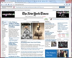
The third is the online version of a daily newspaper. Notice how this page is made up of very short extracts, with links to the full articles, which are located on separate pages. The front page is packed with links, graphics, and advertising. It is also composed ‘dynamically’ – which means that it is updated every few minutes with new content.

Red button The Guardian

© Roy Johnson 2010


More on How-To
More on literary studies
More on writing skills


Filed Under: How-to guides Tagged With: Business, Computers, Information design, Media, Publishing, Web design, Writing skills

HTML and XHTML

July 11, 2009 by Roy Johnson

the encyclopaedia of HTML coding – and the latest XHTML

The problem with HTML is that just when you thought you had grasped the basics of web page design, something new emerges. Here comes the latest development – XHTML – which stands for ‘extensible hypertext markup language’. Musciano and Kennedy aim to keep you up to date with these latest developments. So – what are they? XHTML is an extension to the HTML code – at 4.01 in its present version. It is in fact a part of the XML code – and XML is itself a subset of the general Standard General Markup Language (SGML). Still confused? The authors have already guessed that, and in HTML and XHTML they do their best to explain.

HTML and XHTMLWhat they do in this excellent manual is cover every element of HTML/XHTML in detail, explaining how each element works and how it interacts with other elements. Many hints about HTML/XHTML style help you write documents ranging from simple online documentation to complex presentations. With hundreds of examples, the book gives you models for writing your own effective web pages and for mastering advanced features like style sheets and frames.

When HTML was originally conceived, no one had any idea it would be so successful or be asked to handle so many kinds of documents, browsers, and media. While it has borne up admirably under the demands of web users, HTML 4.0 has stretched as far as it can to accommodate new technology. While HTML 4.0 is petering out, XHTML 1.0 stands ready to step in, designed to handle almost anything web authors can dream up.

There are in fact three possibilities for XHTML – the ‘strict’ version which is limited but future-proof; the ‘transitional’ version which allows authors to write with current browsers in mind; and a third version which deals with frames. The reassuring news they offer is that “learning HTML is still the way to go for most authors and Web developers” – but they do remind readers that “content is paramount; appearance is secondary”.

They also warn that “writing XHTML documents requires much more discipline and attention to detail than even the most fastidious HTML author ever dreamed necessary.” This sounds a bit frightening – but really, it just means being extra careful with coding. It means that all tags must be opened, then closed. No more leaving out those </P> paragraph tags.

And the beauty of this book is that all the basic HTML coding is covered in the great detail which has been generated over its earlier editions. They deal with forms, frames, tables, and even Java scripts, and all the tutorial material is fully illustrated, with plenty of screenshots and understandable code.

All the really useful appendices are there too – HTML grammar, Cascading Style Sheets, the HTML and XHTML document definitions, character entities, color names and values, and of course a complete list of XHTML tags with browser compatibility notes.

If you want the very best reference manual to HTML and its latest developments – this is it. I guarantee that no matter which other web page design books you might have on your shelves, this is the one to which you will keep coming back – again and again.

© Roy Johnson 2006

Buy the book at Amazon UK

Buy the book at Amazon US


Chuck Musciano & Bill Kennedy, HTML& XHTML: The Definitive Guide 6th edition, Sebastopol (CA): O’Reilly, 2006, pp.654, ISBN: 0596527322


More on technology
More on digital media
More on web design
More on computers


Filed Under: HTML-XML-CSS Tagged With: Computers, HTML-XML-CSS, Technology, Web design

HTML Tutorial 01 – contents page

November 22, 2009 by Roy Johnson

• HTML – made simple

• HTML – page template

• HTML – common tags

• HTML – common problems

• HTML – adding colour

• HTML – page anatomy

• HTML – questions of taste

• HTML – text & graphics

• HTML – adding tables

© Roy Johnson 2002


Filed Under: How-to guides, Study Skills Tagged With: Coding, HTML, HTML tutorial, Technology, Web design

HTML Tutorial 02 – code made simple

November 22, 2009 by Roy Johnson

1. You can produce web pages using a simple word processor such as Windows NotePad or WordPad. The files you produce should be saved with an .htm extension.

2. The files can contain text, colour, and pictures [even sounds] – but they also contains HTML code.

3. HyperText Markup Language (HTML) uses ‘tags’ to send instructions to a web browser that will ‘read’ the web page. The browser then arranges the appearance of the text on screen.

4. The tags are a code which is placed between angled brackets – <H1> Here is a level one Heading </H1>.

5. Note that the tags are placed around any text you wish to affect. They commonly begin with one tag <H1>, and then they are switched off with another, </H1>, which contains an olbique stroke.

6. <H1>Heading</H1> – shows headings raging from big and bold at size 1 – to 6 – which is quite small.

7. You can also change the size of text on the page from 1 to 6 by enclosing the text between FONT SIZE tags

<FONT SIZE=”4″>produce text size four</FONT>

8. Notice that in this case the numbers 1 to 6 range from small to large.

9. Browsers show text at SIZE=”3″ unless told to do otherwise.

10. You can also change the colour of the text on the page – but note that the tag requires the US spelling of COLOR.

11. The text between the tags will appear in colour:

<FONT COLOR=”RED”>some text in red</FONT>

12. The <P> tag inserts a double space to start a new paragraph.

<P>
Here is the text of one paragraph, which is shown to illustrate the use of the paragraph tag.
</P>
<P>
And this is the start of the following paragraph, which as you can see has been separated from the first with a space.
</P>

13. The <BR> tag forces text to start on the next line down.

Here is a short statement.<BR>
The tag has been used to force the next sentence to begin on a new line.

14. The <HR SIZE=1> tag inserts a Horizontal Rule. The size of the line goes from 1 (most narrow) upwards, with 3 as the default.

15. There are two types of list – ordered and unordered. These are created by using the tags <OL> and <UL>. The first automatically numbers the points in the list, the second creates bulleted points.

16. The items in the list are created by using the <LI> tag. Notice that each point is automatically indented.

17. This is an example of coding for an ordered list:

<OL>

<LI>List item number one</LI>

<LI>List item number two</LI>

<LI>List item number three</LI>

</OL>

This will be show on the screen as follows:

  1. List item number one
  2. List item number two
  3. List item number three

18. This is the coding for an unordered list:

<UL>

<LI>List item number one</LI>

<LI>List item number two</LI>

</UL>

This will be shown on the screen as follows:

  • List item number one
  • List item number two

19. Emphasis is added to text using the BOLD and ITALIC tags, which are shown as <B></B> and <I></I> respectively.

20. Here is some text which is shown in bold and then in italics.

21. You can combine tags – by making text both bold and italic for instance. Here is bold italics.

22. The tags must be correctly nested. That is, they must be added and removed in the correct sequence (or syntax).

<B><I>bold italics</I></B>

23. You can also insert an extra space by using the non-breaking space tag – &nbsp; (which does not come in angled brackets).

no spaces abcdefgh
extra spaces a   b   c   d   e   f   g   h

24. That’s a quick run through some commonly used tags. Here are some general tips on writing the code.

General points

  • You can type tags in upper case <FONT SIZE=4> or lower case <font size=4>.
  • Do not miss out any angled brackets <these> or quote marks “these” – or the code will not work.
  • Do not insert any spaces, as in <FONT C OLOR=RED> or the code will not work.
  • You can combine tags, but they must be correctly nested, as in <B><I>EXAMPLE</I></B>.

NB! This is an extremely simplified account of HTML coding. The appearance of most web pages these days is controlled by style sheets. But the principles shown here are still working underneath.

© Roy Johnson 2002

previousnext


Filed Under: How-to guides, Study Skills Tagged With: HTML, HTML tutorial, Technology, Web design, Web design tutorial

HTML with CSS and XHTML

June 19, 2009 by Roy Johnson

web design using style sheets and the latest standards

This is an unusual guide to HTML and web design, because it teaches via chat and fun, not boring routines. It’s aimed at beginners who want to get web pages up on to a site, but who don’t want to be bored rigid with long lists of ‘elements’, ‘attributes’, and ‘selectors’. The authors use instead just about every printable device for getting their lessons across: explanations, diagrams, screenshots, cartoons, bulleted lists, quizzes, dialogues, crosswords, tests, and downloadable templates. They also teach predominantly via pictures, which is one reason the book is so long (658 pages). The other reason is that it’s so comprehensive.

HTML CSS XHTMLThey cover basic HTML, then XHTML, interactivity, and style sheets. In fact they take the unusual step of introducing style sheets right at the start. This approach of multiple instruction produces quite a lot of repetition and redundancy – but I’ve no quibble with that. It’s based on the sound pedagogic principle the when you are learning, several approaches are better than one.

Geared towards both Mac and Windows users, they show you how to design pages, how to insert graphics, how to validate your pages to check for problems and make the pages compliant with W3C standards.

I still find the language of stylesheets over-abstract and hard to grasp, but they explain it all very carefully, and most importantly they show you both what to type into your text editor and how it will look in a browser.

There are a couple of easier chapters on styling with fonts and colours, then it’s back to the harder stuff with CSS elements and the box mode – which is similar to HTML tables. Here there are some very useful detail on how browsers deal with the information coded into your pages, some of which explains why you can’t always get things to appear on screen how you want them to look.

They end with chapters on tables and forms – still urging readers not to fall back on old HTML 4.0 tricks for layout and appearance, but to stick with style sheets all the way.

So – truth be told, it’s a book which starts off quite easily, but then gradually becomes more advanced. But if you do all the exercises and tests along the way, this gradual acceleration should be hardly noticeable.

© Roy Johnson 2005

Buy the book at Amazon UK

Buy the book at Amazon US


Elisabeth Freeman and Eric Freeman, Head First: HTML with CSS and XHTML, Sebastopol: CA, 2005, pp.658, ISBN 059610197X


More on technology
More on digital media
More on web design
More on computers


Filed Under: HTML-XML-CSS Tagged With: CSS, HTML, Web design, XHMTL

HTML: The Definitive Guide

July 11, 2009 by Roy Johnson

the encyclopaedia of HTML coding and web design

Most people in the academic and business world are still using HTML Standard 2.0 browsers – partly because of corporate lethargy and partly because upgrading is so costly and disruptive in big organisations. At least these people have had the good fortune to miss out the Standard 3.0 phase, which was something of a dog’s breakfast. Designers however (the people who actually create the Web pages for our consumption) are always keen to make the screen more attractive and escape the confine of earlier standards. In fact they have a doubly difficult job. They might wish to adopt the latest features, but if their sites are to be viewable by people still lumbered with older browsers, they are also under constraint to make their pages ‘backwardly compatible’. This is no easy task.

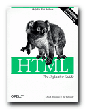
HTML: The Definitive Guide The first edition of Musciano and Kennedy’s book on HTML was rather boldly entitled The Definitive Guide. However, many of the predictions they made then have been substantiated by subsequent meetings of the W3C committee, which decides on these standards. [It’s recently been rumoured that both Microsoft and Netscape try to pack this committee with their appointees.]

The third edition of their reference manual offers an update which includes the latest additions to Standard 4.0 of the official HTML code. They claim that this is a ‘clearer and cleaner standard’ than any previous, but they also admit that Netscape and Microsoft incorporate features not included in the present standard. Fortunately, they take a realistic view of this browser war and make clear which standards are adopted (or not) by the Big Two. So what’s really new here?

The answer is ‘Quite a lot’. The Forms, Tables, and Frames chapters have all become bigger, and JavaScript and DHTML make an appearance. They also cover Layers, Multiple Columns, and creating white space. The big new item of course is a whole chapter on Cascading Style Sheets – a development which has come about precisely because of the shortcomings in standards 1.0, 2.0, and 3.0 – and they recognise in this respect that print publications just can’t keep up with Web developments (which is a brave and honest admission for authors of computer manuals). A section on image formats (.gif and .jpg) is also new – but beware! there are Netscapisms at every turn.

I still find it difficult to remember what is an attribute, a physical style, and why some tags are ‘deprecated’. They even include some which are now obsolete (for historical reasons) which just goes to illustrate their thoroughness. However, you still have to be prepared for a rather abstract manner of expression:

like most other tagged segments of content, user-related events can happen in and around the BLOCK QUOTE tag

But having used the first edition regularly over the last year or two, I can confirm that their manner of writing is amply compensated by the reliability of the advice they offer.

Obviously you should buy this latest edition, but it’s reassuring to know that Musciano and Kennedy continue to offer a guide which stays within the limits of the latest HTML standard, whilst recognising that you will want to go beyond it. In this regard the publisher generously offers an online update.

The usual high quality O’Reilly production values obtain: good quality paper, clear print, consistent layout, and their elegant house font of ITC Garamond. Multiple indexes include HTML grammar, quick tag reference, CSS quick reference, the HTML 4.0 document type definition, character entities, and colour names and values. To a newcomer these might seem like boring technical catalogues – until you see the horror of your Web pages in a browser you don’t normally use. Then you’ll be glad of the reassurance of safe colours and the correct ASCII number for that ampersand or angled bracket.

© Roy Johnson 2006

Buy the book at Amazon UK

Buy the book at Amazon US


Chuck Musciano & Bill Kennedy, HTML: The Definitive Guide (sixth edition) Sebastopol: O’Reilly, 2006, pp.678, ISBN 0596527322


More on technology
More on digital media
More on web design
More on computers


Filed Under: HTML-XML-CSS Tagged With: Computers, HTML, HTML: The Definitive Guide, Technology, Web design

Information Architecture

July 16, 2009 by Roy Johnson

large-scale Web site structure, navigation, and usability

When it first appeared in 1998, Information Architecture became an instant classic amongst information architects. It now appears in its third edition, much enlarged and updated. The new edition reflects the rapid expansion and technical sophistication of large interactive web sites in the last few years. Rosenfeld and Morville deal with all the issues raised in organising information and navigational systems in the design of large-scale sites. Their important starting point is a recommendation that big sites should use three types of information organisation, which they identify as hierarchical, database, and hypertext.

Information Architecture Visitors to a site should have more than one possible route to the same piece of information. They ask some quite fundamental and interesting questions in their updated chapters. These cover issues of organisation, labelling, navigation, and searching – plus new chapters on thesauruses and meta-data.

The new edition has been given many more case studies, and lists of resources on IA have been added, many of which did not exist at the time of the first edition, and there’s a very good bibliography which painlessly blends print and web-based information. Navigation has been expanded into global, local, and contextual systems, and there is a lot more detail on search engines.

Another section which has been considerably expanded is that on classification systems and ‘knowledge management’. That is – where to put things, how to arrange, label and store information.

There’s also a much-enlarged section on the management of web development projects – from the initial strategy meetings through content analysis and mapping, to delivery and maintenance.

They present real life case studies, including one which details how a strategy report was written for Weather.com. Anybody who needs help with report writing will profit from reading this chapter. ‘Information Architecture’ was a relatively new term only a few years ago, but now as you can probably guess, it is of use to anybody who needs to organise information, ideas, or even physical objects – such as books in a library.

There’s an excellent account of how to draw up site maps and flow diagrams which help to explain the deep level architecture of sites to those who are going to populate them with content.

The same is true for page layout diagrams – which they call ‘wireframes’. These test the arrangement of items on main pages before they are passed on to a graphic designer. Architecture and usability are tested before the application of a graphic. It’s rather like designing the layout of a web page with table borders switched on – before setting them to zero.

They take an enthusiastic line on the use of navigational metaphors (the shop, the office, the library) about which other commentators such as Barbara Fleming and Jakob Nielsen are more cautious. The argument against this approach is that the metaphor of an office or a library will not mean much to people who are not familiar with them. And of course the same is true for icons and symbols.

This is a book for serious designers, project managers, and of course information architects. It is also a contribution to design theory which, en passant, makes librarians into the heroes of the information age. The valuable experience embedded within it will make useful reading for anybody organising information, designing a site, or providing content for it. If you read the first or second edition, it’s worth reading the third for the wealth of new material.

© Roy Johnson 2006

Information Architecture   Buy the book at Amazon UK

Information Architecture   Buy the book at Amazon US


Louis Rosenfeld and Peter Morville, Information Architecture for the World Wide Web, Sebastopol (CA): O’Reilly, third edition, 2006, pp.461, ISBN: 0596527349


More on information design
More on design
More on media
More on web design


Filed Under: Information Design, Web design Tagged With: Information architecture, Information design, Navigation, Structure, Usability, Web design

Information Architecture

July 25, 2009 by Roy Johnson

the basic principles of organising information

Books on Information Architecture are coming thick and fast at the moment. Christina Wodtke’s approach will appeal to anyone who wants to learn the main principles, without having to wade through lots of abstractions and jargon. Her written style is very much influenced by web-based writing. She is concise, straight to the point, and entertaining. She starts out by looking at the basics of navigation, screen layout, subject categorising, usability, and liquid pages.

Information ArchitectureAll the time, she keeps the site visitor in mind. It’s a friendly, practical approach, and she illustrates all her points with plenty of screenshots. The main novelty she has to offer is to puncture some of the common suppositions about web design. For instance she argues quite persuasively against a one-size-fits-all approach:

Beware of gurus peddling simple answers. Instead, seek better tools to help you think up better solutions. Think first. Design second.

As is common with good advice, a lot of it seems very obvious when spelled out – but it is useful to be reminded that on the homepage of a site you should ‘show people the range of your offerings’.

She also recommends ‘see also’ pages of the kind at which Amazon excel. If someone visits pages dealing in laptops and novels, there’s a good chance they will also be interested in software and magazine subscriptions.

There’s a particularly good chapter on meta-data where she explains the reason why ‘information about information’ is important. This also includes a clear account of controlled vocabularies – one of the latest issues in usability and Web promotion.

She explains the systems of what are called ‘global navigation systems’ – the links, buttons, and tabs which normally appear at the side(s) and top of every page.

The latter part of the book deals with the process of mapping out and designing a site. This is something that should be done with pencil and paper. She includes storyboarding techniques, sitemaps, content inventories, wireframes – and even illustrates how to conduct cheap, small-scale usability testing.

This is another top quality production from New Riders – who have almost cornered the market in books on this subject.

© Roy Johnson 2005

Information Architecture   Buy the book at Amazon UK

Information Architecture   Buy the book at Amazon US


Christina Wodtke, Information Architecture: Blueprints for the Web, Indianapolis (IN): New Riders, 2002, pp.348, ISBN: 0735712506


More on digital media
More on information design


More on information design
More on design
More on media
More on web design


Filed Under: Information Design Tagged With: Data management, Information architecture, Information design, Web design

Information Dashboard Design

June 18, 2009 by Roy Johnson

effective visual communication of data

Dashboards have become popular in recent years as powerful tools for communicating important information at a glance. They tend to imitate motor car fascias or small airplane cockpit controls and they are used for displaying sales figures, statistics, business information (BI) and any sort of key performance indicators (KPIs). They can be used for all sorts of purposes – monitoring stock market prices, showing the weather, recording production output, or listing web site usage.

Information Dashboard Design My blog for instance is monitored by a service which shows me with maps, graphs, and bar charts who has been visiting, where in the world they are located, how many entries they viewed, and which browser they were using. Stephen Few begins by looking at some examples and defining the issue of dashboards – which is not as simple as you might imagine, Then he looks as some examples of bad design. These include dial gauges with no numbers; pie charts whose slices don’t add up to 100; graphs with distorted axes; meaningless colour coding; and results presented in two and three-dimensional forms which occlude anything that happens to be behind them (as my web site analyser does for instance).

Next he deals with the principles of visual perception – how and why we see things as we do. It’s interesting that he follows exactly the same design principles as Edward Tufte, which is to simplify everything as much as possible, remove all unnecessary chart junk, and let the data speak for itself.

He shows examples of good design, and more importantly how to improve it. The not-so-hidden secret all the time is ‘Less is more’.

Next comes ‘a taxonomy of dashboard media’ – that is, an exposition of all the different ways data can be shown on screen. He shows graphs, bar charts, dials and gauges, pie-charts, and Edward Tufte’s new invention, sparklines. The merits and disadvantages of each system are very well illustrated, and he argues quite persuasively that there’s hardly ever a good reason for using a pie-chart. Reasons? They take up too much room, are hard to read, yield little, and the same information could be delivered more efficiently in other ways.

He shows how all these principles can be brought together to produce good design principles – but then finishes with something very instructive. It’s a design for a business information dashboard, followed by several alternative designs and critiques of them. He shows why, even though they might look superficially attractive, they have design flaws and don’t do the job as effectively.

This is a handsomely designed and well produced book which follows its own principles of clear presentation and efficient communication.

© Roy Johnson 2006

Information Dashboard Design   Buy the book at Amazon UK
Information Dashboard Design   Buy the book at Amazon US


Stephen Few, Information Dashboard Design, Sebastopol, CA: O’Reilly, 2006, pp.211, ISBN: 0596100167


More on information design
More on design
More on media
More on web design


Filed Under: Information Design, Web design Tagged With: Control panels, Dashboards, Information design, Web design

  • « Previous Page
  • 1
  • 2
  • 3
  • 4
  • 5
  • 6
  • …
  • 9
  • Next Page »

Get in touch

info@mantex.co.uk

Content © Mantex 2016
  • About Us
  • Advertising
  • Clients
  • Contact
  • FAQ
  • Links
  • Services
  • Reviews
  • Sitemap
  • T & C’s
  • Testimonials
  • Privacy

Copyright © 2025 · Mantex

Copyright © 2025 · News Pro Theme on Genesis Framework · WordPress · Log in