short-lived but influential design from the Belle Epoque
Alastair Duncan points out in his introduction to this beautifully illustrated study, that Art Nouveau was not a style but a movement which was a reaction against the stuffy over-decoration of the nineteenth century. It took its early inspiration from the work of William Morris, Arthur Mackmurdo, and Walter Crane, and fused these with an enthusiam for Chinoiserie and Japonisme. And as a movement it errupted very suddenly in the 1890s, spread throughout Europe and even top the USA – and then ended just as abruptly in the first decade of the new century.
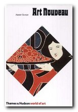 It was known by a variety of names in different countries – Jugendstil in Germany, Art Nouveau in English-speaking countries, Stile Liberty in Italy (after the famous London store) Modernista in Spain, and Style Metro in France, after Guimard’s Underground entrances.
The main features of Art Nouveau were the adoption of flowing, organic forms and the use of floral or vegetable decorative motifs. Even those who followed the severely vertical forms of a designer such as Mackintosh nevertheless chose tulips, poppies, and dragonflies as their embellishments.
After a general introduction, separate chapters of this study are devoted to the manifestation of Art Nouveau in architecture, furniture, graphics, ceramics, jewellery, and sculpture. In architecture, many of the commissions gained by Guimard, Van der Velde, Mucha, and Gaudi are still visible in the Parisian storefronts, the Metro entrances, and of course Gaudi’s buildings in Barcelona – plus the enormous Sagrada Familia which is still under construction (and currently giving town planners headaches).
The furniture that was created at the same time was supposed to be matched in its decorative detail with the buildings for which it was designed – to demonstrate an organic and integrated aesthetic. But most of the tables, cabinets, armoires, and sideboards tend to be illustrated in isolation from their surrounds. Too much ornamentation in a room tends to take it back into the Victorian excess from which Art Nouveau was supposed to be an escape.
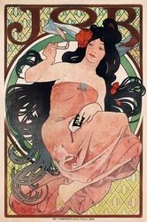 Strangely enough, there was no Art Nouveau school of painting, mainly because it constituted an approach to design. It was in the realm of posters, woodcuts, illustrated books, and typography that it made its greatest impact, and there are excellent examples of posters by Lautrec, Mucha, and Bonnard. These were works which gave birth to the figure that came to symbolise fin de siecle Paris and la Belle Epoque – a young woman with serpentine hair, clad fashionably in jewelled or feathered headgear and wearing immense sweeping skirts, all of which flowed abundantly to fill the frame of the picture. It’s amazing to realise that these romantically stylised images were being used to advertise such mundane objects as bicycles, wine, household soap, and cigarette papers.
The field of decorative glassware was dominated by two figures – Gallé in France and Louis Comfort Tiffany in the USA. The American developed new techniques from his foundry on Long Island:
By mixing up to seven colours, trown together from different ladles, his staff could produce a giddy range of blended hues, many mottled or deeply veined to simulate nature’s ever-changing moods and palette. The sheets obtained were often treated with an iridescent surface finish created in a heating chamber, where an atomised solution of metallic vapours was sprayed onto the final piece. The process gave a kaleidoscopic lustre to the glass, which became a principal characteristic of the firm’s domestic wares.
In ceramics the the novelty elelment was in the application of subtle and complex glazes, but the vases, plates, and jugs are still recognisable Art Nouveau from the curvilnear plant forms and decorative leaves and tendrils cast into their surfaces.
The jewellery section is dominated by the French master of jouillerie, Lalique. He brought the setting of precious stones to a high art by the intricacy of his decorations and the inventiveness of his symbols.
There’s a good bibliography and index, but a future edition might usefully include a glossary of terms for the general reader. It’s not always easy to work out the differences between a selette, a guéridon, and an étagère.
© Roy Johnson 2010
Alastair Duncan, Art Nouveau, London: Thames and Hudson, 2010, pp.236, ISBN 0500202737
More on architecture
More on technology
More on design
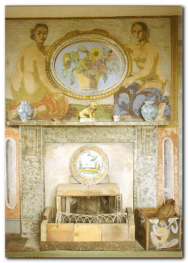
 It is most famous for the fact that Vanessa Bell and Duncan Grant covered the entire surface of the house – walls, fireplace, cupboards, tables, chairs – with their decorations and paintings, an impulse that was also part of the


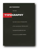
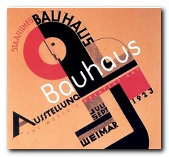
 There are chapters on the use of photographs; the standardisation of paper sizes [the origin of the DIN A4 we all use today] lots of carefully analysed examples of business stationery, and even film posters which evoke the visual ethos of the inter-war years. All this is illustrated by some crisp and still attractive reproductions of everyday graphics – letterheads, postcards, catalogues, and posters – in the red, black and white colour-scheme characteristic of the period.