Mantex

Tutorials, Study Guides & More

  • HOME
  • REVIEWS
  • TUTORIALS
  • HOW-TO
  • CONTACT
>> Home / Design / Graphic design

Graphic design

graphic design in theory and practice

graphic design in theory and practice

Graphic Design for the 21st Century

June 18, 2009 by Roy Johnson

contemporary world graphic design and designers

This is another block-busting visual compendium from Taschen publishing regulars Charlotte and Peter Fiell which maps out the very latest trends in contemporary graphic design. The commentary is in English, German, and French. Each artist gets a full credit with contact details, plus a list of recent exhibitions, awards, and clients. They are given just three or four pages to demonstrate their work. First a cryptic statement opposite a full page spread; then there’s a short biography, a list of recent exhibitions, and a list of clients.
Graphic Design for the 21st CenturyThe importance of these details is that you can follow up those designers who interest you most, check out their web sites, and track down further examples of their work. And it’s amazing, given these constraints, how so many of them come up with work which is visually arresting. Like most of these giant compendiums, the content is ‘mixed’, but I have to say that the longer I pored over these pictures, the richer the work seemed.

Work which is clearly experimental and even anti-commercial is given just as much space as adverts for Nike. There are entries for Stefan Sagmeister, Peter Saville, and other modern design studios such as Ames Brothers, the Pentagram Group, and Research Studios (all of whom have great web sites too).

The collection comes with an introductory essay by the editors which looks over the developments of the last hundred years – and the examples they have chosen come from all over the world: UK, US, Japan, France, Norway, Holland. This is a huge, value-packed compendium of contemporary graphic design, from professionals at the sharp end of what is happening right now.

It’s also a visually rich collection which is doing its best to look ahead to what might happen next. Like most of Taschen’s other publications it’s well designed, well printed and produced, and amazingly good value.

© Roy Johnson 2000

Graphic Design   Buy the book at Amazon UK

Graphic Design   Buy the book at Amazon US


Charlotte and Peter Fiell, Graphic Design for the 21st Century, Cologne: Taschen, pp.638, ISBN: 3822816051


More on design
More on media
More on web design

Filed Under: Graphic design Tagged With: Graphic design, Graphic Design for the 21st Century

Graphic Design School

June 14, 2009 by Roy Johnson

basic design principles using all modern media

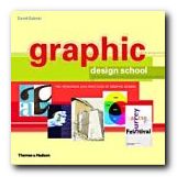
This is a structured self-teaching guide to the principles of graphic design which provides up-to-date information on computer aided design and the use of software applications. Graphic Design School itself is beautifully designed and printed – in full colour, with excellent design and layout fully illustrating the principles it espouses. First of all it deals with basic design principles – layout, space, colour, typography, and graphics.

Graphic Design SchoolEach topic is presented on one double-page spread in a stylish layout which shows off some of the best principles the book is designed to promote. The second part of the book looks in more detail at what effects are possible with detailed manipulation of typeface selection. It also looks at the secret ingredient which lies beneath most examples of good design – grids.

The last part looks at examples of professional design practice – magazines, corporate design, books, presentations, and of course web design.

It’s a visually exciting overview of what’s required in the increasingly complex and sophisticated word of graphic design. The illustrations are wonderfully fresh and well chosen. There wasn’t one I had seen in any publication before.

This will be suitable for people working in newspapers, magazines, books, packaging, advertising, web design, and digital media in general. It’s packed with practical guidance for students and practising designers.

It’s an introductory guide to a discipline with many facets. I imagine that readers will come across a topic that touches a creative nerve – layout, typography, animation, or image manipulation – then shoot off to follow up the subject elsewhere. That’s exactly as it should be – and there’s a glossary and bibliography to help too.

© Roy Johnson 2005

Graphic Design School   Buy the book at Amazon UK

Graphic Design School   Buy the book at Amazon US


David Dabner, Graphic Design School: The Principles and Practices of Graphic Design, London: Thames and Hudson, 2004, pp.192, ISBN: 0500285268


More on design
More on media
More on web design
More on typography


Filed Under: Graphic design, Typography, Web design Tagged With: Design, Graphic design, Graphic Design School, Web design

Graphic Design: a concise history

June 27, 2009 by Roy Johnson

popular potted history of 19th and 20th century graphics

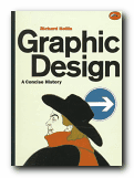
This is an introduction to graphic design in a series from Thames and Hudson which offers very good value for money. Richard Hollis takes as a starting point the idea that graphic design begins in the late nineteenth century with the development of the poster which combined word and image. If you are happy to ignore what went before, what he presents is thought provoking and a visual treat.

Graphic Design: a concise historyThe main feature of the book is that each point of his argument is illustrated by small marginal pictures which function like a lecture slide show (which I suspect is their origin). It’s not quite clear if he is following a chronological, a thematic, or a national structure – but this isn’t really important, as the main pleasure of his account is the exuberant variety of illustrative examples he discusses. These act as a fascinating introduction to the subject.

It’s rather like a very entertaining series of illustrated undergraduate lectures. He starts with the poster in the nineteenth century, then goes on to chart the development of word and image in brochures and magazines, advertising, television and electronic media, and the impact of technical innovations such as photography and the computer.

The strength of his approach is his internationalism and excellent choice of materials. He covers the main figures in Swiss, Dutch, French, American, and British design, and en route there are special features on movements such as Italian futurism, Soviet constructivism, and German expressionism.

His exposition and analysis of the various movements is handled with a light touch, which makes the subject accessible to non-specialists. The most successful parts of the book are his detailed tracing of artistic influences and his arguments for the relation between design and function.

He knows the names, the products, and the businesses which produced the commissions. Maybe the book should have been called ‘Twentieth Century Graphic Design’, but this is excellent value, and always in print.

© Roy Johnson 2000

Graphic Design   Buy the book at Amazon UK

Graphic Design   Buy the book at Amazon US


Richard Hollis, Graphic Design: a concise history, London: Thames and Hudson, 1994, pp.224, ISBN: 0500202702


More on design
More on media
More on web design


Filed Under: Graphic design Tagged With: Art, Design history, Graphic design, Modernism

Grid Systems

June 17, 2009 by Roy Johnson

the principles of organising type on page and screen

Well-designed pages – on screen or in print – are built on the structural basis of grid systems. That’s the hidden network or mesh underlying the page design which helps to keep all its parts in close and logical relationship. This book tells you how to understand and create grids. The approach is that of a tutorial – showing the good and not-so-good results of arranging a set of basic elements on a 3 x 3 grid.

Grid Systems There’s a lot of visual repetition, and the writing is rather stiff, but the upside is thoroughness. The same page is shown over and over again, with endless variations in layout, text position, alignment, and reading direction. These tutorial sections are punctuated by analyses of successful and famous examples of the use of grids.

The illustrations come from classics such as Jan Tschichold’s advertising brochure for his revolutionary study Die Neue Typographie, a Bauhaus catalogue designed by Herbert Bayer, and modern designs such as a an architectural web site and a Nike product catalogue.

The really interesting feature of this book is that the pages used to illustrate its ideas are prefaced by a semi-transparent skin which shows the grid on which the base design has been built. It’s a superb use of modern print technology.

This is a well-produced book which illustrates its point very clearly and is a very attractive production in its own right. It comes from the same series as Ellen Lupton’s Thinking with Type which we also reviewed recently.

© Roy Johnson 2005

Grid Systems   Buy the book at Amazon UK

Grid Systems   Buy the book at Amazon US


Kimberly Elam, Grid Systems, New York: Princeton Architectural Press, 2004, pp.130, ISBN: 1568984650


More on design
More on media
More on web design


Filed Under: Graphic design Tagged With: Graphic design, Grid systems, Information design

Handwritten

June 26, 2009 by Roy Johnson

modern hand-produced lettering and typefaces

In an age which presents designers with the software to create any number of computer-generated fonts, design historian Steven Heller considers the lasting strength of typefaces produced by hand. He has a good track record in writing on graphic design, and Handwritten is an excellent example of his work. He divides his chapters into different hand-scripted styles – sleight of hand, scrawl (letterforms that are raw, splotchy, and untidy) scratch (scraped, cut, and gouged fonts) script (type that is sinuous and ornate) stitch (letters that have been sewn, sutured, and embroidered) shadow (dimensional, voluminous, and monumental letterforms).

HandwrittenThese are followed by suggestive (forms that imply the metaphorical, surreal, and symbolic) and sarcastic (the ironic, comical, and satirical in lettering). This seems a reasonable enough approach: these categories represent the attitudes of the designers, though sometimes there is overlap between them.

It’s also a handsomely designed and beautifully produced book – packed with hundreds of coloured, well-presented examples. The sources are amazingly wide-ranging: theatre posters, record albumn covers, comics and graphic novels, book designs, posters, ephemera, and original art works.

The visual range is also good – hand scrawled letters, painted typefaces, words scratched into surfaces, stitched into fabrics, or written onto surfaces (including Stefan Sagmeister’s body – an illustration which turns up everywhere these days).

He features and obviously has a soft spot for the work of Robert Crumb, the American freehand artist who designed lots of, ahem, alternative comics in the 1960s and 1970s. Crumb drove his sex-obsessed vision to very amusing and visually interesting limits – though it has to be said that although the subject matter of his cartoons is very radical, the essence of his visual style is essentially nostalgic. He gets its striking effects from linking psychologically modern subject matter with a quaint folksy visual idiom. This is what Heller categorises as ironic lettering.

There’s a fashion at the moment for adding hand-crafted type to digitally photo-realistic graphics, so as to play one off against the other. These are well represented here. However, I was surprised not to see more examples of freehand design translated into pixellated typography, but the book does end with examples of digital comic books which suggest that more is to come.

Having just taught on a course where students have to learn the discipline of writing descriptive picture captions, I was impressed by the manner in which his are consistently both succinct and imaginative. Each section of the book is prefaced by an essay, and the origins of the examples are meticulously sourced. Artist, designer, photographer, and client are all named on every example.

His explanation is all the more vigorous for being conducted across continents. There is nothing parochial about this compilation. Examples range from the UK and USA, to Mexico, the USSR, France, and Germany. The selections are witty, bitter, satirical, inventive, and sometimes quite violent.

If you are at all interested in typography, graphic design, or even print production values, this is well worth seeing. Serious students and professionals will want to own it.

© Roy Johnson 2004

Handwritten   Buy the book at Amazon UK

Handwritten   Buy the book at Amazon US


Stephen Heller and Mirko Ilic, Handwritten: expressive lettering in the digital age, London: Thames and Hudson, 2004, pp.192, ISBN: 0500511713


More on typography
More on design
More on media
More on web design

Filed Under: Graphic design, Typography Tagged With: Calligraphy, Graphic design, Handwritten, Typography

Left to Right

June 13, 2009 by Roy Johnson

the cultural shift from words to pictures

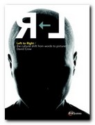
This is a dream production in terms of graphic design – a lavishly illustrated and beautifully produced book which cuts no corners in delivering a luxury product. But it also has a serious argument explored in the text. The thesis is that the modern world has witnessed a shift away from the written word towards the visual image as a form of communication. In other words a shift from left to right of the cerebral cortex in our way of thinking.

graphic designThe book takes a historical survey from the early years of the last century to the present to prove the point, and the theoretical claims are supported by quotes from cultural theorists such as Susan Sontag, Roland Barthes, and Marshall McLuhan. It’s a very lavish production, with thick matte paper; huge page margins; full colour; acres of blank space; colour-coded chapter dividers; and well-selected graphics given all the breathing space they need.

However, I’m not sure that David Crow’s central argument is proven. We communicate a great deal these days with logos, symbols, and icons it’s true, but compared with the daily avalanche of words, the proportion is trivial.

He’s arguing that visual culture is replacing literary culture, but the examples he cites are of magazines which have merely increased the percentage of graphics they use. Commercial companies have to make their advertising act quickly – hence the use of pictures rather than words – but that is not the same as graphics replacing language as a cultural influence.

Lots of bold theoretical claims are made, in a way which somehow don’t need to be made. The examples shown are simply new and interesting visual images: they are not displacing words as an influence or introducing new cultural paradigms: they are simply fresh visual inventions.

The second part of the book deals with the history and development of writing systems – though his source for this is the rather self-confessedly lightweight Story of Writing, rather than the far more scholarly Henri-Jean Martin’s The History and Power of Writing or Walter Ong’s Orality and Literacy. This leads into an encomium on the work of Otto Neurath, who proposed a ‘language’ of symbols, then the work of Charles K. Bliss doing a similar kind of thing.

Next he moves on to typographic experimentation on 1970s and 1980s UK. There are some interesting details on the way new effects were created technically, and we’re introduced to graphically innovative designers of the digital age such as Neville Brody, Peter Saville, and Malcolm Garrett. All the left-cortex right-cortex nonsense is left behind, and the study really comes to life. I would be happy to read a book-length study of this period alone if he chose to write one.

The latter part of the book is a celebration of digital possibilities – for as he rightly claims, the computer is

at once a typewriter, a retrieval device, a page layout engine, a photo retouching tool, an edit suite, a recording studio, a television and a radio.

The same is increasingly true of the mobile phone, with which he concludes. I was quite relieved to leave all the left-brain right-brain and language/visuals dichotomy argument behind and concentrate on graphic design and digital technology, which is where his heart obviously lies – and where he would be best employed concentrating his attention in future publications of this quality.

© Roy Johnson 2006

Left to Right   Buy the book at Amazon UK

Left to Right   Buy the book at Amazon US


David Crow, Left to Right: the cultural shift from words to pictures, Lausanne: AVA Publishing SA, 2006, pp.192, ISBN: 2940373361


More on design
More on media
More on web design


Filed Under: Graphic design Tagged With: Design, Design theory, Graphic design, Theory

Los Logos

July 2, 2009 by Roy Johnson

international  logos, trademarks, and typography

Los Logos is arranged in four main sections: Pictorial Logos, Lettering, Typograms and Combinations. As well as hundreds of pages of beautifully laid out images, it also contains an interesting and informative introduction about the evolution of the logo. All the materials are presented in both English and German. It’s a collection of around 3500 logos from a wide range of contemporary designers including the likes of Buro-destruct, DED associates, Eboy, Rinzen and Woodtli. In terms of colour it’s interesting to note that the predominant choices fall into two groups. Pink, lime green, and peppermint blue crop up again and again for a twenty first-century hippy look. Orange, grey, and black do the same for the post-modern techno look.

Los LogosThere are lots and lots of company logos – though surprisingly few that I recognised. For me, the best part of the book was the section on typography as a logo design element. There are some very attractive typefaces one would like to see in more detail. For instance, there’s a very inventive font (reminiscent of Neville Brody’s work) illustrated simply by the slogan ‘mexico 686’ which has been sprayed on a brick wall.

It’s a very handsome publication, beautifully produced on good quality paper and top class printing. If there’s a weakness, it’s that we don’t get to see the logos in any context. It would be useful to see the products to which some of these logos were attached, or the materials on which they were printed.

This is the sort of compilation which provides a rich source of visual stimulation for designers, and it’s strongest point is the amazingly wide range of examples shown. There are attributions for all designs at the back of the book, but in keeping with the publisher’s persistent habit of information minimalism, it’s not easy to track them down.

© Roy Johnson 2004

los logos   Buy the book at Amazon UK

los logos   Buy the book at Amazon US


Los Logos, Berlin: Die Gestalten Verlag, 2004, pp.416, ISBN: 3931126927


More on typography
More on design
More on media
More on web design

Filed Under: Graphic design, Typography Tagged With: Graphic design, Icons, Logos, Logotypes, Los Logos, Typography

Making Digital Type Look Good

June 19, 2009 by Roy Johnson

illustrated guide to new digital typography techniques

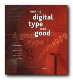
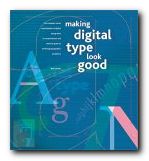
This is a stunningly attractive book. It jumped off the shelf first time I saw it, and after reading it, I’m more in love than ever. Part One offers a history of digital typography and shows how it works. Bob Gordon discusses the features that go into the design of type – the anatomy, rendering, technology, and fine tuning. This is a quick history lesson and a valuable tutorial in basic typography. He gets through the basics quickly, then concentrates on type in the digital age – how it is rendered on screen, in print, and even how it is created, down to pixel level.

Making Digital Type Look GoodThis part also explains those terms you have seen mentioned but never quite understood – such as bitmap, antialiasing, and rasterization. He clarifies all the complexities of font technology in a very straightforward manner – showing how tracking, kerning, and hyphenation can be used to good effect.

What makes this book such a visual treat is that every double-page spread is a work of exquisite design in its own right. The pages are designed on a consistent grid; they are deeply ‘layered’ and colour-coded by subject; the colouring is elegantly restrained; and every detail is illustrated with beautifully-chosen examples.

Part Two shows a a range of classic and contemporary font designs. These range from Bembo and Bodoni to Rotis and ITC Stone. Each font is described, illustrated, and shown with hundreds of examples of styles and setting values. There are also tips on how to set each font to best advantage, using tracking and kerning.

Making Digital Type Look GoodPart Three looks at display type – both on the printed page and the computer screen. He discusses customised font design – making your own font sets using software such as Fontographer and Pyrus. There is a thorough round-up of how the latest font technology is being used on the Web. This involves font-embedding, which is now much more easily achieved than it used to be. Then he concludes with a review of the most innovative font foundries and contemporary designers – such as Neville Brody, Matthew Carter, Zuzana Licko, and Adrian Frutiger.

The really successful feature of this book is that it will appeal to beginners and professionals alike. For those new to typography it offers a visual masterclass of design examples, and for the seasoned practitioner, it is a technical guide to the latest techniques. For anybody interested in good design, it is an example of book production raised to the level of an art form.

NB: The UK and the US editions have different jacket designs and different ISBNs.

© Roy Johnson 2001

Digital Type   Buy the book at Amazon UK

Digital Type   Buy the book at Amazon US


Bob Gordon, Making Digital Type Look Good, London: Thames and Hudson, 2001, pp.192, ISBN: 0500283133


More on typography
More on design
More on media
More on web design

Filed Under: Graphic design, Typography Tagged With: Digital type, Graphic design, Making Digital Type Look Good, Typography, Web design

New Systems in Design

July 2, 2009 by Roy Johnson

contemporary international web design

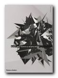
This portfolio presents a body of new systems in design work for the Web that is seeking to redefine the nature and scope of design practice. It is based on the productions of more than thirty-five international studios, and is presented in three categories.

New systems in DesignThe first – Code – shows how designers are using the computer as a tool to become creative programmers. The second – Generic – shows designers manipulating objects from the ordinary and everyday world to produce projects that are off-beat and refreshing. The third part – Disjunction – features work that aims to provoke, to question, and to advance a designer’s particular agenda, whether political, social, or even personal.

It is mainly composed of screenshots from avant guard web sites, samples of distressed modern typography, and reproductions from the pages of contemporary graphics display books. You may not be surprised to hear that this often means banal subjects, retro styling, and unreadable text.

There are also examples of architectural plans and sketches, maps, street signs, posters, fashion photography, book design and public signage, commercial advertising, and photography.

It represents what seems to me like a masochistic school of graphic design. In most cases, every effort seems to be made to alienate rather than to charm or please the viewer.

And yet just occasionally a gem shines through – such as the pictures of beautiful pleated garments created by the Japanese designer Issey Miyake, and the examples of public signage in Rotterdam.

It will probably appeal to young designers and those people who want something provocative for the coffee table.

© Roy Johnson 2001

New Systems in Design   Buy the book at Amazon UK

New Systems in Design   Buy the book at Amazon US


Christian Kusters and Emily King, Restart: New systems in graphic design, London: Thames & Hudson, 2001, pp. 176, ISBN: 0500282978


More on design
More on media
More on web design

Filed Under: Graphic design Tagged With: Graphic design, New Systems in Design, Web design

Open Here: instructional design

July 24, 2009 by Roy Johnson

illustrated and amusing instruction design graphics

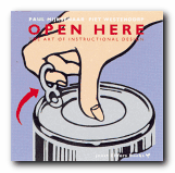
Have you ever tried to erect a wardrobe from the instructions in a self-assembly pack? Or followed the printed notes for programming your VCR? Open Here presents an entertaining collection of diagrams, graphics, and visual instructions for tackling the problems of everyday life which baffle us all. It includes such tricky examples as how to tie a bow tie whilst looking in a mirror, and what instructions to give people for the emergency evacuation of an aeroplane.

Open Here: instructional designMijksenaar and Westendorp achieve much of their effect from the vibrant colour reproductions of instructional design with which the book is packed. Every page is a visual treat. The examples they give are so wide-ranging that I often wished they had stayed longer on any one, providing a more extended analysis, rather than flitting so swiftly onto the next after a few comments.

There’s also an interesting historical overview which shows the presentation of instructions going from realistic photos or drawings of whole objects in the nineteenth century, to more recent depictions which tend to focus on specific parts or functions.

However, applying the principles they espouse to the book itself reveals a weakness as far as the serious sector of their potential market is concerned. Some pictures have explanatory captions, whilst others do not; and on the whole, rather too much space is devoted to visuals and too little to their textual commentary, which for the most part is tantalisingly cryptic.

In addition, they don’t always make a clear distinction between the good and bad examples, and I was disappointed that they didn’t provide a bibliography, because the book is obviously based on a lot of research. They also make little distinction between simple diagrams produced for the lay user and those expanded technical illustrations of cross-sections through a car engine which are produced for engineers. But then, this variety adds to the book’s visual appeal. I was yearning for more analysis, but read it with a permanent smile on my face.

This is a lively and refreshing publication which will make anyone reading it intensely conscious of instructional design. The text suggests that their examples are drawn from an archive of materials which has been built up over thirty years, so I hope that their next publication provides a more extended analysis using similar examples, but without sacrificing any of the graphic zest which makes this book so attractive.

© Roy Johnson 2000

Open Here   Buy the book at Amazon UK
Open Here   Buy the book at Amazon US


Paul Mijksenaar and Piet Westendorp, Open Here: the art of instructional design, New York: Joost Elffers Books, 1999, pp.144, ISBN: 1556709625


More on web design
More on technology
More on digital media
More on study skills
More on information design


Filed Under: Graphic design Tagged With: Graphic design, Information design, instructional design, Open Here

  • « Previous Page
  • 1
  • 2
  • 3
  • 4
  • 5
  • 6
  • Next Page »

Reviews

  • Arts
  • Biography
  • Creative Writing
  • Design
  • e-Commerce
  • Journalism
  • Language
  • Lifestyle
  • Literature
  • Media
  • Publishing
  • Study skills
  • Technology
  • Theory
  • Typography
  • Web design
  • Writing Skills

Get in touch

info@mantex.co.uk

Content © Mantex 2016
  • About Us
  • Advertising
  • Clients
  • Contact
  • FAQ
  • Links
  • Services
  • Reviews
  • Sitemap
  • T & C’s
  • Testimonials
  • Privacy

Copyright © 2025 · Mantex

Copyright © 2025 · News Pro Theme on Genesis Framework · WordPress · Log in