Mantex

Tutorials, Study Guides & More

  • HOME
  • REVIEWS
  • TUTORIALS
  • HOW-TO
  • CONTACT
>> Home / Design / Individual designers

Individual designers

graphic, typographical, and product designers

graphic, typographical, and product designers

Paul Renner: the art of typography

July 16, 2009 by Roy Johnson

illustrated critical biography of modernist typographer

German typographer Paul Renner is best known as the designer of the typeface Futura, which stands as a landmark of modern graphic design. This title is the first study in any language of Renner’s typographic career. It details his life and work to reveal the breadth of his accomplishment and influence. Renner was a central figure in the German artistic movements of the 1920s and 1930s, becoming an early and prominent member of the Deutscher Werkbund while creating his first book designs for various Munich-based publishers. As the author of numerous texts such as Typografie als Kunst (Typography as Art) and Die Kunst der Typographie (The Art of Typography) he created a new set of guidelines for balanced book design.

Paul Renner: the art of typographyRenner taught with Jan Tschichold in the 1930s and was a key participant in the heated ideological and artistic debates of that time. Arrested and dismissed from his post by the Nazis, he eventually emerged as a voice of experience and reason in the postwar years. Throughout this tumultuous period he produced a body of work of the highest distinction.

Christopher Burke’s biography is a PhD thesis which has been transformed into an elegant commercial publication – designed and typeset by the author himself. It follows a chronological structure, tracing the relationship between the history of Germany and Renner’s theories and practice as an artist. He helped lead German print out of the conservative Gothic or Blackletter tradition into the use of modern fonts such as his own best-selling Futura. His life also parallels German cultural history in the twentieth century.

Burke is very good at revealing the political, economic, and social forces which influenced the development of the new aesthetic movements of the period. For instance, he details the post-inflation shortages of the 1920s which gave the Bauhaus its impetus to link art and technology to produce machine-made objects. (Renner participated actively in this movement, developing alongside people such as Mies van der Rohe and Walter Gropius.)

Another wonderfully revealing instance is his discussion of the Nazis’ 1941 ban on the use of gothic script. What was once part of national identity was suddenly denounced as a ‘Jewish abomination’ – when in fact the truth was that the Germans had occupied much of France, Netherlands, Belgium, Denmark, and Norway, and they needed to make their propaganda understandable to people in these countries.

Burke sometimes seems to bury Renner’s theoretical and aesthetic work under lots of historical data. I was amazed that he gives so little attention to Typografie als Kunst (1922). But fortunately he traces the development of Futura in great detail, complete with reproductions of preliminary sketches of the letter forms and their variants.

He discusses the interesting notion that this essentially modernist font actively suppressed the differences between lower and upper case in the pursuit of a purely ‘rational’ design. Yet a weighted stroke emerged as it developed – because it was quite clear that the purely geometric form looked ugly.

Sometimes the politics and typography are not so comfortably integrated. After forty pages of letter forms, we’re suddenly jerked back into the political crises of the time – though it has to be said that part of Burke’s argument is to rescue Renner from the taint of Nazism which might be attached to any survivors of the period who stayed within Germany. Renner maintained a humanitarian stance against the Nazis, which he expressed significantly in his Kulturbolschewismus?, for which he as arrested in 1933 and then went into a period of ‘internal exile’.

Renner was obviously a survivor. The book ends with his post-war contributions to a debate between typographic modernisers and conservatives, in which he characteristically took the middle ground. He even saw a relationship between book design and political ideology:

In Renner’s view, the taste for large volumes, which equated weight with prestige, betrayed a potential flaw in the German character: ‘the “fatal desire for greatness”, by which Hitler was also notoriously motivated

This is a very attractive book which will appeal to both typographists and cultural historians. It will also have a passing attraction for bibliophiles who will appreciate the sheer pleasure of a beautifully illustrated and carefully designed book printed on high quality paper. If this is the level of work done in the department of typography and graphic communication at Reading University, then Christopher Burke is a very good advert for it.

© Roy Johnson 2002

Paul Renner   Buy the book at Amazon UK

Paul Renner   Buy the book at Amazon US


Christopher Burke, Paul Renner: the art of typography, London: Hyphen Press, 1999, pp.223, ISBN: 1568981589


More on typography
More on design
More on media
More on web design


Filed Under: Individual designers, Typography Tagged With: Biography, Fonts, Graphic design, Paul Renner, Typography

Roger Fry a biography

July 25, 2009 by Roy Johnson

portrait of Bloomsbury’s art theorist by premier writer

This is one of the last books Virginia Woolf wrote, and it is a tribute from one artist to another, an account of Fry’s aesthetics, and one of her many excursions into biography. Actually, Roger Fry A Biography is almost a joint production, because much of the text is direct quotations from Fry’s own journals and his letters to friends. It starts with his family background of radical Quakers, a quite strict upbringing, and his interest in science and the natural world.

Roger Fry A Biography He was a studious youth who blossomed when he went to Cambridge and was elected to the semi-secret society of Apostles who were what would be called free-thinkers (and coincidentally formed the basis of what would later be the Bloomsbury Group). He was older than the other members of this group, and always held in high regard by them. Despite getting a first in science, he switched to the study of Art and travelled to Italy and France on a sort of autodidactic Grand Tour to bring himself into contact with the masters.

Apart from her obvious sympathy with his artistic ideas, Woolf’s approach is largely descriptive. There is little attempt at analysis of her material. And we have to put up with her reticence on personal matters to a a degree which is almost infuriating. As a young man Fry forms a relationship with a woman old enough to be his mother, who teaches him ‘the art of love’, and they remain friends to the end of life. Yet this relationship is covered in less than a paragraph, and the woman isn’t even named.

Ever after Cambridge, his problem was how to earn a living from art, and even when he got married to fellow art-lover Helen Coombe, he was still living off an income from his father. But he found work as a lecturer, wrote art criticism, got nowhere as a painter, and was eventually employed by Pierpont Morgan to buy pictures for the Metropolitan Museum of Art.

Woolf makes a great deal of his organising the 1910 Post-Impressionist exhibition which caused such a rumpus (and which she claimed changed human nature). She sees this as a turning point in Fry’s life, and yet the strange thing is that at the very point that he joins the Bloomsbury Group (and where she has first-hand knowledge of his relationships with its members) she remains annoyingly coy about his personal life.

You would not know from her account that he had an affair with her sister Vanessa Bell. His life as a human being is replaced by the artistic debates which raged about Post-Impressionism, Fry’s own artistic theories, and the foundation of the Omega workshops.

Lots of well-known figures flit across the pages – George Bernard Shaw, Elgar, Lytton Strachey, André Gide – but we are as remote from his personal life as ever. Even his late life affair with Helen Anrep is mentioned almost parenthetically – though he was to live with her for the rest of his life (whilst his wife died slowly from a brain disease in a Retreat at York).

You can see why Woolf found his critical theory interesting. He was searching for a synthesis which would embrace visual art and literature, and he was modest enough to admit that his aesthetic opinions were subjective and limited:

But agreeing that aesthetic apprehension is a pre-eminently spiritual function does not imply for me any connection with morals. In the first place the contemplation of Truth is` likewise a spiritual function but is I judge entirely a-moral. Indeed I should be inclined to deny to morals (proper) any spiritual quality—they are rather the mechanism of civil life—the rules by which life in groups can be rendered tolerable and are therefore only concerned directly with behaviours.

She writes very appreciatively of his book on Cezanne, his life in London and St Remy de Provence, and his search for an all-embracing critical theory. All his life he had sought official recognition but it was denied him time and time again. Finally, in 1933 he was appointed Slade Professor of Art at Cambridge, but a year later he died.

© Roy Johnson 2005

Roger Fry biography Buy the book at Amazon UK

Roger Fry biography Buy the book at Amazon US


Virginia Woolf, Roger Fry: A Biography, London: Vintage, 2003, pp.314 ISBN: 0099442523


More on Virginia Woolf
Virginia Woolf – web links
Virginia Woolf – greatest works
Virginia Woolf – criticism
More on the Bloomsbury Group


Filed Under: Art, Biography, Bloomsbury Group, Individual designers, Virginia Woolf Tagged With: Art, Biography, Bloomsbury, Cultural history, Roger Fry, Theory, Virginia Woolf

The End of Print

June 8, 2009 by Roy Johnson

illustrated guide to  popular US avant-garde typographist

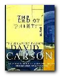
David Carson designs jarring and visually chaotic magazine spreads, posters, and print ads which have consistently challenged the boundaries of legibility and typography. His modest San Diego, California, studio has become the epicentre of a new graphic anti-aesthetic that has stirred ongoing debate among fellow designers such as Neville Brody, who observed that his work prophesies ‘the end of print’. This comment inspired the title of Carson’s new book, the first comprehensive collection of his decade-long output of graphic imagery.

The End of PrintIn past lives, Carson was a top-ranked competitive surfer and a high school sociology teacher. However, during a two-week workshop on graphic arts he discovered his calling. He landed his first major design assignment as art director of Transworld Skateboarding in 1983, and he later moved on to Surf magazine. In 1990, Carson headed the much-praised Beach Culture.

This is where his irreverent but often ingenious layouts consistently pitted editorial substance against graphic style. Carson’s creative vision came out on top – in its six-issue stint, Beach Culture won over 150 design awards. As the art director of Ray Gun, his unconventional look has been shamelessly emulated by a slew of similar start-up magazines.

Recently, Carson has shifted from spokesman for Left-Coast subculture to the corporate arena, taking on larger projects that include print ads for Nike and a television commercial for Citibank, as well as collaborations with musician David Byrne and photographer Albert Watson.

The End of Print was designed by Carson, and ironically, this proves to be the most disappointing aspect of the book. For those designers and readers who want to learn more about Carson’s graphic work and philosophy must do so on his terms. The text of the book is presented in the confusing and often incoherent typography typical of a Ray Gun layout. Those not willing to read the garbled introduction and inarticulate essays may surrender in frustration. However the book manages to stand on its own as a purely visual document, a fascinating chronicle of David Carson’s creative mind.

Like the collage artist Kurt Schwitters, who collected his materials from curbside rubbish, Carson finds much of his inspiration in the visual garbage of modern-day living. Handlettered signs, torn and layered poster kiosks and the eroded storefronts encountered in city streets serve as backdrops which Carson equates into the digital realm. Many of these found objects and photographs are reproduced in the book and they offer insight into Carson’s design approach.

One page reproduces a Carson ad selling a Beach Culture T-shirt sight unseen, with the premise that “if you like the look of the magazine, you probably would like the shirt.” Likewise, if you like the design of David Carson, you probably will like this book.

© Philip Krayna 2000

David Carson   Buy the book at Amazon UK

David Carson   Buy the book at Amazon US


Lewis Blackwell and David Carson, The End of Print: The Graphic Design Of David Carson, Chronicle Books, 1995, pp.160, ISBN: 0811830241


More on typography
More on design
More on media
More on web design

Filed Under: Individual designers, Typography Tagged With: David Carson, Graphic design, Media, The End of Print, Typography

The Graphic Language of Neville Brody

May 31, 2009 by Roy Johnson

best-selling illustrated  guide to popular typographist

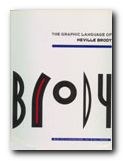
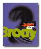
Neville Brody is a now-famous UK graphic designer who shot to prominence in the 1970s. He became artistic director of The Face – a youth and fashion magazine which he revamped – and in doing so set the pace for magazine cover design which persists to this day. Many UK magazines are still designed on the principles he established – of a bold, typographically interesting title at the top of the page (Maxim, Loaded, Mojo,) surmounting a single photographic portrait. In fact he is part graphic designer and part typographer.

The Graphic Language of Neville BrodyAdvertising and logos throughout the world sport his typefaces and their variants. Only the other day I noticed an ad for shoes on the back of a bus which was composed entirely of one of his fonts. He comes up with designs which draw their inspiration from constructivist, modernist, and expressionist designs of the inter-war years, but he gives them a contemporary twist. These are two very stylish publications celebrating his achievement – and very attractive publications in their own right. Even if you are put off by the fact that Brody applies his undoubted talents to the ephemeral products of the worlds of pop and fashion, it’s impossible to escape his harmonious sense of form and crisp sense of design on every page.

The Graphic Language of Neville BrodyThere are pop adverts, albumn and magazine covers, corporate logos and design, fashion magazine plates, book dust jackets, letterheads, and even humble business cards amongst the designs illustrated here. The accompanying text by Jon Wozencroft is enthusiastic without being sycophantic, and there is a good scholarly apparatus which gives full details of sources. However, the principal value of these two volumes is that they are beautifully designed books, full of good page layouts, vivid illustrations, and well-chosen typography. If they are out of print by the time you read this, make the effort to track them down. You will not regret it.

© Roy Johnson 2002


Volume 1

Jon Wozencroft, The Graphic Language of Neville Brody, London: Thames and Hudson, 1988, pp.160, ISBN: 0500274967

The Graphic Language of Neville Brody   Buy the book at Amazon UK
The Graphic Language of Neville Brody   Buy the book at Amazon US


Volume 2

Jon Wozencroft, The Graphic Language of Neville Brody 2, London: Thames and Hudson, 1994, pp.176, ISBN: 0500277702

The Graphic Language of Neville Brody   Buy the book at Amazon UK
The Graphic Language of Neville Brody   Buy the book at Amazon US


More on typography
More on design
More on media
More on web design

Filed Under: Graphic design, Individual designers, Typography Tagged With: Fonts, Graphic design, Neville Brody, Typography

The New Typography

July 20, 2009 by Roy Johnson

classic design manifesto of the Modernist movement

Jan Tschichold [pronounced ‘Chick-old’] was a typographist and graphic designer whose life and work straddled two eras. He was born in Leipzig in 1902, and moved to Berlin to be part of the modernist (and left wing) artistic movement which centred round the Bauhaus in the 1920s. There he met and worked with all the important figures of the Modernist movement – Laszlo Moholy-Nagy, El Lissitzky, Kurt Schwitters – whose work in graphic design is used profusely throughout this book. In 1947 he emigrated to the UK and amongst other things designed the re-launch of the Penguin paperback series that became so successful.

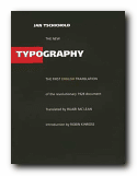
The New TypographyDie Neue Typografie was first published in Berlin when Tschichold was only twenty-six years old, yet it represented – as Robin Kinross explains in an elegant and scholarly introduction – “the manifestation in the sphere of printed communication of the modern movement in art, in design … which developed in Central Europe between the two world wars.”

This is the first publication of an English language version. It has been reproduced in a physical form as closely as possible to the original – a square shape, black cover, glossy pages, sans-serif font, and greyscale illustrations with occasional red titles. Very futurist.

Tschichold looks at typography in a historical context, then explores the developments in twentieth century art and the rise of modernism. The principles of the new typography are then explained as a revolutionary movement towards clarity and readability; a rejection of superfluous decoration; and an insistence on the primacy of functionality in design.

tsch-01There are chapters on the use of photographs; the standardisation of paper sizes [the origin of the DIN A4 we all use today] lots of carefully analysed examples of business stationery, and even film posters which evoke the visual ethos of the inter-war years. All this is illustrated by some crisp and still attractive reproductions of everyday graphics – letterheads, postcards, catalogues, and posters – in the red, black and white colour-scheme characteristic of the period.

Tschichold writes in the vigorous and ‘committed’ manner common to left-wing prose of the time – full of exhortations and generalisations, mainly focussed on the heroes of the New Age:

The engineer shapes our age. Distinguishing marks of his work: economy, precision, use of pure constructional forms that correspond to the functions of the object. Nothing could be more characteristic of our age than these witnesses to the inventive genius of the engineer, whether one-off items such as: airfield, department store, underground railway; or mass-produced objects like: typewriter, electric light-bulb, motor cycle.

Tschichold is also part-responsible for the Modernist ditching of capital letters in favour of all lower-case. Typographic novelty was perhaps sought more vigorously in Germany, because of their continued use of Blackletter or Fraktur (even into the post 1945 period).

The ornate yet corseted ugliness of European typography at the beginning of the twentieth century needed vigorous cleansing and exercise, and functionalist modernism appeared to be the goad and caustic required.

This edition contains not only examples of Tschichold’s revisions to the original text and a multi-language bibliography, but an excellent introduction by the translator Robin Kinross which puts the book in its historical perspective. This is a historic document, a manifesto, a key theoretical document of Central European modernism, and an important reprint. It’s a must-have for anyone with a serious interest in typography or design.

© Roy Johnson 2002

The New Typography   Buy the book at Amazon UK

The New Typography   Buy the book at Amazon US


Jan Tschichold, The New Typography: A Handbook for Modern Designers, Berkeley: University of California Press, 1998, pp.236, ISBN: 0520071476


More on typography
More on design
More on digital media


Filed Under: Design history, Individual designers, Typography Tagged With: Die Neue Typografie, Graphic design, Jan Tschichold, Modernism, The New Typography, Typography

The Struggle for Utopia

July 5, 2009 by Roy Johnson

 Rodchenko,  Lissitzky, Moholy-Nagy 1917-1946

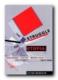
This is a series of essays tracing the development of three ground-breaking artists who deliberately harnessed their design skills during the highpoint of modernism to the service of revolutionary social change. The first chapter of The Struggle for Utopia offers an analysis of Alexander Rodchenko‘s designs for public information kiosks, comparing them with El Lissitzky‘s for new forms of paintings and books. This points to the essentially conservative ideology underlying some of Rodchenko’s work, in distinction to El Lissitzky’s attempts to break into new ground. The next deals with the work and theories of the German constructivists – Moholy-Nagy and Lissitzky who had moved to Berlin from the Soviet Union.

The Struggle for UtopiaThere were lots of theoretical wranglings amongst the artists and many bold claims made for the social and even revolutionary meanings in their works. Nevertheless, a simple connection between artist’s belief or intention and its manifestation on canvas or print remains as illusive as ever it will be. And if these abstract paintings dropped out of the sky unsigned, their meanings would be even more intractable.

This is followed by a chapter on Rodchenko’s work between 1922 and1927 when he gave all his creative energy to the cause of ‘production art’ – the design of socially useful objects such as furniture, books, magazines, exhibitions, and advertising posters. His furniture was never put into production [through no fault of his own] but his graphic design was a big success, was hugely influential, and is still fresh as paint today.

Next comes a comparison of the pioneering work in photography done by Rodchenko and Moholy-Nagy in the 1920s. Then Margolin tackles the difficult task of trying to find positive things to say about the work Rodchenko and Lissitzky produced as propagandists during the black years of the Stalin period. He does his best, but it’s difficult to take seriously the pictures of smiling ethnic minorites and the construction of the White Sea Canal when we now know the brutal truth of what was going on.

Rodchenko amazingly survived until 1956, though he produced nothing more worthy of note. Moholy-Nagy moved to Chicago where he influenced a whole generation of product desgners in his new Bauhaus Institute of Design.

This is a scholarly work with a full apparatus of citations, references and footnotes. It’s also beautifully designed, illustrated, and printed – as befits the subject matter. My only carp is that I wish a list of further reading had been extracted from the dense thicket of footnotes which cluster at the bottom of almost every page of the book. I want to read more: make it easy for me to follow up.

© Roy Johnson 2000

The Struggle for Utopia   Buy the book at Amazon UK

The Struggle for Utopia   Buy the book at Amazon US


Victor Margolin, The Struggle for Utopia: Rodchenko, Lissitzky, Moholy-Nagy 1917—1946, Chicago: University of Chicago Press, 1997, pp.259, ISBN: 0226505162


More on design
More on media
More on web design

Filed Under: Design history, Graphic design, Individual designers, Product design Tagged With: Constructivism, Design theory, El Lissitzsky, Graphic design, Moholy-Nagy, Rodchenko, The Struggle for Utopia, Theory

Tricia Guild Pattern

June 26, 2009 by Roy Johnson

interior design and furnishing with style and colour

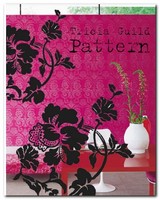
Tricia Guild is an interior designer and the brand name behind a successful company which features a vivid array of fabrics and furnishings – all of which feature striking colours, bold pattern, and luxurious textures. To live with this style you have to be confident enough to choose wallpapers with huge floral designs, curtains which are multi-coloured and decorated with magnificent swags, and be prepared to upholster your three piece suites with fabrics which grab you by the lapels. You need to put turquoise silk next to hot red damask, and if you want to achieve some of the effects illustrated here your house needs to be spotlessly clean and full of marble.

Tricia Guild PatternOrnate gold mirrors, and fresh-cut flowers which offset the decor in every room would be a help too. She is inspired by fabrics, techniques, motifs and designs from all over the world and from every period of history – brocades and damasks from the Far East; the rich history of botanical illustration and flower painting; checks, plaids and stripes from northern Europe; vibrant ethnic prints from India and Central America; painterly designs from Chinese and European porcelain; the bold abstracts and geometric patterns of contemporary painters.

Not that it’s all entirely in-your-face colour and bold pattern. She also has some subtle and restrained examples of ticking used to create a cool, contemporary atmosphere. But those are the exception. Most of the book is filled with hot, passionate colours, and rich textures emphasised by extreme close-up photographs. There’s a whole chapter on the use of flowers in fabric patterns – tulips, poppies, roses, and chrysanthemums.

I feel a bit sorry for the people who supply the text for these books. They are competing for the reader’s attention against overwhelming odds. The visuals drown out everything. And yet Elspeth Thompson has some interesting things to say about the nature of pattern and she offers thoughtful analyses of the interiors illustrated in the examples shown.

Many of the pages are like Howard Hodgkin paintings. It’s difficult not to be seduced by the visual texture of it all. My recipe for these interior design style books is to look at the overall effect, then choose one element on each page which you could incorporate into your own home. It could be the colour scheme, the positioning of furniture, the lighting, or (in this case) the use of patterned fabrics to breathe life into a room.

The book itself is a bibliographic reflection of this torrid style. It’s printed on thick paper, with occasional translucent inserts, beautifully photographed and illustrated – and has a cover jacket that’s like flock wallpaper from an Indian restaurant.

© Roy Johnson 2006

Tricia Guild   Buy the book at Amazon UK

Tricia Guild   Buy the book at Amazon US


Tricia Guild and Elspeth Thompson, Pattern, London: Quadrille, 2006, pp.208, ISBN: 1844003264


More on design
More on media
More on web design


Filed Under: Individual designers, Lifestyle Tagged With: Decorative arts, Design, Interior design, Lifestyle, Tricia Guild: Pattern, Trisha Guild

  • « Previous Page
  • 1
  • 2

Reviews

  • Arts
  • Biography
  • Creative Writing
  • Design
  • e-Commerce
  • Journalism
  • Language
  • Lifestyle
  • Literature
  • Media
  • Publishing
  • Study skills
  • Technology
  • Theory
  • Typography
  • Web design
  • Writing Skills

Get in touch

info@mantex.co.uk

Content © Mantex 2016
  • About Us
  • Advertising
  • Clients
  • Contact
  • FAQ
  • Links
  • Services
  • Reviews
  • Sitemap
  • T & C’s
  • Testimonials
  • Privacy

Copyright © 2025 · Mantex

Copyright © 2025 · News Pro Theme on Genesis Framework · WordPress · Log in