Mantex

Tutorials, Study Guides & More

  • HOME
  • REVIEWS
  • TUTORIALS
  • HOW-TO
  • CONTACT
>> Home / Typography

Typography

type design, page layout, and font technology

type design, page layout, and font technology

Los Logos

July 2, 2009 by Roy Johnson

international  logos, trademarks, and typography

Los Logos is arranged in four main sections: Pictorial Logos, Lettering, Typograms and Combinations. As well as hundreds of pages of beautifully laid out images, it also contains an interesting and informative introduction about the evolution of the logo. All the materials are presented in both English and German. It’s a collection of around 3500 logos from a wide range of contemporary designers including the likes of Buro-destruct, DED associates, Eboy, Rinzen and Woodtli. In terms of colour it’s interesting to note that the predominant choices fall into two groups. Pink, lime green, and peppermint blue crop up again and again for a twenty first-century hippy look. Orange, grey, and black do the same for the post-modern techno look.

Los LogosThere are lots and lots of company logos – though surprisingly few that I recognised. For me, the best part of the book was the section on typography as a logo design element. There are some very attractive typefaces one would like to see in more detail. For instance, there’s a very inventive font (reminiscent of Neville Brody’s work) illustrated simply by the slogan ‘mexico 686’ which has been sprayed on a brick wall.

It’s a very handsome publication, beautifully produced on good quality paper and top class printing. If there’s a weakness, it’s that we don’t get to see the logos in any context. It would be useful to see the products to which some of these logos were attached, or the materials on which they were printed.

This is the sort of compilation which provides a rich source of visual stimulation for designers, and it’s strongest point is the amazingly wide range of examples shown. There are attributions for all designs at the back of the book, but in keeping with the publisher’s persistent habit of information minimalism, it’s not easy to track them down.

© Roy Johnson 2004

los logos   Buy the book at Amazon UK

los logos   Buy the book at Amazon US


Los Logos, Berlin: Die Gestalten Verlag, 2004, pp.416, ISBN: 3931126927


More on typography
More on design
More on media
More on web design

Filed Under: Graphic design, Typography Tagged With: Graphic design, Icons, Logos, Logotypes, Los Logos, Typography

Making Digital Type Look Good

June 19, 2009 by Roy Johnson

illustrated guide to new digital typography techniques

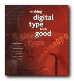
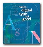
This is a stunningly attractive book. It jumped off the shelf first time I saw it, and after reading it, I’m more in love than ever. Part One offers a history of digital typography and shows how it works. Bob Gordon discusses the features that go into the design of type – the anatomy, rendering, technology, and fine tuning. This is a quick history lesson and a valuable tutorial in basic typography. He gets through the basics quickly, then concentrates on type in the digital age – how it is rendered on screen, in print, and even how it is created, down to pixel level.

Making Digital Type Look GoodThis part also explains those terms you have seen mentioned but never quite understood – such as bitmap, antialiasing, and rasterization. He clarifies all the complexities of font technology in a very straightforward manner – showing how tracking, kerning, and hyphenation can be used to good effect.

What makes this book such a visual treat is that every double-page spread is a work of exquisite design in its own right. The pages are designed on a consistent grid; they are deeply ‘layered’ and colour-coded by subject; the colouring is elegantly restrained; and every detail is illustrated with beautifully-chosen examples.

Part Two shows a a range of classic and contemporary font designs. These range from Bembo and Bodoni to Rotis and ITC Stone. Each font is described, illustrated, and shown with hundreds of examples of styles and setting values. There are also tips on how to set each font to best advantage, using tracking and kerning.

Making Digital Type Look GoodPart Three looks at display type – both on the printed page and the computer screen. He discusses customised font design – making your own font sets using software such as Fontographer and Pyrus. There is a thorough round-up of how the latest font technology is being used on the Web. This involves font-embedding, which is now much more easily achieved than it used to be. Then he concludes with a review of the most innovative font foundries and contemporary designers – such as Neville Brody, Matthew Carter, Zuzana Licko, and Adrian Frutiger.

The really successful feature of this book is that it will appeal to beginners and professionals alike. For those new to typography it offers a visual masterclass of design examples, and for the seasoned practitioner, it is a technical guide to the latest techniques. For anybody interested in good design, it is an example of book production raised to the level of an art form.

NB: The UK and the US editions have different jacket designs and different ISBNs.

© Roy Johnson 2001

Digital Type   Buy the book at Amazon UK

Digital Type   Buy the book at Amazon US


Bob Gordon, Making Digital Type Look Good, London: Thames and Hudson, 2001, pp.192, ISBN: 0500283133


More on typography
More on design
More on media
More on web design

Filed Under: Graphic design, Typography Tagged With: Digital type, Graphic design, Making Digital Type Look Good, Typography, Web design

Paul Rand

June 26, 2009 by Roy Johnson

illustrated study of influential graphic designer

Paul Rand (1914 -1996) was one of the most successful figures in corporate American graphic design. He is best known for his IBM logo, which helped to resurrect the company in the 1970s, and led to its dominant position in computer manufacture. His early success in New York was founded – quite apart from his natural talent as an illustrator – on his appreciation of European modernism. He absorbed its influences quickly and, combining them with his precocious technical skills, produced a distinctive ‘American’ style. His basic approach is founded on photo-montage, collage, and elements of surrealism. But it’s a style which manages to look permanently modern.

Paul RandHe seems to have been particularly strongly influenced – as were many others at that time – by Jan Tschichold’s classic study of the relationship between politics and design in Die Neue Typografie. By the 1940s and 1950s, his combination of simple, abstracted forms contrasted with handwritten text came to be the template for many US book jacket and LP albumn designers – such as Milton Glaser and David Stone Martin. He coined the phrase ‘less is more’ – perhaps a summary of modernism in graphic design. He worked seven days a week, did all his own technical work, and he even designed his own house.

This beautifully illustrated biography traces his early work, which still looks fresh today; it covers the book jackets which set design pace in the 1950s and 1960s; and then the centre of the study is taken up with the development of the IBM corporate image and its famous Venetian blind logo. The conclusion is an illustrated gallery tour of his best commercial contracts – Westinghouse, United Parcels Service, ABC, and even re-designs such as Ford for which he was not actually awarded the contract.

Steven Heller, his biographer, is art director of The New York Times and the author of several influential books on graphic design. His account is even-handed on the whole, though it becomes a little whimsical in places – such as when describing Rand’s illustrations for children’s books written by his wife Anne. However, this book is exquisitely designed and elegantly printed from first page to last – which is why it is already a best-seller. The new paperback edition should help to bring the vivacity of Rand’s work to a wider audience.

© Roy Johnson 2002

Paul Rand   Buy the book at Amazon UK

Paul Rand   Buy the book at Amazon US


Steven Heller, Paul Rand, London: Phaidon, 2000, pp.255, ISBN: 0714839949


More on design
More on media
More on web design

More on typography


Filed Under: Individual designers, Typography Tagged With: Design, Graphic design, Paul Rand, Typography

Paul Renner: the art of typography

July 16, 2009 by Roy Johnson

illustrated critical biography of modernist typographer

German typographer Paul Renner is best known as the designer of the typeface Futura, which stands as a landmark of modern graphic design. This title is the first study in any language of Renner’s typographic career. It details his life and work to reveal the breadth of his accomplishment and influence. Renner was a central figure in the German artistic movements of the 1920s and 1930s, becoming an early and prominent member of the Deutscher Werkbund while creating his first book designs for various Munich-based publishers. As the author of numerous texts such as Typografie als Kunst (Typography as Art) and Die Kunst der Typographie (The Art of Typography) he created a new set of guidelines for balanced book design.

Paul Renner: the art of typographyRenner taught with Jan Tschichold in the 1930s and was a key participant in the heated ideological and artistic debates of that time. Arrested and dismissed from his post by the Nazis, he eventually emerged as a voice of experience and reason in the postwar years. Throughout this tumultuous period he produced a body of work of the highest distinction.

Christopher Burke’s biography is a PhD thesis which has been transformed into an elegant commercial publication – designed and typeset by the author himself. It follows a chronological structure, tracing the relationship between the history of Germany and Renner’s theories and practice as an artist. He helped lead German print out of the conservative Gothic or Blackletter tradition into the use of modern fonts such as his own best-selling Futura. His life also parallels German cultural history in the twentieth century.

Burke is very good at revealing the political, economic, and social forces which influenced the development of the new aesthetic movements of the period. For instance, he details the post-inflation shortages of the 1920s which gave the Bauhaus its impetus to link art and technology to produce machine-made objects. (Renner participated actively in this movement, developing alongside people such as Mies van der Rohe and Walter Gropius.)

Another wonderfully revealing instance is his discussion of the Nazis’ 1941 ban on the use of gothic script. What was once part of national identity was suddenly denounced as a ‘Jewish abomination’ – when in fact the truth was that the Germans had occupied much of France, Netherlands, Belgium, Denmark, and Norway, and they needed to make their propaganda understandable to people in these countries.

Burke sometimes seems to bury Renner’s theoretical and aesthetic work under lots of historical data. I was amazed that he gives so little attention to Typografie als Kunst (1922). But fortunately he traces the development of Futura in great detail, complete with reproductions of preliminary sketches of the letter forms and their variants.

He discusses the interesting notion that this essentially modernist font actively suppressed the differences between lower and upper case in the pursuit of a purely ‘rational’ design. Yet a weighted stroke emerged as it developed – because it was quite clear that the purely geometric form looked ugly.

Sometimes the politics and typography are not so comfortably integrated. After forty pages of letter forms, we’re suddenly jerked back into the political crises of the time – though it has to be said that part of Burke’s argument is to rescue Renner from the taint of Nazism which might be attached to any survivors of the period who stayed within Germany. Renner maintained a humanitarian stance against the Nazis, which he expressed significantly in his Kulturbolschewismus?, for which he as arrested in 1933 and then went into a period of ‘internal exile’.

Renner was obviously a survivor. The book ends with his post-war contributions to a debate between typographic modernisers and conservatives, in which he characteristically took the middle ground. He even saw a relationship between book design and political ideology:

In Renner’s view, the taste for large volumes, which equated weight with prestige, betrayed a potential flaw in the German character: ‘the “fatal desire for greatness”, by which Hitler was also notoriously motivated

This is a very attractive book which will appeal to both typographists and cultural historians. It will also have a passing attraction for bibliophiles who will appreciate the sheer pleasure of a beautifully illustrated and carefully designed book printed on high quality paper. If this is the level of work done in the department of typography and graphic communication at Reading University, then Christopher Burke is a very good advert for it.

© Roy Johnson 2002

Paul Renner   Buy the book at Amazon UK

Paul Renner   Buy the book at Amazon US


Christopher Burke, Paul Renner: the art of typography, London: Hyphen Press, 1999, pp.223, ISBN: 1568981589


More on typography
More on design
More on media
More on web design


Filed Under: Individual designers, Typography Tagged With: Biography, Fonts, Graphic design, Paul Renner, Typography

Penguin by Design

May 21, 2009 by Roy Johnson

a history of Penguin’s typography and graphic designs

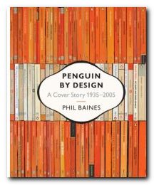
If you’re interested in typography, graphic design, bibliography, collecting books, or just cultural nostalgia, this book is an absolute treat. It’s a beautifully illustrated history of the graphic design used for the Penguin imprint book jackets from its creation in 1935 to the present. Penguins were first sold for sixpence (2.5p) which was the price of a packet of ten cigarettes. That’s cheap by today’s standards when ten fags cost £2.70 but a typical Penguin costs twice that. Right from the start, Penguins were marketed via the elegance and consistency of their cover designs, with their easily recognisable orange covers and their perky logo. Its founder Allen Lane employed some of the most gifted graphic designers and typographists of the day.

Penguin DesignSo it’s no accident that Penguin was (and still is) such a successful imprint. Cover designs changed subtly to keep up with modern fashion, and even the famous penguin logo itself has changed shape, size, and even posture during its seventy year lifespan. It also morphed into the puffin for children and the pelican for the non-fiction series, the best-seller of which my father once urged on to me as a birthday present. Metals in the Service of Man was my bedtime reading as a child – which might explain a lot.

In the 1930s there were lots of polemical titles – not unlike Gollancz’s Left Book Club – and there were also lots of special ventures which are well presented here – children’s books during the war, American titles shortly after it, and books on art in the lead up to the Festival of Britain.

Jan Tschichold helped to bring the cover designs into the post-war world. He worked on the covers for a couple of years, but his attention to small details and his tight, conservative designs established a convention via a house style manual Penguin Composition Rules, which was a precursor to his essays in The Form of the Book.

The book is elegantly designed, set in Adobe Sabon and Monotype Gill Sans Display Bold, and laid out in what are largely double-page spreads. In addition to fiction, Penguin titles covered poetry, science, current affairs, architecture, the history of art, and even music scores – though these were dropped because they didn’t make enough money. The same was true of Pevsner’s famous Buildings of England, despite the fact that he waived his royalty payments.

Anyone who has been closely associated with the world of books during the last fifty years will feel that reading this book is like watching a moving picture of their own intellectual history. What’s more, it is difficult to imagine anybody not being overcome with an almost overwhelming desire to start their own collection – something quite easy with second-hand copies available for pennies in charity shops and online bookstores. And if you want to see an online gallery of cover designs, have a look at the collection Joe Kral has started in his picture collection at Flickr.

Phil Baines also traces the history progression of Penguin’s modern designers – Germano Facetti, Romek Marber, Alan Aldridge, and David Pelham, revealing en passant that all was not necessarily sweetness and light in the offices where design policies were made.

It is interesting to note that most of the designs look more attractive when viewed in groups – because this emphasises the unity of design, the form of the page, and the texture of patterns – such as the wallpapers and fabrics used in the poetry series.

There are some weak patches in the 1970s and 1980s, and I don’t think many of the current fiction cover designs will be remembered affectionately. But the downward trend has been reversed in two recent series: the reference books with their rounded corners, and the classics, which feature black covers and centred titles. In both cases there has been a return to two key elements of the classic Penguin: the horizontal division of the cover page into three distinct bands; and the reintroduction of the plucky little penguin itself – which had almost been sent to extinction in the previous decade.

© Roy Johnson 2006

Penguin by Design   Buy the book at Amazon UK

Penguin by Design   Buy the book at Amazon US


Phil Baines, Penguin by Design , London: Penguin, 2006, pp.256, ISBN: 0713998393


More on typography
More on technology
More on digital media


Filed Under: Graphic design, Typography Tagged With: Bibliography, Book jackets, Graphic design, Penguin Books, Penguin by Design, Typography

Stop Stealing Sheep

July 19, 2009 by Roy Johnson

best-seller on the basics of typography and page design

Don’t worry about the quirky title. Just pay attention to what’s on offer. This is a popular beginner’s guide to the appreciation of type which teaches by good example. Every page is a mini-tutorial in good design – an elegant balance of body text, pull quotes, graphics, and a interesting variety of fonts, weights, and sizes. Spiekermann and Ginger start with the issue of appreciating and selecting typefaces for specific purposes. There are guidance notes on the provenance of the typefaces they discuss, and they take the line that context is all.

Stop Stealing SheepThat is, the value of a font can only be seen when it is put into use, and is seen where it will be used – on the page or screen. A lot of their exposition is conducted via extended metaphors – families, music, driving, and human character – which sometimes seem rather strained. But they do cover all the basics of typography: selection of font type, size, and weight; word and line spacing; and page design.

Make sure you get the second edition. It’s a big improvement on the first. Lots of colour has been added to the pages, and the topics they discuss now include the latest developments in font technology. They also explain how to choose type for the best effects on Web pages, email, and writing for the screen.

The emphasis is on visually exciting graphic examples, rather than a ponderous lecture on typography. That’s probably what has made this book such a best-seller. It’s an introduction which is entertaining and breathes enthusiasm for the subject of tasteful design. It’s also an elegant production in its own right.

© Roy Johnson 2002

stop stealing sheep Buy the book at Amazon UK

stop stealing sheep Buy the book at Amazon US


Erik Spiekermann & E.M. Ginger, Stop Stealing Sheep & find out how type works, Mountain View (CA) Adobe Press, 2nd edition 2002, pp.192, ISBN 0201703394


More on typography
More on technology
More on digital media


Filed Under: Typography Tagged With: Design, Fonts, Graphic design, Information design, Stop Stealing Sheep, Typography

The Complete Manual of Typography

June 18, 2009 by Roy Johnson

encyclopedia of type and typography

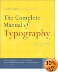
This is a very elegantly-produced book which sets out the basic principles of type design and page layout. It bids to stand as a classic alongside the reigning Bible of typography – Robert Bringhurst’s The Elements of Typographic Style, which always comes top of typography favourites lists. It includes the basic concepts and anatomy of good typography: how type came about, how to set type, and the difference between type and fonts.

The Complete Manual of Typography Then comes how to manage fonts – techniques for working with leading, kerning, and managing indentation and alignment. There are sections which deal with setting type in language-specific instances such as using foreign character sets, which specialists will find useful. There’s even a chapter on dealing with style sheets – something which really does bridge the gap between print and digital culture. What’s interesting about this book is that it’s not just a historical survey. It covers all aspects of type design and applications of them in print and screen. It’s packed with illustrative examples, and anybody who has the slightest interest in typography will find something of interest in its detailed exposition of the basics. It’s an ambitious book, because it seeks to deal with type from Gutenburg to digital fonts. And it does it very well. There’s an extensive glossary and a very good index. Only the bibliography was rather disappointing.

For those who are still interested in using type for print rather than on screen, Felici covers all the niceties of font weight, ligatures, letter-spacing, hyphenation, and wrapping text around graphics. There are plenty of examples of well presented typesetting, with detailed analyses showing the subtle differences between them. This is like a mastercourse in the finer points of typography. He also covers issues such as footnotes, endnotes, picture captions, and bibliographies.

feliciThere’s some amazing detail. I hadn’t appreciated before the difference between a standard and a punctuating m-dash. This stuff will appeal to typography buffs – and it’s all beautifully illustrated.

I also enjoyed a section on document structure, in which he shows you how to arrange headings and various levels of sub-headings. This section could be useful for those people [like me] currently grappling with the possibilities of cascading style sheets.

For a book which covers the historical tradition as well as digital innovations, this is a remarkable achievement. As Frank Romano says in his introduction:

At this point, most people who work with type have to catch up with both what is old and what is new in typography. Fortunately, you have the solution in your hands: a concise, beautiful book that pulls together everything you need to produce great typography.

© Roy Johnson 2003

Buy the book at Amazon UK

Buy the book at Amazon US


James Felici, The Complete Manual of Typography, Berkeley (CA): Peachpit Press, 2003, pp.360, ISBN 0321127307


More on typography
More on technology
More on digital media


Filed Under: Typography Tagged With: Fonts, Graphic design, The Complete Manual of Typography, Typefaces, Typography

The Elements of Typographic Style

May 31, 2009 by Roy Johnson

Best-selling classic manual – the typographist’s Bible

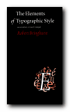
Subscribers to Internet lists dealing with fonts and typography often ask “Which books would you recommend as a guide to good design principles?”. And no matter how many responses emerge, one book comes out on top every time – Robert Bringhurst’s The Elements of Typographic Style. It’s a book packed with design wisdom. Bringhurst has produced what is essentially a first principles of typography – a grammar of good taste based on the relationship between form and content of printed matter.

The Elements of Typographic StyleIt’s also a very beautiful book in its own right. You will not fail to discover visual pleasures on almost every page, and the text is illustrated with such an astonishing variety of beautiful fonts, that this almost doubles as a catalogue of type designs. It is obvious from almost every word that he’s thought profoundly about the fundamental issues of printed words on the page, and he often has insights to offer on topics most of us take for granted. He can conjour poetry out of the smallest detail, and he offers a scholarly yet succinct etymology of almost every mark that can be made – from the humble hyphen to the nuances of serifs on Trajan Roman or a Carolingian Majuscule.

The well-made page is now what it was then: a window into history, language and the mind: a map of what is being said and a portrait of the voice that is silently speaking.

As you would expect, he traces the development of type from its origins in eleventh century China to the present, and he deals with such extremely subtle distinctions as the differences in quality of letter forms produced by pressing hot metal onto paper, by offset litho (laying the letter on top of the paper) or by the digital means of charged electrons on the screen. he doesn’t actually have much to say about computers and typography, and yet his brief comments summarise almost everything there is to say about digital type:

Good text faces for the screen are therefore as a rule faces with low contrast, a large torso, open counters, sturdy terminals, and slab serifs or no serifs at all. [And he might have added – ‘a large x-height’.]

He does seem to become a little fanciful when discussing the mathematics of page proportions, especially when maintaining an extended comparison with the musical scale, and he misses the chance to give historical examples of page design, rather than the mathematical tables which populate this part of the book. But it seems almost churlish to complain when everything is so beautifully presented.

He ends with two very useful chapters – one of which analyses commonly available fonts (“prowling the specimen books” as he calls it). Paragraph-length potted histories are followed by suggestions on how the font is best used. This is typical of the manner in which he very elegantly combines scholarship and a cultivated taste with the requirements of a practical guidance manual.

Bringhurst is also a novelist, and he brings a prose style of some distinction to the subject, ornamenting his text with the lyrical jargon of typography, and quite obviously relishing terms such at the pilcrow, the octothorpe, the virgule, guillemets and chevrons, and the solidus; as well as the romance of small caps, analphabetic symbols, the shape of pages, the order of footnote symbols, the ‘looser dressing’ and the ‘larger torso’ of a font.

The book ends with a fascinating tour of sorts and characters, revealing the subtle functions of the cedilla and the ogonek; the umlaut and the diaeresis; the ligatures aesc, and oethel; the prime, the macron, and the vinculum. He completes this tour de force with several more appendices: a glossary of typographic terms; a listing of type designers; another of typefoundries; a recapitulation of the main recommendations in the text; and a list of further reading.

This is a wonderful book which fully deserves its widespread reputation as a classic and the ultimate guide for laying out pages in print of on screen. Anyone who wishes to gain insights into the aesthetics and the finer details of good design should read this book. Anyone with a serious typographic intent should own it.

© Roy Johnson 2000

The Elements of Typographic Style   Buy the book at Amazon UK

The Elements of Typographic Style   Buy the book at Amazon US


Robert Bringhurst, The Elements of Typographic Style (2nd edn), Toronto: Hartley & Marks, 1996, pp.351, ISBN: 0881791326


More on typography
More on design
More on media
More on web design

Filed Under: Graphic design, Typography Tagged With: Fonts, Graphic design, Information design, Printing, Typographic style, Typography

The End of Print

June 8, 2009 by Roy Johnson

illustrated guide to  popular US avant-garde typographist

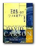
David Carson designs jarring and visually chaotic magazine spreads, posters, and print ads which have consistently challenged the boundaries of legibility and typography. His modest San Diego, California, studio has become the epicentre of a new graphic anti-aesthetic that has stirred ongoing debate among fellow designers such as Neville Brody, who observed that his work prophesies ‘the end of print’. This comment inspired the title of Carson’s new book, the first comprehensive collection of his decade-long output of graphic imagery.

The End of PrintIn past lives, Carson was a top-ranked competitive surfer and a high school sociology teacher. However, during a two-week workshop on graphic arts he discovered his calling. He landed his first major design assignment as art director of Transworld Skateboarding in 1983, and he later moved on to Surf magazine. In 1990, Carson headed the much-praised Beach Culture.

This is where his irreverent but often ingenious layouts consistently pitted editorial substance against graphic style. Carson’s creative vision came out on top – in its six-issue stint, Beach Culture won over 150 design awards. As the art director of Ray Gun, his unconventional look has been shamelessly emulated by a slew of similar start-up magazines.

Recently, Carson has shifted from spokesman for Left-Coast subculture to the corporate arena, taking on larger projects that include print ads for Nike and a television commercial for Citibank, as well as collaborations with musician David Byrne and photographer Albert Watson.

The End of Print was designed by Carson, and ironically, this proves to be the most disappointing aspect of the book. For those designers and readers who want to learn more about Carson’s graphic work and philosophy must do so on his terms. The text of the book is presented in the confusing and often incoherent typography typical of a Ray Gun layout. Those not willing to read the garbled introduction and inarticulate essays may surrender in frustration. However the book manages to stand on its own as a purely visual document, a fascinating chronicle of David Carson’s creative mind.

Like the collage artist Kurt Schwitters, who collected his materials from curbside rubbish, Carson finds much of his inspiration in the visual garbage of modern-day living. Handlettered signs, torn and layered poster kiosks and the eroded storefronts encountered in city streets serve as backdrops which Carson equates into the digital realm. Many of these found objects and photographs are reproduced in the book and they offer insight into Carson’s design approach.

One page reproduces a Carson ad selling a Beach Culture T-shirt sight unseen, with the premise that “if you like the look of the magazine, you probably would like the shirt.” Likewise, if you like the design of David Carson, you probably will like this book.

© Philip Krayna 2000

David Carson   Buy the book at Amazon UK

David Carson   Buy the book at Amazon US


Lewis Blackwell and David Carson, The End of Print: The Graphic Design Of David Carson, Chronicle Books, 1995, pp.160, ISBN: 0811830241


More on typography
More on design
More on media
More on web design


Filed Under: Individual designers, Typography Tagged With: David Carson, Graphic design, Media, The End of Print, Typography

The Form of the Book

July 20, 2009 by Roy Johnson

short essays on the finer points of book design

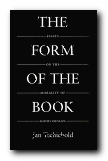
Jan Tschichold [pronounced ‘Chick-old’] is probably best known in the UK for his work in designing Penguin paperbacks in the late 1940s. He was a German refugee who had made his mark as a radical modernist in 1928 with the publication of Die Neue Typografie. The collection of short and elegantly written essays in The Form of the Book are however largely arguments in favour of traditional, hard-earned craftsmanship, artistic self-effacement, and typographical restraint. As Robert Bringhurst puts it with characteristic elegance in his introduction: ‘Like Stravinsky, after making his reputation as a rebel, [Tschichold] entered on a long and productive neo-classical phase.’

The Form of the BookWritten between 1937 and 1975, these essays discuss every element of the traditional printed book. Tschichold ranges from its shape and size, its cover and title page, via its typeface, margins, paragraphs and section headings, through to footnotes, its index, colophon, and even the blank pages before its final covers. This is the work of a master craftsman sharing a lifetime’s experience, and it’s a delight to read. The German tradition out of which these observations spring is betrayed by his habit of formulating arguments in the imperative mode as a series of abstract absolutes. He also sometimes poses his arguments as quite witty aphorisms:

Comfortable legibility is the absolute benchmark for all typography … Good typography can never be humorous … a truly beautiful book cannot be a novelty. It must settle for mere perfection instead.

It’s interesting that Tschichold, the author of the modernist New Typography, should take such a traditionalist line, with his concern for harmony, proportion, tact,balance, and good taste. This collection includes an essay on ‘The Importance of Tradition’ which is effectively a refutation of his own ideas written in 1928. He also has essay titles which are almost amusingly didactic: ‘Why the Beginnings of Paragraphs Must Be Indented’, and he has firm views on book design, page proportions, title pages, house rules, indentation, footnotes, punctuation marks, and even the colour of paper.

On the subject of the book page and its type area, there are some pages of quite mathematical minutiae, but this supports the overall impression one gains that the secret of typographical success – as with so much else – lies in the details. He loves the finer points of design and book production, and there are eloquent passages on the spacing of ellipses, the thickness of an em-dash, the positioning of illustrations, and – two of his pet hates – white paper and the design of book jackets.

For those with a serious interest in typography, this is a ‘must have’. It belongs alongside works such as Robert Bringhurst’s Elements of Typographic Style as a modern classic. Even if it’s out of print – order it, or keep looking. It’s worth the effort.

© Roy Johnson 2002

The Form of the Book   Buy the book at Amazon UK

The Form of the Book   Buy the book at Amazon US


Jan Tschichold, The Form of the Book: Essays on the Morality of Good Design, Vancouver, BC: Hartley & Marks, 1991, pp.180, ISBN: 0881791164


More on typography
More on design
More on media
More on web design

Filed Under: Graphic design, Typography Tagged With: Book design, Jan Tschichold, The Form of the Book, Typography

  • « Previous Page
  • 1
  • 2
  • 3
  • 4
  • Next Page »

Reviews

  • Arts
  • Biography
  • Creative Writing
  • Design
  • e-Commerce
  • Journalism
  • Language
  • Lifestyle
  • Literature
  • Media
  • Publishing
  • Study skills
  • Technology
  • Theory
  • Typography
  • Web design
  • Writing Skills

Get in touch

info@mantex.co.uk

Content © Mantex 2016
  • About Us
  • Advertising
  • Clients
  • Contact
  • FAQ
  • Links
  • Services
  • Reviews
  • Sitemap
  • T & C’s
  • Testimonials
  • Privacy

Copyright © 2025 · Mantex

Copyright © 2025 · News Pro Theme on Genesis Framework · WordPress · Log in