Mantex

Tutorials, Study Guides & More

  • HOME
  • REVIEWS
  • TUTORIALS
  • HOW-TO
  • CONTACT
>> Home / Web design

Web design

web design skills, usability, tools, techniques, and styling

web design skills, usability, tools, techniques, and styling

72 dpi

July 2, 2009 by Roy Johnson

showcase of the latest in web design techniques

This is a handsome collection of web site illustrations – with a difference. All the designers wish to challenge conventional web design principles and exploit the possibilities of the new medium to achieve dramatically innovative effects. 72 dpi is a book with superb graphics and production values, but you have to be prepared for some challenging visual concepts. The pages make few concessions to what Jakob Nielsen calls ‘usability’. Plus the authors are not very good at explaining what they’re up to. Details of navigation and who produced what are almost wilfully obscure. But it’s all there if you’re patient.
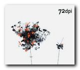
72 dpi What the designers have in common is seemingly a desire to get away from standard navigation devices and text-dominated explanations of content. Their home pages offer instead visual dramas which are more like modernist paintings. Black and dark grey are the most popular screen colours, and there’s lots of imaginative use of typography as a graphic design element. When I checked some the sites, many of them were using Flash and Shockwave [no surprise there then].

The elegant page spreads are interspersed by brief policy statements from the designers, some of them interestingly thoughtful on the subject of web design and its new challenges, others lapsing badly into art school manifesto babble.

Some of the designs show exquisite use of colour. I particularly liked Matt Owens’ deeply layered pages which are reminiscent of Francis Bacon portraits. And indeed, some of these creations are very close to being works of art in a new medium.

Most of the latest avant-garde styles are represented – what Curt Cloninger calls HTML minimalism, Lo-Fi grunge, Mondrian poster, and Drafting table / transformer. What they certainly have in common is an imaginative approach to creating web sites. You are sure to find fresh ideas and visual stimulation here, even if they don’t reveal how their special effects are achieved.

© Roy Johnson 2000

72 dpi   Buy the book at Amazon UK
72 dpi   Buy the book at Amazon US


Robert Klanten (ed), 72 dpi , Berlin: Die Gestalten Verlag, 2000, pp.345, ISBN: 3931126358


More on design
More on media
More on web design

Filed Under: Graphic design, Web design Tagged With: Graphic design, Web design

A Pattern Language for Web Usability

June 20, 2009 by Roy Johnson

improve web site efficiency and usability

Pattern language is a notion borrowed from architecture. It means ‘standard solutions to recurring problems’. This is rather like ‘learning objects; in the design of training courses or standard solutions to problems in computer programming. In terms of Web design, this means using templates and lowest common denominator solutions to graphic interface design, following common routes, and using ‘patterns’ of what users normally expect to see on screen.

In software development, a pattern (or design pattern) is a written document that describes a general solution to a design problem that recurs repeatedly in many projects.

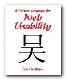
A Pattern Language for Web UsabilityThe first three chapters of this book discusses these issues theoretically. The topics are also linked to questions of usability, navigation, and information architecture. It has to be said that these pages make for rather dry reading. But then in the second, larger part of the book, everything comes to life. What follows is a series of seventy-eight case studies in which a problem is posed, analysed, and solved using the pattern language model.

This is as much business studies and project management as web design. But then anyone who has had to decide what to put on a homepage and where to place it will have already been engaged in such decisions.

It includes very good tips such as resisting the urge to add help features in place of removing anything which impedes a user’s intuitive navigation of the site. He draws heavily on the work of Jakob Nielsen, Jeffrey Veen, Steve Krug, and Edward Tufte – all of whom are reliable sources.

What emerges is good, brief advice notes on how to create site maps, where to position search boxes, use of colour-coding for navigation, breadcrumb trails, and where to place navigation bars.

These suggestions eventually include the more sophisticated issues of server side includes, cookies, and even security and encryption.

You won’t be surprised to hear that he advises against the use of frames. I wish somebody had told me that earlier. Converting from a framed to a non-framed structure has cost me more time, energy, and money than anything else on the site you are visiting now. Thank goodness for the arrival of WordPress and its content management system. Now that is a pattern that’s worth repeating.

© Roy Johnson 2003

Buy the book at Amazon UK

Buy the book at Amazon US


Ian Graham, A Pattern Language for Web Usability, London: Addison Wesley, 2003, pp.283, ISBN 0201788888


More on web design
More on digital media
More on technology


Filed Under: Web design Tagged With: A Pattern Language for Web Usability, Information design, Usability, Web design

Ambient Findability

July 10, 2009 by Roy Johnson

why designers must keep users in mind

Peter Morville was co-author (with Louis Rosenfeld) of one of the essential books on information architecture, Information Architecture for the World Wide Web. This is his solo follow-up, which looks at the latest features of on-line life and tries to see what lies ahead. Ambient Findability is a very positive, almost excited, view of the last decade in web development. His central thesis is that information literacy, information architecture, and usability are all critical components of a new world order.

Ambient Findability He believes we have almost an ethical imperative to design the best possible software and web services to enhance the quality of our online life. All this has come about because of the unprecedented developments in data manipulation, connectivity, hyperlinking, and interactive services which have emerged in the last few years.

His new take on arranging information and navigational systems insists that they must be constructed around what the user requires, not the designer, and that they must be constructed with maximum findability in mind. The users, purchasers, or consumers are now Kings – because of their experiences on sites such as eBay and Amazon.

Never before has the consumer had so much access to product information before the point of purchase.

He looks at wayfinding systems in the natural world, then considers the relationship between language and information retrieval, including how we define meta-data. He sets great store by the theory of information analyst Calvin Moores, who suggested that people will not seek information that makes their jobs harder, even if it might benefit the organisation they work for.

For this reason, he has positive things to say about gossip and browsing. We are conditioned by evolution to pick up signals and recognise what he calls ‘textual landmarks’ in our search for information and our interpretation of the world. “Technology moves fast. Evolution moves slow.”

Because computers are becoming smaller and smaller, he then moves on to an encomium for the mobile device. This is followed by the technology which comes closest to fulfilling his desire for maximum findability – GPS (Global Positioning Systems).

He then looks at the issues of reconciling good web design with the competing demands of usability and efficient marketing – and solves the problem with a mantra that summarises his principal thesis: “Findability precedes usability. You can’t use what you can’t find.”

This leads into what I take to be the heart of the book – his take on the state of information architecture today. First he explains the competing views regarding the ‘semantic web’, which centre around definitions of meta-data so far as I understand it. Then he argues that these views can be reconciled if we accept the traditional roles of taxonomies for defining data – along with what he called ‘folksonomies’ whereby people put their own definitions on tagged objects.

This is not as important a book as Information Architecture for the World Wide Web, but it’s a thought-provoking guide to recent web developments and what might happen next in the online world. It’s full of interesting and provocative ideas, relevant graphics (first time I’ve seen colour in an O’Reilly publication!) and all the references are fully sourced.

© Roy Johnson 2005

Ambient Findability   Buy the book at Amazon UK

Ambient Findability   Buy the book at Amazon US


Peter Morville, Ambient Findability, Sebastopol, CA: O’Reilly, 2005, pp.188, ISBN: 0596007655


More on information design
More on design
More on media
More on web design


Filed Under: Information Design, Web design Tagged With: Ambient Findability, Findability, Information design, Navigation, Search, Usability, Web design

Create your First Web Page in a Weekend

June 3, 2009 by Roy Johnson

well-planned tutorials on HTML design basics

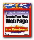
Can it really be done in a weekend? Well, if you set some time aside and follow the tutorials in this clearly-written guide, it’s possible that you could have a few decent pages up within the forty-eight hours. Steve Callihan kicks off with some background explanation of Web matters, and information on what you’ll need. This is designated as what you might do as preparation on ‘Friday night’. On Saturday morning there’s a first step-by-step tutorial on HTML code basics. This is followed by tips and tricks which will help you to control the layout and appearance of your Web pages.

First Web PageThe Saturday afternoon tutorial covers graphics, wrapping text around images, and how to deal with the tricky issue of browser-safe colours. Everything is spelled out very clearly, strictly one topic per paragraph, and everything clearly labelled and well illustrated. Assuming that you don’t go out on Saturday evening, it is devoted to learning the mysteries of tables. Then during the rest of the weekend you put what you have learned into practice by making a small web site. There is quite a heavy emphasis on graphics, so this will appeal to people interested in such visual effects as drop shadows, decorated text, and creating your own 3-D buttons.

When that is done, he shows you how to get your site up onto the Web, and there are bonus extras on those items which seem to be popular with beginners – hit counters, guestbooks, image maps, and animated gifs.

This book is in its third edition – so the basic approach has obviously been successful. To be truthful and realistic, I would suggest spending at least a week reading it and absorbing what it has to say first. Then a weekend at the keyboard might yield decent results. And if you need extra help, there are plenty of page templates, plus lots of free software on the accompanying CD-ROM.

© Roy Johnson 2000

Buy the book at Amazon UK

Buy the book at Amazon US


Steve Callihan, Create your First Web Page in a Weekend, (third edition) Rocklin, CA: Prima Publishing, 1999, pp.425, ISBN 0761524827


More on web design
More on digital media
More on technology


Filed Under: Web design Tagged With: HTML, Technology, Web design

Creating Killer Web Sites

July 18, 2009 by Roy Johnson

best-selling web design guide with graphics emphasis

Design guru David Siegel posits the notion that web sites exist in three ‘generations’. First generation sites, created in the mad rush of the early 1990s, were not much more than text files with hyperlinks – and they were inescapably linear:

most had edge-to-edge text that ran on for pages, separated by meaningless blank lines. At best, they looked like slide presentations shown on a cement wall.

Creating Killer Web SitesSecond generation sites were basically the same, but with with icons replacing words, tiled images replacing the ubiquitous grey background, and banners replacing headlines. His claim for the idea of third generation sites is that they offer a new visual experience in which the visitor is ‘pulled’ through the pages using metaphors and “well-know models of consumer psychology”.

For instance, he’s in favour of ‘splash screens’ – entry pages which act as an advert for the sites they introduce. Then he wants sites to offer an ‘experience’ rather than effective data-sharing. The site maps he reproduces in the latest edition of Creating Killer Web Sites have pages on which there is only one link to anything else. He even promotes the idea of ‘exit’ pages which tell the site visitor that this web experience is over.

Having visited his personal site with its splash screen of the Andy Warhol ‘Marilyn’ prints several times, I find them simply an unnecessary impediment to accessing the valuable advice he makes available beyond. None of this sits easily with the idea that any page should be no more than two or three clicks away from any given point. And why introduce an extra stage in the navigational process which yields no real information? This ‘guided tour’ approach to the web experience works directly against the sprit of hypertext, which should give people the freedom to follow whatever links they choose. Why then has he been such a powerful influence in the last few years?

Well, the truth is that apart from this rather idiosyncratic notion, he has a lot of very useful advice to offer on the practical aspects of site design. Not only is his book elegantly produced, it’s packed with tips and tricks which have proved enduringly popular. Much of his success as a designer is founded on his background in typography and graphics, and he makes no bones about the fact that he wants more control of layout on screen.

His most useful guidance, it seems to me, is focused on the aesthetics of page elements and the visual experience of reading on a monitor. For instance, he maintains his crusade against the horizontal rule <HR> but has abandoned advocacy of the single-pixel gif trick to control white space. He’s now in favour of the non-breaking space <&nbsp;> and he has the honesty to admit that many of these devices are ‘hacks’ to achieve effects denied us by the browser.

Text should be held in a narrow column [like this one] and should be limited to what can be read in about a minute, or four to six screens, before offering a new page. He’s against the use of bullets: “They are ugly, identical, and convey little meaning…design around them in all cases” – and he produces plenty of elegant screen shots and page makeovers which support his arguments.

He’s equally adamant on the use of indents to separate paragraphs – “no matter what it takes to make them” and the use of the <P> tag is designated as Deadly Sin number one. I think he’s just a little quirky in this, because this strategy is clearly striving to imitate the appearance of the printed page where it may not always be appropriate – on screen.

He deals with the most fundamental issues of page layout using clear language, and he illustrates the HTML techniques to achieve each effect in a way which anybody could follow. There’s no tricky programming or Java script to be mastered. My notebook was full in no time of coding tips, URLs, and bibliographic recommendations which I’m itching to follow up.

It’s slightly disappointing that the admirable clarity of his approach in early sections of the book is not extended to those on typography and ‘site makeover’. Here he assumes that all the manipulation will be via graphics, and some chapters are dense with PhotoShop techniques which are not as general as his advice on page layout. There is nothing on choice of fonts or the use of the <FONT> tag, which is still controversial enough to warrant comment. He assumes you’ll already know a lot about the creation and manipulation of images. Yet how many readers outside design studios would be able to make much of advice such as “I flatten this entire page and use adaptive color reduction with no dithering”?

Fortunately, there are full-page reproductions of the HTML code for his designs, which is helpful for analysing and understanding the effects he is discussing. He also has an honest and breezy style – “Hang on. This is going to get messy” – and he spells out the truth of rapid and uneven development:

Designers are facing new challenges: how to design sites during the awkward transition from version 3.0 and 4.0 browsers to the version 5.0 and [more important] 6.0 browsers to come. The limitations of 3.0 browsers require designers to resort to workarounds and tricks

This frankness is one of his key strengths. He admits that he doesn’t know how to write his own cgi scripts, and en passant like a young enthusiast he recommends interesting free services and software – such as Gif Wizard, which will optimise your images – as well as very clever tricks for pre-loading the image for a page in advance of its appearance.

In the latter part of the book he offers predictions for the future – cascading style sheets, then XML will predominate – plus some rash promises on details: “I predict that in late 1998, PNG [a graphic format] will take over. With any luck, GIF will be eradicated like the SmallPox virus by the end of 1999”. We’ll wait and see.

I think it’s clear why Creating Killer Web Sites has become a best-seller. Apart from the fact that it’s very stylishly designed and printed, it concentrates on reproducing the sort of graphically advanced page designs which many people would like to create. Strictly speaking, this is really for site builders who wish to maximise the visual novelties of their design whilst minimising the strain put on bandwidth resources. However, it has so many fascinating insights and practical tips to offer, it’s a design manual you can’t really afford to miss.

© Roy Johnson 2002

Buy the book at Amazon UK

Buy the book at Amazon US


David Siegel, Creating Killer Web Sites: The Art of Third-Generation Site Design (2nd edn) Indianapolis: Hayden, 1997, pp.306, ISBN: 1568304331


More on web design
More on digital media
More on technology


Filed Under: Web design Tagged With: Creating Killer Web Sites, David Siegel, Graphic design, Web design

Creating Web Sites: The Missing Manual

July 5, 2009 by Roy Johnson

basic hands-on techniques for beginners

Missing Manuals are a series of technical help books which have come along to fill the space left by software developers who can’t be bothered to explain how their programs work. This one covers lots of software, because it deals with the entire process of creating and running your own web site. Matthew MacDonald starts off by explaining how web sites work and how to decide which is the best type for you. Then it’s time to roll up your sleeves and learn the details of HTML code and how to create a sample site. First he talks you through the basics of page layout, then he takes a big step forward technically to show you how to choose and register a domain name and how to upload files via FTP.

Creating Web Sites: The Missing Manual(My advice for beginners would be to skip this chapter and come back to it later when you are ready to launch.) Following this he looks at HTML editors such as Front Page and Dreamweaver and talks you through their features. I was glad to see however that he also includes free downloadable editors such as Nvu and CoffeCup. Next he talks you through all the most common formatting devices you will need to make your pages look good. Then it’s on to style sheets, which is the correct and the best way to arrange the appearance of what appears on screen.

Next comes adding graphics, which most people want to do, once they’ve started creating text. Some of the techniques he demonstrates involve quite a sophisticated knowledge of style sheets and graphics, but fortunately he spells out the required coding and gives illustrated examples of the results. The same is true of his chapter on tables and layout using styles.

He gives excellent advice on promoting your site to search engines and directories, as well as straightforward explanations of some of the arcane technicalities of search engines.

There’s also a chapter I didn’t really expect – on how to make money with your site by signing up to the Google Ads and Amazon affiliate programs. These really do allow you to “make money whilst you are asleep” – so long as you can attract enough visitors to your site.

He ends with some fairly advanced tips and tricks: using JavaScripts and Dynamic HTML; creating fancy buttons and dropdown menus; and adding multimedia audio and video files. But for those people who want to have a presence on the Web but can’t cope with all the technicalities of building and maintaining pages, he concludes with a chapter on blogging. This really is the quickest and easiest solution.

I have been tinkering with web sites and reviewing web design manuals for years, and all I can say is that this is the best beginners manual I have come across.

© Roy Johnson 2005

Buy the book at Amazon UK

Buy the book at Amazon US


Matthew MacDonald, Creating Web Sites: The Missing Manual, Sebastopol: CA, O’Reilly, 2005, pp.548, ISBN 0596008422


More on web design
More on digital media
More on technology


Filed Under: Web design Tagged With: Creating Web Sites, The Missing Manual, Web design

Design and Build the Coolest Website in Cyberspace

July 11, 2009 by Roy Johnson

web design guidance manual – from start to finish

There are dozens and dozens of web design manuals on the market, so what makes this one any different than all the rest? Nick Nettleton has gone for a visually attractive layout. Every page in this guide is composed of densely layered graphics; every section is colour-coded; and every page is laid out in a very appealing manner. He takes web site design right from the simplest beginning – what equipment and software you need, how to get on line, and how to create your first pages.

Design and Build the Coolest Website in CyberspaceHe assumes you are going to use an HTML editor such as Dreamweaver or GoLive, so there’s no detail about tags and coding. Some may see this as a good thing, others a weakness – especially since in his first site project he uses heavily nested tables. However he covers all the basics – fonts, screen colours, and graphics. Then its on to the special effects you can create by adding colour, outlines, shadows, gradients, and textures.

There’s plenty on the manipulation of graphics – enhancing images, creating thumbnails, buttons, and icons. Then there are more advanced issues such as using templates and library items, when and when not to use frames.

When it comes to animation, there’s a lot of sound advice on Macromedia Flash – with other programs mentioned but trailing in terms of features. The same is true for sound and video, though there are a larger variety of formats to choose from.

He also covers style sheets and making your site interactive using DHTML, ASP, or PHP. It’s likely that you’ll need other guidance manuals if you want to pursue any of these advanced features in any detail, but the good thing about his approach is that it gives you an overview of web design with plenty of jumping off points offering the addresses of further resources.

He even goes as far as showing you how you could make money from your site once it’s up and running. And once again the approach is simple. Here is a list of possibilities and site details. Here is some advice plus the pros and cons of these approaches – with screenshots. Now go and do it.

© Roy Johnson 2004

Buy the book at Amazon UK

Buy the book at Amazon US


Nick Nettleton, How to Design and Build the Coolest Website in Cyberspace, Cambridge: Ilex, 2003, pp.224, ISBN 1904705065


More on web design
More on digital media
More on technology


Filed Under: Web design Tagged With: Design and Build the Coolest Website in Cyberspace, Technology, Web design

Designing Web Graphics

July 23, 2009 by Roy Johnson

comprehensive tutorials on web site design

Don’t make any mistake. This is not just a book about designing web graphics. It’s the fourth edition of guru Lynda Weinman’s best-selling compendium of web design tutorials. She offers a manual of digital design which deals with far more than its title suggests. It covers all the basics of graphic design for the web – typography, browser safe colours, and the differences between HTML and XHTML. Almost every point is illustrated with a coloured screenshot; there are lots of tips and tricks in callout boxes; and she gives sources for free software such as XHTML editors, clip art, JavaScripts, and downloadable fonts.

Designing Web Graphics 4Serious designers will be interested in the fact that she includes lots of advice about getting work as a freelance designer. There’s also guidance on web project management, usability, and content architecture. She offers a particularly good explanation of how to organise the structure of a site and design its navigation system. And for anyone who wants to make their web design politically correct, there’s a clear account of current ‘accessibility’ requirements.

On graphics, she favours Photoshop and Fireworks in her coverage of all aspects of graphic files. These include JPGs, GIFs, scalable vector graphics, Flash, and PNG. She also covers colour pallets and compression techniques, plus effects such as transparency.

She’s very keen on rollovers, and devotes a lot of effort to explaining the JavaScript and Flash approaches to creating them, complete with examples of code.

She also explains tables, frames, and cascading style sheets, arguing for the advantages and disadvantages of each one, and she has lots of tips and tricks.

She finishes with the elements of audio files and animations using Flash, Macromedia Director, and Quicktime, then how to promote your site using newsletters, blogs, scripts, and search engine submissions.

This is the latest edition of a very popular guide. These New Riders publications are expensive but exceptionally good quality – packed with screenshots, links to websites, and recommendations for further reading.

© Roy Johnson 2004

artie shaw Buy the book at Amazon UK

artie shaw Buy the book at Amazon US


Lynda Weinman, Designing Web Graphics 4, Indianapolis IN: New Riders, 2003, pp.512 ISBN 0735710791


More on web design
More on technology
More on digital media


Filed Under: Web design Tagged With: Designing Web Graphics, Graphic design, Web design

Designing Web Navigation

June 30, 2009 by Roy Johnson

optimising the user experience

Anyone who has ever designed a web site will know that navigation of its contents is a key issue in the site’s usability. Visitors must be able to find their way around – otherwise they’ll leave, and they won’t come back again. Successful navigation systems require good screen design, well thought out information architecture, clear labelling, logical hierarchies, and effective linking. This book deals with all these issues of designing web navigation in an extremely thorough manner.

Designing Web NavigationEvery aspect of navigational design is examined in close detail – through both theoretical models and technical research, and a practical examination of a wide variety of large scale web sites from around the world. It’s a beautifully presented book, with elegantly designed pages, full colour illustrations, and scholarly yet unobtrusive footnotes leading to web references and recommendations for further reading.

The chapters are almost exhaustively thorough. On navigation mechanisms for instance, he covers every possibility – from tabs to breadcrumb trails, and from dropdown menus to sitemaps, tag clouds, A to Z indexes, and star trees. You couldn’t wish for anything more comprehensive. He discusses the advantages and the potential disadvantages of each system, showing examples of where they are used to good effect.

Although it is primarily concerned with the delivery of content over the Web and read in browsers on a computer, he also discusses the navigational consequences of content delivery via mobile phones, personal digital assistants (PDAs) and even car navigation systems.

On the issue of designing a navigation system he has a very sound piece of advice. “Don’t start by designing the navigation on the home page.” This might seem counter-intuitive, because for most designers the home page is the focus of their attention, and it’s the root, the index page of the entire site. But it’s not the most important page for visitors. Most of them will enter via a page deep within the site to which they have been referred by a link from a search engine.

Although there’s quite a lot on extensive usability testing, in general he strikes a reasonable balance between writing for professional designers of large scale corporate and ecommerce sites, and smaller sites which might be the work of an individual entrepreneur. There are certainly plenty of tips on the presentation of text on a page for instance which could help improve the work of an enthusiastic amateur.

He ends by discussing the relationship between navigation and searching, social tagging systems, and rich web applications. These latter post a new challenge to designers, because web pages are no longer static entities which appear in the order they are summoned via mouse clicks. Rich web applications can compose the content of a web page dynamically. Once the user has chosen a new set of data on screen, there is nowhere to go back to. The page URL remains the same, even though what is being displayed has changed. Fortunately, he provides ample guidance to designers on how to cope with such new problems.

I think this is a book which aspires to position itself alongside Louis Rosenfeld and Peter Morville’s Information Architecture for the World Wide Web and Jakob Nielsen’s Homepage Usability as modern classics of web design principles.

© Roy Johnson 2007

Designing Web Navigation   Buy the book at Amazon UK

Designing Web Navigation   Buy the book at Amazon US


James Kalbach, Designing Web Navigation, Sebastopol (CA): O’Reilly, 2007, pp.394, ISBN: 0596528108


More on information design
More on design
More on media
More on web design

Filed Under: Information Design, Web design Tagged With: Communication, Design, Designing Web Navigation, Information design, Web design

Designing Web Usability

July 12, 2009 by Roy Johnson

provocative and radical examination of good web design

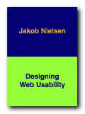
Jakob Nielsen is the number one guru of ‘Web usability’ – mainly because he invented the term. What this expression means in a general sense is the degree to which web sites have been designed with the needs of users in mind – as distinct from those of the designer or the site owner. Nielsen is former distinguished engineer at Sun Microsystems, and he has been writing on hypertext, navigation, and Internet engineering for the last decade. Designing Web Usability is part one of a two-volume major statement of his theories on web design.

Designing Web UsabilityHe expresses his views in a blunt and uncompromising manner. This is a bracing, indeed challenging book to read – but it is packed with reflections, principles, tips, and design theory on just about every possible aspect of web site design. He backs up his theory with the results of ‘usability testing’ and plenty of well illustrated, closely analysed real life examples, in many of which major companies have their sites held up for rigorous criticism.

His main priority is the creation of fast downloading pages (‘speed must be the overriding design criterion’) on the basis that people simply will not wait. Ten seconds is the average maximum, it would seem. To this end page size should be kept below 35K, and he’s severely critical of big graphics. (‘Remove graphic; increase traffic. It’s that simple’.) Similarly, he’s quite firm on the question of using frames: ‘Just say No’.

There are good arguments to back up all these assertions – but also occasional puzzles. He seems to take a radical and scientific line when he argues that a page is inefficient because only sixty percent of the screen is devoted to product and navigation. But then in the next breath he admits that good design might include ‘white space’ – that is, unused screen real estate. There is no explanation of where one consideration ends and the other begins. He also makes the radical claim that HTML Standard 1.0 should be the web author’s common denominator, but he is quite happy to discuss Cascading Style Sheets [supported only by version 4.0 browsers and above]. But these are minor problems: most of the time I was swept along by his infectious sense of intellectual exhilaration.

He argues for well-annotated outbound links, on the basis that each pointer towards useful information adds quality to your site. There are also interesting tips on links, such as not trying to link everybody to your home page. There’s a strong temptation to do this – because you would naturally prefer every visitor to explore your site in full. But there is no reason why they should tolerate searching your site when they have been referred on the promise of something specific.

On writing for the web he favours brevity, content chunking [short paragraphs] and accuracy – on the basis that Content is King. As he puts it in his idiosyncratic prose style, we should ‘write for scannability’. For someone whose message is to design for maximum usability, his language is occasionally a little opaque. He uses terms such as ‘instantiated’, ‘best-fit regression line’, ‘optimal user experience’ and ‘hedonic wage model’. But once again, this quirkiness is vastly outweighed by the density of good advice packed into every page.

Advanced web site designers will be interested in what he has to say about the use of audio, video, animation, and even 3D effects – yet he also has insightful things to say about some of the smallest and apparently mundane elements of a web page. It’s amazing what subtle nuances he wrings from his meditation on the choice of words for a page title for instance – something I imagine most people hardly give a second thought.

Beginners will appreciate his advice on matters such as creating good domain names for new businesses, whilst advanced users are catered for in sections which discuss the integration of your site with a search engine and the techniques for creating dynamic pages which change their content in response to customer demand.

He is unremittingly on the side of the user rather than the site owner or designer. In this sense he’s the very opposite of design and graphics guru David Siegel – arguing extreme functionality over aesthetic form.

We still need more sites to base their information architecture on the customer’s needs instead of the company’s own internal thinking.

On large scale sites, he has some interesting points to make regarding the distinctions between intranets and extranets, and he deals comprehensively with issues of designing for international audiences, for users with disabilities, and for Web TV. He ends with some predictions on likely trends over the next few years, reminding us that despite any increases in audience and bandwidth, the vast majority will be low-end users for whom the prime concern is download time.

There have recently been criticisms in some design circles that Jakob Nielsen is too dogmatic and that his theories are based on the commercial demands of the Internet. Some of this may well be true, but anybody who has the slightest interest in web pages, site design, and information architecture should read this book. I feel quite confident that it is destined to become a classic, and personally, I look forward to the next volume, which is going to tell us ‘How To Do It’. He’s even got a provisional title – Ensuring Web Usability – and lists it for us in his section of recommended reading.

© Roy Johnson 2002

Buy the book at Amazon UK

Buy the book at Amazon US


Jakob Nielsen, Designing Web Usability: The Practice of Simplicity, Indianapolis, Ind: New Riders, 2000, pp.420, ISBN: 156205810X


More on web design
More on digital media
More on technology


Filed Under: Web design Tagged With: Designing Web Usability, e-Commerce, Jakob Nielsen, Usability, Web design

  • 1
  • 2
  • 3
  • …
  • 6
  • Next Page »

Reviews

  • Arts
  • Biography
  • Creative Writing
  • Design
  • e-Commerce
  • Journalism
  • Language
  • Lifestyle
  • Literature
  • Media
  • Publishing
  • Study skills
  • Technology
  • Theory
  • Typography
  • Web design
  • Writing Skills

Get in touch

info@mantex.co.uk

Content © Mantex 2016
  • About Us
  • Advertising
  • Clients
  • Contact
  • FAQ
  • Links
  • Services
  • Reviews
  • Sitemap
  • T & C’s
  • Testimonials
  • Privacy

Copyright © 2025 · Mantex

Copyright © 2025 · News Pro Theme on Genesis Framework · WordPress · Log in