Mantex

Tutorials, Study Guides & More

  • HOME
  • REVIEWS
  • TUTORIALS
  • HOW-TO
  • CONTACT
>> Home / Archives for Web design

E-Commerce User Experience

July 12, 2009 by Roy Johnson

guide to making eCommerce sites more efficient

Web guru Jakob Nielsen teamed up with design maven Donald Norman to form a consultancy which now dominates the business of Web ‘usability’. E-Commerce User Experience is a company report they have produced which offers guidelines on how to make e-commerce sites more efficient. The suggestions they make are based on findings from detailed studies of twenty e-commerce sites, with users in the United States and Europe. The sites tested are typical e-Commerce sites – clothes, flowers, books, furniture, toys, and CDs. Companies range from Boo, Sears, Disney, and eToys, to Herman Miller. The main issues covered include how to sell goods and services, how to build trust with customers, and how to display product information.

E-Commerce User ExperienceOther important issues include trading across national boundaries, and making the ordering transaction as smooth as possible. The testing methodology is meticulously documented, and in line with current thinking on quality testing, the emphasis is on small groups carefully watched – not mass numbers. It throws down the gauntlet to his critics. What he’s saying is – ‘This is what users actually do and want. Can you prove otherwise?’

Nielsen even gives you advice on how to do your own usability testing – and how to cut corners to make it cheaper than the very service he offers. In other words, he follows his own principles of ‘show the customer what’s available’. This is an approach which inspires confidence in the user – and it does the same for his readers.

He deals with issues which are very basic, and yet which can be difficult to do properly – such as how to categorise topics on a site. Do CD-ROMs belong under ‘entertainment’ or ‘electronics’ – or both? How to classify information requires that you have analysed your bank of data closely, and conceptualised the connections between its items.

On some of his recommendations you might be tempted to think ‘But that’s common sense’. For instance – ‘Make it clear how much products cost’. But when he examines the sample sites, it’s interesting how they often don’t deliver this information. Prices are often concealed until late in the checkout process.

He’s very thorough on how search results should be displayed – and in particular ‘failed results’. Any eBusiness which carries a lot of different stock items needs to think this issue through carefully. There’s also a detailed examination of the heart of any eCommerce site – the shopping basket. Every click, box, and link is examined for its relevance and efficiency.

He follows the policy of comparing eCommerce sites with physical bricks and mortar stores – which is reasonable, because these are the real competition. Some people are bound to complain that Nielsen’s paradigm is entirely commercial, arguing that there are Web sites where the ‘experience’ is paramount. His reply will be to point to his title – this is e-Commerce. But in fact the lessons we can learn from this can meaningfully inform designers of all kinds of sites.

Nielsen’s approach forces you to consider every smallest detail of the on-screen experience from the user’s point of view. This means clear labelling and navigation, intelligent page design, and thoughtful information architecture. Show graphics of your products – close-up pictures giving details. Arrange shopping carts so that the customer choices on colour, size, and other variables is made before the actual check out.

Don’t be surprised by the high price tag. What you’re paying for here is an industrial strength professional business report. Anybody working in eCommerce will profit from its recommendations. It’s packed with first-hand experience, well illustrated with real-life examples, and the advice offered is based on rigorous testing.

As one of his enthusiastic reviewers at Amazon says – ‘Anybody contemplating a serious e-Commerce site will find their investment in this report repaid ten times within the first year’s trading’. I think that might also be said for any serious Web designers or design studios.

© Roy Johnson 2002

E-Commerce User Experience   Buy the book at Amazon UK

E-Commerce User Experience   Buy the book at Amazon US


Jakob Nielsen et al, E-Commerce User Experience, Fremont (CA): Nielsen Norman Group, 2001, pp.389, ISBN: 0970607202


More on eCommerce
More on media
More on publishing
More on technology

Filed Under: e-Commerce Tagged With: Business, e-Commerce, E-Commerce User Experience, Jakob Nielsen, Online selling, Usability, Web design

Eric Meyer on CSS

July 9, 2009 by Roy Johnson

web design using cascading style sheets

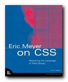
This is essentially a series of practical tutorials on using style sheets. Eric Meyer on CSS talks you through a series of web page makeovers in fine detail, illustrating the tips and tricks of a professional designer. It’s a book for people who already know HTML, but who want to move on into using style sheets. In fact that’s the point from which he starts – showing you how to convert an existing HTML page. The advantages of using CSS are threefold. Your web pages will be smaller and will download more quickly; you gain fine control over the layout of the page; and if you change the appearance of your site, it can be done with no more than one or two lines of code in the style sheet.

Eric Meyer on CSSHe goes through one makeover project in each chapter, showing how each additional line of coding affects the layout of the page. The changes are illustrated with screenshots each step of the way. For those who are really keen to learn, the book has its own web site where you can download all the pages and style sheets used in the tutorials. The idea is you can read his advice and work through the pages in a text editor at the same time.

His examples include styling a press release and an events calendar; bringing hyperlinks to life; controlling and styling navigation menus; and dealing with forms and background images using layers.

One of the most interesting chapters for me was creating style sheets for producing print versions of Web pages – something we have been asked to do a lot recently.

He also covers how to float and position page elements, how to create multi-column pages, and even how to combine sliced graphics with style sheet positioning to make non-rectangular pages.

It all becomes quite technically advanced, but he sticks to his one step at a time approach and explains every change of code and what effect it will have.

This will appeal to those people who want to get hands-on experience of style sheets, and I imagine it will also be useful as a reference for checking the effect of using any coding element – including the often unforeseen side effects.

© Roy Johnson 2003

Buy the book at Amazon UK

Buy the book at Amazon US

Eric A. Mayer, Eric Mayer on CSS: Mastering the Language of Web Design, Indianapolis: IN, New Riders, 2003, pp.322, ISBN 073571245X


More on technology
More on digital media
More on web design
More on computers


Filed Under: HTML-XML-CSS, Web design Tagged With: CSS, Eric Meyer on CSS, HTML-XML-CSS, Web design

Free fonts – a list of suppliers

September 15, 2009 by Roy Johnson

free Fontsa selection of free font suppliers

All these sites listed below offer free fonts. Some of the designs are weird and wacky, but they are all give-aways. Don’t expect miracles: font designers put a lot of love and devotion into their creations, but you cannot expect professional standards in something offered free of charge.

The other limitation in free fonts is that you have to accept that they might not include a full set of characters, including all the special figures such as lining and non-lining numbers, fractions, ampersands, accented letters, and dingbats which would be present in a full professional product. Font designers give away these free samples in the hope you will enjoy their designs and maybe purchase from their commercially available materials.

The good news for font lovers is that the price of these original designs has been dropping as a result of advances in digital type technology. If you use any of these fonts in your work, it would be a nice touch of courtesy to acknowledge where you obtained them. Let us know if you find any more.

Free fonts http://www.k-type.com

Blubtn http://www.ffonts.net

Blubtn http://www.misprintedtype.com/v3/fonts.php

Blubtn http://www.fontsite.com

Blubtn http://www.1001freefonts.com

Blubtn http://www.freefonts.org.uk

Blubtn Digital.com

Blubtn http://www.philsfonts.com

Blubtn http://www.fontopolis.com

Blubtn http://www.microsoft.com/truetype

Blubtn http://www.abcgiant.com

Blubtn http://www.chank.com

Blubtn http://www.mashy.com

Blubtn http://www.tyworld.com/download

Blubtn http://www.arttoday.com

Blubtn http://members.tripod.com/poeticwolf/fonts/

Blubtn http://www.arts-letters.com

Blubtn http://www.alteredegofonts.com/

Blubtn http://www.girlswhowearglasses.com

Blubtn http://www.fontfreak.com

Blubtn http://www.smackbomb.com/famousfonts/

Blubtn http://www.all-4-free.com/fonts

© Roy Johnson 2004


More on How-To
More on literary studies
More on writing skills


Filed Under: How-to guides Tagged With: Fonts, Graphic design, Typography, Web design

Free web design tutorials

November 16, 2009 by Roy Johnson

learn the basics of HTML coding to make web pages

NB! All these links work at the time of publishing the page – but these sites have a habit of moving. That’s the bad news. The good news is that more established sites have the equally good habit of adding to their tutorials. So what starts out as a simple HTML tutorial might well now include guidance on cascading style sheets, XML, and much else. Be prepared to click around and search. You’ve nothing to lose – because it’s all free.

web design tutorials Jo Barta’s tutorial
This is a very popular free downloadable guide for beginners. It’s strong point is that Jo Barta takes everything one step at a time – and shows what the results should look like. It also contains a useful guide to web-safe colours.
http://www.pagetutor.com/download.html

web design tutorials XML School
This is a very comprehensive site which covers every aspect of HTML and web page design – as well as style sheets, XML, and other refinements. It’s also a model of clarity in site design itself.
http://www.w3schools.com/

web design tutorials Yale Web Style Manual
This does not teach the details of coding – but it’s a wonderful guide to site structure, navigation, and page design. Use it in conjunction with Joe Barta’s tutorial, and you’ve got everything you need.
http://info.med.yale.edu/caim/manual/

web design tutorials HTML 4.0 Reference
An authoritative guide to the HTML language by the Web Design Group, in easily searchable HTML format. You will find full explanations of elements, tags and attributes, and how they are used in an HTML 4.0 document.
http:/www.htmlhelp.com/distribution/

web design tutorials Web Design Group Web Authoring FAQ
Lots of how-to’s and information on overcoming common problems.
http://www.htmlhelp.com/faq/html/all.html

redbtn Scott Brady’s ‘Unofficial’ alt.html FAQ
More answers to problems that are often encountered.
http://www.sbrady.com/hotsource/toc.html

redbtn Introduction to HTML
A tutorial guide written in plain language with clear explanations of the HTML 4.0 specification from the University of Toronto.
http://www.utoronto.ca/webdocs/HTMLdocs/NewHTML/intro.html

redbtn Sizzling HTML Jalfrezi
This is an A to Z reference guide to HTML specification 4.0.
http://vzone.virgin.net/sizzling.jalfrezi/intro.htm

redbtn Web Techniques
This an online version of the magazine Web Techniques – with a browsable archive of tutorial articles.
http://www.webtechniques.com

redbtn World Wide Web Consortium
This is the official body which co-ordinates all the latest developments in HTML and other Web standards. Visit the site for exact descriptions of cascading style sheets (CCSS) XML, and XHTML – but don’t expect any user-friendly tips and tricks.
http://www.w3.org

redbtn MSDN Online Web Workshop
This is Microsoft’s huge collection of tutorial guides for Web developers. Fairly advanced stuff – but very thorough.
http://msdn.microsoft.com/en-us/library/aa155133.aspx

redbtn HTML Code Tutorial
http://www.htmlcodetutorial.com/

redbtn HTML: An Interactive Tutorial for Beginners
http://www.davesite.com/webstation/html/

redbtn BigNoseBird.com
http://www.bignosebird.com/

© Roy Johnson 2009


More on technology
More on digital media
More on web design
More on computers


Filed Under: How-to guides, HTML-XML-CSS, Web design Tagged With: Free tutorials, Web design

Fresh Styles for Web Designers

June 8, 2009 by Roy Johnson

new web design strategies and techniques

So far, web design theory has been split between usability minimalism as urged by gurus such as Jakob Nielsen at one end of the spectrum, and the bandwidth-hogging graphic designs of David Siegel at the other. Now Curt Cloninger suggests we can combine the two approaches – and he shows how it can be done. This is one of those Web strategy guides which assume you know the details of designing pages.

Fresh Styles for Web Designers What it offers is a survey of new strategies in structure and graphic presentation – some of them on the edge of the avant garde. Cloninger takes the line that these are the early days of the Web, that there are severe limitations on what is possible, but that inventive designers will embrace the limitations and turn them into positives.

The reasons he offers are that not all sites are driven by e-commerce or a desire to maximise hits. Some are exhibition or display sites; galleries or individual portfolios of work – something like an elaborate visiting card. There is no reason why such sites shouldn’t indulge themselves with the sorts of glamorous graphics and ‘entry pages’ supported by designers such as David Siegel.

He categorises sites as ‘Gothic’, ‘Grid-based’, ‘Grunge’, ‘Mondrian poster’, ‘Paper Bag’, and ‘HTMinimaLism’ – and despite his post-hippy approach these distinctions do eventually make sense. Designers in these camps treat the page design, the Web strategy, and the visitor experience in significantly different ways.

One of my favourites was the minimalist style – sites from the competition www.the5K.org which feature pages of games, puzzles and art collections the total size which must come in under five kilobytes. [Try it!] The other was the sci-fi look of what he calls ‘Drafting/Table Transformer’ style led by Mike Young, whose work is featured in the recently published book of animated graphics.

Each chapter describes the features of one style. It then analyses examples, with well-produced screenshots of sites which are often private and experimental. Then he tells you how to achieve these effects. It’s a very good formula – no matter what you think of the sites.

He’s quite keen on distressed backgrounds and the grunge typography of designers such as David Carson – and he tells you how to create the effects. This will appeal to those who want to make a visual impact. He has favoured designers who he claims have been influential – Mike Cina, Miika Saksi, and a Chicago design group 37signals.

There’s a lot of detailed instruction on how to achieve special effects – most of them done in Photoshop. The general strategy is to maximise visual effects whilst minimising download time. And it has to be said that all the effects are beautifully illustrated, with full pages of elegantly presented coding.

© Roy Johnson 2004

web design   Buy the book at Amazon UK

web design   Buy the book at Amazon US


Curt Cloninger, Fresh Styles for Web Designers, Indianapolis IN: New Riders, 2001, pp.211, ISBN: 0735710740


More on design
More on media
More on web design


Filed Under: Graphic design, Web design Tagged With: Fresh Styles for Web Designers, Graphic design, HTML, Navigation, Usability, Web design

Futurize your Enterprise

July 18, 2009 by Roy Johnson

radical advice on customer-centred business methods

David Siegel is a Web design guru who made his name with the best-selling Creating Killer Web Sites. That was a manifesto on graphic presentation: this is his thesis on business strategy and e-Commerce. The message is quite uncompromising – you must pay attention to what your customers want, or be prepared for extinction. He’s a great believer that total de-regulation and the freedom for anybody to trade on line will allow the best ideas and services to prevail. He argues that commercial success in the online world comes from giving things away, letting go of control, networking, and above all in giving customers exactly what they ask for.

Futurize your EnterpriseAt times he becomes slightly Utopian, arguing that Truth will out, and the Little Man will prevail, but he has very direct, practical advice for those who want to seriously participate in the new e-Commerce. For instance, he suggests that you ditch voice mail:

It’s slow, retrieval is cumbersome, it can’t be skimmed, it’s almost impossible to annotate, it doesn’t take attachments, it can’t be archived easily, and it doesn’t tie into any other kind of system. Voice mail may be useful for some things, but switching to e-mail will pay off quickly.

He takes what sometimes seems like a New Age approach in expecting business executives to become altruists, to empower their employees, and even to give away time, effort, and information. Yet there does seem to be some logic to all this in the odd new world of e-commerce. It’s also good that he draws his illustrative examples from a wide variety of businesses.

His advice is aimed at big businesses, but the underlying principles will be equally applicable to small start-ups or individual entrepreneurs. It will be of most use to those people who realise that the Internet offers a new way of doing business, but can’t quite see how it could be realised.

He also throws out plenty of practical tips – such as the suggestion that most web sites could be improved by the use of plain English. This is because “most companies communicate using the passive rather than the active voice … and copywriters sanitize their corporate communications until they become meaningless … most web sites are full of jargon”

The latter part of the book contains eight business case studies – companies selling health foods, magazines, steel, real estate, books, and such. He analyses where they are going wrong in their web strategies; how they should make closer contact with their customers; and how they can change their behaviour to survive in the New Age. Unfortunately, these are all hypothetical companies, so his arguments are seriously weakened. With Siegel’s resources, he could surely have given real case studies, which would have been infinitely more convincing to his case.

So, like his killer web sites book, this one is full of thought-provoking ideas expressed in an energetic and ‘committed’ style. There’s quite a lot of generalization and wish-fulfilment too – but on the whole anyone who is interested in e-commerce and web-based business will profit from considering what he has to offer.

© Roy Johnson 2003

Futurize your Enterprise   Buy the book at Amazon UK

Futurize your Enterprise   Buy the book at Amazon US


David Siegel, Futurize your Enterprise: Business Strategy in the Age of the e-Customer, London/New York, John Wiley, 2003, pp.318, ISBN: 0471357634


More on eCommerce
More on media
More on publishing
More on technology


Filed Under: e-Commerce Tagged With: Business, e-Commerce, Futurize your Enterprise, Web design

Graphic Design School

June 14, 2009 by Roy Johnson

basic design principles using all modern media

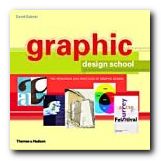
This is a structured self-teaching guide to the principles of graphic design which provides up-to-date information on computer aided design and the use of software applications. Graphic Design School itself is beautifully designed and printed – in full colour, with excellent design and layout fully illustrating the principles it espouses. First of all it deals with basic design principles – layout, space, colour, typography, and graphics.

Graphic Design SchoolEach topic is presented on one double-page spread in a stylish layout which shows off some of the best principles the book is designed to promote. The second part of the book looks in more detail at what effects are possible with detailed manipulation of typeface selection. It also looks at the secret ingredient which lies beneath most examples of good design – grids.

The last part looks at examples of professional design practice – magazines, corporate design, books, presentations, and of course web design.

It’s a visually exciting overview of what’s required in the increasingly complex and sophisticated word of graphic design. The illustrations are wonderfully fresh and well chosen. There wasn’t one I had seen in any publication before.

This will be suitable for people working in newspapers, magazines, books, packaging, advertising, web design, and digital media in general. It’s packed with practical guidance for students and practising designers.

It’s an introductory guide to a discipline with many facets. I imagine that readers will come across a topic that touches a creative nerve – layout, typography, animation, or image manipulation – then shoot off to follow up the subject elsewhere. That’s exactly as it should be – and there’s a glossary and bibliography to help too.

© Roy Johnson 2005

Graphic Design School   Buy the book at Amazon UK

Graphic Design School   Buy the book at Amazon US


David Dabner, Graphic Design School: The Principles and Practices of Graphic Design, London: Thames and Hudson, 2004, pp.192, ISBN: 0500285268


More on design
More on media
More on web design
More on typography


Filed Under: Graphic design, Typography, Web design Tagged With: Design, Graphic design, Graphic Design School, Web design

Guide to XML for Web Designers

July 5, 2009 by Roy Johnson

full explanation of XML coding and web design

XML is a set of codes which allow you, the user, to define the structure of your documents. These might be any tags – from <title> to <footnote>, from <quotation> to <caption>. People familiar with HTML will feel on home ground here. These tags mean that data can be displayed in whatever way you choose. For instance, once they have been tagged, a collection of books could be displayed in order of author, title, or publication date – with only one command – say, a click on a tab or a menu item.

Guide to XMLHowever, before you get too excited, XML has nothing to do with the manner in which the information is displayed on screen. For that, you need to add cascading style sheets. As Teresa Martin points out:

Insert some XML tags into your page and… they’ll just sit there. But, combined with style data, scripting data … you can create some powerful ways to present information

So – XML doesn’t make actions happen: it is used to define and describe a document. She provides quite a lot on the history of these standards – why and how they came into being, and who brought them about. There’s even a chapter on how the W3C deals with submissions and makes decisions about standards. This delays the hands-on instruction if read in page order, but I felt glad for the background.

In fact, en passant, there is a lot of interesting information on how and why XML has grown out of SGML, plus information on the Document Type Definition (DTD) and the Document Object Model (DOM). All this will be of interest to those people who want to know the difference between SGML, HTML, XML, and CSS, as well as those with a curiosity about information design and architecture. She also points to some of the latest developments which will be available soon – XPointer and XLink, which will allow a menu of potential destinations when you click on a hyperlink.

When the XML instructions eventually arrive, they are relatively simple and very similar to HTML. The one difference is that all tags have to be opened and closed without exception. She describes document structure, elements, and format via metaphors – which will be laboured for the technically-minded but reassuring for those like me who want their hands held as we walk into this complex world.

She includes the sensible suggestion that writing the document and adding the tags are kept as two separate processes. Trying to do both at the same time can easily result in a longer writing process, or missing some tags.

XML will be of most interest to people who are working with complex documents such as catalogues and instruction manuals which need to be consistent, or very big single documents such as reference manuals and dictionaries. It’s for creating the possibility of displaying the data in a number of different forms – alphabetically, by subject, author surname, date of publication, or even selected topic.

And if you feel you are going dizzy with all the acronyms and markup language, Teresa Martin has a valuable piece of advice. She suggests that you repeat as a mantra – ‘I can’t do it all’.

© Roy Johnson 2006

Buy the book at Amazon UK

Buy the book at Amazon US


Teresa A. Martin, Project Cool Guide to XML for Web Designers, London-New York: John Wiley, 2006, pp.298, ISBN 047134401X


More on technology
More on digital media
More on web design
More on computers


Filed Under: HTML-XML-CSS Tagged With: Computers, Guide to XML for Web Designers, Technology, Web design, XML

High Performance Web Sites

July 18, 2009 by Roy Johnson

fourteen steps to faster loading web sites

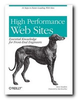
Steve Souders calls himself a ‘frontend engineer’. He’s a designer at Yahoo responsible for making their site work faster. He explains fourteen strategies for making web pages appear more quickly in a browser. And they’re not overly-technical. In fact he reveals his basic purpose from the outset in what he calls his Performance Golden Rule: “Only 10-20% of the end user response time is spent in downloading the HTML document. The other 80-90% is spent downloading all the components of the page”. From this flows his objective: the book is devoted to showing you his favoured methods of reducing that 80-90% time deficit and speeding up your page delivery.

High Performance Web Sites First he suggests that all scripts and any stylesheets should be rolled up together into one sheet each. That means that the server only makes one HTTP request per page instead of several. All this shaves valuable milliseconds off delivery time. Second (if you’re a big organisation) he suggests that you use a content delivery network. This means placing your web content on a number of different geographically disparate servers. Visitors making requests for your pages will get them more quickly from the nearest available source. Amazingly, some companies offer this service free of charge.

You can Gzip your content and your stylesheets, which might result in a 70%+ saving in file size, and he recommends putting stylesheets in the header and scripts at the bottom of the page.

He illustrates every one of the suggestions he makes with ‘before and after’ examples on his own web site – so it’s possible to check the effects and see his code.

Some of his tips seem better suited to large scale rather than small scale sites, but he shows in each case how you can best judge the decision for adopting them on your own site.

A knowledge of JavaScript and style sheets would be useful for understanding the details of his explanations, particularly if you are going to follow him into the process of obfuscating and munging your code. As you can perhaps guess from this, he’s much given to inventing his own jargon:

This step could also be an opportunity to minify the files … [You should] analyze your pages and see whether the combinatorics is manageable.

In the last section of the book he analyses the construction and performance of ten large scale sites (rather as Jakob Nielsen does in his Homepage Usability). The entry pages of Amazon, YouTube, CNN, Wikipedia, eBay, and MySpace are all put through tests, and the results show. (Not surprisingly, Google is fastest of all.) He then shows you how they could speed up their page delivery by implementing those of his fourteen rules which are appropriate.

In fact as one of his pre-publicity supporters observes: “If everyone would implement just 20% of Steve’s guidelines, the Web would be a dramatically better place “.

© Roy Johnson 2007

Buy the book at Amazon UK

Buy the book at Amazon US


Steve Souders, High Performance Web Sites, Sebastopol (CA): O’Reilly, 2007, pp.146, ISBN: 0596529309


More on web design
More on digital media
More on technology


Filed Under: Web design Tagged With: High Performance Web Sites, Technology, Usability, Web design

Homepage Usability

July 12, 2009 by Roy Johnson

rigorous examination of 50 big commercial websites

This is the latest broadside from usability guru Jakob Nielsen – well known for his radical and uncompromising views on Web design. It’s a follow-up to his best-selling Designing Web Usability. What he does in Homepage Usability is spell out the basic principles of what makes a Web page efficient – then he applies these principles to fifty commercial sites.

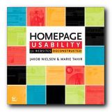
Homepage UsabilityThe first part of the book analyses the basic elements of a home page – its name, shape, content, links, navigation, and graphics. His statement of general principles (established with co-author Marie Tahir) includes information design, typography, and navigation, as well as consistency and logic of categorisation.

He makes all this seem perfectly reasonable and almost beyond doubt. This establishes Nielsen’s ‘Guidelines’ – which he then uses as a benchmark against which to dissect a collection of sites – ranging from amazon.com to yahoo.com. In other words, he aims high, and he doesn’t pull his punches.

The analysis is detailed and unsparing – and any Web designer who stays with him through the process will learn a lot. He is keen on simplicity, clarity, minimalism, overt navigation, and lack of visual clutter.

Everything is served up with Nielsen’s customary brio. If you score below 50% on his usability test, he shows no mercy. “Most likely, you should abandon [your] entire current site and start over from scratch”.

There have been criticisms of this approach – for instance, that he assumes an aggressive commercial model as the norm. But what if your site is a walk-through gallery, or a portfolio of work, rather than an e-Commerce site like Ford or Amazon. Surely the same ‘guidelines’ would not apply.

In each analysis he shows the client’s home page and describes it across a double page spread. Just occasionally he might even sprinkle a few words of praise. Then he pulls it apart bit by bit – showing where the designers are going wrong. The secret of his approach is attention to fine detail. He looks at the small print (literally and metaphorically) checking even the font, its size, its colour, and its position on the page.

I think you could argue with some parts of his methodology. For instance, in his statistical breakdown of screen real estate (how much space each topic occupies) he puts portal listings and niche product details into the same category. Then in some cases a list of category links might be rated lowly, whereas in others blatant advertising copy might be rated highly. I don’t think that is consistent, and it doesn’t correspond to the real user experience.

He’s good on conventions for naming. For instance, ‘site contents’ is not the same as ‘site map’ – because web users have quickly got used to certain conventions – the site name at top left, Help top right, and so on. Homepage links to ‘Forum’ for instance don’t mean much – even though the information beneath them might be quite valuable. These are valuable insights.

This is an attractive and well-illustrated book. Don’t be put off by the front cover – which makes it look like a home improvements catalogue. It’s is a serious workbook for Web designers at all levels. Anybody who wants to keep abreast of Web design and e-Commerce should read Nielsen – even if it’s to disagree with him.

© Roy Johnson 2003

Buy the book at Amazon UK

Buy the book at Amazon US


Jakob Nielsen and Marie Tahir, Homepage Usability: 50 websites deconstructed, Indianapolis, (Ind): New Riders, 2002, pp.315, ISBN: 073571102X


More on web design
More on digital media
More on technology


Filed Under: Web design Tagged With: e-Commerce, Homepage Usability, Jakob Nielsen, Usability, Web design

  • « Previous Page
  • 1
  • 2
  • 3
  • 4
  • 5
  • …
  • 9
  • Next Page »

Get in touch

info@mantex.co.uk

Content © Mantex 2016
  • About Us
  • Advertising
  • Clients
  • Contact
  • FAQ
  • Links
  • Services
  • Reviews
  • Sitemap
  • T & C’s
  • Testimonials
  • Privacy

Copyright © 2025 · Mantex

Copyright © 2025 · News Pro Theme on Genesis Framework · WordPress · Log in