Mantex

Tutorials, Study Guides & More

  • HOME
  • REVIEWS
  • TUTORIALS
  • HOW-TO
  • CONTACT
>> Home / Design / Graphic design

Graphic design

graphic design in theory and practice

graphic design in theory and practice

130 Alphabets and Other Signs

May 21, 2009 by Roy Johnson

charming samples of unusual alphabets, fonts, and signs

When it first appeared, this is a book I used to pick up and browse in bookshops, wondering whether to buy it or not. There was no need to be so cautious, because it’s quite cheap, and since taking the plunge it’s given me hours of enjoyment. Basically, it’s a sample book of fonts, characters, trademarks, alphabet designs, logos, and dingbats. But what makes the book so attractive is that the collection is both eclectic and suffused with a period charm of the inter-war years.
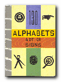
AlphabetsMany of the designs and fonts are drawn from that period – with a hint of colonial nostalgia in labels from products destined for Africa, China, and India. Even the pages are printed in a pre-faded manner and cut with rounded corners. But there’s also the cosmopolitan up-side to the same tendency, with fonts from the Victorian revival, Russian constructivism, and even an alphabet cut in bone by French prisoners during the Napoleonic wars.

There are elaborate display fonts, shaded letters, monograms, a set called ‘Huxley Vertical’ which seem like a precursor to Neville Brody, a selection of ink blots, labels from Joan of Arc laxatives, labels for matches, cigarettes and drinks, a two-page spread of ampersands, examples of visiting cards, Japanese packaging labels, even a typographic book-cover design by Natalia Goncharova from 1920s Paris.

Don’t expect any scholarly rigour. Although the collection is interspersed with a few short essays, there are very few technical details given. Many of the fonts are not even even given a name or credited by a caption. A full alphabet in Cyrillic on a single page is left to speak for itself. But somehow this doesn’t really matter.

The compilation is very obviously offered just as a source of visual stimulation, and it works marvelously. It would be a jaded aesthetic palate indeed which was not stimulated by the range and vitality of this collection. It’s a treat, from first page to last.

© Roy Johnson 2000

130 Alphabets and Other Signs   Buy the book at Amazon UK

130 Alphabets and Other Signs   Buy the book at Amazon US


Julian Rothenstein and Mel Gooding (eds), 130 Alphabets and Other Signs, London: Thames and Hudson, 1993, pp.183, ISBN: 0500277419


More on typography
More on design
More on media
More on web design

Filed Under: Graphic design, Typography Tagged With: Alphabets, Fontss, Graphic design, Symbols, Typography

20th Century Type: Remix

May 26, 2009 by Roy Johnson

illustrated showcase of 20th century type designers

This book became an instant classic on font design when it first appeared. The second revised and enlarged edition is even more impressive. In structure, it’s quite simple. Ten chapters are split into periods of a decade each. It starts from the Art Nouveau type of the early 1900s then works its way to the present via a series of beautifully designed pages.

Font DesignLewis Blackwell has a very keen eye and a sharp sense of historical innovation in spotting the typographical innovations developed by designers such as Marinetti and the Italian futurists, El Lissitsky, Moholy-Nagy, and the Bauhaus workers.

All the examples are illustrated by type in practical use, set alongside a number of sample font sets of what have become modern classics. There are some particularly good reproductions of book pages and the use of typography as a design feature.

What he’s done is to distil the essential innovations of designers such as Jan Tschichold and Paul Renner, and he places them in a well developed historical context. Into the middle of the century the names become Saul Bass, Roger Excoffon, Paul Rand, and Adrian Frutiger.

The 1960s sees the first signs of the influence of computer technology on type design, as well as the explosion of pop psychedelia on design. Some of the rock music albumn covers might make you cringe if like me you lived through that period.

In the 1980s the major influence is Neville Brody – who is still very popular and influential – as well as the Emigreé designers Rudy Vanderlans and Zuzana Licko. Next comes the ‘expressive’ school of David Carson. He challenged the notion of type’s legibility to the point where the pages of his work in the influential Ray Gun became almost unreadable.

Yet this experimental approach to designing type forms continued unabated in the 1990s, alongside more traditional work in public signage done by designers such as Erik Spiekermann. All of this is given generous coverage, and the book ends with a section on type description and classification – the most modern examples of which become BC (Beyond Classification).

This is an excellent piece of work which well deserves its place in the list of favourite typography manuals amongst professional designers.

© Roy Johnson 2000

20th Century Type   Buy the book at Amazon UK

20th Century Type   Buy the book at Amazon US


Lewis Blackwell, 20th Century Type: Remix, London: Lawrence King, 1998, pp.191, ISBN: 1856691160


More on typography
More on design
More on media
More on web design

Filed Under: Graphic design, Typography Tagged With: 20th century type, Fonts, Graphic design, Typography

72 dpi

July 2, 2009 by Roy Johnson

showcase of the latest in web design techniques

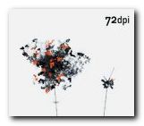
This is a handsome collection of web site illustrations – with a difference. All the designers wish to challenge conventional web design principles and exploit the possibilities of the new medium to achieve dramatically innovative effects. 72 dpi is a book with superb graphics and production values, but you have to be prepared for some challenging visual concepts. The pages make few concessions to what Jakob Nielsen calls ‘usability’. Plus the authors are not very good at explaining what they’re up to. Details of navigation and who produced what are almost wilfully obscure. But it’s all there if you’re patient.

72 dpi What the designers have in common is seemingly a desire to get away from standard navigation devices and text-dominated explanations of content. Their home pages offer instead visual dramas which are more like modernist paintings. Black and dark grey are the most popular screen colours, and there’s lots of imaginative use of typography as a graphic design element. When I checked some the sites, many of them were using Flash and Shockwave [no surprise there then].

The elegant page spreads are interspersed by brief policy statements from the designers, some of them interestingly thoughtful on the subject of web design and its new challenges, others lapsing badly into art school manifesto babble.

Some of the designs show exquisite use of colour. I particularly liked Matt Owens’ deeply layered pages which are reminiscent of Francis Bacon portraits. And indeed, some of these creations are very close to being works of art in a new medium.

Most of the latest avant-garde styles are represented – what Curt Cloninger calls HTML minimalism, Lo-Fi grunge, Mondrian poster, and Drafting table / transformer. What they certainly have in common is an imaginative approach to creating web sites. You are sure to find fresh ideas and visual stimulation here, even if they don’t reveal how their special effects are achieved.

© Roy Johnson 2000

72 dpi   Buy the book at Amazon UK
72 dpi   Buy the book at Amazon US


Robert Klanten (ed), 72 dpi , Berlin: Die Gestalten Verlag, 2000, pp.345, ISBN: 3931126358


More on design
More on media
More on web design

Filed Under: Graphic design, Web design Tagged With: Graphic design, Web design

A 2 Z and More Signs

May 21, 2009 by Roy Johnson

unusual alphabets, fonts, logos, symbols, and signs

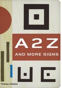
This is a compilation of the best-selling albumns of quirky typography, 130 Alphabets and Other Signs and A B Z: More Alphabets and Other Signs, with new materials added. Basically, it’s a sample book of fonts, characters, trademarks, logos, dingbats, and alphabet designs. But what makes the book so attractive is that the collection is both eclectic and suffused with a period charm of the inter-war years. Many of the designs and fonts are drawn from that period – with a hint of colonial nostalgia in labels from products destined for Africa, China, and India.

Alphabet Design Even the pages are printed in a pre-faded manner and cut with rounded corners to enhance this effect. There are elaborate display fonts, shaded letters, monograms, a set called ‘Huxley Vertical’ which seem like a precursor to Neville Brody, a selection of ink blots, labels from Joan of Arc laxatives, labels for matches, cigarettes and drinks, a two-page spread of ampersands, examples of visiting cards, Japanese packaging labels, even a typographic book-cover design by Natalia Goncharova from 1920s Paris.

The materials are the products of the main centres of modernist design in the first third of the last century: largely French, German, Czech, and Russian. The selection of material comes from private collections in London, Paris, Amsterdam, Prague, New York, and Mexico City.

Many of the designs appear here for the first time since their first use. Some of the examples, such as Karel Tiegel’s photo-balletic alphabet of 1926 and a Spanish civil war manual for illiterate soldiers, have never been reproduced before since they first appeared.

The sources of this new collection are wonderfully assorted. There are plenty of straight font sets, but also monograms, letter headings, package labels, posters, shop signs, opticians’ eye test charts, book jackets, film posters, technical manuals, propaganda leaflets, and magazine covers. The selection reflects mainly European modernism, constructivism, and Art Deco – though there are also novelties from Mexican graffiti and Asian medicine labels.

Each large page is striking in its muted, silkscreened colours, and the book
itself is amazingly attractive, with rounded corners, pre-faded yellow edges, and splotchy endpapers.

It has to be said that the main charm of this book is its unashamed retro feel; but I would defy anyone not to be pleased with the result. It is beautifully designed and produced, well printed, and altogether a must-have for anybody interested in typography and graphic design.

A 2 Z and More Signs   Buy the book at Amazon UK

A 2 Z and More Signs   Buy the book at Amazon US

© Roy Johnson 2006


Julian Rothenstein and Mel Goodwin, A 2 Z and More Signs, London: Thames and Hudson, 2006, pp.320, ISBN: 0500286043


More on typography
More on design
More on media
More on web design

Filed Under: Graphic design, Typography Tagged With: Alphabets, Graphic design, Symbols, Typography

A B Z More Alphabets and Signs

May 21, 2009 by Roy Johnson

glamorous collection of font sets and graphic designs

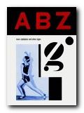
This is a follow-up to the excellent 130 Alphabets and Other Signs – a fascinating collection of font sets, alphabet design, and attractively printed designs from the early part of the last century. The sources of this new collection are wonderfully assorted. There are plenty of straight font sets, but also monograms, letter headings, packaging labels, posters, shop signs, opticians’ eye test charts, book jackets, film posters, technical manuals, propaganda leaflets, magazine covers, and dingbats. The selection reflects mainly European modernism, and Art Deco – though there are also novelties from Mexican graffiti art and Asian medicine labels.

A B Z: More Alphabets & SignsThe materials are the products of the main centres of modernist design in the first third of the last century: largely French, German, Czech, and Russian. The selection of material comes from private collections in London, Paris, Amsterdam, Prague, New York, and Mexico City.

Many of the designs appear here for the first time since their first use. Some of the examples, such as Karel Tiegel’s photo-balletic alphabet of 1926 and a Spanish civil war manual for illiterate soldiers, have never been reproduced before since they first appeared.

I was slightly disappointed that there’s so little explanation or comment on the materials – except for some rather cryptic notes on sources in the index. This seems to have been done to keep the display area free of any visual clutter.

Each large page is striking in its muted, silkscreened colours, and the book itself is beautiful, with rounded corners, pre-faded yellow edges, and green splotchy endpapers.

It has to be said that the main charm of this book is its unashamed retro feel; but I would defy anyone not to be pleased with the result. It is beautifully designed and produced, well printed (in Hong Kong) and altogether a must-have for anybody interested in typography, design, or attractive books.

© Roy Johnson 2004

A B Z: More Alphabets and Signs   Buy the book at Amazon UK

A B Z: More Alphabets and Signs   Buy the book at Amazon US


Julian Rothenstein and Mel Gooding, A B Z: More Alphabets and Other Signs, London: Redstone Press, 2003, pp.221, ISBN: 1870003330


More on typography
More on design
More on media
More on web design

Filed Under: Graphic design, Typography Tagged With: Alphabets, Fonts, Graphic design, Symbols, Typography

Alexander Rodchenko Design

June 21, 2010 by Roy Johnson

design, modernism, and constructivism

Alexander Rodchenko (1891-1956) was one of the most influential artists to emerge from the explosion of Russian modernism which took place between 1915 and 1923. Initially working as a painter, he stripped bare the canvas and worked with ruler and compasses to devise minimalist pictures which he described as ‘subjectless’. But then given the opportunities presented by the early years of the revolution, he went on to become a designer in furniture and fabrics, ceramics, posters, typography, stage and film design, exhibition display, and radical innovations in photography. He was a central figure in the movement of Russian constructivism, a radical activist, a theorist, teacher, and a pioneer of photo-montage. Alexander Rodchenko Design is an elegantly illustrated introduction to the full range of his work.

Alexander RodchenkoAfter the early abstract designs he moved on to public artworks – kiosks, posters, and theatre designs which you could say provided him with a subject – yet he continued to create what he called ‘spatial compositions’, many of which look like bicycle wheels distorted into three dimensional sculptural arrangements.

He worked alongside and sometimes in collaboration with Malevich, Kandinsky, and Tatlin, developing his abstract work into three-dimensional paintings, product designs, and constructions that were half way between art works and domestic objects. It was in the spirit of the new communism to produce an art that aimed to be useful, classless, and practical. This was the aim of what came to be called ‘Constructivism’, even if its results were what we would now call modernist art.

Alexander Rodchenko - poster design

In the early 1920s he produced the work for which he is best known – the combinations of collage images, new typography, and asymmetric graphic design which created the hallmark of Russian modernism. It is this brief period of state-sponsored radical designs that still have an influence today – as you can see in the work of Neville Brody and his many imitators.

His work in the late 1920s and 1930s centred largely on photography, much of it featuring objects shot from unusual angles – street scenes from overhead, trees and chimneys from ground level, all objects highlighted wherever possible by dark expressive shadows.

The illustrations are very well chosen to avoid some of the better-known images. Instead, they draw on quite rare materials from the Rodchenko and Stepanova archive in Moscow, the Burman Collection in New York, and the David King collection in London.

It’s amazing that such an original and gifted artist survived the Stalinist purges (unlike so many others) but then he did produce propaganda work which glorified the regime – including even such projects as the construction of the White Sea Canal in 1933 which cost the lives of 100,000 GULAG prisoners.

Alexander Rodchenko - magazine coverIn fact the depictions of his subjects become more and more heroic, almost in inverse proportion to the degree of social and political misery in the Soviet Union under Stalin. There is very little evidence (anywhere) of his work beyond 1940, even though he lived until 1956 – although there is one astonishing image in this collection dated 1943-44 which you would swear was a Jackson Pollock painting. But it seems quite obvious that the creative highpoint of his career is the 1920s, when he was free to experiment and theorise with his fellow pioneers, and even (dare one say it) when the state encouraged and supported such experimentation.

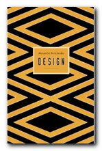
The series of design monographs of which this volume is part feature very high design and production values. They are slim but beautifully stylish productions, each with an introductory essay, and all the illustrative material is fully referenced. Even the cover design is taken from Rochenko’s work. It’s from a 1923 poster advertising Zebra biscuits.

Alexander Rodchenko Buy the book at Amazon UK

Alexander Rodchenko Buy the book at Amazon US

© Roy Johnson 2010


John Milner, Rodchenko: Design, Suffolk: Antique Collectors Club, 2009, pp.98, ISBN: 1851495916


More on art
More on media
More on design


Filed Under: Art, Design, Graphic design, Individual designers Tagged With: Alexander Rodchenko, Design, Graphic design, Modernism, Russian modernism

Anime

July 1, 2009 by Roy Johnson

Showcase of the latest digital animation – print and DVD

Don’t be misled if you see this book in a shop. It’s a dazzlingly attractive publication – an elegant catalogue of full-colour screenshots housed in a translucent plastic case. But the heart of the production is a huge collection of animated graphics on the enclosed DVD. These are movie clips, motion graphics, linear narrative sequences, interactive web pages, and vector presentations – some as long as promotional videos. They range from avant-guard art-school productions – fuzzy, out-of-focus, and granular – to slick commercial projects by some of the best designers in this new field.

AnimeQuite a few of the most stylish examples are rendered in the manner of French bandes dessinées and graphic novels – hard outlines, block colour, and a predominance of black and grey highlighted by occasional dark brown, blue, or citron. I’ve watched them over and over again, and I’m still amazed.

There’s lots of deliberately jerky editing, overlayering, jumpcuts, and out-of-focus images set to the rhythms of stripped-down, heavily sampled techno-music – sometimes drum-and-base dance style, and occasionally ‘ambient’ sound.

A lot of them are in what Web designer Curt Cloninger in his recent Fresh Styles for Web Designers calls ‘Drafting Table/Transformer’ style – the kind of things that look like docking station accidents in outer space. Others favour the ‘Mondrian poster style’ – screen filled with block colour in muted tones, and pared down text in lower-case sans-serif font.

There are lots of recurrent images and themes – architecture, motorways, metal fabrications, skyscrapers – and the spirit of Ridley Scott’s Bladerunner hangs over the majority. It’s a great pity there isn’t more technical detail on how these pieces were made – though Flash seems to be the prevalent technology.

Most of the movies seem to be from the ‘Yellow Submarine’ school of graphic design – lots of semi-surreal cartoon figures morphing in and out of each other. There’s also a popular streak of sci-fi comic book characters and their icons brought to life.

For me, the simplest and the shortest pieces are the best. There are two wonderful movie title sequences designed by YU + CO for ‘Mercury Rising’ and ‘Lost Souls’. These are in black and white, and they are largely composed of motion typography with a moody soundtrack. They show how a simple combination of image, movement, and music can create stunning effects.

This is not just a book with DVD attached, it’s an outstanding DVD gallery of motion graphics with a first rate printed catalogue. There is an amazing amount of visual stimulation material here for those studying or working in the digital arts. Anybody who is interested in graphic animation and the latest developments in Web technology should see these works.

© Roy Johnson 2001

Anime   Buy the book at Amazon UK

Anime   Buy the book at Amazon US


Robert Klanten (editor), Anime, Die Gestalten Verlag, 2001, pp.192 pages ISBN: 3931126722


More on design
More on media
More on web design

Filed Under: Graphic design, Media Tagged With: Anime, Graphic design, Media, Video animation, Web design

Bauhaus

June 16, 2009 by Roy Johnson

Design history: Weimar, Dessau, Berlin 1919-1933

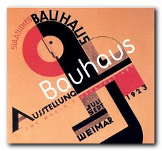
The Bauhaus was a major landmark in the development of modernism in the early years of the last century. In concept it grew out of the German desire to form its own version of the English Arts and Crafts movement, but it quickly became influenced by constructivism and expressionism. As a movement it grew rapidly in Weimar, despite the economic recession in Germany in the 1920s – and it embraced all forms of design – typography, ceramics, furniture, architecture.

Bauhaus Its principal teachers and movers are now household names in their respective disciplines – painters Wassily Kandinsky, Paul Klee, and Lionel Feininger; architects Walter Gropius and Mies van der Rohe; designers Joseph Albers and Laszlo Moholy-Nagy. What made them different to earlier design movements was that they wished to make their products available for industrial production.

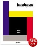
This is the first full-length study of the movement and its participants to be based on the papers of the Bauhaus archive – many of which are reproduced in this elegantly designed book which does its subject proud in terms of page layout and typographic design. Magdalene Droste traces both the artistic policies which were constantly changing as key personnel came and went, as well as the political and economic difficulties of keeping the institution afloat – most of which was achieved in its first phase by Walter Gropius.

The structure of the book follows the policies under its three directors – Gropius, Mayer, and van der Rohe on its three sites, Weimar, Dessau, and Berlin.

I hadn’t realised before that the curriculum also included drama, which produced mechanical ballet and abstract theatre which still seems quite avant garde now, eighty-odd years later. There are some wonderful pictures of the products of the institute: the first really modern furniture; stained glass, pottery, and rugs; plus some exquisite tableware by Marianne Brandt, who for me is the outstanding discovery of this collection.

brandt_02
Gropius presciently observed: “Much of what we today consider luxury will tomorrow be the norm” – and its true that looking at the (for then) ultra-modern chairs, tables, and kitchen cabinets is hardly any different to thumbing through a contemporary IKEA catalogue. Some of their designs were commercially successful, particularly their best-selling wallpaper designs, many of which are still in production today.

The Bauhaus is perhaps known best for its influence on modern architecture, and yet strangely enough that subject was not taught there until a demand for it was made by students and then implemented by Mies van der Rohe. Droste’s detailed accounts of the classes taught there and the examples of work produced make you wish you could sign up as a student.

The latter part of her story deals with the intense battles which went on between left and right-wing political forces over the future of the Bauhaus. These ended in 1933 with the victory of the Nazis and the closure of the institution.

If there is a weakness in this scholarly piece of work, it’s that the story is not taken beyond there. For we know that many of the principal figures involved emigrated to America and continued their work in the New World . But you have to stop somewhere, and any shortfall is made up for by the quality of the illustrations,

I spotted this book in a display on modernism at Waterstone’s, selected it as the best on offer, and was amazed when I saw the price. It’s another in the astonishingly cheap and high quality publications from Taschen

© Roy Johnson 2007

Bauhaus Buy the book at Amazon UK

Bauhaus Buy the book at Amazon US


Magdalene Droste, Bauhaus, London: Taschen, 2006, pp.256, ISBN 3822821055


More on architecture
More on technology
More on design


Filed Under: Architecture, Design history, Graphic design, Product design Tagged With: Architecture, Bauhaus, Design, Product design

Bauhaus 1919-1933

October 22, 2009 by Roy Johnson

modernist design movement

Bauhaus was a design movement which sprang up in Germany in post 1914-1918 as a reaction to the efflorescent curlicues of la Belle Epoque. It emphasised (particularly in theory) rectilinear practicality, function over form, and a political element of art for the masses rather than a privileged few. Most of its designers were of course middle-class artists who were caught up in the revolutionary fervour of the Weimar Republic – but its greatest strength in terms of enduring design is that many of its creations are still in production today. Wallpapers are still in print, vintage retro table lamps are either being reproduced at exorbitant prices, or are trading on eBay for not much less.

Bauhaus 1919-1933This is an excellent presentation of the work done there – for a number of reasons. First, it shows a wide range of products – from paintings, furniture, and architecture, to photography and household effects. Second, the illustrations are fresh and well researched. There are illustrations here I have never seen before in books on the subject. And third, there is plenty of historical depth and context, including original photos of the Bauhaus studios and the people who taught there.

The staff list is like a roll call of modernism at its highest – architects Walter Gropius and Mies van der Rohe, designer Herbert Bayer, painters Wassily Kandinsky, Paul Klee, Joseph Albers, and Lionel Feininger, artists El Lizitsky and Moholy-Nagy, plus the constructivists Vladimir Tatlin and Alexander Rodchenko. I was also glad to see that the book included work by the wonderful and much under-rated product designer Marianne Brandt.

marianne brandt

The format of the book is simple and effective. Double page spreads are arranged with explanatory text on the left and colour illustrations on the right. Just the right sort of proportion for this type of book. Full details of each item are provided, and there are links to further information in the appendices.

The range of items is quite astonishing. There are buildings (the Bauhaus workshops themselves) designs and photos of completed architectural projects, furniture, wall hangings, paintings, advertising posters, household objects such as electric lamps and tea sets, rugs, children’s toys, and photographs.

However, form and function were not always harmonised as successfully as they might have been. It has to be said that even a design ‘classic’ such as Gerrit Ritvelt’s armchair (1918) looked as modern as modern could be in 1918 – but as design critic Victor Papanek observes

These square abstractions painted in shrill primaries were almost impossible to sit in; they were extremely uncomfortable. Sharp corners ripped clothing, and the entire zany construction bore no relation to the human body

But the overwhelming impression one takes from a collection like this is of design inventiveness working at all levels – from architecture, interior and furniture design, through fabrics and furnishings, down to graphics and typography.

In fact much of today’s architectural design is directly attributable to the influence of the Bauhaus designers. Rectilinear buildings, minimalist interiors, walls made from glass bricks, bentwood furniture, ceiling to floor windows, uncarpeted hard surface floors. Moreover, the spirit of Bauhaus functionality lives on in the products and styles of stores such as Habitat and IKEA.

I got an email only the other day offering copies of the famous Barcelona chair (Mies van der Rohe 1929) for a mere $3000 – only they called it the ‘Madrid’ chair just to cover themselves. So the spirit of the Bauhaus is definitely alive and doing commercially well today thank you very much.

Bauhaus Buy the book at Amazon UK

Bauhaus Buy the book at Amazon US

© Roy Johnson 2009


Andrew Kennedy, Bauhaus, London: Flame Tree Publishing, 2005, pp.384, ISBN 184451336X


More on architecture
More on technology
More on design


Filed Under: Architecture, Design history, Graphic design, Product design Tagged With: Architecture, Art, Bauhaus, Cultural history, Design, Graphic design, Interior design

Blood, Sweat and Tears

June 25, 2009 by Roy Johnson

comic book illustrations and dark-souled graphics

Die Gestalten Verlag are curious publishers. They produce books of high-spec contemporary graphics and computer animations such as 72dpi and Anime – yet at the same time they come up with this curiously disembodied publication of assorted illustrations and sketch book entries. It’s quite difficult to understand its purpose, except as a sample portfolio of one designer’s work.

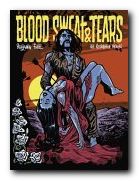
Blood, Sweat and Tears Benjamin Guedel is I suppose an illustrator. He draws pictures of a kind which seem to evoke a comic book retro feel of the 1970s and 1980s. The pictures are largely close-ups of people shown in reaction to dramatic situations. You will have to imagine scenes from pulp fiction or ‘adult’ comics. It’s the sort of work you would expect to find in something called Raw Comix or Naked Truth.

The images are largely nightmarish, with lots of the violence, anguish, and suffering to produce the blood, sweat, and tears of the title. The book is bizarre in that it has not a single printed word except its title – so as you flick through the pages there’s a very strong urge to construct a narrative from the sequence of images. Whether you can make a logic or narrative is up to you. I gave up after a couple of attempts.

In fact the illustrations are extracted from dark, violent, and surreal comic books to which he has contributed. And yet I was driven on to make the attempt for an oblique reason. It’s because this guy has got such an interesting web site. It features some of the same images, but there’s much more in his digital presence.

All of which is a shame – because the book could be a great advert for the site if the images were put into some sort of context, and if his web site was listed. But at the moment it’s the wrong way round.

© Roy Johnson 2005

Blood, Sweat and Tears   Buy the book at Amazon UK

Blood, Sweat and Tears   Buy the book at Amazon US


Benjamin Guedel, Blood Sweat & Tears, Die Gestalten Verlag, 2005, no page numbers, ISBN: 3899550749


More on design
More on media
More on web design

Filed Under: Graphic design Tagged With: Art, Graphic design

  • 1
  • 2
  • 3
  • …
  • 6
  • Next Page »

Reviews

  • Arts
  • Biography
  • Creative Writing
  • Design
  • e-Commerce
  • Journalism
  • Language
  • Lifestyle
  • Literature
  • Media
  • Publishing
  • Study skills
  • Technology
  • Theory
  • Typography
  • Web design
  • Writing Skills

Get in touch

info@mantex.co.uk

Content © Mantex 2016
  • About Us
  • Advertising
  • Clients
  • Contact
  • FAQ
  • Links
  • Services
  • Reviews
  • Sitemap
  • T & C’s
  • Testimonials
  • Privacy

Copyright © 2025 · Mantex

Copyright © 2025 · News Pro Theme on Genesis Framework · WordPress · Log in