creating effective text for on-screen reading
 In order the communicate effectively on the Internet, you need to know how to write a web page that is successful.
Web pages are available for the whole world to see – but you will no doubt have an audience in mind.
Your audience is the people you hope to be addressing. They might be – fellow hobbyists, opinion makers, customers for products, or fan club members.
So – you have your own target audience, but anybody else can read your pages. There is therefor another audience about which you can know nothing (in advance).
If you want to reach as many people as possible, keep this invisible audience in mind. Write in a clear and simple manner. Avoid jargon and complicated expressions.
Layout
A web page is not the same thing as printed document. It might look similar, but it does different things. Your writing needs to be grammatically correct and free from mistakes. But it will not be read in the same way as a book or even a magazine.
People scan a web page before they read it. They glance at the overall content first. They read headings and sub-headings, glance at pictures, and even look for links.
Reading text on a screen is much harder than reading it on a printed page. This means that your writing needs to be different in style.
Your objectives
The function of a web page will depend upon your objectives. The page could be designed to offer a number of things:
- news
- information
- entertainment
- instruction
- advice
This will have an effect on the way you deliver the content. But no matter what the function, there are certain golden rules that will help to make any web page effective.
Style
All your writing should be split up into small chunks. Huge blocks of writing on a screen are very difficult to read. The short paragraph is an important part of writing for the Web. This allows readers to grasp what you have to say more quickly.
Have a look at online newspapers. They use short and even one-sentence paragraphs.
Employ as many devices as possible to break up dense blocks of writing. Use headings, sub-headings, bold, and italics. Add graphics where appropriate and use bulleted lists.
Short sentences are easier to read than long ones. This is true on paper, but even more so when writing for the screen. Put a limit of twenty words per sentence on your writing – and watch its effectiveness improve!
The most effective way to communicate with general readers is to write directly in a simple, friendly manner.
Don’t forget that only a small part of a long web page will appear in the monitor screen at any one time. In such cases it’s important that you offer readers clear signals to find their way around.
Vocabulary
The language you use will be conditioned by your subject and the audience you are trying to reach (as well as the extent of your own vocabulary).
If you have a specialist subject and audience (agricultural biology, jet engine design) you will naturally be using the specialist language of your subject (jargon). But if you wish to reach a wide and general public, it’s better to keep you language plain and simple.
There’s no point in using a term such as aerated beverages when fizzy drinks will be understood just as well.
Conventions
It’s not necessary to know HTML coding to write a web page. Most software will do this for you. But a little knowledge will help you control the appearance of the page.
Use the text editing menus that appear in Microsoft Word and the page creation panels of most blogging software (Blogger, WordPress). These will give you the option to put text in bold, italics, and even colour.
A screen of text with different fonts, colours, and emphasis splattered all over the page looks bad. The golden rule here is this – Less is more. Restraint will help you achieve a more impressive appearance.
- Headings in bold and a larger font size
- Sub-headings in bold
- Italics for emphasis and foreign words
- No use of underlining at all
Underlining makes text hard to read, and the underlining can be confused with a hyperlink.
Examples
You are looking at an example of a web page right now. This type of page is called a ‘How to’ in the language of Web commerce. That is, it offers simple guidance notes on a single topic. Here are three more very different types of page.
Historical document
The first is from the nineteenth century. None of the above guidance notes apply, because readers want the document in a form that is as similar as possible to the original.
![]() Henry James on ‘The Art of Fiction’
Henry James on ‘The Art of Fiction’
Essay
The second is to a short illustrated essay on an artistic movement. This is the sort of article that might normal occupy a few pages in a magazine or a weekend newspaper supplement. It has graphics, links to related subject, and it also contains advertising.
Newspaper
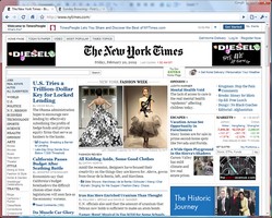
The third is the online version of a daily newspaper. Notice how this page is made up of very short extracts, with links to the full articles, which are located on separate pages. The front page is packed with links, graphics, and advertising. It is also composed ‘dynamically’ – which means that it is updated every few minutes with new content.
© Roy Johnson 2010
More on How-To
More on literary studies
More on writing skills
