Mantex

Tutorials, Study Guides & More

  • HOME
  • REVIEWS
  • TUTORIALS
  • HOW-TO
  • CONTACT
>> Home / Archives for Usability

A Pattern Language for Web Usability

June 20, 2009 by Roy Johnson

improve web site efficiency and usability

Pattern language is a notion borrowed from architecture. It means ‘standard solutions to recurring problems’. This is rather like ‘learning objects; in the design of training courses or standard solutions to problems in computer programming. In terms of Web design, this means using templates and lowest common denominator solutions to graphic interface design, following common routes, and using ‘patterns’ of what users normally expect to see on screen.

In software development, a pattern (or design pattern) is a written document that describes a general solution to a design problem that recurs repeatedly in many projects.
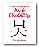
A Pattern Language for Web UsabilityThe first three chapters of this book discusses these issues theoretically. The topics are also linked to questions of usability, navigation, and information architecture. It has to be said that these pages make for rather dry reading. But then in the second, larger part of the book, everything comes to life. What follows is a series of seventy-eight case studies in which a problem is posed, analysed, and solved using the pattern language model.

This is as much business studies and project management as web design. But then anyone who has had to decide what to put on a homepage and where to place it will have already been engaged in such decisions.

It includes very good tips such as resisting the urge to add help features in place of removing anything which impedes a user’s intuitive navigation of the site. He draws heavily on the work of Jakob Nielsen, Jeffrey Veen, Steve Krug, and Edward Tufte – all of whom are reliable sources.

What emerges is good, brief advice notes on how to create site maps, where to position search boxes, use of colour-coding for navigation, breadcrumb trails, and where to place navigation bars.

These suggestions eventually include the more sophisticated issues of server side includes, cookies, and even security and encryption.

You won’t be surprised to hear that he advises against the use of frames. I wish somebody had told me that earlier. Converting from a framed to a non-framed structure has cost me more time, energy, and money than anything else on the site you are visiting now. Thank goodness for the arrival of WordPress and its content management system. Now that is a pattern that’s worth repeating.

© Roy Johnson 2003

Buy the book at Amazon UK

Buy the book at Amazon US


Ian Graham, A Pattern Language for Web Usability, London: Addison Wesley, 2003, pp.283, ISBN 0201788888


More on web design
More on digital media
More on technology


Filed Under: Web design Tagged With: A Pattern Language for Web Usability, Information design, Usability, Web design

Ambient Findability

July 10, 2009 by Roy Johnson

why designers must keep users in mind

Peter Morville was co-author (with Louis Rosenfeld) of one of the essential books on information architecture, Information Architecture for the World Wide Web. This is his solo follow-up, which looks at the latest features of on-line life and tries to see what lies ahead. Ambient Findability is a very positive, almost excited, view of the last decade in web development. His central thesis is that information literacy, information architecture, and usability are all critical components of a new world order.

Ambient Findability He believes we have almost an ethical imperative to design the best possible software and web services to enhance the quality of our online life. All this has come about because of the unprecedented developments in data manipulation, connectivity, hyperlinking, and interactive services which have emerged in the last few years.

His new take on arranging information and navigational systems insists that they must be constructed around what the user requires, not the designer, and that they must be constructed with maximum findability in mind. The users, purchasers, or consumers are now Kings – because of their experiences on sites such as eBay and Amazon.

Never before has the consumer had so much access to product information before the point of purchase.

He looks at wayfinding systems in the natural world, then considers the relationship between language and information retrieval, including how we define meta-data. He sets great store by the theory of information analyst Calvin Moores, who suggested that people will not seek information that makes their jobs harder, even if it might benefit the organisation they work for.

For this reason, he has positive things to say about gossip and browsing. We are conditioned by evolution to pick up signals and recognise what he calls ‘textual landmarks’ in our search for information and our interpretation of the world. “Technology moves fast. Evolution moves slow.”

Because computers are becoming smaller and smaller, he then moves on to an encomium for the mobile device. This is followed by the technology which comes closest to fulfilling his desire for maximum findability – GPS (Global Positioning Systems).

He then looks at the issues of reconciling good web design with the competing demands of usability and efficient marketing – and solves the problem with a mantra that summarises his principal thesis: “Findability precedes usability. You can’t use what you can’t find.”

This leads into what I take to be the heart of the book – his take on the state of information architecture today. First he explains the competing views regarding the ‘semantic web’, which centre around definitions of meta-data so far as I understand it. Then he argues that these views can be reconciled if we accept the traditional roles of taxonomies for defining data – along with what he called ‘folksonomies’ whereby people put their own definitions on tagged objects.

This is not as important a book as Information Architecture for the World Wide Web, but it’s a thought-provoking guide to recent web developments and what might happen next in the online world. It’s full of interesting and provocative ideas, relevant graphics (first time I’ve seen colour in an O’Reilly publication!) and all the references are fully sourced.

© Roy Johnson 2005

Ambient Findability   Buy the book at Amazon UK

Ambient Findability   Buy the book at Amazon US


Peter Morville, Ambient Findability, Sebastopol, CA: O’Reilly, 2005, pp.188, ISBN: 0596007655


More on information design
More on design
More on media
More on web design


Filed Under: Information Design, Web design Tagged With: Ambient Findability, Findability, Information design, Navigation, Search, Usability, Web design

Designing Web Usability

July 12, 2009 by Roy Johnson

provocative and radical examination of good web design

Jakob Nielsen is the number one guru of ‘Web usability’ – mainly because he invented the term. What this expression means in a general sense is the degree to which web sites have been designed with the needs of users in mind – as distinct from those of the designer or the site owner. Nielsen is former distinguished engineer at Sun Microsystems, and he has been writing on hypertext, navigation, and Internet engineering for the last decade. Designing Web Usability is part one of a two-volume major statement of his theories on web design.

Designing Web UsabilityHe expresses his views in a blunt and uncompromising manner. This is a bracing, indeed challenging book to read – but it is packed with reflections, principles, tips, and design theory on just about every possible aspect of web site design. He backs up his theory with the results of ‘usability testing’ and plenty of well illustrated, closely analysed real life examples, in many of which major companies have their sites held up for rigorous criticism.

His main priority is the creation of fast downloading pages (‘speed must be the overriding design criterion’) on the basis that people simply will not wait. Ten seconds is the average maximum, it would seem. To this end page size should be kept below 35K, and he’s severely critical of big graphics. (‘Remove graphic; increase traffic. It’s that simple’.) Similarly, he’s quite firm on the question of using frames: ‘Just say No’.

There are good arguments to back up all these assertions – but also occasional puzzles. He seems to take a radical and scientific line when he argues that a page is inefficient because only sixty percent of the screen is devoted to product and navigation. But then in the next breath he admits that good design might include ‘white space’ – that is, unused screen real estate. There is no explanation of where one consideration ends and the other begins. He also makes the radical claim that HTML Standard 1.0 should be the web author’s common denominator, but he is quite happy to discuss Cascading Style Sheets [supported only by version 4.0 browsers and above]. But these are minor problems: most of the time I was swept along by his infectious sense of intellectual exhilaration.

He argues for well-annotated outbound links, on the basis that each pointer towards useful information adds quality to your site. There are also interesting tips on links, such as not trying to link everybody to your home page. There’s a strong temptation to do this – because you would naturally prefer every visitor to explore your site in full. But there is no reason why they should tolerate searching your site when they have been referred on the promise of something specific.

On writing for the web he favours brevity, content chunking [short paragraphs] and accuracy – on the basis that Content is King. As he puts it in his idiosyncratic prose style, we should ‘write for scannability’. For someone whose message is to design for maximum usability, his language is occasionally a little opaque. He uses terms such as ‘instantiated’, ‘best-fit regression line’, ‘optimal user experience’ and ‘hedonic wage model’. But once again, this quirkiness is vastly outweighed by the density of good advice packed into every page.

Advanced web site designers will be interested in what he has to say about the use of audio, video, animation, and even 3D effects – yet he also has insightful things to say about some of the smallest and apparently mundane elements of a web page. It’s amazing what subtle nuances he wrings from his meditation on the choice of words for a page title for instance – something I imagine most people hardly give a second thought.

Beginners will appreciate his advice on matters such as creating good domain names for new businesses, whilst advanced users are catered for in sections which discuss the integration of your site with a search engine and the techniques for creating dynamic pages which change their content in response to customer demand.

He is unremittingly on the side of the user rather than the site owner or designer. In this sense he’s the very opposite of design and graphics guru David Siegel – arguing extreme functionality over aesthetic form.

We still need more sites to base their information architecture on the customer’s needs instead of the company’s own internal thinking.

On large scale sites, he has some interesting points to make regarding the distinctions between intranets and extranets, and he deals comprehensively with issues of designing for international audiences, for users with disabilities, and for Web TV. He ends with some predictions on likely trends over the next few years, reminding us that despite any increases in audience and bandwidth, the vast majority will be low-end users for whom the prime concern is download time.

There have recently been criticisms in some design circles that Jakob Nielsen is too dogmatic and that his theories are based on the commercial demands of the Internet. Some of this may well be true, but anybody who has the slightest interest in web pages, site design, and information architecture should read this book. I feel quite confident that it is destined to become a classic, and personally, I look forward to the next volume, which is going to tell us ‘How To Do It’. He’s even got a provisional title – Ensuring Web Usability – and lists it for us in his section of recommended reading.

© Roy Johnson 2002

Buy the book at Amazon UK

Buy the book at Amazon US


Jakob Nielsen, Designing Web Usability: The Practice of Simplicity, Indianapolis, Ind: New Riders, 2000, pp.420, ISBN: 156205810X


More on web design
More on digital media
More on technology

Filed Under: Web design Tagged With: Designing Web Usability, e-Commerce, Jakob Nielsen, Usability, Web design

Don’t Make Me Think

July 2, 2009 by Roy Johnson

illustrated guide to new web strategies and usability

This is one of the new generation of web usability manuals. The objective isn’t to produce sophisticated pages full of tricky code. It’s more concerned with general strategies – based not on what web designers can do, but on what web users actually need. Steve Krug’s sub-title makes his approach clear – ‘A Common Sense Approach to Web Usability’. He admits from the outset of Don’t Make Me Think that he will only comment on successful sites. [This is the opposite approach to Flanders and Willis’s very successful Web Pages that Suck]. And like many other instances of successfully applied common sense, his advice comes from carefully observed details. In almost every example of successful implementation here, you feel like saying ‘Oh yes – that seems so obvious now!.’

Don't Make Me ThinkHe’s particularly good at analysing the finer points of positioning instructions on the page, the careful use of navigation devices, and the reduction of all text and choices to an unambiguous minimum. That’s the point of his title. We want to get through web sites with the least possible thought and struggle. He has a light, friendly style, and almost every point he makes is elegantly illustrated by examples from well known web sites which you can check. He offers a detailed study of tabs for navigation, then a few sample pages as tests to see if his theories work – which they do.

There’s also a lot of good advice on the design of home pages – using and organising the screen real estate as efficiently as possible and maximising the information conveyed by visual messages. His arguments are illustrated with analyses and makeovers of well known sites.

He’s very strong on usability testing, and offers good reasons why it should be done as early in the design process as possible. He also shows how it can be done very simply, and even argues that a small group of three or four testers is enough.

This is a pricey but very elegant publication from New Riders – who have set new standards in book production values. It’s amongst their web design best sellers – and quite rightly so.

© Roy Johnson 2000

Buy the book at Amazon UK

Buy the book at Amazon US


Steve Krug, Don’t Make Me Think: A Common Sense Approach to Web Usability, Indianapolis (IN): New Riders, 2000, pp.195, ISBN 0789723107


More on web design
More on digital media
More on technology

Filed Under: Web design Tagged With: Don't Make Me Think, Navigation, Usability, Web design

E-Commerce User Experience

July 12, 2009 by Roy Johnson

guide to making eCommerce sites more efficient

Web guru Jakob Nielsen teamed up with design maven Donald Norman to form a consultancy which now dominates the business of Web ‘usability’. E-Commerce User Experience is a company report they have produced which offers guidelines on how to make e-commerce sites more efficient. The suggestions they make are based on findings from detailed studies of twenty e-commerce sites, with users in the United States and Europe. The sites tested are typical e-Commerce sites – clothes, flowers, books, furniture, toys, and CDs. Companies range from Boo, Sears, Disney, and eToys, to Herman Miller. The main issues covered include how to sell goods and services, how to build trust with customers, and how to display product information.

E-Commerce User ExperienceOther important issues include trading across national boundaries, and making the ordering transaction as smooth as possible. The testing methodology is meticulously documented, and in line with current thinking on quality testing, the emphasis is on small groups carefully watched – not mass numbers. It throws down the gauntlet to his critics. What he’s saying is – ‘This is what users actually do and want. Can you prove otherwise?’

Nielsen even gives you advice on how to do your own usability testing – and how to cut corners to make it cheaper than the very service he offers. In other words, he follows his own principles of ‘show the customer what’s available’. This is an approach which inspires confidence in the user – and it does the same for his readers.

He deals with issues which are very basic, and yet which can be difficult to do properly – such as how to categorise topics on a site. Do CD-ROMs belong under ‘entertainment’ or ‘electronics’ – or both? How to classify information requires that you have analysed your bank of data closely, and conceptualised the connections between its items.

On some of his recommendations you might be tempted to think ‘But that’s common sense’. For instance – ‘Make it clear how much products cost’. But when he examines the sample sites, it’s interesting how they often don’t deliver this information. Prices are often concealed until late in the checkout process.

He’s very thorough on how search results should be displayed – and in particular ‘failed results’. Any eBusiness which carries a lot of different stock items needs to think this issue through carefully. There’s also a detailed examination of the heart of any eCommerce site – the shopping basket. Every click, box, and link is examined for its relevance and efficiency.

He follows the policy of comparing eCommerce sites with physical bricks and mortar stores – which is reasonable, because these are the real competition. Some people are bound to complain that Nielsen’s paradigm is entirely commercial, arguing that there are Web sites where the ‘experience’ is paramount. His reply will be to point to his title – this is e-Commerce. But in fact the lessons we can learn from this can meaningfully inform designers of all kinds of sites.

Nielsen’s approach forces you to consider every smallest detail of the on-screen experience from the user’s point of view. This means clear labelling and navigation, intelligent page design, and thoughtful information architecture. Show graphics of your products – close-up pictures giving details. Arrange shopping carts so that the customer choices on colour, size, and other variables is made before the actual check out.

Don’t be surprised by the high price tag. What you’re paying for here is an industrial strength professional business report. Anybody working in eCommerce will profit from its recommendations. It’s packed with first-hand experience, well illustrated with real-life examples, and the advice offered is based on rigorous testing.

As one of his enthusiastic reviewers at Amazon says – ‘Anybody contemplating a serious e-Commerce site will find their investment in this report repaid ten times within the first year’s trading’. I think that might also be said for any serious Web designers or design studios.

© Roy Johnson 2002

E-Commerce User Experience   Buy the book at Amazon UK

E-Commerce User Experience   Buy the book at Amazon US


Jakob Nielsen et al, E-Commerce User Experience, Fremont (CA): Nielsen Norman Group, 2001, pp.389, ISBN: 0970607202


More on eCommerce
More on media
More on publishing
More on technology


Filed Under: e-Commerce Tagged With: Business, e-Commerce, E-Commerce User Experience, Jakob Nielsen, Online selling, Usability, Web design

Emotional Design

July 12, 2009 by Roy Johnson

why we love (and hate) the everyday objects we use

Donald Norman is famous for The Design of Everyday Things – a best-selling study of the need for functionality in consumer product design. It’s no good having tea pots that don’t pour properly, chairs you can’t sit in, or doorknobs that don’t open the door. Emotional Design is his follow up to that study, in which he revises his views. He confesses that he had previous under-rated the importance of emotions and aesthetics:

Product Design

in writing The Design of Everyday Things I didn’t take emotions into account … But now I have changed … Sure, utility and usability are important, but without fun and pleasure, joy and excitement…our lives would be incomplete. Along with our emotions, there is one other point as well: aesthetics, attractiveness, and beauty.

The first part of the book is actually concerned with the psychology of our response to objects. He suggests that we perceive them at a visceral, behavioural ,and a reflective level. That is – Do I like it? Does it work? and Will I use it again? The first is instinctive, the second rational, the third a combination of experience and cultural influence, rather like the super-ego.

The second part of the book applies these principles to product design. His examples range from mineral water bottles to web sites, and from hiking boots to industrial vacuum cleaners.

What he does here is to emphasise the desirability of good shape and satisfying textures. The rest is a repeat of what he argued in the earlier book. The product must work easily, and ideally it should be tested for usability (presumably by a company such as the Nielsen-Norman Group).

He is still generally on the side of functionality, but now appears to be prepared to defend the appeal of glamorous surfaces. However, you do begin to wonder about his judgements when he gets excited about owning one of those Martian-looking Philippe Starck lemon juicers which even the designer confesses were “not designed to squeeze lemons [but] to start conversations.”

He gets so carried away that when he comes to analyse the social interactions of text messaging and mobile phone conversations, it’s hard to see what it has to do with design, and much of what he has to say should be fairly obvious to everyone conversant with their advantages and limitations.

He eventually blends this interest in emotions and design by considering the future of robots which have been programmed to have emotions. Not necessarily human emotions, but appropriate for their function and survival.

Strangely enough, the rationale for all this is given in an epilogue which traces the development of his professional career. He has latterly been working with psychologists and now sees that human choices are made on more than functionality alone. [One wonders whether his business partner, the ultra-functionalist Jakob Nielsen is persuaded by this approach.]

This is a lively, thought-provoking study of design principles. Donald Norman writes in a friendly, jargon-free style, and he communicates a humane enthusiasm for his subject. I doubt that this will dislodge The Design of Everyday Things from the top of the Design Classics list, but it is one which anyone with an interest in design will not want to miss.

© Roy Johnson 2003

Emotional Design   Buy the book at Amazon UK

Emotional Design   Buy the book at Amazon US


Donald A. Norman, Emotional Design: why we love (or hate) everyday things, New York: Basic Books, 2003, pp.257, ISBN: 0465051359.


More on design
More on media
More on web design
More on information design


Filed Under: Product design Tagged With: Design, Donald Norman, Emotional Design, Product design, Usability

Fresh Styles for Web Designers

June 8, 2009 by Roy Johnson

new web design strategies and techniques

So far, web design theory has been split between usability minimalism as urged by gurus such as Jakob Nielsen at one end of the spectrum, and the bandwidth-hogging graphic designs of David Siegel at the other. Now Curt Cloninger suggests we can combine the two approaches – and he shows how it can be done. This is one of those Web strategy guides which assume you know the details of designing pages.

Fresh Styles for Web Designers What it offers is a survey of new strategies in structure and graphic presentation – some of them on the edge of the avant garde. Cloninger takes the line that these are the early days of the Web, that there are severe limitations on what is possible, but that inventive designers will embrace the limitations and turn them into positives.

The reasons he offers are that not all sites are driven by e-commerce or a desire to maximise hits. Some are exhibition or display sites; galleries or individual portfolios of work – something like an elaborate visiting card. There is no reason why such sites shouldn’t indulge themselves with the sorts of glamorous graphics and ‘entry pages’ supported by designers such as David Siegel.

He categorises sites as ‘Gothic’, ‘Grid-based’, ‘Grunge’, ‘Mondrian poster’, ‘Paper Bag’, and ‘HTMinimaLism’ – and despite his post-hippy approach these distinctions do eventually make sense. Designers in these camps treat the page design, the Web strategy, and the visitor experience in significantly different ways.

One of my favourites was the minimalist style – sites from the competition www.the5K.org which feature pages of games, puzzles and art collections the total size which must come in under five kilobytes. [Try it!] The other was the sci-fi look of what he calls ‘Drafting/Table Transformer’ style led by Mike Young, whose work is featured in the recently published book of animated graphics.

Each chapter describes the features of one style. It then analyses examples, with well-produced screenshots of sites which are often private and experimental. Then he tells you how to achieve these effects. It’s a very good formula – no matter what you think of the sites.

He’s quite keen on distressed backgrounds and the grunge typography of designers such as David Carson – and he tells you how to create the effects. This will appeal to those who want to make a visual impact. He has favoured designers who he claims have been influential – Mike Cina, Miika Saksi, and a Chicago design group 37signals.

There’s a lot of detailed instruction on how to achieve special effects – most of them done in Photoshop. The general strategy is to maximise visual effects whilst minimising download time. And it has to be said that all the effects are beautifully illustrated, with full pages of elegantly presented coding.

© Roy Johnson 2004

web design   Buy the book at Amazon UK

web design   Buy the book at Amazon US


Curt Cloninger, Fresh Styles for Web Designers, Indianapolis IN: New Riders, 2001, pp.211, ISBN: 0735710740


More on design
More on media
More on web design


Filed Under: Graphic design, Web design Tagged With: Fresh Styles for Web Designers, Graphic design, HTML, Navigation, Usability, Web design

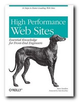
High Performance Web Sites

July 18, 2009 by Roy Johnson

fourteen steps to faster loading web sites

Steve Souders calls himself a ‘frontend engineer’. He’s a designer at Yahoo responsible for making their site work faster. He explains fourteen strategies for making web pages appear more quickly in a browser. And they’re not overly-technical. In fact he reveals his basic purpose from the outset in what he calls his Performance Golden Rule: “Only 10-20% of the end user response time is spent in downloading the HTML document. The other 80-90% is spent downloading all the components of the page”. From this flows his objective: the book is devoted to showing you his favoured methods of reducing that 80-90% time deficit and speeding up your page delivery.

High Performance Web Sites First he suggests that all scripts and any stylesheets should be rolled up together into one sheet each. That means that the server only makes one HTTP request per page instead of several. All this shaves valuable milliseconds off delivery time. Second (if you’re a big organisation) he suggests that you use a content delivery network. This means placing your web content on a number of different geographically disparate servers. Visitors making requests for your pages will get them more quickly from the nearest available source. Amazingly, some companies offer this service free of charge.

You can Gzip your content and your stylesheets, which might result in a 70%+ saving in file size, and he recommends putting stylesheets in the header and scripts at the bottom of the page.

He illustrates every one of the suggestions he makes with ‘before and after’ examples on his own web site – so it’s possible to check the effects and see his code.

Some of his tips seem better suited to large scale rather than small scale sites, but he shows in each case how you can best judge the decision for adopting them on your own site.

A knowledge of JavaScript and style sheets would be useful for understanding the details of his explanations, particularly if you are going to follow him into the process of obfuscating and munging your code. As you can perhaps guess from this, he’s much given to inventing his own jargon:

This step could also be an opportunity to minify the files … [You should] analyze your pages and see whether the combinatorics is manageable.

In the last section of the book he analyses the construction and performance of ten large scale sites (rather as Jakob Nielsen does in his Homepage Usability). The entry pages of Amazon, YouTube, CNN, Wikipedia, eBay, and MySpace are all put through tests, and the results show. (Not surprisingly, Google is fastest of all.) He then shows you how they could speed up their page delivery by implementing those of his fourteen rules which are appropriate.

In fact as one of his pre-publicity supporters observes: “If everyone would implement just 20% of Steve’s guidelines, the Web would be a dramatically better place “.

© Roy Johnson 2007

Buy the book at Amazon UK

Buy the book at Amazon US


Steve Souders, High Performance Web Sites, Sebastopol (CA): O’Reilly, 2007, pp.146, ISBN: 0596529309


More on web design
More on digital media
More on technology


Filed Under: Web design Tagged With: High Performance Web Sites, Technology, Usability, Web design

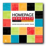
Homepage Usability

July 12, 2009 by Roy Johnson

rigorous examination of 50 big commercial websites

This is the latest broadside from usability guru Jakob Nielsen – well known for his radical and uncompromising views on Web design. It’s a follow-up to his best-selling Designing Web Usability. What he does in Homepage Usability is spell out the basic principles of what makes a Web page efficient – then he applies these principles to fifty commercial sites.

Homepage UsabilityThe first part of the book analyses the basic elements of a home page – its name, shape, content, links, navigation, and graphics. His statement of general principles (established with co-author Marie Tahir) includes information design, typography, and navigation, as well as consistency and logic of categorisation.

He makes all this seem perfectly reasonable and almost beyond doubt. This establishes Nielsen’s ‘Guidelines’ – which he then uses as a benchmark against which to dissect a collection of sites – ranging from amazon.com to yahoo.com. In other words, he aims high, and he doesn’t pull his punches.

The analysis is detailed and unsparing – and any Web designer who stays with him through the process will learn a lot. He is keen on simplicity, clarity, minimalism, overt navigation, and lack of visual clutter.

Everything is served up with Nielsen’s customary brio. If you score below 50% on his usability test, he shows no mercy. “Most likely, you should abandon [your] entire current site and start over from scratch”.

There have been criticisms of this approach – for instance, that he assumes an aggressive commercial model as the norm. But what if your site is a walk-through gallery, or a portfolio of work, rather than an e-Commerce site like Ford or Amazon. Surely the same ‘guidelines’ would not apply.

In each analysis he shows the client’s home page and describes it across a double page spread. Just occasionally he might even sprinkle a few words of praise. Then he pulls it apart bit by bit – showing where the designers are going wrong. The secret of his approach is attention to fine detail. He looks at the small print (literally and metaphorically) checking even the font, its size, its colour, and its position on the page.

I think you could argue with some parts of his methodology. For instance, in his statistical breakdown of screen real estate (how much space each topic occupies) he puts portal listings and niche product details into the same category. Then in some cases a list of category links might be rated lowly, whereas in others blatant advertising copy might be rated highly. I don’t think that is consistent, and it doesn’t correspond to the real user experience.

He’s good on conventions for naming. For instance, ‘site contents’ is not the same as ‘site map’ – because web users have quickly got used to certain conventions – the site name at top left, Help top right, and so on. Homepage links to ‘Forum’ for instance don’t mean much – even though the information beneath them might be quite valuable. These are valuable insights.

This is an attractive and well-illustrated book. Don’t be put off by the front cover – which makes it look like a home improvements catalogue. It’s is a serious workbook for Web designers at all levels. Anybody who wants to keep abreast of Web design and e-Commerce should read Nielsen – even if it’s to disagree with him.

© Roy Johnson 2003

Buy the book at Amazon UK

Buy the book at Amazon US


Jakob Nielsen and Marie Tahir, Homepage Usability: 50 websites deconstructed, Indianapolis, (Ind): New Riders, 2002, pp.315, ISBN: 073571102X


More on web design
More on digital media
More on technology


Filed Under: Web design Tagged With: e-Commerce, Homepage Usability, Jakob Nielsen, Usability, Web design

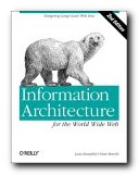
Information Architecture

July 16, 2009 by Roy Johnson

large-scale Web site structure, navigation, and usability

When it first appeared in 1998, Information Architecture became an instant classic amongst information architects. It now appears in its third edition, much enlarged and updated. The new edition reflects the rapid expansion and technical sophistication of large interactive web sites in the last few years. Rosenfeld and Morville deal with all the issues raised in organising information and navigational systems in the design of large-scale sites. Their important starting point is a recommendation that big sites should use three types of information organisation, which they identify as hierarchical, database, and hypertext.

Information Architecture Visitors to a site should have more than one possible route to the same piece of information. They ask some quite fundamental and interesting questions in their updated chapters. These cover issues of organisation, labelling, navigation, and searching – plus new chapters on thesauruses and meta-data.

The new edition has been given many more case studies, and lists of resources on IA have been added, many of which did not exist at the time of the first edition, and there’s a very good bibliography which painlessly blends print and web-based information. Navigation has been expanded into global, local, and contextual systems, and there is a lot more detail on search engines.

Another section which has been considerably expanded is that on classification systems and ‘knowledge management’. That is – where to put things, how to arrange, label and store information.

There’s also a much-enlarged section on the management of web development projects – from the initial strategy meetings through content analysis and mapping, to delivery and maintenance.

They present real life case studies, including one which details how a strategy report was written for Weather.com. Anybody who needs help with report writing will profit from reading this chapter. ‘Information Architecture’ was a relatively new term only a few years ago, but now as you can probably guess, it is of use to anybody who needs to organise information, ideas, or even physical objects – such as books in a library.

There’s an excellent account of how to draw up site maps and flow diagrams which help to explain the deep level architecture of sites to those who are going to populate them with content.

The same is true for page layout diagrams – which they call ‘wireframes’. These test the arrangement of items on main pages before they are passed on to a graphic designer. Architecture and usability are tested before the application of a graphic. It’s rather like designing the layout of a web page with table borders switched on – before setting them to zero.

They take an enthusiastic line on the use of navigational metaphors (the shop, the office, the library) about which other commentators such as Barbara Fleming and Jakob Nielsen are more cautious. The argument against this approach is that the metaphor of an office or a library will not mean much to people who are not familiar with them. And of course the same is true for icons and symbols.

This is a book for serious designers, project managers, and of course information architects. It is also a contribution to design theory which, en passant, makes librarians into the heroes of the information age. The valuable experience embedded within it will make useful reading for anybody organising information, designing a site, or providing content for it. If you read the first or second edition, it’s worth reading the third for the wealth of new material.

© Roy Johnson 2006

Information Architecture   Buy the book at Amazon UK

Information Architecture   Buy the book at Amazon US


Louis Rosenfeld and Peter Morville, Information Architecture for the World Wide Web, Sebastopol (CA): O’Reilly, third edition, 2006, pp.461, ISBN: 0596527349


More on information design
More on design
More on media
More on web design


Filed Under: Information Design, Web design Tagged With: Information architecture, Information design, Navigation, Structure, Usability, Web design

  • 1
  • 2
  • Next Page »

Get in touch

info@mantex.co.uk

Content © Mantex 2016
  • About Us
  • Advertising
  • Clients
  • Contact
  • FAQ
  • Links
  • Services
  • Reviews
  • Sitemap
  • T & C’s
  • Testimonials
  • Privacy

Copyright © 2025 · Mantex

Copyright © 2025 · News Pro Theme on Genesis Framework · WordPress · Log in