Mantex

Tutorials, Study Guides & More

  • HOME
  • REVIEWS
  • TUTORIALS
  • HOW-TO
  • CONTACT
>> Home / Archives for Web design

CSS The Missing Manual

July 8, 2009 by Roy Johnson

easy guide to styling web pages

We all know that cascading style sheets (CSS) is the way to go for web designers. It helps to separate style from content, and you can change the appearance, font, or layout of an entire website with just one tweak of style sheet code. But how d’you do it, and what’s the best way of controlling the appearance of your web pages? David McFarland’s new book CSS – The Missing Manual starts out by listing all the reasons you should wean yourself away from those old HTML habits and explaining why XHTML and the use of style sheets is more efficient. He explains inline and external stylesheets then very gradually shows you how to create one.
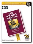
CSS The Missing ManualI still find it difficult to get my head round the abstract language of styles (declaration, selector, property, and value) but he spells it out as clearly as possible. But the best part about his approach is that he is systematic, detailed, and very straightforward. Each stage in the process is illustrated with a screenshot – though I think the use of colour printing would have helped. Then it’s on to class selectors, plus divs and spans for creating special effects

After that he moves on to discuss basic formatting – how to adjust the appearance of text on the screen. And i couldn’t help thinking that this should have come earlier. Almost any beginner I can imagine would first of all want to learn how to affect the appearance of text on the page, beforedealing with more complex issues such as ‘cascade inheritance’. So if you’re just starting out, jump straight to chapter six.

The good thing is that he shows you every step of the way: what to type in as CSS code; how to create the effect you need; refresh the browser – and, hey presto! – there it is on screen.

Another thing I like about this series is that all along the learning route they list software which is available as free download to perform the tasks that you need.

© Roy Johnson 2009

Buy the book at Amazon UK

Buy the book at Amazon US


David McFarland, CSS: the Missing Manual, Sebastopol, CA: O’Reilly, 2009, pp. 560, ISBN: 0596802447


More on technology
More on digital media
More on web design
More on computers


Filed Under: HTML-XML-CSS Tagged With: CSS, HTML-XML-CSS, Style sheets, Web design

Design and Build the Coolest Website in Cyberspace

July 11, 2009 by Roy Johnson

web design guidance manual – from start to finish

There are dozens and dozens of web design manuals on the market, so what makes this one any different than all the rest? Nick Nettleton has gone for a visually attractive layout. Every page in this guide is composed of densely layered graphics; every section is colour-coded; and every page is laid out in a very appealing manner. He takes web site design right from the simplest beginning – what equipment and software you need, how to get on line, and how to create your first pages.

Design and Build the Coolest Website in CyberspaceHe assumes you are going to use an HTML editor such as Dreamweaver or GoLive, so there’s no detail about tags and coding. Some may see this as a good thing, others a weakness – especially since in his first site project he uses heavily nested tables. However he covers all the basics – fonts, screen colours, and graphics. Then its on to the special effects you can create by adding colour, outlines, shadows, gradients, and textures.

There’s plenty on the manipulation of graphics – enhancing images, creating thumbnails, buttons, and icons. Then there are more advanced issues such as using templates and library items, when and when not to use frames.

When it comes to animation, there’s a lot of sound advice on Macromedia Flash – with other programs mentioned but trailing in terms of features. The same is true for sound and video, though there are a larger variety of formats to choose from.

He also covers style sheets and making your site interactive using DHTML, ASP, or PHP. It’s likely that you’ll need other guidance manuals if you want to pursue any of these advanced features in any detail, but the good thing about his approach is that it gives you an overview of web design with plenty of jumping off points offering the addresses of further resources.

He even goes as far as showing you how you could make money from your site once it’s up and running. And once again the approach is simple. Here is a list of possibilities and site details. Here is some advice plus the pros and cons of these approaches – with screenshots. Now go and do it.

© Roy Johnson 2004

Buy the book at Amazon UK

Buy the book at Amazon US


Nick Nettleton, How to Design and Build the Coolest Website in Cyberspace, Cambridge: Ilex, 2003, pp.224, ISBN 1904705065


More on web design
More on digital media
More on technology


Filed Under: Web design Tagged With: Design and Build the Coolest Website in Cyberspace, Technology, Web design

Designing Interfaces

July 20, 2009 by Roy Johnson

navigation, interactivity, and graphic design techniques

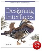
O’Reilly have recently taken to adding colour to their publications – and it works. The pages are more visually interesting, and the reader gets a more accurate picture of what will appear on screen. This book is attempting to get down to the fundamentals of interface design – How many clicks, how many screens do you need to see before you get to what you want? In fact Jenifer Tidwell starts of with usability issues, showing what real users do and ask of interfaces. Then she starts considering design, starting from the top and most general level – the organisation of content, or information architecture. This also includes consideration of the user interface or screen.

Designing InterfacesThe main strength of her approach is that she is very thorough. Her examples include different types of software and hardware. A design that works on a computer screen will have to be adapted if it’s going to be read on a mobile phone, and if viewed on a TV screen, you won’t have a mouse for navigation. She deals with web pages, installation programs, spreadsheets, and even graphic design packages – but keeps these issues in mind at all times.

Next comes navigation which deals with methods for leading the user through the contents. These include navigation panels, sequence maps, breadcrumb trails, and colour coding.

The next level down in terms of detail is page layout. This introduces elements of graphic design in arranging both content and navigation. This where the going can get rough. The layout part is easy if you’ve got a reasonable eye for design, but after that you need to choose between columns and tabs, and fixed width and liquid pages. She explains all the options, with the advantages and drawbacks of each.

Then comes what she calls the ‘verbs’ of the interface – objects such as buttons, action panels, and menus which make things happen. I was pleased to see that she gave as an example of bad design just how difficult it is to cancel a print job in Windows.

It’s fairly obvious that her principal interest is in information graphics – maps, tables, and graphs plus all their variants. Here she covers the ground which Edward Tufte has made his own – but you’ll find her prose easier to understand. She covers tooltips, expandable views, and what she calls ‘data brushing’ whereby the user can select which part(s) of a collection of information to view on screen.

Then comes a section on the much trickier issue of designing interactive choice lists. There are all sorts of possibilities here – forms, checkboxes, toggle buttons, dropdown lists, and so on – but the important point is that she illustrates them all, pointing to their advantages and weaknesses.

She even covers the design of interfaces for editors – such as text and image editing programs. Not many people outside a technological elite few will need to know these matters, but I found it instructive to see the general principles behind so many of the drag and drop or click and resize functions we come across all the time.

She finishes with a chapter any designer will enjoy – dealing with the graphic design of what appears on screen. This involves colour, spacing, typography, balance, and every other facet of visual rhetoric to make a visitor wish to stay on the site. I picked up some useful tips on hairlines and rounded corners here.

It’s a handsome, well-designed book – as befits its subject – and she includes a generous bibliography. O’Reilly have done her proud.

© Roy Johnson 2005

Designing Interfaces   Buy the book at Amazon UK

Designing Interfaces   Buy the book at Amazon US


Jenifer Tidwell, Designing Interfaces, Sebastopol, CA: O’Reilly, 2005, pp.331, ISBN: 0596008031


More on design
More on media
More on web design


Filed Under: Graphic design, Information Design Tagged With: Computers, Designing Interfaces, Graphic design, Information design, Navigation, Web design

Designing Web Graphics

July 23, 2009 by Roy Johnson

comprehensive tutorials on web site design

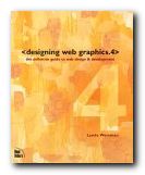
Don’t make any mistake. This is not just a book about designing web graphics. It’s the fourth edition of guru Lynda Weinman’s best-selling compendium of web design tutorials. She offers a manual of digital design which deals with far more than its title suggests. It covers all the basics of graphic design for the web – typography, browser safe colours, and the differences between HTML and XHTML. Almost every point is illustrated with a coloured screenshot; there are lots of tips and tricks in callout boxes; and she gives sources for free software such as XHTML editors, clip art, JavaScripts, and downloadable fonts.

Designing Web Graphics 4Serious designers will be interested in the fact that she includes lots of advice about getting work as a freelance designer. There’s also guidance on web project management, usability, and content architecture. She offers a particularly good explanation of how to organise the structure of a site and design its navigation system. And for anyone who wants to make their web design politically correct, there’s a clear account of current ‘accessibility’ requirements.

On graphics, she favours Photoshop and Fireworks in her coverage of all aspects of graphic files. These include JPGs, GIFs, scalable vector graphics, Flash, and PNG. She also covers colour pallets and compression techniques, plus effects such as transparency.

She’s very keen on rollovers, and devotes a lot of effort to explaining the JavaScript and Flash approaches to creating them, complete with examples of code.

She also explains tables, frames, and cascading style sheets, arguing for the advantages and disadvantages of each one, and she has lots of tips and tricks.

She finishes with the elements of audio files and animations using Flash, Macromedia Director, and Quicktime, then how to promote your site using newsletters, blogs, scripts, and search engine submissions.

This is the latest edition of a very popular guide. These New Riders publications are expensive but exceptionally good quality – packed with screenshots, links to websites, and recommendations for further reading.

© Roy Johnson 2004

artie shaw Buy the book at Amazon UK

artie shaw Buy the book at Amazon US


Lynda Weinman, Designing Web Graphics 4, Indianapolis IN: New Riders, 2003, pp.512 ISBN 0735710791


More on web design
More on technology
More on digital media


Filed Under: Web design Tagged With: Designing Web Graphics, Graphic design, Web design

Designing Web Navigation

June 30, 2009 by Roy Johnson

optimising the user experience

Anyone who has ever designed a web site will know that navigation of its contents is a key issue in the site’s usability. Visitors must be able to find their way around – otherwise they’ll leave, and they won’t come back again. Successful navigation systems require good screen design, well thought out information architecture, clear labelling, logical hierarchies, and effective linking. This book deals with all these issues of designing web navigation in an extremely thorough manner.

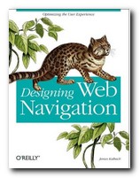
Designing Web NavigationEvery aspect of navigational design is examined in close detail – through both theoretical models and technical research, and a practical examination of a wide variety of large scale web sites from around the world. It’s a beautifully presented book, with elegantly designed pages, full colour illustrations, and scholarly yet unobtrusive footnotes leading to web references and recommendations for further reading.

The chapters are almost exhaustively thorough. On navigation mechanisms for instance, he covers every possibility – from tabs to breadcrumb trails, and from dropdown menus to sitemaps, tag clouds, A to Z indexes, and star trees. You couldn’t wish for anything more comprehensive. He discusses the advantages and the potential disadvantages of each system, showing examples of where they are used to good effect.

Although it is primarily concerned with the delivery of content over the Web and read in browsers on a computer, he also discusses the navigational consequences of content delivery via mobile phones, personal digital assistants (PDAs) and even car navigation systems.

On the issue of designing a navigation system he has a very sound piece of advice. “Don’t start by designing the navigation on the home page.” This might seem counter-intuitive, because for most designers the home page is the focus of their attention, and it’s the root, the index page of the entire site. But it’s not the most important page for visitors. Most of them will enter via a page deep within the site to which they have been referred by a link from a search engine.

Although there’s quite a lot on extensive usability testing, in general he strikes a reasonable balance between writing for professional designers of large scale corporate and ecommerce sites, and smaller sites which might be the work of an individual entrepreneur. There are certainly plenty of tips on the presentation of text on a page for instance which could help improve the work of an enthusiastic amateur.

He ends by discussing the relationship between navigation and searching, social tagging systems, and rich web applications. These latter post a new challenge to designers, because web pages are no longer static entities which appear in the order they are summoned via mouse clicks. Rich web applications can compose the content of a web page dynamically. Once the user has chosen a new set of data on screen, there is nowhere to go back to. The page URL remains the same, even though what is being displayed has changed. Fortunately, he provides ample guidance to designers on how to cope with such new problems.

I think this is a book which aspires to position itself alongside Louis Rosenfeld and Peter Morville’s Information Architecture for the World Wide Web and Jakob Nielsen’s Homepage Usability as modern classics of web design principles.

© Roy Johnson 2007

Designing Web Navigation   Buy the book at Amazon UK

Designing Web Navigation   Buy the book at Amazon US


James Kalbach, Designing Web Navigation, Sebastopol (CA): O’Reilly, 2007, pp.394, ISBN: 0596528108


More on information design
More on design
More on media
More on web design


Filed Under: Information Design, Web design Tagged With: Communication, Design, Designing Web Navigation, Information design, Web design

Designing Web Usability

July 12, 2009 by Roy Johnson

provocative and radical examination of good web design

Jakob Nielsen is the number one guru of ‘Web usability’ – mainly because he invented the term. What this expression means in a general sense is the degree to which web sites have been designed with the needs of users in mind – as distinct from those of the designer or the site owner. Nielsen is former distinguished engineer at Sun Microsystems, and he has been writing on hypertext, navigation, and Internet engineering for the last decade. Designing Web Usability is part one of a two-volume major statement of his theories on web design.

Designing Web UsabilityHe expresses his views in a blunt and uncompromising manner. This is a bracing, indeed challenging book to read – but it is packed with reflections, principles, tips, and design theory on just about every possible aspect of web site design. He backs up his theory with the results of ‘usability testing’ and plenty of well illustrated, closely analysed real life examples, in many of which major companies have their sites held up for rigorous criticism.

His main priority is the creation of fast downloading pages (‘speed must be the overriding design criterion’) on the basis that people simply will not wait. Ten seconds is the average maximum, it would seem. To this end page size should be kept below 35K, and he’s severely critical of big graphics. (‘Remove graphic; increase traffic. It’s that simple’.) Similarly, he’s quite firm on the question of using frames: ‘Just say No’.

There are good arguments to back up all these assertions – but also occasional puzzles. He seems to take a radical and scientific line when he argues that a page is inefficient because only sixty percent of the screen is devoted to product and navigation. But then in the next breath he admits that good design might include ‘white space’ – that is, unused screen real estate. There is no explanation of where one consideration ends and the other begins. He also makes the radical claim that HTML Standard 1.0 should be the web author’s common denominator, but he is quite happy to discuss Cascading Style Sheets [supported only by version 4.0 browsers and above]. But these are minor problems: most of the time I was swept along by his infectious sense of intellectual exhilaration.

He argues for well-annotated outbound links, on the basis that each pointer towards useful information adds quality to your site. There are also interesting tips on links, such as not trying to link everybody to your home page. There’s a strong temptation to do this – because you would naturally prefer every visitor to explore your site in full. But there is no reason why they should tolerate searching your site when they have been referred on the promise of something specific.

On writing for the web he favours brevity, content chunking [short paragraphs] and accuracy – on the basis that Content is King. As he puts it in his idiosyncratic prose style, we should ‘write for scannability’. For someone whose message is to design for maximum usability, his language is occasionally a little opaque. He uses terms such as ‘instantiated’, ‘best-fit regression line’, ‘optimal user experience’ and ‘hedonic wage model’. But once again, this quirkiness is vastly outweighed by the density of good advice packed into every page.

Advanced web site designers will be interested in what he has to say about the use of audio, video, animation, and even 3D effects – yet he also has insightful things to say about some of the smallest and apparently mundane elements of a web page. It’s amazing what subtle nuances he wrings from his meditation on the choice of words for a page title for instance – something I imagine most people hardly give a second thought.

Beginners will appreciate his advice on matters such as creating good domain names for new businesses, whilst advanced users are catered for in sections which discuss the integration of your site with a search engine and the techniques for creating dynamic pages which change their content in response to customer demand.

He is unremittingly on the side of the user rather than the site owner or designer. In this sense he’s the very opposite of design and graphics guru David Siegel – arguing extreme functionality over aesthetic form.

We still need more sites to base their information architecture on the customer’s needs instead of the company’s own internal thinking.

On large scale sites, he has some interesting points to make regarding the distinctions between intranets and extranets, and he deals comprehensively with issues of designing for international audiences, for users with disabilities, and for Web TV. He ends with some predictions on likely trends over the next few years, reminding us that despite any increases in audience and bandwidth, the vast majority will be low-end users for whom the prime concern is download time.

There have recently been criticisms in some design circles that Jakob Nielsen is too dogmatic and that his theories are based on the commercial demands of the Internet. Some of this may well be true, but anybody who has the slightest interest in web pages, site design, and information architecture should read this book. I feel quite confident that it is destined to become a classic, and personally, I look forward to the next volume, which is going to tell us ‘How To Do It’. He’s even got a provisional title – Ensuring Web Usability – and lists it for us in his section of recommended reading.

© Roy Johnson 2002

Buy the book at Amazon UK

Buy the book at Amazon US


Jakob Nielsen, Designing Web Usability: The Practice of Simplicity, Indianapolis, Ind: New Riders, 2000, pp.420, ISBN: 156205810X


More on web design
More on digital media
More on technology


Filed Under: Web design Tagged With: Designing Web Usability, e-Commerce, Jakob Nielsen, Usability, Web design

Designing with Web Standards

July 25, 2009 by Roy Johnson

XHTML + style sheets = creating ‘timeless code’

Jeffrey Zeldman is an evangelist for designing with web standards and browser compatibility. He suggests that we should embrace the latest technologies to design pages that everyone can view. And he shows how it can be done. The standards in this case are methods of what he calls ‘creating timeless code’. What he means by this is using HTML, XHTML, and style sheets to create pages which can be viewed in almost all current browsers. There are two possibilities – both of which combine XHTML and style sheets.

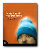
Designing with Web Standards The first is ‘transitional’ and allows light use of tables for positioning page elements. The second is ‘strict’ and requires you to use CSS for all matters of appearance. There’s a lot about browser development and why Netscape and Internet Explorer from versions 1.0 to 6.0 caused the problems for which Web standards are a solution. Then he launches into an enthusiastic account of how XML will be the technology to finally end the browser wars.

After the theory and argument, the second part of the book shows you how to work in XHTML. This will be relatively easy for anyone used to dealing with HTML. The harder part is controlling the layout and appearance of pages using style sheets.

Zeldman adopts a realistic and tolerant line, knowing that most designers will take the transitional route from HTML to XHTML. He designs a sample site using a combination of XHTML, tables, and style sheets, showing how they can be combined and yet still pass the requirements of W3C validation.

His mission all the while is to reduce the amount of code required to render a page, to eliminate ‘bloat’, and make pages available in all browsers. The secret here seems to be that pages can’t be made to look the same, but they can be made to look acceptable.

As a website designer, I would much rather have my users say my web pages ‘look funny’ rather than saying they ‘don’t work’.

He explains style sheets in a simple and clear manner, then shows them in use as he designs an attractive-looking web site one step at a time.

En passant, he reveals an amazingly clever trick for dealing with older browsers which don’t fully support style sheets. It’s to create a second, simpler set of styles, and force old browsers to use them, leaving more recent browsers to pick up the first more sophisticated set.

He also has lots of useful advice about dealing with multiple browser support, though by the time he has explained all the potential difficulties, you begin to wonder how any web page ever gets published at all.

The latter part of the book deals with accessibility issues, and he ends by showing how the interface of his personal site at zeldman.com was re-designed using style sheets. All the code and the style sheets are available as free downloads at his site.

I was surprised that there was no bibliography, and I think the publishers should have treated him to full colour reproduction. This is intermediate to advanced level guidance, but Zeldman does everything he can to make it entertaining and accessible.

Buy the book at Amazon UK

Buy the book at Amazon US

© Roy Johnson 2005


Jeffrey Zeldman, Designing with Web Standards, Indianapolis:IN, New Riders, 2003, pp.435, ISBN: 0735712018


More on web design
More on digital media
More on technology


Filed Under: Web design Tagged With: CSS, Designing with Web Standards, Technology, Web design, XHTML

Developing Online Content

June 26, 2009 by Roy Johnson

The principles of writing and editing for the Web

Anybody who has worked on Web projects will know they can become very complex. And those who provide the textual content are often trapped between graphic designers striving for visual glamour, and clients who want to promote their message. This guide to the entire process offers both detailed advice on writing and editing, plus checklists of help on how to clarify the job of the content provider, and how to survive a project. The authors start out by explaining the role of the web author and editor. This tends to be a mixture – part designer, part content provider, part information architect, plus usability tester and proofreader.

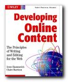
Developing Online ContentThey start with an excellent analysis of why so many business web sites are unappealing, inefficient, and downright bad. There’s a very good example of their makeover of the CIA web site, which spends too much time patting itself on the back. They improve its efficiency by ruthless pruning and making the information user-oriented. This is a master class in converting text from its print brochure origins to web-based delivery.

The focus throughout is on text, but they give plenty of attention to its close relationship with images on web sites. There’s also an interesting consideration of the theory, the psychology, and the creation of hypertext links.

They have a lot of interesting observations on the relationship between the Web page and the screen. The issues are those all Web authors confront: how to minimise scrolling; how to keep content in the reader’s mind; and how to create tight structure and clear navigation.

They also have valuable advice on creating editorial style guides and proofreading, plus an explanation of the latest technology and how it affects the content of a site.

It’s a professionally oriented book, which assumes readers might wish to work in the new medium. And they tell you how to go about it. There are tables and checklists of the skills you will require and even pointers towards the opportunities available and what rates to charge.

This is aimed at intermediate to advanced users – but it will be of interest to anybody who wants to extend their writing skills into the digital realm. I read this book whilst engaged on two medium-sized Web projects, and can confirm that all the roles, tasks, and collaborations they describe are 100 per cent accurate.

© Roy Johnson 2002

Buy the book at Amazon UK

Buy the book at Amazon US


Irene Hammerich and Claire Harrison, Developing Online Content: the Principles of Writing and Editing for the Web, New York: John Wiley, 2002, pp.384, ISBN 0471146110


More on online learning
More on technology
More on digital media
More on web design
More on computers

Filed Under: Online Learning, Web design Tagged With: Developing Online Content, eLearning, Online learning, Web design, Web writing, Writing skills

Don’t Make Me Think

July 2, 2009 by Roy Johnson

illustrated guide to new web strategies and usability

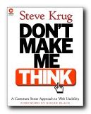
This is one of the new generation of web usability manuals. The objective isn’t to produce sophisticated pages full of tricky code. It’s more concerned with general strategies – based not on what web designers can do, but on what web users actually need. Steve Krug’s sub-title makes his approach clear – ‘A Common Sense Approach to Web Usability’. He admits from the outset of Don’t Make Me Think that he will only comment on successful sites. [This is the opposite approach to Flanders and Willis’s very successful Web Pages that Suck]. And like many other instances of successfully applied common sense, his advice comes from carefully observed details. In almost every example of successful implementation here, you feel like saying ‘Oh yes – that seems so obvious now!.’

Don't Make Me ThinkHe’s particularly good at analysing the finer points of positioning instructions on the page, the careful use of navigation devices, and the reduction of all text and choices to an unambiguous minimum. That’s the point of his title. We want to get through web sites with the least possible thought and struggle. He has a light, friendly style, and almost every point he makes is elegantly illustrated by examples from well known web sites which you can check. He offers a detailed study of tabs for navigation, then a few sample pages as tests to see if his theories work – which they do.

There’s also a lot of good advice on the design of home pages – using and organising the screen real estate as efficiently as possible and maximising the information conveyed by visual messages. His arguments are illustrated with analyses and makeovers of well known sites.

He’s very strong on usability testing, and offers good reasons why it should be done as early in the design process as possible. He also shows how it can be done very simply, and even argues that a small group of three or four testers is enough.

This is a pricey but very elegant publication from New Riders – who have set new standards in book production values. It’s amongst their web design best sellers – and quite rightly so.

© Roy Johnson 2000

Buy the book at Amazon UK

Buy the book at Amazon US


Steve Krug, Don’t Make Me Think: A Common Sense Approach to Web Usability, Indianapolis (IN): New Riders, 2000, pp.195, ISBN 0789723107


More on web design
More on digital media
More on technology


Filed Under: Web design Tagged With: Don't Make Me Think, Navigation, Usability, Web design

Dreamweaver The Missing Manual

July 8, 2009 by Roy Johnson

complete manual and guide to popular web editor

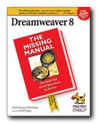
The ‘Missing Manual’ series is the brainchild of best-selling author David Pogue. These guides provide printed instructions for software normally issued without them. Dreamweaver seems to be the web design tool of choice for both serious amateurs and professionals. It offers lots of powerful tools which allow you to control everything from the details of page design to larger issues of style sheets, JavaScript interactivity, and Web management. Dreamweaver is to web pages as a word processor is to normal documents. That is, it has multiple commands which format the page in any way you wish. And the good thing is, you don’t have to learn any of the underlying code.

Dreamweaver 8 The Missing Manual You can preview the results in multiple browsers – whichever you have installed. This manual covers all the conventional topics of web design – tables, frames, links, text formatting, and layout – but without once discussing the hieroglyphics of coding which must deter so many people wishing to design their own pages. It also deals with the more advanced features of web design, using style sheets, forms, layers, and multimedia such as Flash and Shockwave.

I think this is what has made Dreamweaver so popular – it caters for the amateur who doesn’t need to learn code; the semi-pro who needs power tools on a reasonable budget; and even the pro who wants site maintenance and management. It handles all these levels of task with ease.

Dreamweaver has lots of terrific features – such as a tool which will convert tags from upper to lower case – that is from from <B> to <b>. Why is this important? Because XML – to which we’re all heading – requires lower case tags. This makes it a powerful conversion tool, amongst other things.

There’s even a feature for re-organising existing sites which will automatically update all your links and folders. In addition, you can run a site past the program and it will show you any orphaned pages and broken links. These are excellent features for both amateur and professional users.

David McFarland’s explanations are painstaking and thorough, and these Missing Manuals are produced at O’Reilly Associates – which guarantees high quality production values.

© Roy Johnson 2006

Buy the book at Amazon UK

Buy the book at Amazon US


David McFarland, Dreamweaver: The Missing Manual, Sebastopol (CA): Pogue Press/O’Reilly, 2006, pp.960, ISBN: 0596100566


More on web design
More on digital media
More on technology


Filed Under: Web design Tagged With: Dreamweaver, HTML, HTML-XML-CSS, Web design

  • « Previous Page
  • 1
  • 2
  • 3
  • 4
  • …
  • 9
  • Next Page »

Get in touch

info@mantex.co.uk

Content © Mantex 2016
  • About Us
  • Advertising
  • Clients
  • Contact
  • FAQ
  • Links
  • Services
  • Reviews
  • Sitemap
  • T & C’s
  • Testimonials
  • Privacy

Copyright © 2025 · Mantex

Copyright © 2025 · News Pro Theme on Genesis Framework · WordPress · Log in