Mantex

Tutorials, Study Guides & More

  • HOME
  • REVIEWS
  • TUTORIALS
  • HOW-TO
  • CONTACT
>> Home / Arts / Art

Art

art, painting, and digital media

art, painting, and digital media

art, painting, and digital media

A Crisis of Brilliance

October 11, 2015 by Roy Johnson

biographical studies of five early English modernist painters

A Crisis of Brilliance is a study of five talented British painters in the early modernist period who were contemporaries at the Slade School of Art – Dora Carrington, Mark Gertler, Stanley Spencer, Richard Nevinson, and Paul Nash – a generation which their Professor of Drawing Henry Tonks described in the phrase which gives the book its title.

A Crisis of Brilliance

Author David Boyd Haycock’s approach is to present the biographical sketches like a relay race. With one artist profile under way, he passes on to the next, until they are all at work simultaneously. This makes the book eminently readable and it also reinforces the fact that the members of this group, though from very different backgrounds, were all developing their talents in the same artistic environment, and at the same time.

Stanley Spencer was from a small village in Berkshire on the Thames. He had virtually no formal education, and was introduced to the world of art via the patronage of a local landowner’s wife. His drawing skills were so developed that he was allowed to skip the Slade’s formal entrance requirements of a written exam.

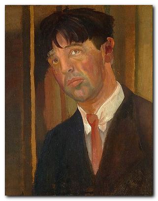
Mark (Max) Gertler was the youngest son of poor Jewish immigrants who settled in London’s East End. He left school early and worked in a stained glass studio to pay his tuition fees at Regent Street Polytechnic. Via social connections he was fortunate enough to meet fellow painter Isaac Rosenberg and the gallery owner William Rothenstein, through whose influence he was admitted to the Slade.

The students of this generation graduated from sketching plaster casts in the Antiques Room to the Life Class where they were allowed to draw nude models (women) for the first time. It is interesting to note that conversation between male and female students was frowned upon by the School, and any discussion with the models strictly forbidden.

Stanley Spenser missed out on these late afternoon life classes because he had to catch the train back home. His fellow student Richard ‘Chips’ Nevinson satirised this provincialism by calling Spenser ‘Cookham’ – the name of his home village. It was a nickname which stuck with him throughout the rest of his time at the Slade.

Stanley Spencer - self portrait

Stanley Spencer – self-portrait 1923

The next arrivals in 1910 included Paul Nash, and Dora Carrington. Nash was another educational tragedy whose only talent was drawing. He paid his own fees for the one year he spent at the Slade, and made rapid progress despite the caustic tutorial method of Henry Tonks.

Carrington too was someone whose background almost inhibited any form of intellectual development, but her skill at portraiture gave her access to the premier art college in England and the bohemian life in Bloomsbury that she craved. She had her hair cropped, wore men’s clothes, and became quite avant garde in her behaviour if not in her style of painting.

One interesting feature (which might be worth further exploration) is that none of these people were particularly gifted in an academic sense. Spencer had almost no formal education, Nevinson went to a public school, from which he emerged with nothing but contempt for its values, Paul Nash was an educational duffer, Gertler left school at fourteen, and Carrington’s education didn’t begin until she arrived at the Slade.

Dora Carrington biography

Yes – that’s Dora Carrington

Nineteen hundred and ten was a good year to be there, because as Virginia Woolf later observed ‘On or about December 1910, human character changed’. The occasion to which she referred was the exhibition of post-Impressionist paintings organised at the Grafton Galleries in Mayfair by her friend Roger Fry, the newly appointed Professor of Art History at the Slade.

The exhibition was enormously controversial. Henry Tonks actually pleaded with students to stay away from the Galleries altogether lest they be ‘contaminated’. However, although the Slade group were enthusiastically modern in their behaviour, the post-Impressionists did not greatly affect their style of painting – with the exception of Carrington, who felt that her whole life had been changed at this point. Stanley Spencer carried on painting as before and was more enthusiastic about the early Italian masters than ever.

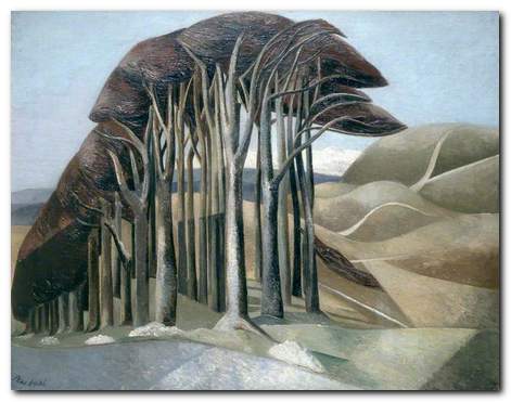
Nevinson and Gertler became involved in a triangular relationship with Carrington – one that continued long after they had all left the Slade. Paul Nash discovered his visionary appreciation of the English countryside, Spencer retired to Cookham to produce allegorical works such as John Donne Arriving in Heaven and Gertler was the envy of his colleagues, earning £1,000 a year painting society portraits.

In addition to the painters, Haycock also includes studies of the patrons who bought and collected their works. The most outstanding amongst these was Eddie Marsh, personal secretary to Winston Churchill (at that time First Lord of the Admiralty) who inherited money paid in compensation to the family of his relative Spencer Percival, the only British prime minister to be assassinated. Marsh called it ‘the murder money’ and used it to buy paintings.

When war broke out in 1914 the responses of the Slade group varied from Paul Nash immediately enlisting (for Home Guard duties) to Gertler’s absolute refusal to countenance the conflict in any way. Gertler escaped into the countryside with fellow refusenik D.H.Lawrence, later moving to Hampstead where he became friendly with Lytton Strachey and other members of the Bloomsbury Group.

Dora Carrington followed suit via a different route, and ended up falling in love with Lytton Strachey in a famous incident when she crept into his bedroom at night to cut off his long beard with a pair of scissors. Strachey was completely homosexual, but that did not prevent them going on to have a lifelong relationship, living together.

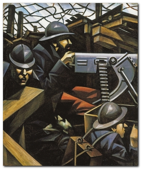
As the mass slaughter of the war continued unabated into 1916, more bodies were required to fill the trenches. The Conscription Acts meant that any male between eighteen and forty-one was obliged to enlist for service. This led to people registering as conscientious objectors, and their reactions to the war were summed up by Gertler in what was to become his most famous painting, Merry-Go-Round. Nevinson had a similar success with his painting La Mitrailleuse.

Richard Nevinson - La Mitrailleuse

Richard Nevinson – La Mitrailleuse (1915)

After leaving the war as invalids, both Nevinson and Nash were recalled to military service, and only with great difficulty managed to secure positions as war artists, but this helped them both to stay away from the slaughter in the front lines. Meanwhile Carrington finally gave in to Gertler’s sexual demands, yet at the same time established her curious sexless menage with Lytton Strachey. They moved into a large mill house at Tidmarsh in Berkshire.

Stanley Spencer was pinned down in the Balkans whilst suffering from the irony that he had been asked to contribute to a war memorial. When the war finally ended he was given rapid transit back home – only to find that plans for the memorial had meanwhile been scrapped. However, he threw himself into the completion of one of his masterpieces, Swan Upping at Cookham which had been left unfinished at his conscription.

After the war Carrington managed to complicate her life even further by marrying Ralph Partridge, with whom her partner Lytton Strachey was in love. It was her way of keeping them all together. She also went on to have an affair with her new husband’s best friend, Gerald Brenan, then passed on to relationships with women. She continued painting but did not exhibit, and was generally depressed. Her suffering came to an end when Strachey died of stomach cancer in 1932 and she shot herself, unwilling to go on living without him.

Gertler’s life after the war (or in his case, after Carrington) was a series of ups and downs. He was penniless one minute, successful the next. He married a former Slade student and they had a son, but the marriage was not a success. By the late nineteen-thirties, feeling that his personal and his professional life were failures, and learning that Hitler was persecuting Jews, he gassed himself in his studio.

Nevinson and Nash became ‘war artists without a war’. Nevinson’s post-war years were tortured – mainly by his rancour at not being celebrated, and he died embittered in 1946. Nash on the other hand emerged from the war with what we now call post-traumatic stress disorder. He was unsure how to develop any further sense of modernism and reverted to traditional landscape painting. There was a brief flirtation with the surrealists, but that came to nothing. Unlike Nevinson, he did become a war artist again during 1939-45, but his health gave out and he died of heart failure in 1946.

Paul Nash - Wood on the Downs

Paul Nash – Wood on the Downs (1929)

Stanley Spencer was the longest-lived of this group. In 1925 he suddenly married a fellow Slade student Hilda Carline and he discovered a new subject for some of his later works – conjugal sex. The sudden change to his normally puritanical lifestyle presaged major disruptions. First he moved back to Cookham trying to recapture (unsuccessfully) some of his earlier feelings and artistic inspiration. Then he met Patricia Preece, a former Slade student who was living in the village with her lover Dorothy Hepworth.

Spencer proposed a menage a trois with Patricia, but his wife refused and divorced him. He immediately married Patricia who equally refused to cohabit or to have any sexual relations with him. So he ended up with a wife, an ex-wife, and two children to support. When he signed over the deeds of his own home to her, his wife forced him out, and perhaps not surprisingly he had a nervous breakdown. He was commissioned as a war artist during 1939-45 and completed paintings of shipbuilding on the Clyde. But his main creative impetus was spent, and he died in 1956, the same year as he received a knighthood.

Haycock’s elegant study quite rightly got rave reviews when it was first published. It is well structured and written, beautifully illustrated, and like all successful studies of this kind leaves you with a desire to know more about this cultural period and these quasi-tragic figures who contributed so much to English visual culture.

Richard Nevinson Buy the book at Amazon UK

Richard Nevinson Buy the book at Amazon US

© Roy Johnson 2015


David Boyd Haycock, A Crisis of Brilliance, London: Old Street Publishing, pp.386, ISBN: 1906964327


More on art
More on media
More on design


Filed Under: Art, Biography Tagged With: Art, Biography, Cultural history, English painting

Alexander Rodchenko Design

June 21, 2010 by Roy Johnson

design, modernism, and constructivism

Alexander Rodchenko (1891-1956) was one of the most influential artists to emerge from the explosion of Russian modernism which took place between 1915 and 1923. Initially working as a painter, he stripped bare the canvas and worked with ruler and compasses to devise minimalist pictures which he described as ‘subjectless’. But then given the opportunities presented by the early years of the revolution, he went on to become a designer in furniture and fabrics, ceramics, posters, typography, stage and film design, exhibition display, and radical innovations in photography. He was a central figure in the movement of Russian constructivism, a radical activist, a theorist, teacher, and a pioneer of photo-montage. Alexander Rodchenko Design is an elegantly illustrated introduction to the full range of his work.

Alexander RodchenkoAfter the early abstract designs he moved on to public artworks – kiosks, posters, and theatre designs which you could say provided him with a subject – yet he continued to create what he called ‘spatial compositions’, many of which look like bicycle wheels distorted into three dimensional sculptural arrangements.

He worked alongside and sometimes in collaboration with Malevich, Kandinsky, and Tatlin, developing his abstract work into three-dimensional paintings, product designs, and constructions that were half way between art works and domestic objects. It was in the spirit of the new communism to produce an art that aimed to be useful, classless, and practical. This was the aim of what came to be called ‘Constructivism’, even if its results were what we would now call modernist art.

Alexander Rodchenko - poster design

In the early 1920s he produced the work for which he is best known – the combinations of collage images, new typography, and asymmetric graphic design which created the hallmark of Russian modernism. It is this brief period of state-sponsored radical designs that still have an influence today – as you can see in the work of Neville Brody and his many imitators.

His work in the late 1920s and 1930s centred largely on photography, much of it featuring objects shot from unusual angles – street scenes from overhead, trees and chimneys from ground level, all objects highlighted wherever possible by dark expressive shadows.

The illustrations are very well chosen to avoid some of the better-known images. Instead, they draw on quite rare materials from the Rodchenko and Stepanova archive in Moscow, the Burman Collection in New York, and the David King collection in London.

It’s amazing that such an original and gifted artist survived the Stalinist purges (unlike so many others) but then he did produce propaganda work which glorified the regime – including even such projects as the construction of the White Sea Canal in 1933 which cost the lives of 100,000 GULAG prisoners.

Alexander Rodchenko - magazine coverIn fact the depictions of his subjects become more and more heroic, almost in inverse proportion to the degree of social and political misery in the Soviet Union under Stalin. There is very little evidence (anywhere) of his work beyond 1940, even though he lived until 1956 – although there is one astonishing image in this collection dated 1943-44 which you would swear was a Jackson Pollock painting. But it seems quite obvious that the creative highpoint of his career is the 1920s, when he was free to experiment and theorise with his fellow pioneers, and even (dare one say it) when the state encouraged and supported such experimentation.

The series of design monographs of which this volume is part feature very high design and production values. They are slim but beautifully stylish productions, each with an introductory essay, and all the illustrative material is fully referenced. Even the cover design is taken from Rochenko’s work. It’s from a 1923 poster advertising Zebra biscuits.

Alexander Rodchenko Buy the book at Amazon UK

Alexander Rodchenko Buy the book at Amazon US

© Roy Johnson 2010


John Milner, Rodchenko: Design, Suffolk: Antique Collectors Club, 2009, pp.98, ISBN: 1851495916


More on art
More on media
More on design


Filed Under: Art, Design, Graphic design, Individual designers Tagged With: Alexander Rodchenko, Design, Graphic design, Modernism, Russian modernism

Art Nouveau

April 21, 2010 by Roy Johnson

short-lived but influential design from the Belle Epoque

Alastair Duncan points out in his introduction to this beautifully illustrated study, that Art Nouveau was not a style but a movement which was a reaction against the stuffy over-decoration of the nineteenth century. It took its early inspiration from the work of William Morris, Arthur Mackmurdo, and Walter Crane, and fused these with an enthusiam for Chinoiserie and Japonisme. And as a movement it errupted very suddenly in the 1890s, spread throughout Europe and even top the USA – and then ended just as abruptly in the first decade of the new century.

Art NouveauIt was known by a variety of names in different countries – Jugendstil in Germany, Art Nouveau in English-speaking countries, Stile Liberty in Italy (after the famous London store) Modernista in Spain, and Style Metro in France, after Guimard’s Underground entrances.

The main features of Art Nouveau were the adoption of flowing, organic forms and the use of floral or vegetable decorative motifs. Even those who followed the severely vertical forms of a designer such as Mackintosh nevertheless chose tulips, poppies, and dragonflies as their embellishments.

After a general introduction, separate chapters of this study are devoted to the manifestation of Art Nouveau in architecture, furniture, graphics, ceramics, jewellery, and sculpture. In architecture, many of the commissions gained by Guimard, Van der Velde, Mucha, and Gaudi are still visible in the Parisian storefronts, the Metro entrances, and of course Gaudi’s buildings in Barcelona – plus the enormous Sagrada Familia which is still under construction (and currently giving town planners headaches).

The furniture that was created at the same time was supposed to be matched in its decorative detail with the buildings for which it was designed – to demonstrate an organic and integrated aesthetic. But most of the tables, cabinets, armoires, and sideboards tend to be illustrated in isolation from their surrounds. Too much ornamentation in a room tends to take it back into the Victorian excess from which Art Nouveau was supposed to be an escape.

Mucha posterStrangely enough, there was no Art Nouveau school of painting, mainly because it constituted an approach to design. It was in the realm of posters, woodcuts, illustrated books, and typography that it made its greatest impact, and there are excellent examples of posters by Lautrec, Mucha, and Bonnard. These were works which gave birth to the figure that came to symbolise fin de siecle Paris and la Belle Epoque – a young woman with serpentine hair, clad fashionably in jewelled or feathered headgear and wearing immense sweeping skirts, all of which flowed abundantly to fill the frame of the picture. It’s amazing to realise that these romantically stylised images were being used to advertise such mundane objects as bicycles, wine, household soap, and cigarette papers.

The field of decorative glassware was dominated by two figures – Gallé in France and Louis Comfort Tiffany in the USA. The American developed new techniques from his foundry on Long Island:

By mixing up to seven colours, trown together from different ladles, his staff could produce a giddy range of blended hues, many mottled or deeply veined to simulate nature’s ever-changing moods and palette. The sheets obtained were often treated with an iridescent surface finish created in a heating chamber, where an atomised solution of metallic vapours was sprayed onto the final piece. The process gave a kaleidoscopic lustre to the glass, which became a principal characteristic of the firm’s domestic wares.

In ceramics the the novelty elelment was in the application of subtle and complex glazes, but the vases, plates, and jugs are still recognisable Art Nouveau from the curvilnear plant forms and decorative leaves and tendrils cast into their surfaces.

The jewellery section is dominated by the French master of jouillerie, Lalique. He brought the setting of precious stones to a high art by the intricacy of his decorations and the inventiveness of his symbols.

There’s a good bibliography and index, but a future edition might usefully include a glossary of terms for the general reader. It’s not always easy to work out the differences between a selette, a guéridon, and an étagère.

Art Nouveau Buy the book at Amazon UK

Art Nouveau Buy the book at Amazon US

© Roy Johnson 2010


Alastair Duncan, Art Nouveau, London: Thames and Hudson, 2010, pp.236, ISBN 0500202737


More on architecture
More on technology
More on design


Filed Under: Architecture, Art, Design history, Product design Tagged With: Art Nouveau, Cultural history, Design, Modernism

Art of the Digital Age

July 22, 2009 by Roy Johnson

pictures, sculpture, installations, and web-art

Art of the Digital Age is a beautifully illustrated survey of the latest developments in art which has been generated digitally. Well, for ‘latest’ read ‘in the last ten or fifteen years’, because people were attempting to use IT for art even before the arrival of the Web. Bruce Wands very sensibly begins by defining ‘digital art’ – pointing out that many artists may use computers and digitisation in the preparation of works which are then executed by conventional means.

Art of the Digital Age His first section on digital imaging illustrates that perfectly. Many of the artists combine photography, painting, and scanned imagery – to produce data files which can then be projected into other media. He then moves on to show works which are categorised as ‘virtual sculpture’. In this genre, 3-D modelling software is used to produce wireframe shapes which can then be clad in a variety of skins or surfaces. The results can be sent as a file to a rendering studio which creates the object in a substances of the artist’s choice.

There is also 3-D printing, in which layer upon layer of a plastic coating can be applied to a surface until the result is a three dimensional shape. This can be the desired sculpture or a mould from which the finished work is cast. there are some slightly gruesome-looking organic forms here, but the constructivist work of sculptor Bruce Beasley (www.brucebeasley.com) stands out as possibly the most impressive work in the book.

On installation art I remained unconvinced. Much of it seemed like 3-D objects with light shows thrown in – though it is hard to judge an environment when it is only captured in a 2-D photograph. The problem here and elsewhere is that the term ‘art’ has been taken to mean ‘arty’. If the pages had been thrown open to the truly popular users of new technology, we could have had the work of those people whose works are viewed by up to ten million at a time on YouTube.

The same is even more true of digital music – though he ‘cheats’ by going back into performance and installation art which also happens to feature music. Video (which is now called ‘time-based media’) is another example where current commercial practice far outstrips the arty experimentalists

I followed up lots of the sources, and was amazed how few of the artists featured had their work available for view on their web sites – though the spectacular animations of Dennis H. Miller were an honourable and very worthwhile exception here (www.dennismiller.neu.edu). But when I arrived in the ‘Net Art’ section at work which allows you to connect interactively with snakes, I felt I could give that one a miss.

It’s a visually rich publication, marred only by the use of a sans-serif font for the body text which sits rather unsympathetically with the pictures; but this is offset by a richer-than-usual scholarly apparatus which includes a 1450—2006 IT timeline, a glossary, lists of further reading, a list of digital art resources, and a webliography of the artists featured.

© Roy Johnson 2007

Digital Art Buy the book at Amazon UK

Digital Art Buy the book at Amazon US


Bruce Wands, Art of the Digital Age, London: Thames and Hudson, new edition 2007, pp.224, ISBN 0500286299


More on digital media
More on graphic design
More on art

Filed Under: Art Tagged With: Art, Art of the Digital Age, Digital art, Media, New media, Technology

Art Theory: a short introduction

August 4, 2009 by Roy Johnson

brief critical guide to study of art and art theories

This introductory to art theory guide comes from a new series by Oxford University Press. They are written by specialists, aimed at the common reader, and offer an introduction to the main cultural and philosophical ideas which have shaped the western world. Cynthia Freeland takes a very lively and un-stuffy approach to explaining a wide variety of theories of art. She chooses topics – her first is the use of blood in art – then shows possible theoretical responses to it.

Art Theory Her range of examples is wide and impressive. She sweeps without pause from ancient and classical art to modern performance and digital arts, from Christian to Inca rituals, and on to Park Avenue auction prices. She is very well informed. En route she explains theories of art, from Kant, Hume, and Nietzsche, to Walter Benjamin, Marshall McLuhan, and Jean Baudrillard. Her prime intention seems to be to force us to think more flexibly about what constitutes a work of art. It’s an approach which consciously raises questions rather than delivering answers.

For instance there is an interesting chapter on art museums – who creates and owns them, what they exhibit, and what function they serve. Links with big business and even international politics are explored, but at the end we are no closer to knowing what makes good art. It is less an explanation of art theories and more an introduction to themes and topics in the study of art, with particular emphasis on contemporary art from a largely American perspective.

But finally she does get round to two theories for the interpretation of art – what she calls expressionist and cognitive theories. She argues, quite reasonably, that there can never be a ‘right’ or ‘wrong’ interpretation of a work of art – only ones which are more insightful, well-informed, and ultimately more persuasive than others. This is more or less the same conclusion as Jonathan Culler’s in his very short introduction to Literary Theory.

One very good feature of her presentation is that whilst clearly rooted in visual arts (painting and sculpture) it ranges widely over others: architecture, music, performance and video art, and even Japanese Zen gardening get a mention.

Despite my reservations, I think this is a book which will encourage readers to think more widely about questions of what is or is not art; the possible relevance of an artist’s gender; and the changing social significance of an art work according to the context into which it is placed.

These are interesting as well as cheap and cheerful introductions – and they come complete with a full critical apparatus plus suggestions for further reading.

© Roy Johnson 2005

Art Theory Buy the book at Amazon UK

Art Theory Buy the book at Amazon US


Cynthia Freeland, Art Theory : a very short introduction, Oxford: Oxford University Press, 2005, pp.158. ISBN: 0192804634


More on art
More on media
More on design


Filed Under: Art, Theory Tagged With: Art, Art theory, Theory

Bloomsbury Art and Design

August 6, 2009 by Roy Johnson

painting, illustration, ceramics, interior design

The Bloomsbury Group included a number of painters and designers who had an important influence on the visual and decorative arts during the period of English modernism (1905—1930). The group included artists Vanessa Bell and her husband Clive Bell; the artist and critic (and Vanessa Bell’s lover) Roger Fry; the artist (and Vanessa Bell’s lifetime companion) Duncan Grant, plus painters Dora Carrington and Mark Gertler. Bloomsbury art and design was never a coherent movement with an agreed set of theories: it was a close-knit group of friends who shared an interest in aesthetics.

The following publications deal with the amazingly wide range of their art in its pure and applied manifestations. These range from easel paintings, public commissions, interior designs, book illustrations, furniture and tapestries, plus the celebrated wall decorations at Charleston.

Bloomsbury Art and DesignThe Art of Bloomsbury features the paintings and drawings of artists Roger Fry, Vanessa Bell, and Duncan Grant – three of the central figures of the Bloomsbury Group. There are entries on two hundred works of art, all illustrated in colour, which bring out the chief characteristics of Bloomsbury painting – domestic, contemplative, sensuous, and essentially pacific. These are seen in landscapes, portraits, and still lifes set in London, Sussex, and the South of France. The volume also features the abstract painting and applied art that placed these artists at the forefront of the avant-garde before the First World War. There are portraits of family and friends – from Virginia Woolf and Maynard Keynes to Aldous Huxley and Edith Sitwell. Essays by leading scholars provide further insights into the works and the changing critical reaction to them.
Bloomsbury Group Buy the book from Amazon UK
Bloomsbury Group Buy the book from Amazon US


Bloomsbury Art and DesignBloomsbury Rooms: Modernism, Subculture, and Domesticity is a scholarly study which traces the development of Bloomsbury’s domestic aesthetic from the group’s influential Post-Impressionism in Britain around 1910 through to the 1930s. Christopher Reed makes detailed studies of rooms and environments created by Virginia Woolf’s sister Vanessa Bell, Duncan Grant, and Roger Fry, and he puts them into the context of aesthetic debates of the period. His study challenges the accepted notion that these artists drifted away from orthodox modernism. Whatever you think of the book’s theoretical arguments, it’s a beautifully illustrated production, full of fascinating paintings, fabrics, decoration, interior design, and original graphics.
Bloomsbury Group Buy the book from Amazon UK
Bloomsbury Group Buy the book from Amazon US


Bloomsbury Art and DesignThe Art of Dora Carrington At the age of 38, Dora Carrington (1893-1932) committed suicide, unable to contemplate living without her companion, Lytton Strachey, who had died a few weeks before. The association with Lytton and his Bloomsbury friends, combined with her own modesty have tended to overshadow Carrington’s contribution to modern British painting. She hardly exhibited at all during her own lifetime, and didn’t even bother signing her own works. This book aims to redress the balance by looking at the immense range of her work. She produced portraits, landscapes, glass paintings, letter illustrations and decorative work – all illustrated here in full colour. It also acts as an introduction to the artist herself, with rare photographs helping form a fuller picture of this fascinating woman.
Bloomsbury Group Buy the book from Amazon UK
Bloomsbury Group Buy the book from Amazon US


Bloomsbury Art and DesignThe Bloomsbury Artists: Prints and Book Designs This volume catalogues the woodcuts, lithographs, etchings and other prints created by Vanessa Bell, Dora Carrington, Roger Fry and Duncan Grant – with various colour and black and white reproductions. Of particular interest are the many book jackets designed for the Hogarth Press, the publishing company established by Leonard Woolf and Virginia Woolf. Also included are ephemera such as social invitations, trade cards, catalogue covers, and bookplates. Many of these were produced as part of the movement for modern design established by the Omega Workshops.
Bloomsbury Group Buy the book from Amazon UK
Bloomsbury Group Buy the book from Amazon US


Bloomsbury Art and DesignVision and Design is a collection of Roger Fry’s best articles and writings. It had a significant impact on the art world in the 1920s and 1930s. Unlike many critics and scholars of the time, Fry expanded his discussion on art outside of the Western world, even to the degree of contending that primitive sculpture surpasses that of the West. As well as Western art, the book examines the use of form and aesthetics in ethnic art from Africa, America and Asia. It reinforced his position as a critic and it is still recognised as an extremely influential work in the development of modernist theory.
Bloomsbury Group Buy the book from Amazon UK
Bloomsbury Group Buy the book from Amazon US


Bloomsbury Art and DesignCharleston: A Bloomsbury House and Garden by Quentin Bell and Virginia Nicolson encapsulates the artistic sensibility of the Bloomsbury Group. It is an illustrated record of the farmhouse at Charleston in Sussex which Vanessa Bell and Duncan Grant treated as a blank canvas in interior design. In doing so, they created a treasury of Bloomsbury art. The book provides family memories and anecdotes drawn from a lifetime’s experience. Each room links the interiors with some of the leading cultural figures of the 20th century, plus guests such as Vanessa’s sister Virginia Woolf and Lytton Strachey. Specially commissioned photographs portray the essence of the Bloomsbury style both throughout the house, with its painted furniture and walls, plus decorative items, paintings, and objects in the garden.
Bloomsbury Group Buy the book from Amazon UK
Bloomsbury Group Buy the book from Amazon US


Bloomsbury Art and DesignThe Art of Duncan Grant In addition to being a central figure in the Bloomsbury group, Duncan Grant played a leading role in the establishment of modernist art in Britain. His principal works were easel paintings, but he also produced murals, fabric designs, theatre and ballet work, illustration and print-making, and commercial interior decoration. Throughout a long life Duncan Grant continued to experiment with and adapt to new styles and techniques, and this book offers an opportunity to grasp the extent of his achievement. It examines the influence that people and places had on him and demonstrates, with more than a hundred illustrations of his work, the range of his talent. It’s been said that he was as polymorphous in his work as he was in his much-discussed private life.
Bloomsbury Group Buy the book from Amazon UK
Bloomsbury Group Buy the book from Amazon US


Bloomsbury Group – web links

Hogarth Press first editions
Annotated gallery of original first edition book jacket covers from the Hogarth Press, featuring designs by Vanessa Bell, Roger Fry, and others.

The Omega Workshops
A brief history of Roger Fry’s experimental Omega Workshops, which had a lasting influence on interior design in post First World War Britain.

The Bloomsbury Group and War
An essay on the largely pacifist and internationalist stance taken by Bloomsbury Group members towards the First World War.

Tate Gallery Archive Journeys: Bloomsbury
Mini web site featuring photos, paintings, a timeline, sub-sections on the Omega Workshops, Roger Fry, and Duncan Grant, and biographical notes.

Bloomsbury: Books, Art and Design
Exhibition of paintings, designs, and ceramics at Toronto University featuring Hogarth Press, Vanessa Bell, Dora Carrington, Quentin Bell, and Stephen Tomlin.

Blogging Woolf
A rich enthusiast site featuring news of events, exhibitions, new book reviews, relevant links, study resources, and anything related to Bloomsbury and Virginia Woolf

Hyper-Concordance to Virginia Woolf
Search the texts of all Woolf’s major works, and track down phrases, quotes, and even individual words in their original context.

A Mrs Dalloway Walk in London
An annotated description of Clarissa Dalloway’s walk from Westminster to Regent’s Park, with historical updates and a bibliography.

Women’s History Walk in Bloomsbury
Annotated tour of literary and political homes in Bloomsbury, including Gordon Square, University College, Bedford Square, Doughty Street, and Tavistock Square.

Virginia Woolf Society of Great Britain
News of events, regular bulletins, study materials, publications, and related links. Largely the work of Virginia Woolf specialist Stuart N. Clarke.

BBC Audio Essay – A Eulogy to Words
A charming sound recording of a BBC radio talk broadcast in 1937 – accompanied by a slideshow of photographs of Virginia Woolf.

A Family Photograph Albumn
Leslie Stephens’ collection of family photographs which became known as the Mausoleum Book, collected at Smith College – Massachusetts.

Bloomsbury at Duke University
A collection of book jacket covers, Fry’s Twelve Woodcuts, Strachey’s ‘Elizabeth and Essex’.

© Roy Johnson 2000-2014


More on art
More on design
More on lifestyle
More on biography
More on the Bloomsbury Group


Filed Under: Art, Bloomsbury Group, Lifestyle Tagged With: Art, Bloomsbury Group, Bloomsbury rooms, Charleston, Dora Carrington, Duncan Grant, Graphic design, Interior design

Carrington: A Life of Dora Carrington

June 19, 2009 by Roy Johnson

Art, love, and Bohemian life in Bloomsbury

Dora Carrington was a painter, an early feminist, and a figure who flits in and out of the lives of several members of the Bloomsbury Group, of which she was a significant member. This is the (so far) definitive biography of her troubled existence, which covers her day-to-day life in great detail – much of it based upon her voluminous correspondence. She grew up in a stiflingly conventional home in Bedford, loving her father and hating her mother.

Carrington: A Life of Dora Carrington With a talent for art, she was glad to get away from home at seventeen and spread her wings at the Slade, living in Gordon Square, right in the heart of Bloomsbury. Her style of painting and drawing was firmly traditional, and it fitted with the aesthetic of the Slade.

She was unaffected by the craze for Post-Impressionism which followed Roger Fry’s famous 1910 exhibition at the Grafton Galleries which Virginia Woolf claimed changed human nature that year. She cut her hair short in a style which became famous (‘crop head’) and two of her fellow students, ‘Chips’ Nevinson and Mark Gertler, promptly fell in love with her. This resulted in the first of her many love triangles, plus a form of unhappiness for all concerned. Although she behaved in a provocative manner, she refused to choose between them, or to have a sexual relationship with either of them.

In 1914 she met D.H. Lawrence and David Garnett, joined Roger Fry’s Omega Workshop, and was moderately successful in her decorative art work. Then in 1915 she spent a weekend amongst the Bloomsbury Group at Asheham which was to change her life. Lytton Strachey (who was in love with Mark Gertler) made a sexual pass at her, and she immediately fell in love with him.

Although she had kept Gertler at bay for five years, she gave herself to Strachey from the outset – then ended up having a sexual relationship with both men at the same time, even though Strachey was really a homosexual. [Remember – this is Bloomsbury.] Eventually she set up home with Strachey at Tidmarch Mill House and found her first sustained period of happiness.

Dora Carrington nude

Yes – that’s Dora Carrington

However, with a twist which typifies relationships in the Bloomsbury Group, they moved Ralph Partridge in to live with them. Carrington shared his bed, and Strachey fell in love with him. She then moved to live with Partridge in Gordon Square when he was given a job at the Hogarth Press, and then married him in 1921, even though she claimed she was still in love with Strachey – who with characteristic generosity paid for their honeymoon, and even joined them on it.

Not long afterwards she started an affair with her husband’s best friend, Gerald Brenan – around the same time that Partridge moved his new lover Valentine (actually Gladys) Dobree into their family home at Tidmarsh.

It is commonly assumed that Carrington sacrificed her artistic possibilities to the effort of looking after Strachey and Partridge, but Gretchen Gerzina argues that on the contrary, she was at her most productive when her domestic and personal life were settled and untroubled by romantic entanglements.

But the level of emotional masochism in her life is remarkable. Whilst her husband took his new lover Frances Marshall on holiday to Paris, he forbade her to even write to Gerald Brenan. She distracted herself from this humiliating position by starting an affair with Henrietta Bingham, the daughter of the American ambassador, a foray into Sapphism which made her regret she hadn’t started earlier. And this didn’t stop her sleeping with Gerald Brenan as well – so by this time she had certainly got rid of her earlier sexual reluctance.

Almost all the evidence for this personal narrative comes from letters. These people were super-communicative on paper. But the correspondence needs to be carefully interpreted – because they often wrote knowing that third parties might read what they said. Partridge not only banned Carrington from writing to Brenan, but insisted on reading all her correspondence. So she developed the strategy of inserting personal messages into secret addenda – which were nevertheless sometimes intercepted. And she was much given to reading other people’s private mail too.

As the menage she helped to create with Strachey and Partridge began to fall apart, she consoled herself with Bernard (Beakus) Penrose [brother of Sir Roland] in one last romance. But it was Strachey who remained her most lasting affection, and when he died (of undiagnosed stomach cancer) in 1932 she felt that she could not live without him. So she shot herself – aged just thirty-nine.

© Roy Johnnson 2012

Dora Carrington Buy the book at Amazon UK

Dora Carrington Buy the book at Amazon US


Gretchen Gerzina, Carrington: A Life of Dora Carrington 1893-1932, London: Pimlico, 1995, pp.342, ISBN 0712674209


More on art
More on biography
More on the Bloomsbury Group
Twentieth century literature


Filed Under: Art, Biography, Bloomsbury Group, Individual designers Tagged With: Art, Biography, Bloomsbury Group, Cultural history, Dora Carrington

Charleston Saved 1979-1989

May 25, 2010 by Roy Johnson

restoring a Bloomsbury decorated house

Charleston is a farmhouse near Lewes, Sussex which was once the home of Clive Bell, his wife Vanessa, and her lover Duncan Grant. Leonard and Virginia Woolf were frequent visitors from their own country property at Monk’s House in nearby Rodmell. Other members of the Bloomsbury Group such as Lytton Strachey, David Garnett, and Maynard Keynes were regular visitors.

Charleston savedIt is most famous for the fact that Vanessa Bell and Duncan Grant covered the entire surface of the house – walls, fireplace, cupboards, tables, chairs – with their decorations and paintings, an impulse that was also part of the Omega Workshops movement initiated by Roger Fry around the same time during the first world war. [A subsidiary purpose of the house was to act as a refuge for conscientious objectors to the war.]

The house was famously damp and rather uncomfortable, but Duncan Grant went on living there until his death in 1978 – at which point it was in a state of neglect and dilapidation. This book is an account of the restoration project made to bring the hopuse back to life – ‘from the Broncoo toilet paper to the Bakelight electrical fittings’. Indeed throughout the whole project there was a constant debate over the relative merits of re-creating the original or saving what was left, which was a very expensive option.

There’s a great deal of fund-raising by the great and the good, but the real interest of Anthea Arnold’s account is in how a decaying over-decorated farmhouse can be pulled back from the brink of disintegration whilst preserving its spirit and integrity. There was much to be done against death watch beetles, mold, dry rot, and general decay.

At some points the narrative becomes a somewhat bizaare mixture of raffle prizewinners at fundraising events sandwiched between detailed technical accounts of replastering walls using goat’s hair bonding agents.

Charleston - fireplace and overmantle

Chapters are ordered by the objects and materials being restored – furniture, ceramics, fabrics, stained glass, pictures, the garden – and most problematic of all, the original wallpaper. Yet desite all the nit-picking over minor details of wallpaper pattern repeats and curtain fabrics, the house was re-opened to the public without the fundamental problem of rising damp having been solved. Plaster had to be cut back to the bare wall more than once.

There was quite a lot of disagreement over the wisdom and accuracy of the restoration. Why spend tens of thousands of pounds preserving rotting wallpaper when the original designs could easily be reproduced? In the end, the argument for authenticity prevailed – so long as there were sufficient US-funded endowments to sustain it.

Anyway, the project finally succeeded, and Charleston is now a thriving visitors’ centre, and the location of an annual arts festival. So – Bloomsbury fans apart, this is a book that could appeal to public relations buffs and fundraisers, or to fans of Grand Designs or property restoration specialists.

Charleston Buy the book at Amazon UK

Charleston Buy the book at Amazon US

© Roy Johnson 2010


Anthea Arnold, Charleston Saved 1979-1989, London: Robert Hale, 2010, pp. 144, ISBN: 0709090188


More on art
More on design
More on biography
More on the Bloomsbury Group
Twentieth century literature


Filed Under: Architecture, Art, Bloomsbury Group, Design, Design history Tagged With: Bloomsbury, Charleston Saved, Design, Duncan Grant, Modernism, Omega Workshops, Vanessa Bell

Charleston: Past and Present

May 23, 2009 by Roy Johnson

official guide to one of Bloomsbury’s cultural treasures

Charleston is the country house in Lewes, Sussex which was established as a family home by Vanessa Bell and Duncan Grant. She was married to Clive Bell at the time and had children by both men, but this was how things were done in the Bloomsbury Group. They lived in the house for over fifty years, covering the walls and furniture with their paintings, designing ceramics, making rugs and wall hangings, cultivating the gardens – and generally forming what became a unique collection of domestic and interior design.

Charleston: Past and Present The house also became the country retreat for many of the Bloomsbury Group. Vanessa raised her children Julian, Quentin and Angelica there, and she was visited by her sister Virginia Woolf, as well as by her ex-lover Roger Fry, and at weekends her husband Clive Bell and his lover Mary Hutchinson. These people in turn brought their friends such as John Maynard Keynes, Lytton Strachey, E.M.Forster, and David Garnett. Their personal lives and relationships were rather complicated, but this joint artistic venture was one that helped cement their common interests in design, decoration, painting, and domestic arts.

The Bloomsberries were great supporters of modern art, and many of them had made judicious purchases long before the artists became well known. Consequently, the walls of the house came to be decorated not only with their own paintings, but with works by Picasso, Matisse, Derain, Vlaminck, and Modigliani.

The main part of the book is the official guide to the house and gardens, written by Bloomsbury expert Richard Shone. This contains details of the contents of all the main rooms, and is well illustrated by colour photographs of their principal features and objects.

The latter part of the book is a collection of letters and memoirs, written by Quentin Bell and Angelica Garnett, who was his sister but who didn’t know that her father was Duncan Grant until she was eighteen. Quentin Bell’s memoir is of an idyllic childhood, spent with his brother Julian, largely unsupervised by semi-absent parents. He gives a Swallows and Amazons type of account.

His sister Angelica’s is more seriously thoughtful and reflective. It combines observations on Vanessa Bell’s fabric designs with psychological analyses of her relationship with Charleston and its other inhabitants. She captures the spirit and the development of the house as if it were a living being. She also draws an interesting socio-political contrast with her Christmas visits to the conservative house at Seend, which was the home of Clive Bell’s parents:

Even though it was at Seend that I celebrated my birthday – a birthday that belonged by rights to Charleston…the atmosphere of Victorian constraint could not have been tolerated for longer than the three or four days we spent there … it did not contain, as Charleston seemed to, the secret of creativity and renewal.

It’s also a paean of appreciation for her mother, as the presiding spirit of generosity and creativeness that permeated the house. This chapter is an interesting addendum to the account of her childhood that she provides in Deceived with Kindness.

Miraculously, the house survived the second world war and was kept in more or less its original condition. Quentin Bell (who grew up there) describes the practical difficulties and strategic frustrations of restoring the property. Fortunately for the historical records of English modernism, the house was completely refurbished, then purchased from its original owners, and is now governed by The Charleston Trust.

© Roy Johnson 2000

Charleston Buy the book at Amazon UK

Charleston Buy the book at Amazon US


Quentin Bell et al, Charleston: Past and Present: The Official Guide to One of Bloomsbury’s Cultural Treasures, London: Harvest Books, 1988, pp.180, ISBN 0156167735


More on art
More on design
More on biography
More on the Bloomsbury Group
Twentieth century literature


Filed Under: Art, Bloomsbury Group, Lifestyle, Product design Tagged With: Bloomsbury Group, Charleston, Decorative arts, Interior design, Lifestyle

Contemporary Art: a short introduction

July 19, 2009 by Roy Johnson

New movements in art 1989—2005

Contemporary art has hardly ever been as notorious as it is today. We need all the help we can get in understanding sharks pickled in formaldehyde, unmade beds, paintings which feature elephant dung, and people having live cosmetic surgery as a form of performance art. Julian Stallabrass clearly knows this world and what is going on in it, and his book is a spirited attempt to situate and explain work which is breaking every known boundary. You’ll have to be prepared for an introduction which is largely devoted to a study of contemporary politics and economics, because he clearly believes that these have a direct effect on art via the close connections between art galleries, museums, and exhibitions and investors from the corporate world.

Contemporary Art: a short introductionThese are the people he believes are controlling the art world today. He covers performance art, painting, sculpture, installations, and mixed media, no matter how bizarre. But the problems is that he tends to analyse works in relation to what motivated the artist – political protest, social outrage – making no attempt to say how valuable they are artistically. And most of his argument is posed in the form of abstract generalisations. This has the effect of holding the reader a long way off, remote from the art itself.

One of his central arguments is that art is gradually merging with fashion and advertising. But this claim is founded on two weaknesses. The first is that he takes the claims of all the artists at face value without any attempt at critical evaluation. The second is that he doesn’t make any attempt to place his examples in any sort of historical perspective.

The latter part of the book deals with the relationship between art and money, and the current state of art criticism. He has some interesting revelations to make about price fixing, corporate investment, and secret deals as a means of inflating reputations – and we feel no shame in the schadenfreudliche thrill of learning that some speculators have lost their shirts to the tune of 99 percent on their original investment.

One other feature struck me as odd or unconvincing. It’s that many of the examples he discusses are ‘projects’ which are clearly forms of political activity. Not just propaganda, but demonstrations, protests, and even theoretical discussions masquerading as works of art.

I was glad to see that he concluded with examples of Internet art, but once again, because of his bias in favour of protest, most of the sites had been closed down by the time I came to check them.

© Roy Johnson 2006

Contemporary Art Buy the book at Amazon UK

Contemporary Art Buy the book at Amazon US


Julian Stallabrass, Contemporary Art: A Very Short Introduction, Oxford: Oxford University Press, 2006, pp.154, ISBN: 0192806467


More on art
More on media
More on design


Filed Under: Art Tagged With: Art, Contemporary art, Cultural history, Modern art, Theory

  • 1
  • 2
  • 3
  • 4
  • Next Page »

Reviews

  • Arts
  • Biography
  • Creative Writing
  • Design
  • e-Commerce
  • Journalism
  • Language
  • Lifestyle
  • Literature
  • Media
  • Publishing
  • Study skills
  • Technology
  • Theory
  • Typography
  • Web design
  • Writing Skills

Get in touch

info@mantex.co.uk

Content © Mantex 2016
  • About Us
  • Advertising
  • Clients
  • Contact
  • FAQ
  • Links
  • Services
  • Reviews
  • Sitemap
  • T & C’s
  • Testimonials
  • Privacy

Copyright © 2025 · Mantex

Copyright © 2025 · News Pro Theme on Genesis Framework · WordPress · Log in