Mantex

Tutorials, Study Guides & More

  • HOME
  • REVIEWS
  • TUTORIALS
  • HOW-TO
  • CONTACT
>> Home / Design / Graphic design

Graphic design

graphic design in theory and practice

graphic design in theory and practice

Penguin by Design

May 21, 2009 by Roy Johnson

a history of Penguin’s typography and graphic designs

If you’re interested in typography, graphic design, bibliography, collecting books, or just cultural nostalgia, this book is an absolute treat. It’s a beautifully illustrated history of the graphic design used for the Penguin imprint book jackets from its creation in 1935 to the present. Penguins were first sold for sixpence (2.5p) which was the price of a packet of ten cigarettes. That’s cheap by today’s standards when ten fags cost £2.70 but a typical Penguin costs twice that. Right from the start, Penguins were marketed via the elegance and consistency of their cover designs, with their easily recognisable orange covers and their perky logo. Its founder Allen Lane employed some of the most gifted graphic designers and typographists of the day.
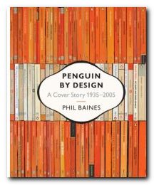
Penguin DesignSo it’s no accident that Penguin was (and still is) such a successful imprint. Cover designs changed subtly to keep up with modern fashion, and even the famous penguin logo itself has changed shape, size, and even posture during its seventy year lifespan. It also morphed into the puffin for children and the pelican for the non-fiction series, the best-seller of which my father once urged on to me as a birthday present. Metals in the Service of Man was my bedtime reading as a child – which might explain a lot.

In the 1930s there were lots of polemical titles – not unlike Gollancz’s Left Book Club – and there were also lots of special ventures which are well presented here – children’s books during the war, American titles shortly after it, and books on art in the lead up to the Festival of Britain.

Jan Tschichold helped to bring the cover designs into the post-war world. He worked on the covers for a couple of years, but his attention to small details and his tight, conservative designs established a convention via a house style manual Penguin Composition Rules, which was a precursor to his essays in The Form of the Book.

The book is elegantly designed, set in Adobe Sabon and Monotype Gill Sans Display Bold, and laid out in what are largely double-page spreads. In addition to fiction, Penguin titles covered poetry, science, current affairs, architecture, the history of art, and even music scores – though these were dropped because they didn’t make enough money. The same was true of Pevsner’s famous Buildings of England, despite the fact that he waived his royalty payments.

Anyone who has been closely associated with the world of books during the last fifty years will feel that reading this book is like watching a moving picture of their own intellectual history. What’s more, it is difficult to imagine anybody not being overcome with an almost overwhelming desire to start their own collection – something quite easy with second-hand copies available for pennies in charity shops and online bookstores. And if you want to see an online gallery of cover designs, have a look at the collection Joe Kral has started in his picture collection at Flickr.

Phil Baines also traces the history progression of Penguin’s modern designers – Germano Facetti, Romek Marber, Alan Aldridge, and David Pelham, revealing en passant that all was not necessarily sweetness and light in the offices where design policies were made.

It is interesting to note that most of the designs look more attractive when viewed in groups – because this emphasises the unity of design, the form of the page, and the texture of patterns – such as the wallpapers and fabrics used in the poetry series.

There are some weak patches in the 1970s and 1980s, and I don’t think many of the current fiction cover designs will be remembered affectionately. But the downward trend has been reversed in two recent series: the reference books with their rounded corners, and the classics, which feature black covers and centred titles. In both cases there has been a return to two key elements of the classic Penguin: the horizontal division of the cover page into three distinct bands; and the reintroduction of the plucky little penguin itself – which had almost been sent to extinction in the previous decade.

© Roy Johnson 2006

Penguin by Design   Buy the book at Amazon UK

Penguin by Design   Buy the book at Amazon US


Phil Baines, Penguin by Design , London: Penguin, 2006, pp.256, ISBN: 0713998393


More on typography
More on technology
More on digital media


Filed Under: Graphic design, Typography Tagged With: Bibliography, Book jackets, Graphic design, Penguin Books, Penguin by Design, Typography

Screen

June 26, 2009 by Roy Johnson

essays on graphic design, new media, and visual culture

Jessica Helfand is a critic of digital media and design matters. This collection of essays Screen first appeared in Eye, The New Republic, and Print Magazine. They deal with issues of visual design, digital culture, film, and media in general – including television, radio, and the Web. They are commendably short pieces, and it has to be said that they are elegantly written. Her formula is to take a single observation as a starting point, then spin it around with lots of cultural references to make gnomic statements about the state of culture in society.

ScreenThe problem is that they are basically personal opinions, and she very rarely examines concrete examples in any detail. This approach leads her into the marshy swamps of false generalisation. On our sense of space in a digital age, she claims:

The computer is our connection to the world. It is an information source, an entertainment device, a communications portal, a production tool … But we are also its prisoners: trapped in a medium in which visual expression must filter through a protocol of uncompromising programming scripts

Yes, it’s true that using computers requires mastery of complex techniques – but we are not its prisoners, because our sense of space is formed by many sources beyond the computer screen.

It’s obvious that she is well informed on digital technology. She discusses issues of web design, navigation buttons, splash screens, and the cultural significance of ‘rollovers’. Yet she confuses navigation with content, and even thinks that email has a homogenising effect:

In the land of email we all ‘sound’ alike: everyone writes in system fonts … Software protocols require that we title our mail, a leftover model from the days of interoffice correspondence, which makes even the most casual letter sound like a corporate memo.

That is simply not true. Anybody who receives more than a couple of dozen emails a day knows that most people generate their own ‘voice’ using this medium. And the titles of some of the messages I receive would certainly never make the ‘corporate memo’ file.

The fact is that there’s lot of techno-scepticism here. Underneath the glossy media guru carapace, she is actually digitally uncertain. Yet she’s not averse to patting herself on the back; she drops lots of Post-Modernist names, and at its most acute, her writing comes dangerously close to something from Pseud’s Corner. Encountering a consumer quiz on chicken nuggets, she reports

while I would like to report that my thoughts … drifted to Martin Heidegger or Giles Deleuze, to existentialism or metaphysics or even postmodernism, alas, they did not.

Fortunately, the collection is rescued by two excellent essays on the designer Paul Rand, where her analyses are much more meaningful because they are focused on concrete examples. The first is an analysis of his work as a commercial designer, and the second an interesting account of his methods as a teacher at Yale.

These two essays are first rate pieces of work. It’s a shame that the rest of the collection doesn’t match up. But having said that, the book comes larded with praise by other designers, and copies at my local bookshop have been flying off the shelves – so you will need to judge for yourself.

© Roy Johnson 2001

screen   Buy the book at Amazon UK

screen   Buy the book at Amazon US


Jessica Helfand, Screen: Essays on Graphic Design, New Media, and Visual Culture, New York: Princeton Architectural Press, 2001, pp.175, ISBN: 1568983107


More on design
More on media
More on web design


Filed Under: Graphic design, Media, Theory Tagged With: Design, Media, Media theory, New media, Screen, Theory

Specials

June 8, 2009 by Roy Johnson

graphic design examples from the stuff of everyday life

This is an eclectic assembly of graphic design stimulus material. It’s a handsomely printed samples book – if you’re interested in the scratchy-grunge school of typography and design. The examples are drawn from an amazing variety of everyday sources. If there’s a theme that emerges, it’s that a lot of the illustrations originate in one-off events. They come from exhibition catalogues; interactive software paint programs; advertising hoardings; and digitized typefaces.

Specials Some of the more interesting are from business cards; CD covers and record albumn sleeves; art gallery exhibition flyers; and print magazine pages. A lot of the ‘design’, it has to be said, is pretty flimsy. But amongst the more substantial offering are web site home portals; designs for promotional packaging; and some curious examples from public signage.

For trivia enthusiasts there are football score sheets; art college doodlings; some amusing, ultra-utilitarian birthday cards; a carrier bag design; three-dimensional postcards, and (I’m not kidding) instructions for making an origami snowball.

Some of the ideas behind the exhibits are more interesting than the finished work itself, but the book is packed with visual stimulation. In fact the dust cover inserts an interesting invitation to aspiring designers – “It’s about more than just typography. If your work isn’t here, let us know, and perhaps you’ll make it into our next book.”

© Roy Johnson 2002

specials   Buy the book at Amazon UK

specials   Buy the book at Amazon US


Claire Catterall (ed), Specials, London: Booth-Clibborn, 2001, pp. ISBN: 1861542208


More on design
More on media
More on web design


Filed Under: Graphic design Tagged With: Graphic design, Specials, Typography

The Designer

July 17, 2009 by Roy Johnson

fifty years of change in image, training, and techniques

Rosemary Sassoon is a distinguished authority on typography, writing, and education – with publications as diverse as Computers and Typography, Signs, Symbols and Icons, and Handwriting of the Twentieth Century. What marks her out from many other writers on these issues is that she tends to test her ideas in the classroom – either by designing fonts to assist children’s reading [Sassoon Primary] or researching how children learn to write. It was she who came up with the observation that the way children hold a pen has no relation to or effect on the clarity of their writing.

The DesignerHer latest book is about the development and training of designers over the last half century. She begins just after the end of the second world war, when although design was harnessed to promote post-war recovery, designers were regarded as second-class citizens. The Festival of Britain (1951) did little to change matters, even though the exhibition was successful. Designers were labelled ‘commercial artists’. Now, fifty-odd years on, some designers are better known than [‘fine’] artists. How times change.

She considers the neglect of drawing skills in design training and sees this as a sad loss which began with the encouragement of ‘conceptual’ design in the 1970s – one which has accelerated with the arrival of computer-assisted deign (CAD).

Much of the evidence she produces for the changes in design education comes from interviews with professional designers and teachers who look back on their own educational history. Common themes include regret at the demise of the apprenticeship system; scepticism regarding the use of computers in the teaching of typography; regret that design students often avoid theory; and despair over class sizes which during this period have risen from 15-20 to 100+ – a phenomenon which results in such practices as ‘hot-desking’ and ‘elearning’ to cope with these numbers and spread scarce resources further and further.

The second part of the book is a series of essays on contemporary issues and prospects for the future written by distinguished practitioners. They reflect on their own professional development and the manner in which teaching design has changed all over the world in the last fifty years.

Then in the third part of the book (and I have to say its the best-written and illustrated) Rosemary Sassoon reflects on her own experience and practice as a designer. She went through quite a random but eminently practical training as a calligraphist and a textile designer. She gives a first hand account of what practical commercial design involved – working with different types of printing and reproduction, then negotiating with clients and sales representatives.

In a quite amazing career where one thing led to another, she became a regularly published writer on typography, a teacher, a government consultant on writing, with particular reference to children and stroke victims, and a book designer. And one supposes she will go on this way until one day she joins the Big Design Studio in the sky.

© Roy Johnson 2008

The Designer   Buy the book at Amazon UK

The Designer   Buy the book at Amazon US


Rosemary Sassoon, The Designer: half a century of change in image, training, and techniques, Bristol: Intellect, 2008, pp.144, ISBN: 1841501956


More on design
More on media
More on web design


Filed Under: Graphic design Tagged With: Design, Education, Graphic design, The Designer, Writing

The Elements of Typographic Style

May 31, 2009 by Roy Johnson

Best-selling classic manual – the typographist’s Bible

Subscribers to Internet lists dealing with fonts and typography often ask “Which books would you recommend as a guide to good design principles?”. And no matter how many responses emerge, one book comes out on top every time – Robert Bringhurst’s The Elements of Typographic Style. It’s a book packed with design wisdom. Bringhurst has produced what is essentially a first principles of typography – a grammar of good taste based on the relationship between form and content of printed matter.

The Elements of Typographic StyleIt’s also a very beautiful book in its own right. You will not fail to discover visual pleasures on almost every page, and the text is illustrated with such an astonishing variety of beautiful fonts, that this almost doubles as a catalogue of type designs. It is obvious from almost every word that he’s thought profoundly about the fundamental issues of printed words on the page, and he often has insights to offer on topics most of us take for granted. He can conjour poetry out of the smallest detail, and he offers a scholarly yet succinct etymology of almost every mark that can be made – from the humble hyphen to the nuances of serifs on Trajan Roman or a Carolingian Majuscule.

The well-made page is now what it was then: a window into history, language and the mind: a map of what is being said and a portrait of the voice that is silently speaking.

As you would expect, he traces the development of type from its origins in eleventh century China to the present, and he deals with such extremely subtle distinctions as the differences in quality of letter forms produced by pressing hot metal onto paper, by offset litho (laying the letter on top of the paper) or by the digital means of charged electrons on the screen. he doesn’t actually have much to say about computers and typography, and yet his brief comments summarise almost everything there is to say about digital type:

Good text faces for the screen are therefore as a rule faces with low contrast, a large torso, open counters, sturdy terminals, and slab serifs or no serifs at all. [And he might have added – ‘a large x-height’.]

He does seem to become a little fanciful when discussing the mathematics of page proportions, especially when maintaining an extended comparison with the musical scale, and he misses the chance to give historical examples of page design, rather than the mathematical tables which populate this part of the book. But it seems almost churlish to complain when everything is so beautifully presented.

He ends with two very useful chapters – one of which analyses commonly available fonts (“prowling the specimen books” as he calls it). Paragraph-length potted histories are followed by suggestions on how the font is best used. This is typical of the manner in which he very elegantly combines scholarship and a cultivated taste with the requirements of a practical guidance manual.

Bringhurst is also a novelist, and he brings a prose style of some distinction to the subject, ornamenting his text with the lyrical jargon of typography, and quite obviously relishing terms such at the pilcrow, the octothorpe, the virgule, guillemets and chevrons, and the solidus; as well as the romance of small caps, analphabetic symbols, the shape of pages, the order of footnote symbols, the ‘looser dressing’ and the ‘larger torso’ of a font.

The book ends with a fascinating tour of sorts and characters, revealing the subtle functions of the cedilla and the ogonek; the umlaut and the diaeresis; the ligatures aesc, and oethel; the prime, the macron, and the vinculum. He completes this tour de force with several more appendices: a glossary of typographic terms; a listing of type designers; another of typefoundries; a recapitulation of the main recommendations in the text; and a list of further reading.

This is a wonderful book which fully deserves its widespread reputation as a classic and the ultimate guide for laying out pages in print of on screen. Anyone who wishes to gain insights into the aesthetics and the finer details of good design should read this book. Anyone with a serious typographic intent should own it.

© Roy Johnson 2000

The Elements of Typographic Style   Buy the book at Amazon UK

The Elements of Typographic Style   Buy the book at Amazon US


Robert Bringhurst, The Elements of Typographic Style (2nd edn), Toronto: Hartley & Marks, 1996, pp.351, ISBN: 0881791326


More on typography
More on design
More on media
More on web design


Filed Under: Graphic design, Typography Tagged With: Fonts, Graphic design, Information design, Printing, Typographic style, Typography

The Form of the Book

July 20, 2009 by Roy Johnson

short essays on the finer points of book design

Jan Tschichold [pronounced ‘Chick-old’] is probably best known in the UK for his work in designing Penguin paperbacks in the late 1940s. He was a German refugee who had made his mark as a radical modernist in 1928 with the publication of Die Neue Typografie. The collection of short and elegantly written essays in The Form of the Book are however largely arguments in favour of traditional, hard-earned craftsmanship, artistic self-effacement, and typographical restraint. As Robert Bringhurst puts it with characteristic elegance in his introduction: ‘Like Stravinsky, after making his reputation as a rebel, [Tschichold] entered on a long and productive neo-classical phase.’

The Form of the BookWritten between 1937 and 1975, these essays discuss every element of the traditional printed book. Tschichold ranges from its shape and size, its cover and title page, via its typeface, margins, paragraphs and section headings, through to footnotes, its index, colophon, and even the blank pages before its final covers. This is the work of a master craftsman sharing a lifetime’s experience, and it’s a delight to read. The German tradition out of which these observations spring is betrayed by his habit of formulating arguments in the imperative mode as a series of abstract absolutes. He also sometimes poses his arguments as quite witty aphorisms:

Comfortable legibility is the absolute benchmark for all typography … Good typography can never be humorous … a truly beautiful book cannot be a novelty. It must settle for mere perfection instead.

It’s interesting that Tschichold, the author of the modernist New Typography, should take such a traditionalist line, with his concern for harmony, proportion, tact,balance, and good taste. This collection includes an essay on ‘The Importance of Tradition’ which is effectively a refutation of his own ideas written in 1928. He also has essay titles which are almost amusingly didactic: ‘Why the Beginnings of Paragraphs Must Be Indented’, and he has firm views on book design, page proportions, title pages, house rules, indentation, footnotes, punctuation marks, and even the colour of paper.

On the subject of the book page and its type area, there are some pages of quite mathematical minutiae, but this supports the overall impression one gains that the secret of typographical success – as with so much else – lies in the details. He loves the finer points of design and book production, and there are eloquent passages on the spacing of ellipses, the thickness of an em-dash, the positioning of illustrations, and – two of his pet hates – white paper and the design of book jackets.

For those with a serious interest in typography, this is a ‘must have’. It belongs alongside works such as Robert Bringhurst’s Elements of Typographic Style as a modern classic. Even if it’s out of print – order it, or keep looking. It’s worth the effort.

© Roy Johnson 2002

The Form of the Book   Buy the book at Amazon UK

The Form of the Book   Buy the book at Amazon US


Jan Tschichold, The Form of the Book: Essays on the Morality of Good Design, Vancouver, BC: Hartley & Marks, 1991, pp.180, ISBN: 0881791164


More on typography
More on design
More on media
More on web design


Filed Under: Graphic design, Typography Tagged With: Book design, Jan Tschichold, The Form of the Book, Typography

The Graphic Language of Neville Brody

May 31, 2009 by Roy Johnson

best-selling illustrated  guide to popular typographist

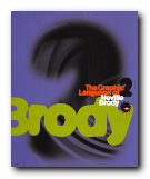
Neville Brody is a now-famous UK graphic designer who shot to prominence in the 1970s. He became artistic director of The Face – a youth and fashion magazine which he revamped – and in doing so set the pace for magazine cover design which persists to this day. Many UK magazines are still designed on the principles he established – of a bold, typographically interesting title at the top of the page (Maxim, Loaded, Mojo,) surmounting a single photographic portrait. In fact he is part graphic designer and part typographer.

The Graphic Language of Neville BrodyAdvertising and logos throughout the world sport his typefaces and their variants. Only the other day I noticed an ad for shoes on the back of a bus which was composed entirely of one of his fonts. He comes up with designs which draw their inspiration from constructivist, modernist, and expressionist designs of the inter-war years, but he gives them a contemporary twist. These are two very stylish publications celebrating his achievement – and very attractive publications in their own right. Even if you are put off by the fact that Brody applies his undoubted talents to the ephemeral products of the worlds of pop and fashion, it’s impossible to escape his harmonious sense of form and crisp sense of design on every page.

The Graphic Language of Neville BrodyThere are pop adverts, albumn and magazine covers, corporate logos and design, fashion magazine plates, book dust jackets, letterheads, and even humble business cards amongst the designs illustrated here. The accompanying text by Jon Wozencroft is enthusiastic without being sycophantic, and there is a good scholarly apparatus which gives full details of sources. However, the principal value of these two volumes is that they are beautifully designed books, full of good page layouts, vivid illustrations, and well-chosen typography. If they are out of print by the time you read this, make the effort to track them down. You will not regret it.

© Roy Johnson 2002


Volume 1

Jon Wozencroft, The Graphic Language of Neville Brody, London: Thames and Hudson, 1988, pp.160, ISBN: 0500274967

The Graphic Language of Neville Brody   Buy the book at Amazon UK
The Graphic Language of Neville Brody   Buy the book at Amazon US


Volume 2

Jon Wozencroft, The Graphic Language of Neville Brody 2, London: Thames and Hudson, 1994, pp.176, ISBN: 0500277702

The Graphic Language of Neville Brody   Buy the book at Amazon UK
The Graphic Language of Neville Brody   Buy the book at Amazon US


More on typography
More on design
More on media
More on web design


Filed Under: Graphic design, Individual designers, Typography Tagged With: Fonts, Graphic design, Neville Brody, Typography

The Struggle for Utopia

July 5, 2009 by Roy Johnson

 Rodchenko,  Lissitzky, Moholy-Nagy 1917-1946

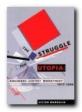
This is a series of essays tracing the development of three ground-breaking artists who deliberately harnessed their design skills during the highpoint of modernism to the service of revolutionary social change. The first chapter of The Struggle for Utopia offers an analysis of Alexander Rodchenko‘s designs for public information kiosks, comparing them with El Lissitzky‘s for new forms of paintings and books. This points to the essentially conservative ideology underlying some of Rodchenko’s work, in distinction to El Lissitzky’s attempts to break into new ground. The next deals with the work and theories of the German constructivists – Moholy-Nagy and Lissitzky who had moved to Berlin from the Soviet Union.

The Struggle for UtopiaThere were lots of theoretical wranglings amongst the artists and many bold claims made for the social and even revolutionary meanings in their works. Nevertheless, a simple connection between artist’s belief or intention and its manifestation on canvas or print remains as illusive as ever it will be. And if these abstract paintings dropped out of the sky unsigned, their meanings would be even more intractable.

This is followed by a chapter on Rodchenko’s work between 1922 and1927 when he gave all his creative energy to the cause of ‘production art’ – the design of socially useful objects such as furniture, books, magazines, exhibitions, and advertising posters. His furniture was never put into production [through no fault of his own] but his graphic design was a big success, was hugely influential, and is still fresh as paint today.

Next comes a comparison of the pioneering work in photography done by Rodchenko and Moholy-Nagy in the 1920s. Then Margolin tackles the difficult task of trying to find positive things to say about the work Rodchenko and Lissitzky produced as propagandists during the black years of the Stalin period. He does his best, but it’s difficult to take seriously the pictures of smiling ethnic minorites and the construction of the White Sea Canal when we now know the brutal truth of what was going on.

Rodchenko amazingly survived until 1956, though he produced nothing more worthy of note. Moholy-Nagy moved to Chicago where he influenced a whole generation of product desgners in his new Bauhaus Institute of Design.

This is a scholarly work with a full apparatus of citations, references and footnotes. It’s also beautifully designed, illustrated, and printed – as befits the subject matter. My only carp is that I wish a list of further reading had been extracted from the dense thicket of footnotes which cluster at the bottom of almost every page of the book. I want to read more: make it easy for me to follow up.

© Roy Johnson 2000

The Struggle for Utopia   Buy the book at Amazon UK

The Struggle for Utopia   Buy the book at Amazon US


Victor Margolin, The Struggle for Utopia: Rodchenko, Lissitzky, Moholy-Nagy 1917—1946, Chicago: University of Chicago Press, 1997, pp.259, ISBN: 0226505162


More on design
More on media
More on web design


Filed Under: Design history, Graphic design, Individual designers, Product design Tagged With: Constructivism, Design theory, El Lissitzsky, Graphic design, Moholy-Nagy, Rodchenko, The Struggle for Utopia, Theory

The Visual Display of Information

July 20, 2009 by Roy Johnson

best-selling illustrated essays on presenting information

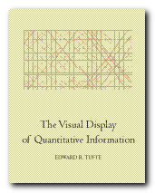
The Visual Display of Information is the earliest of the three books on information design which Edward Tufte has written, designed, and published himself. In it he develops his theory of “a language for discussing graphics and a practical theory of data graphics” The first chapter plots the rise of data maps, which he claims didn’t really develop properly until the late seventeenth century, and then took off in the nineteenth – from which he gives some very elegantly illustrated examples. The centrepiece of this section is Charles Joseph Minard’s time chart of Napoleon’s retreat from Moscow. This shows in a really interesting manner the devastating reduction in the size of the army plotted again geographic location and ambient temparature. It is a fascinating mixure of three levels of information rendered as a graphical image.

Graphical excellence is the well-designed presentation of interesting data – a matter of substance, of statistics, and of design.

The Visual Display of InformationI was surprised to find how his writing is even more compacted and elliptical than in a book such as Visual Explanations written nearly twenty years later. Here he writes of a map “achieving statistical graphicacy, even approaching the bivariate scatterplot”. You’ve got to be prepared to hack your way through a lot of this sort of thing.

In a discussion of the integrity of graphical data and statistics that lie he gives examples from Britain’s national debt during the war of American Independence – which show graphs going up whilst the truth goes down. This is very convincing – though I couldn’t easily get used to his habit of referring to ‘data’ in the plural.

He has the interesting notion that ‘data-ink’ ought to be minimised. In other words, any information will stand out more clearly the less printing is done to present it.: “The number of information-carrying dimensions depicted should not exceed the number of dimensions in the data”. You’ve got to be prepared to leap from traffic deaths and government expenditure to the properties of chemical elements, and be prepared for lots of detail on the difference between boxplots, bar charts, histograms, and scatterplots.

He’s basically in favour of simplifying representation – reducing what he calls ‘chart-junk’. That is, anything which does not contribute to revealing information. Yet there remain strange contradictions. One of his edicts (which seems sensible) is that “Graphics can be shrunk way down – Many data graphics can be reduced in area to half their currently published size with virtually no loss in legibility and information.” Yet he often presents examples of bad (but visually attractive) graphics across double page spreads. And he’s not bashful. When it comes to naming one of his own designs (a list of voting patterns in the 1980 US elections) it becomes not a mere list but a ‘SUPERtable’.

But this is a stimulating and attractive production. I was surprised that there wasn’t a formal bibliography, but he chooses to foreground his references directly into the generous page margins as a design feature. He developed a graphic style for this book which he has stuck to ever since. The basic formula is beautiful illustrations, some occupying a whole page, with the relevant text condensed in a crisp and economic style. No topic exceeds a double page spread, and the book is produced from very high quality paper, printed like a work of art, and bound as if it were a rare first edition.

© Roy Johnson 2002

The Visual Display of Information   Buy the book at Amazon UK

The Visual Display of Information   Buy the book at Amazon US


Edward Tufte, The Visual Display of Quantitative Information, Cheshire, CT: Graphics Press, 1997, pp.156, ISBN: 0961392126


More on information design
More on technology
More on digital media

Filed Under: Graphic design, Information Design Tagged With: Displaying information, Edward Tufte, Graphic design, Information design, The Visual Display of Information

Thinking with Type

July 5, 2009 by Roy Johnson

critical guide for designers, writers, editors, students

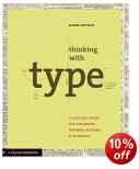
Ellen Lupton’s new design guide is in three parts. The first of Thinking with Type deals with the range, choice, and nature of the typeface you can use; the second shows how it can be squeezed, adjusted, and re-arranged for effect; and the third deals with the underlying structures upon which good page design is built. Actually, there’s a fourth as well – an appendix offering a list of hints on editing and punctuation, plus a comprehensive bibliography.

Thinking with TypeEach part is accompanied by an essay explaining key concepts, and then a set of practical demonstrations illustrating that material. Part One delivers an excellent tutorial in the history and analysis of moveable type – from its origins in the Renaissance printing houses through to the designs for digital type which have arisen in the last twenty years. She writes in a light, rapid, and elegant style which packs a lot into a small space. What she has to say has obviously been distilled through many years teaching the subject.

Letters gather into words, words build into sentences. In typography ‘text’ is defined as an ongoing sequence of words, distinct from shorter headlines or captions. The main text is often called the ‘body’, comprising the principal mass of content. Also known as ‘running text’, it can flow from one page, column, or box to another. Text can be viewed as a thing—a sound and sturdy object—or a fluid poured into the containers of page or screen. Text can be solid or liquid, body or blood.

Part Two enters the semi-philosophic realm of the relationships between text and space. Here she explains how layout is used as an aid to comprehension, navigation, and structure. She also extends this discussion to include hypertext and human interface design.

This is followed by solidly reliable advice on the basic techniques of type kerning, line spacing, text alignment, and creating structure and hierarchies of significance in a text by spatial placement and visual emphasis.

Part Three deals with grids – the hidden systems for arranging content within the space of a page or a screen. In fact grids are shown in use in the presentation of information in a variety of media magazines and books, catalogues and newspapers, and she even quotes Edward Tufte’s example of railway timetables.

The book itself is beautifully designed and produced. Each topic is covered in a single or double page spread; marginal notes point to the sources of quotations and suggestions for background reading; and almost every other page includes a colour graphic illustrating the issue in question.

© Roy Johnson 2004

Thinking with Type   Buy the book at Amazon UK

Thinking with Type   Buy the book at Amazon US


Ellen Lupton, Thinking with Type: A critical guide for designers, editors, and students, New York: Princeton Architectural Press, 2004, pp.176, ISBN: 1568984480


More on typography
More on design
More on media
More on web design


Filed Under: Graphic design, Typography Tagged With: Ellen Lupton, Graphic design, Thinking with Type, Typography

  • « Previous Page
  • 1
  • …
  • 3
  • 4
  • 5
  • 6
  • Next Page »

Reviews

  • Arts
  • Biography
  • Creative Writing
  • Design
  • e-Commerce
  • Journalism
  • Language
  • Lifestyle
  • Literature
  • Media
  • Publishing
  • Study skills
  • Technology
  • Theory
  • Typography
  • Web design
  • Writing Skills

Get in touch

info@mantex.co.uk

Content © Mantex 2016
  • About Us
  • Advertising
  • Clients
  • Contact
  • FAQ
  • Links
  • Services
  • Reviews
  • Sitemap
  • T & C’s
  • Testimonials
  • Privacy

Copyright © 2025 · Mantex

Copyright © 2025 · News Pro Theme on Genesis Framework · WordPress · Log in