Mantex

Tutorials, Study Guides & More

  • HOME
  • REVIEWS
  • TUTORIALS
  • HOW-TO
  • CONTACT
>> Home / Design

Design

design history, graphic design, information design, product design

design history, graphic design, information design, product design

design history, graphic design, information design, product design

Graphic Design 1870-2000

July 23, 2009 by Roy Johnson

a century of poster and advertising design

Graphics 1870-2000 is a compact account of the history of commercial graphic design and image-making from the end of the nineteenth century to the present day. It covers graphic design in the UK, France, Germany, Holland, Belgium, Russia, and the USA. All the major movements are covered – from Art Nouveau, Dada, Constructivism, De Stijl, and Bauhaus, right up to the as-yet-unnamed movements at the end of the last century, with generous entries on Paul Rand, Neville Brody and David Carson, plus recent development in the digital age.
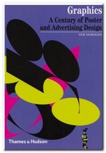
Graphic DesignEvery page is a visual treat: well-chosen graphics illustrate every point of the exposition. The examples are fresh and original. There are even page decoration elements on the supporting theoretical documents reproduced along with the index

What I particularly liked about Alain Weill’s account is that the graphic innovations he traces are related to developments in the products they are advertising or the methods by which they are manufactured.

He also has a good eye for detail and can spot a significant novelty which becomes a turning point in design history – such as Lucian Bernhard’s removal of all extraneous detail to focus on brand name and product in the Sachplakat.

sachplakat

He is the former director of the Musée de la Publicité in Paris, and it is quite obvious from this that he has a deep knowledge and love for his subject.

Two issues emerge as sub-themes here. The first is the close link between graphic design and architecture – another discipline which is trying to do several things at the same time. The second is the close relationship between commercial and fine art. This might have dwindled somewhat towards the end of the last century, but it is still present in the work of people such as David Hockney.

It’s a shame it’s in such a small pocket-book format, because I think the elegantly designed pages deserve to breathe in a larger format. But the upside of this is that it’s very good value at a knock-down price.

© Roy Johnson 2004

Graphic Design 1870-2000   Buy the book at Amazon UK

Graphic Design 1870-2000   Buy the book at Amazon US


Alain Weill, Graphics: A Century of Poster and Advertising Design, London Thames and Hudson, 2004, pp.160, ISBN: 0500301166


More on graphic design
More on web design
More on technology
More on digital media

Filed Under: Design history, Graphic design Tagged With: Graphic design, Graphics 1870-2000

Graphic Design for the 21st Century

June 18, 2009 by Roy Johnson

contemporary world graphic design and designers

This is another block-busting visual compendium from Taschen publishing regulars Charlotte and Peter Fiell which maps out the very latest trends in contemporary graphic design. The commentary is in English, German, and French. Each artist gets a full credit with contact details, plus a list of recent exhibitions, awards, and clients. They are given just three or four pages to demonstrate their work. First a cryptic statement opposite a full page spread; then there’s a short biography, a list of recent exhibitions, and a list of clients.

Graphic Design for the 21st CenturyThe importance of these details is that you can follow up those designers who interest you most, check out their web sites, and track down further examples of their work. And it’s amazing, given these constraints, how so many of them come up with work which is visually arresting. Like most of these giant compendiums, the content is ‘mixed’, but I have to say that the longer I pored over these pictures, the richer the work seemed.

Work which is clearly experimental and even anti-commercial is given just as much space as adverts for Nike. There are entries for Stefan Sagmeister, Peter Saville, and other modern design studios such as Ames Brothers, the Pentagram Group, and Research Studios (all of whom have great web sites too).

The collection comes with an introductory essay by the editors which looks over the developments of the last hundred years – and the examples they have chosen come from all over the world: UK, US, Japan, France, Norway, Holland. This is a huge, value-packed compendium of contemporary graphic design, from professionals at the sharp end of what is happening right now.

It’s also a visually rich collection which is doing its best to look ahead to what might happen next. Like most of Taschen’s other publications it’s well designed, well printed and produced, and amazingly good value.

© Roy Johnson 2000

Graphic Design   Buy the book at Amazon UK

Graphic Design   Buy the book at Amazon US


Charlotte and Peter Fiell, Graphic Design for the 21st Century, Cologne: Taschen, pp.638, ISBN: 3822816051


More on design
More on media
More on web design


Filed Under: Graphic design Tagged With: Graphic design, Graphic Design for the 21st Century

Graphic Design School

June 14, 2009 by Roy Johnson

basic design principles using all modern media

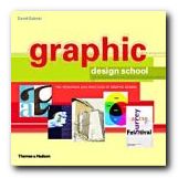
This is a structured self-teaching guide to the principles of graphic design which provides up-to-date information on computer aided design and the use of software applications. Graphic Design School itself is beautifully designed and printed – in full colour, with excellent design and layout fully illustrating the principles it espouses. First of all it deals with basic design principles – layout, space, colour, typography, and graphics.

Graphic Design SchoolEach topic is presented on one double-page spread in a stylish layout which shows off some of the best principles the book is designed to promote. The second part of the book looks in more detail at what effects are possible with detailed manipulation of typeface selection. It also looks at the secret ingredient which lies beneath most examples of good design – grids.

The last part looks at examples of professional design practice – magazines, corporate design, books, presentations, and of course web design.

It’s a visually exciting overview of what’s required in the increasingly complex and sophisticated word of graphic design. The illustrations are wonderfully fresh and well chosen. There wasn’t one I had seen in any publication before.

This will be suitable for people working in newspapers, magazines, books, packaging, advertising, web design, and digital media in general. It’s packed with practical guidance for students and practising designers.

It’s an introductory guide to a discipline with many facets. I imagine that readers will come across a topic that touches a creative nerve – layout, typography, animation, or image manipulation – then shoot off to follow up the subject elsewhere. That’s exactly as it should be – and there’s a glossary and bibliography to help too.

© Roy Johnson 2005

Graphic Design School   Buy the book at Amazon UK

Graphic Design School   Buy the book at Amazon US


David Dabner, Graphic Design School: The Principles and Practices of Graphic Design, London: Thames and Hudson, 2004, pp.192, ISBN: 0500285268


More on design
More on media
More on web design
More on typography


Filed Under: Graphic design, Typography, Web design Tagged With: Design, Graphic design, Graphic Design School, Web design

Graphic Design: a concise history

June 27, 2009 by Roy Johnson

popular potted history of 19th and 20th century graphics

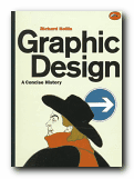
This is an introduction to graphic design in a series from Thames and Hudson which offers very good value for money. Richard Hollis takes as a starting point the idea that graphic design begins in the late nineteenth century with the development of the poster which combined word and image. If you are happy to ignore what went before, what he presents is thought provoking and a visual treat.

Graphic Design: a concise historyThe main feature of the book is that each point of his argument is illustrated by small marginal pictures which function like a lecture slide show (which I suspect is their origin). It’s not quite clear if he is following a chronological, a thematic, or a national structure – but this isn’t really important, as the main pleasure of his account is the exuberant variety of illustrative examples he discusses. These act as a fascinating introduction to the subject.

It’s rather like a very entertaining series of illustrated undergraduate lectures. He starts with the poster in the nineteenth century, then goes on to chart the development of word and image in brochures and magazines, advertising, television and electronic media, and the impact of technical innovations such as photography and the computer.

The strength of his approach is his internationalism and excellent choice of materials. He covers the main figures in Swiss, Dutch, French, American, and British design, and en route there are special features on movements such as Italian futurism, Soviet constructivism, and German expressionism.

His exposition and analysis of the various movements is handled with a light touch, which makes the subject accessible to non-specialists. The most successful parts of the book are his detailed tracing of artistic influences and his arguments for the relation between design and function.

He knows the names, the products, and the businesses which produced the commissions. Maybe the book should have been called ‘Twentieth Century Graphic Design’, but this is excellent value, and always in print.

© Roy Johnson 2000

Graphic Design   Buy the book at Amazon UK

Graphic Design   Buy the book at Amazon US


Richard Hollis, Graphic Design: a concise history, London: Thames and Hudson, 1994, pp.224, ISBN: 0500202702


More on design
More on media
More on web design


Filed Under: Graphic design Tagged With: Art, Design history, Graphic design, Modernism

Grid Systems

June 17, 2009 by Roy Johnson

the principles of organising type on page and screen

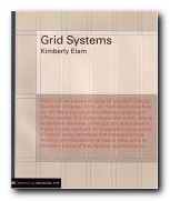
Well-designed pages – on screen or in print – are built on the structural basis of grid systems. That’s the hidden network or mesh underlying the page design which helps to keep all its parts in close and logical relationship. This book tells you how to understand and create grids. The approach is that of a tutorial – showing the good and not-so-good results of arranging a set of basic elements on a 3 x 3 grid.

Grid Systems There’s a lot of visual repetition, and the writing is rather stiff, but the upside is thoroughness. The same page is shown over and over again, with endless variations in layout, text position, alignment, and reading direction. These tutorial sections are punctuated by analyses of successful and famous examples of the use of grids.

The illustrations come from classics such as Jan Tschichold’s advertising brochure for his revolutionary study Die Neue Typographie, a Bauhaus catalogue designed by Herbert Bayer, and modern designs such as a an architectural web site and a Nike product catalogue.

The really interesting feature of this book is that the pages used to illustrate its ideas are prefaced by a semi-transparent skin which shows the grid on which the base design has been built. It’s a superb use of modern print technology.

This is a well-produced book which illustrates its point very clearly and is a very attractive production in its own right. It comes from the same series as Ellen Lupton’s Thinking with Type which we also reviewed recently.

© Roy Johnson 2005

Grid Systems   Buy the book at Amazon UK

Grid Systems   Buy the book at Amazon US


Kimberly Elam, Grid Systems, New York: Princeton Architectural Press, 2004, pp.130, ISBN: 1568984650


More on design
More on media
More on web design


Filed Under: Graphic design Tagged With: Graphic design, Grid systems, Information design

Handwritten

June 26, 2009 by Roy Johnson

modern hand-produced lettering and typefaces

In an age which presents designers with the software to create any number of computer-generated fonts, design historian Steven Heller considers the lasting strength of typefaces produced by hand. He has a good track record in writing on graphic design, and Handwritten is an excellent example of his work. He divides his chapters into different hand-scripted styles – sleight of hand, scrawl (letterforms that are raw, splotchy, and untidy) scratch (scraped, cut, and gouged fonts) script (type that is sinuous and ornate) stitch (letters that have been sewn, sutured, and embroidered) shadow (dimensional, voluminous, and monumental letterforms).

HandwrittenThese are followed by suggestive (forms that imply the metaphorical, surreal, and symbolic) and sarcastic (the ironic, comical, and satirical in lettering). This seems a reasonable enough approach: these categories represent the attitudes of the designers, though sometimes there is overlap between them.

It’s also a handsomely designed and beautifully produced book – packed with hundreds of coloured, well-presented examples. The sources are amazingly wide-ranging: theatre posters, record albumn covers, comics and graphic novels, book designs, posters, ephemera, and original art works.

The visual range is also good – hand scrawled letters, painted typefaces, words scratched into surfaces, stitched into fabrics, or written onto surfaces (including Stefan Sagmeister’s body – an illustration which turns up everywhere these days).

He features and obviously has a soft spot for the work of Robert Crumb, the American freehand artist who designed lots of, ahem, alternative comics in the 1960s and 1970s. Crumb drove his sex-obsessed vision to very amusing and visually interesting limits – though it has to be said that although the subject matter of his cartoons is very radical, the essence of his visual style is essentially nostalgic. He gets its striking effects from linking psychologically modern subject matter with a quaint folksy visual idiom. This is what Heller categorises as ironic lettering.

There’s a fashion at the moment for adding hand-crafted type to digitally photo-realistic graphics, so as to play one off against the other. These are well represented here. However, I was surprised not to see more examples of freehand design translated into pixellated typography, but the book does end with examples of digital comic books which suggest that more is to come.

Having just taught on a course where students have to learn the discipline of writing descriptive picture captions, I was impressed by the manner in which his are consistently both succinct and imaginative. Each section of the book is prefaced by an essay, and the origins of the examples are meticulously sourced. Artist, designer, photographer, and client are all named on every example.

His explanation is all the more vigorous for being conducted across continents. There is nothing parochial about this compilation. Examples range from the UK and USA, to Mexico, the USSR, France, and Germany. The selections are witty, bitter, satirical, inventive, and sometimes quite violent.

If you are at all interested in typography, graphic design, or even print production values, this is well worth seeing. Serious students and professionals will want to own it.

© Roy Johnson 2004

Handwritten   Buy the book at Amazon UK

Handwritten   Buy the book at Amazon US


Stephen Heller and Mirko Ilic, Handwritten: expressive lettering in the digital age, London: Thames and Hudson, 2004, pp.192, ISBN: 0500511713


More on typography
More on design
More on media
More on web design


Filed Under: Graphic design, Typography Tagged With: Calligraphy, Graphic design, Handwritten, Typography

Industrial Design A-Z

June 18, 2009 by Roy Johnson

influential 20C designers, companies, and products

These Taschen pocketbooks are very well produced, with high quality print, full colour illustrations, and amazingly cheap. I’ve bought several of them, both in the UK and abroad, and somehow always been surprised at the integrity of the writing and the scholarship. But I have not been surprised at the quality of the illustration and the graphic design. It’s always been first rate.

Industrial Design A-Z This particular volume concentrates on industrial design – which authors Charlotte and Peter Fiell suggest is a twentieth century concept which essentially adds aesthetics to functionality and mass production. It’s an A to Z listing of designers and companies, running from AEG, via Herman Miller, to Xerox and the stylish but ill-fated product of Ferdinand Graff von Zeppelin.

Each entry consists of a biographical sketch or a historical account of a design company. The range of products represented is truly amazing – everything from the ball-point pen to aeroplanes designed by Boeing and McDonnell Douglas. There are cars, cameras, telephones, vacuum cleaners, computers, typewriters, radios, and kettles, electric shavers, and office furniture. All of these design classics are illustrated by well-chosen full colour photographs.

Standout individuals include the multi-talented and hugely influential Peter Behrens, Henry Dreyfuss, and Raymond Loewy. It’s interesting to note how many of the most influential were trans-nationals and how many German – either by birth, education, or influence.

The authors are both experts in industrial design, both ex-Sotheby’s, and now running their own design consultancy in London, specialising in industrial design. They offer some fascinating information which reveals the breadth of their knowledge. Did you know that over 15 million BIC pens are sold every day, and that the best-selling iMac was created by the English designer Jonathan Ive?

If you are the slightest interested in design, it’s really impossible to go wrong with this book – which is itself well designed, stylishly illustrated, and amazingly cheap.

© Roy Johnson 2004

Industrial Design A-Z   Buy the book at Amazon UK

Industrial Design A-Z   Buy the book at Amazon US


Charlotte and Peter Fiell, Industrial Design A—Z, Taschen, 2003, pp.190, ISBN: 3822824267


More on design
More on media
More on web design
More on information design


Filed Under: Product design Tagged With: Industrial design, Product design, Reference

Information Architecture

July 16, 2009 by Roy Johnson

large-scale Web site structure, navigation, and usability

When it first appeared in 1998, Information Architecture became an instant classic amongst information architects. It now appears in its third edition, much enlarged and updated. The new edition reflects the rapid expansion and technical sophistication of large interactive web sites in the last few years. Rosenfeld and Morville deal with all the issues raised in organising information and navigational systems in the design of large-scale sites. Their important starting point is a recommendation that big sites should use three types of information organisation, which they identify as hierarchical, database, and hypertext.

Information Architecture Visitors to a site should have more than one possible route to the same piece of information. They ask some quite fundamental and interesting questions in their updated chapters. These cover issues of organisation, labelling, navigation, and searching – plus new chapters on thesauruses and meta-data.

The new edition has been given many more case studies, and lists of resources on IA have been added, many of which did not exist at the time of the first edition, and there’s a very good bibliography which painlessly blends print and web-based information. Navigation has been expanded into global, local, and contextual systems, and there is a lot more detail on search engines.

Another section which has been considerably expanded is that on classification systems and ‘knowledge management’. That is – where to put things, how to arrange, label and store information.

There’s also a much-enlarged section on the management of web development projects – from the initial strategy meetings through content analysis and mapping, to delivery and maintenance.

They present real life case studies, including one which details how a strategy report was written for Weather.com. Anybody who needs help with report writing will profit from reading this chapter. ‘Information Architecture’ was a relatively new term only a few years ago, but now as you can probably guess, it is of use to anybody who needs to organise information, ideas, or even physical objects – such as books in a library.

There’s an excellent account of how to draw up site maps and flow diagrams which help to explain the deep level architecture of sites to those who are going to populate them with content.

The same is true for page layout diagrams – which they call ‘wireframes’. These test the arrangement of items on main pages before they are passed on to a graphic designer. Architecture and usability are tested before the application of a graphic. It’s rather like designing the layout of a web page with table borders switched on – before setting them to zero.

They take an enthusiastic line on the use of navigational metaphors (the shop, the office, the library) about which other commentators such as Barbara Fleming and Jakob Nielsen are more cautious. The argument against this approach is that the metaphor of an office or a library will not mean much to people who are not familiar with them. And of course the same is true for icons and symbols.

This is a book for serious designers, project managers, and of course information architects. It is also a contribution to design theory which, en passant, makes librarians into the heroes of the information age. The valuable experience embedded within it will make useful reading for anybody organising information, designing a site, or providing content for it. If you read the first or second edition, it’s worth reading the third for the wealth of new material.

© Roy Johnson 2006

Information Architecture   Buy the book at Amazon UK

Information Architecture   Buy the book at Amazon US


Louis Rosenfeld and Peter Morville, Information Architecture for the World Wide Web, Sebastopol (CA): O’Reilly, third edition, 2006, pp.461, ISBN: 0596527349


More on information design
More on design
More on media
More on web design


Filed Under: Information Design, Web design Tagged With: Information architecture, Information design, Navigation, Structure, Usability, Web design

Information Architecture

July 25, 2009 by Roy Johnson

the basic principles of organising information

Books on Information Architecture are coming thick and fast at the moment. Christina Wodtke’s approach will appeal to anyone who wants to learn the main principles, without having to wade through lots of abstractions and jargon. Her written style is very much influenced by web-based writing. She is concise, straight to the point, and entertaining. She starts out by looking at the basics of navigation, screen layout, subject categorising, usability, and liquid pages.

Information ArchitectureAll the time, she keeps the site visitor in mind. It’s a friendly, practical approach, and she illustrates all her points with plenty of screenshots. The main novelty she has to offer is to puncture some of the common suppositions about web design. For instance she argues quite persuasively against a one-size-fits-all approach:

Beware of gurus peddling simple answers. Instead, seek better tools to help you think up better solutions. Think first. Design second.

As is common with good advice, a lot of it seems very obvious when spelled out – but it is useful to be reminded that on the homepage of a site you should ‘show people the range of your offerings’.

She also recommends ‘see also’ pages of the kind at which Amazon excel. If someone visits pages dealing in laptops and novels, there’s a good chance they will also be interested in software and magazine subscriptions.

There’s a particularly good chapter on meta-data where she explains the reason why ‘information about information’ is important. This also includes a clear account of controlled vocabularies – one of the latest issues in usability and Web promotion.

She explains the systems of what are called ‘global navigation systems’ – the links, buttons, and tabs which normally appear at the side(s) and top of every page.

The latter part of the book deals with the process of mapping out and designing a site. This is something that should be done with pencil and paper. She includes storyboarding techniques, sitemaps, content inventories, wireframes – and even illustrates how to conduct cheap, small-scale usability testing.

This is another top quality production from New Riders – who have almost cornered the market in books on this subject.

© Roy Johnson 2005

Information Architecture   Buy the book at Amazon UK

Information Architecture   Buy the book at Amazon US


Christina Wodtke, Information Architecture: Blueprints for the Web, Indianapolis (IN): New Riders, 2002, pp.348, ISBN: 0735712506


More on digital media
More on information design


More on information design
More on design
More on media
More on web design


Filed Under: Information Design Tagged With: Data management, Information architecture, Information design, Web design

Information Dashboard Design

June 18, 2009 by Roy Johnson

effective visual communication of data

Dashboards have become popular in recent years as powerful tools for communicating important information at a glance. They tend to imitate motor car fascias or small airplane cockpit controls and they are used for displaying sales figures, statistics, business information (BI) and any sort of key performance indicators (KPIs). They can be used for all sorts of purposes – monitoring stock market prices, showing the weather, recording production output, or listing web site usage.

Information Dashboard Design My blog for instance is monitored by a service which shows me with maps, graphs, and bar charts who has been visiting, where in the world they are located, how many entries they viewed, and which browser they were using. Stephen Few begins by looking at some examples and defining the issue of dashboards – which is not as simple as you might imagine, Then he looks as some examples of bad design. These include dial gauges with no numbers; pie charts whose slices don’t add up to 100; graphs with distorted axes; meaningless colour coding; and results presented in two and three-dimensional forms which occlude anything that happens to be behind them (as my web site analyser does for instance).

Next he deals with the principles of visual perception – how and why we see things as we do. It’s interesting that he follows exactly the same design principles as Edward Tufte, which is to simplify everything as much as possible, remove all unnecessary chart junk, and let the data speak for itself.

He shows examples of good design, and more importantly how to improve it. The not-so-hidden secret all the time is ‘Less is more’.

Next comes ‘a taxonomy of dashboard media’ – that is, an exposition of all the different ways data can be shown on screen. He shows graphs, bar charts, dials and gauges, pie-charts, and Edward Tufte’s new invention, sparklines. The merits and disadvantages of each system are very well illustrated, and he argues quite persuasively that there’s hardly ever a good reason for using a pie-chart. Reasons? They take up too much room, are hard to read, yield little, and the same information could be delivered more efficiently in other ways.

He shows how all these principles can be brought together to produce good design principles – but then finishes with something very instructive. It’s a design for a business information dashboard, followed by several alternative designs and critiques of them. He shows why, even though they might look superficially attractive, they have design flaws and don’t do the job as effectively.

This is a handsomely designed and well produced book which follows its own principles of clear presentation and efficient communication.

© Roy Johnson 2006

Information Dashboard Design   Buy the book at Amazon UK
Information Dashboard Design   Buy the book at Amazon US


Stephen Few, Information Dashboard Design, Sebastopol, CA: O’Reilly, 2006, pp.211, ISBN: 0596100167


More on information design
More on design
More on media
More on web design


Filed Under: Information Design, Web design Tagged With: Control panels, Dashboards, Information design, Web design

  • « Previous Page
  • 1
  • …
  • 4
  • 5
  • 6
  • 7
  • 8
  • …
  • 11
  • Next Page »

Reviews

  • Arts
  • Biography
  • Creative Writing
  • Design
  • e-Commerce
  • Journalism
  • Language
  • Lifestyle
  • Literature
  • Media
  • Publishing
  • Study skills
  • Technology
  • Theory
  • Typography
  • Web design
  • Writing Skills

Get in touch

info@mantex.co.uk

Content © Mantex 2016
  • About Us
  • Advertising
  • Clients
  • Contact
  • FAQ
  • Links
  • Services
  • Reviews
  • Sitemap
  • T & C’s
  • Testimonials
  • Privacy

Copyright © 2025 · Mantex

Copyright © 2025 · News Pro Theme on Genesis Framework · WordPress · Log in