navigation, interactivity, and graphic design techniques
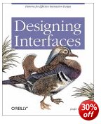
O’Reilly have recently taken to adding colour to their publications – and it works. The pages are more visually interesting, and the reader gets a more accurate picture of what will appear on screen. This book is attempting to get down to the fundamentals of interface design – How many clicks, how many screens do you need to see before you get to what you want? In fact Jenifer Tidwell starts of with usability issues, showing what real users do and ask of interfaces. Then she starts considering design, starting from the top and most general level – the organisation of content, or information architecture. This also includes consideration of the user interface or screen.
 The main strength of her approach is that she is very thorough. Her examples include different types of software and hardware. A design that works on a computer screen will have to be adapted if it’s going to be read on a mobile phone, and if viewed on a TV screen, you won’t have a mouse for navigation. She deals with web pages, installation programs, spreadsheets, and even graphic design packages – but keeps these issues in mind at all times.
Next comes navigation which deals with methods for leading the user through the contents. These include navigation panels, sequence maps, breadcrumb trails, and colour coding.
The next level down in terms of detail is page layout. This introduces elements of graphic design in arranging both content and navigation. This where the going can get rough. The layout part is easy if you’ve got a reasonable eye for design, but after that you need to choose between columns and tabs, and fixed width and liquid pages. She explains all the options, with the advantages and drawbacks of each.
Then comes what she calls the ‘verbs’ of the interface – objects such as buttons, action panels, and menus which make things happen. I was pleased to see that she gave as an example of bad design just how difficult it is to cancel a print job in Windows.
It’s fairly obvious that her principal interest is in information graphics – maps, tables, and graphs plus all their variants. Here she covers the ground which Edward Tufte has made his own – but you’ll find her prose easier to understand. She covers tooltips, expandable views, and what she calls ‘data brushing’ whereby the user can select which part(s) of a collection of information to view on screen.
Then comes a section on the much trickier issue of designing interactive choice lists. There are all sorts of possibilities here – forms, checkboxes, toggle buttons, dropdown lists, and so on – but the important point is that she illustrates them all, pointing to their advantages and weaknesses.
She even covers the design of interfaces for editors – such as text and image editing programs. Not many people outside a technological elite few will need to know these matters, but I found it instructive to see the general principles behind so many of the drag and drop or click and resize functions we come across all the time.
She finishes with a chapter any designer will enjoy – dealing with the graphic design of what appears on screen. This involves colour, spacing, typography, balance, and every other facet of visual rhetoric to make a visitor wish to stay on the site. I picked up some useful tips on hairlines and rounded corners here.
It’s a handsome, well-designed book – as befits its subject – and she includes a generous bibliography. O’Reilly have done her proud.
© Roy Johnson 2005
Jenifer Tidwell, Designing Interfaces, Sebastopol, CA: O’Reilly, 2005, pp.331, ISBN: 0596008031
More on design
More on media
More on web design


