Mantex

Tutorials, Study Guides & More

  • HOME
  • REVIEWS
  • TUTORIALS
  • HOW-TO
  • CONTACT
>> Home / Archives for Design

El Lissitzky Design

June 26, 2010 by Roy Johnson

design , modernism, and Russian Suprematism

El Lissitzky (1890-1941) was one of the pioneers of the modernist movement in Russian art which flourished in the period 1915-1925. He was one of the most graphically radical of his era, and yet only a few years earlier he was painting rather conventional landscape paintings in the tradition of Russian realism. El Lissitzky’s earliest creative period was spent at Vitebsk working with Mark Chagall and Kasimir Malevich. With the latter he spearheaded to Suprematist movement. His geometric constructions developed from two to three dimensions and became a sort of theoretical architecture – shapes which float in space. He called the works ‘Proun’ – an invented word which means ‘Project for asserting the New’. El Lissitzky Design is an elegantly illustrated introduction to all this work.
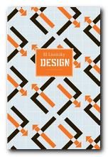
El Lissitzky He is best known for his propaganda painting ‘Beat the Whites with the Red Wedge’ of 1919 – a work which very typically for its time was geometric in form, non-representational, and included typographical elements in the same style as his contemporaries Alexander Rodchenko and Malevich. At the same time he also started producing abstract constructions in two and three dimensions which were (like Rodchenko’s) geometrically based, but more mature and developed than any works of this kind that had emerged up to this date.
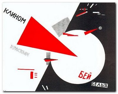
El Lissitzky: Beat the Whites with the Red Wedge

His finest work seems to have been produced in an amazing creative outburst between 1917 and 1925 – just at the point where unfettered Russian modernist art theory was taking off alongside the political revolution in its positive and expansive phase.

When El Lissitzky crossed the line between art and work after 1917, he became an international social activist promoting a political message. Like the Russian Constructivists that he admired, he sought to use his creative energy to help design a new social structure in which the new engineer-architect-artist could erase old boundaries.

El Lissitzky was fortunate to be at his creative peak at a time when foreign travel was still possible in the USSR. He took exhibitions to Germany and mixed with other modernists such as Laszlo Moholy-Nagy and Kurt Schwitters. He had connection with the De Stijl group in Holland, and he taught at the Bahaus.
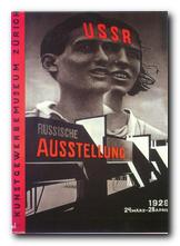
El LissitzkyBut it’s amazing to realise in how short a creative lifespan artists like El Lissitzky (and Rodchenko) had when they exerted such a powerful influence on the modernist movement. The images, paintings, typography, and ‘designs for projects’ illustrated in this collection are almost all from the 1920s. By the following decade El Lissitzky had become little more than an exhibition organiser. He was working for the State – but by the 1930s the dead hand of totalitarian control had stifled all originality from the arts, and his interesting designs for the Kremlin were replaced by the sort of drab architecture that became the norm under Stalin.

He lived until 1943, but there is very little that he produced after the mid 1920s that stands up to any degree of scrutiny today. What he produced before then was awe inspiring – and remains so to this day.

El Lissitzky Buy the book at Amazon UK

El Lissitzky Buy the book at Amazon US

© Roy Johnson 2010


John Milner, El Lissitzky – Design, Suffolk: Antique Collectors Club, 2009, pp.96, ISBN: 185149619X


More on art
More on media
More on design


Filed Under: Art, Design, Graphic design, Individual designers Tagged With: Design, El Lissitzky, Graphic design, Modernism, Russian modernism

Emotional Design

July 12, 2009 by Roy Johnson

why we love (and hate) the everyday objects we use

Donald Norman is famous for The Design of Everyday Things – a best-selling study of the need for functionality in consumer product design. It’s no good having tea pots that don’t pour properly, chairs you can’t sit in, or doorknobs that don’t open the door. Emotional Design is his follow up to that study, in which he revises his views. He confesses that he had previous under-rated the importance of emotions and aesthetics:

Product Design

in writing The Design of Everyday Things I didn’t take emotions into account … But now I have changed … Sure, utility and usability are important, but without fun and pleasure, joy and excitement…our lives would be incomplete. Along with our emotions, there is one other point as well: aesthetics, attractiveness, and beauty.

The first part of the book is actually concerned with the psychology of our response to objects. He suggests that we perceive them at a visceral, behavioural ,and a reflective level. That is – Do I like it? Does it work? and Will I use it again? The first is instinctive, the second rational, the third a combination of experience and cultural influence, rather like the super-ego.

The second part of the book applies these principles to product design. His examples range from mineral water bottles to web sites, and from hiking boots to industrial vacuum cleaners.

What he does here is to emphasise the desirability of good shape and satisfying textures. The rest is a repeat of what he argued in the earlier book. The product must work easily, and ideally it should be tested for usability (presumably by a company such as the Nielsen-Norman Group).

He is still generally on the side of functionality, but now appears to be prepared to defend the appeal of glamorous surfaces. However, you do begin to wonder about his judgements when he gets excited about owning one of those Martian-looking Philippe Starck lemon juicers which even the designer confesses were “not designed to squeeze lemons [but] to start conversations.”

He gets so carried away that when he comes to analyse the social interactions of text messaging and mobile phone conversations, it’s hard to see what it has to do with design, and much of what he has to say should be fairly obvious to everyone conversant with their advantages and limitations.

He eventually blends this interest in emotions and design by considering the future of robots which have been programmed to have emotions. Not necessarily human emotions, but appropriate for their function and survival.

Strangely enough, the rationale for all this is given in an epilogue which traces the development of his professional career. He has latterly been working with psychologists and now sees that human choices are made on more than functionality alone. [One wonders whether his business partner, the ultra-functionalist Jakob Nielsen is persuaded by this approach.]

This is a lively, thought-provoking study of design principles. Donald Norman writes in a friendly, jargon-free style, and he communicates a humane enthusiasm for his subject. I doubt that this will dislodge The Design of Everyday Things from the top of the Design Classics list, but it is one which anyone with an interest in design will not want to miss.

© Roy Johnson 2003

Emotional Design   Buy the book at Amazon UK

Emotional Design   Buy the book at Amazon US


Donald A. Norman, Emotional Design: why we love (or hate) everyday things, New York: Basic Books, 2003, pp.257, ISBN: 0465051359.


More on design
More on media
More on web design
More on information design


Filed Under: Product design Tagged With: Design, Donald Norman, Emotional Design, Product design, Usability

Graphic Design School

June 14, 2009 by Roy Johnson

basic design principles using all modern media

This is a structured self-teaching guide to the principles of graphic design which provides up-to-date information on computer aided design and the use of software applications. Graphic Design School itself is beautifully designed and printed – in full colour, with excellent design and layout fully illustrating the principles it espouses. First of all it deals with basic design principles – layout, space, colour, typography, and graphics.

Graphic Design SchoolEach topic is presented on one double-page spread in a stylish layout which shows off some of the best principles the book is designed to promote. The second part of the book looks in more detail at what effects are possible with detailed manipulation of typeface selection. It also looks at the secret ingredient which lies beneath most examples of good design – grids.

The last part looks at examples of professional design practice – magazines, corporate design, books, presentations, and of course web design.

It’s a visually exciting overview of what’s required in the increasingly complex and sophisticated word of graphic design. The illustrations are wonderfully fresh and well chosen. There wasn’t one I had seen in any publication before.

This will be suitable for people working in newspapers, magazines, books, packaging, advertising, web design, and digital media in general. It’s packed with practical guidance for students and practising designers.

It’s an introductory guide to a discipline with many facets. I imagine that readers will come across a topic that touches a creative nerve – layout, typography, animation, or image manipulation – then shoot off to follow up the subject elsewhere. That’s exactly as it should be – and there’s a glossary and bibliography to help too.

© Roy Johnson 2005

Graphic Design School   Buy the book at Amazon UK

Graphic Design School   Buy the book at Amazon US


David Dabner, Graphic Design School: The Principles and Practices of Graphic Design, London: Thames and Hudson, 2004, pp.192, ISBN: 0500285268


More on design
More on media
More on web design
More on typography


Filed Under: Graphic design, Typography, Web design Tagged With: Design, Graphic design, Graphic Design School, Web design

Hip Hotels: New York

July 25, 2009 by Roy Johnson

glamorous, modern, and fashionable locations

Who would have thought that books on architecture and interior design would suddenly become fashionable. But that’s what’s happened with this Hip Hotels series, which made a big impact when it first appeared a couple of years ago. What are Hip Hotels? Well, Herbert Ypma defines them as Highly Individual Places, but I think it’s a bit more than that – because even traditional hotels can be individual. The selection he shows (and he claims to have stayed in them) are all very modern, usually minimalist, and the emphasis throughout is that they are located in very fashionable parts of the city – even if that means you’re in the Meatpacking District.

Hip Hotels: New York But he covers other parts of the city too. His survey goes from the Lower East to the Upper West Side, with Tribeca, SoHo, Midtown, and Times Square in between. The common features of most examples are dark brown modernist furniture, exposed brick or granite, soft downlighting, stainless steel bathroom fittings, no pictures, decorations, or knickknacks of any kind, a lot of square, black leather chairs and settees, and of course some stupendous views over the city’s roofscapes.

You get an eight page spread on each location. It goes almost without saying (these days) that the photography is of superb quality, and there are full contact and location details for each hotel – so you can phone in or log onto their web sites and book a room if you wish.

And it’s not just pretty pictures. He’s obviously well informed on the practical issues of architecture: he gives details of the planning permission, zoning regulations, and the acquisition of ‘air rights’ necessary for these largely high-rise buildings. He’s also good on the way in which the districts have changed their nature – turning from manufacturing to arts and fashion centres within a couple of generations.

These publications are normally big expensive coffee table books, but for this series they have been reduced in size to a more easily portable format. You lose some of the visual expansiveness of the originals, but Thames and Hudson call it their ‘travel format’. I suppose the idea is that you could take them along on your cultural pilgrimage. However, I should warn you, before you get too excited, that most of these places charge $300-plus minimum per night. Buy the book instead. It’s twenty-five times cheaper.

© Roy Johnson 2006

Hip Hotels: New York Buy the book at Amazon UK

Hip Hotels: New York Buy the book at Amazon US


Herbert Ypma, Hip Hotels: New York, London: Thames & Hudson, 2006, pp.192, ISBN: 0500286183


More on architecture
More on technology
More on design


Filed Under: Architecture, Lifestyle Tagged With: Architecture, Design, Hip Hotels: New York, Interior design, Lifestyle

InteractiveDesign2

July 14, 2009 by Roy Johnson

interactive web site pages sample book

This is a stylish – nay, glamorous portfolio of Web page design. InteractiveDesign2 collects the best in graphic creativity from interactive environments generated over the past two years. Two hundred illustrations are featured, including color reproductions of websites, CDROMs, kiosks, and other interactive media. The companies featured include big corporations such as Coca-Cola and Mercedes Benz, National Geographic magazine, film studios, plus IBM, Sony, and Adobe. The majority are saturated with art work and heavy graphic design. But the odd thing is that they are imitating magazine advertising and the cinema screen, rather than maximising the essence of the Web page.

web page designMost of these sites look very attractive printed out on the page – but they take an age to download. The level of interactivity varies. A lot of the sites, when I visited them, have homepages announcing that you need Shockwave and a Flash plug-in just to view what’s beyond the entry screen. These are obviously not businesses who want to make things easy to attract lots of visitors or clients.

Some crashed the browser, whilst others such as Gucci and San Francisco Museum of Modern Art – a rare case where horizontal scrolling seems to work – worked seamlessly, making a very stylish presentation.

Amazingly, none of the sites is credited with a URL. If you want to see the site live in action, you need to work out an address from the title bar or you could make a guess from the name.

There is no commentary or analysis. Designers are listed in an appendix, but it’s a bit of a fag matching names to their work, and there is no informative backup to any of this. You simply have the graphic images to inspect, plus some skimpy designer credits.

You’ll get lots of graphic design stimulation just from looking at the pages of the book. But for fuller value, you’ll need to work out those URLs and look at some of the stunning effects created on screen.

© Roy Johnson 2005

Buy the book at Amazon UK

Buy the book at Amazon US


B. Martin Pedersen (ed) InteractiveDesign2, New York; Graphis, nd, pp.256, ISBN: 1888001925


More on web design
More on digital media
More on technology


Filed Under: Web design Tagged With: Design, Graphic design, Interactive Design, Web design

Le Corbusier

August 29, 2018 by Roy Johnson

his life, loves, and works

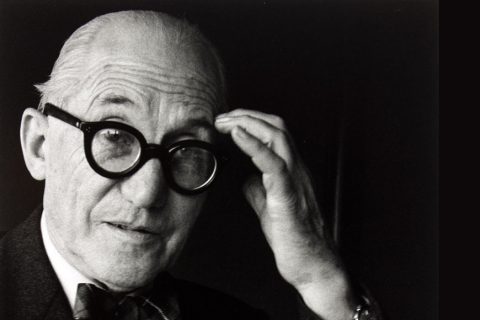
Le Corbusier was born Charles-Edward Jeanneret in 1887 in the Swiss Alps into a modest middle-class family with a culture of hard work, music, and exploration of the countryside at weekends. Although he was not as academically talented as his older brother Albert, he rapidly developed skills in drawing and painting.

Le Corbusier

He enrolled at the Ecole d’Art and then, without any formal training, began to practise architecture, designing his first house at the age of seventeen. Influenced by his reading of Ruskin, he travelled to Italy, where he was inspired by the cathedrals of Milan, Pisa, and Florence. His trip ended in Vienna, where he hoped to find work. All of these destinations at the time were within the Hapsburg Austro-Hungarian Empire.

Vienna was a disappointment: ‘if it weren’t for the music, one would commit suicide’. Despite protests from his family and teacher, he then moved to Paris in 1908. There he encountered something that was to change his life – reinforced concrete. He worked in an architect’s office in the afternoon and continued his own self-generated curriculum of study in the museums and art galleries each morning.

Despite this early success he suddenly decided to go to Germany. There he had the good fortune to be commissioned to write a study on contemporary design developments. This resulted in travel to Frankfurt, Dusseldorf, and Weimar, and the publication of two reports. He also managed to talk his way into an internship with the Peter Behrens practice.

This was followed by a period of acute Weltschmerz from which he emerged with a desire for further travel. He sailed from Vienna down the Danube with a friend to Constantinople, then journeyed on to the monasteries of Mount Athos, which had an inspirational effect on him. As did the Parthenon, which he visited every day for almost a fortnight. He was recalled from this orgy of Mediterraneanism by the offer of a job back home.

Feeling depressed at returning to what he regarded as a provincial backwater, he nevertheless threw himself into teaching theoretical and practical design at the Ecole d’Art. This was something like a precursor to the Bauhaus. He also opened an official office as a practising architect, even though he was completely without professional qualifications.

Le Corbusier

La Maison Blanche 1912

His first major project was the design and construction of a palatial villa for his parents. The house was a triumph of modernist design, even though he almost ruined the family financially by a budget overspend. A few years later the house had to be sold off at a huge loss, which wiped out his parents’ savings.

During the First World War he designed a cheap and modular system of building to re-house homeless people. He travelled to France and met the artist Maillol, who at that time was considered the world’s leading sculptor. He continued to work on small design projects, but as the war ended he decided to make a new beginning for his life. He moved to live in Paris.

He set himself up in a studio apartment in the rue Jacob, visited prostitutes, and was at the notorious first night performance of Parade in 1917. He also entered his first major architectural competition, which was to design a large scale industrial slaughterhouse for Nevers in central France.

At a social level he befriended his neighbour, the artist Amedee Ozenfant. He also rather bizarrley established a business for the manufacture of reinforced concrete bricks. He and Ozenfant collaborated on the publication of their artistic manifesto – After Cubism – and they exhibited paintings together. At this time he regarded his commercial enterprises and design work as merely sources of income to support his ambition to be a painter.

In 1920 he changed his name from Charles-Edouard Jenneret to Le Corbusier, and together with Ozenfant launched the avant gard magazine L’Esprit Nouveau. He designed another form of modular shoebox-shaped housing called Citrohan, using concrete, steel, and glass. His objective was to make buildings of Spartan simplicity that were filled with light.

Le Corbusier

Villa Guiette 1927

He met and began to live with Yvonne Gallis, an earthy Mediterranean-style woman whom he kept more or less secret from his family. (There are unconfirmed rumours that they met in a brothel.). He built a modernist palace for the banker and art collector Raoul La Roche and in 1923 published a major series of theoretical essays as Towards a New Architecture.

A partnership with his younger cousin Pierre Jenneret flourished and they were forced to employ more and more assistants. Le Corbusier still spent his mornings painting, but from this point onwards kept this side of his life almost secret, so that it didn’t dilute his growing reputation as an architect. He complained about being exhausted by the demands of his profession, but in fact his office hours were in the afternoons between 2.00 and 5.00 pm.

His ideas were mocked by critics and the general public because his designs put functionality before all else. The house of the future was given features we now take for granted: built-in wardrobes and storage, open plan rooms, plain walls, large industrial-sized windows, and furniture which he chose from the manufacturers of hospital equipment. Yet despite the criticisms he was becoming a celebrity architect, with requests from Princess de Polignac and the writer Colette. He also designed a very successful villa for Michael Stein, the brother of the American writer Gertrude Stein.

Corbusier engaged with design at all levels of scope and size. For interiors he designed arm chairs and occasional tables; for social housing he created multi-storey residential blocks; and at city level he wanted to re-shape urban areas – to admit light and space where once there had been narrow, crowded streets. For these ambitions, and because he theorised about them, he was widely (but incorrectly) regarded as a communist.

Nevertheless he did visit Moscow in 1926, where he won a commission to design new offices for the Centrosoyuz. He felt his visit was a big success, though some of his ideas were criticised (quite intelligently) by El Lissitsky. He was also invited to South America, where he lectured on urban planning and designed a house for Victoria Ocampo – a friend of the writer Jorge Luis Borges.

He prepared his lectures in advance, then delivered them without notes, illustrating his arguments with fluidly produced diagrams and sketches whilst speaking. On the lecture tour he met the singer Josephine Baker, for whom he was to design a house in Paris. He also took the opportunity to have an affair with her during their ten day transatlantic journey back to France.

Le Corbusier

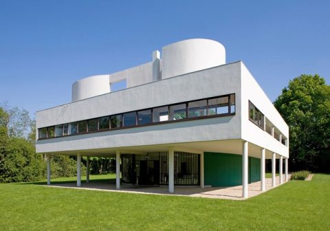
Villa Savoye 1928

In 1930 he made two decisive steps in his public life: he took out French citizenship, and he married Yvonne. Two years later he submitted his plans for the Palace of the Soviets in Moscow, confident that his ideas would be accepted by a regime that had earlier produced the forward-thinking designs of the Constructivists. What he didn’t realise was that Joseph Stalin (like other dictators) had already decreed that all architecture for the proletariat must be Greco-Roman in style. He had more success a year later with the Cite de Refuge – a purpose-built hostel for children and the homeless he built for the Salvation Army in Paris.

When he visited America for a further lecture tour he felt that the skyscrapers were too small and too close together, but he did find a new client – the socialite divorcee Tjader Harris, who also became his lover. However, he was disappointed that no grand schemes in urban projects resulted from his contact with the New World.

When war broke out in Europe he was recruited as advisor to the war ministry (with the rank of colonel). He worked on designing a modular munitions factory, but when the Germans invaded and occupied Paris he fled to Petain’s headquarters in Vichy. It was at this point that his ideas concerning ‘modernity’. ‘The machine age’, and urban planning meshed all too easily with fascist ideology, and he collaborated with people who eventually deported eighty thousand Jews from France to the death camps.

His participation with the regime was in no way passive or accidental. He actively sought the support of Petain himself, and was eventually rewarded with a post on the committee for ‘Habitation and Urbanism’ of Paris. Here he worked alongside racists, eugenicists,and people who advocated euthanasia for ‘cleansing’ the capital’s population. Plagued by bureaucratic indecision and in-fighting, the committee never achieved anything, and Corbusier ended back in Paris running a sort of private college of architecture.

When France was liberated by the Allies in 1944 (and ten thousand collaborators had been executed) Corbusier merely made himself available to the De Gaul government and ever after whitewashed his collaborationist record of the war years. He was given a dream project – to construct a huge modernist apartment block in Marseille..

Le Corbusier

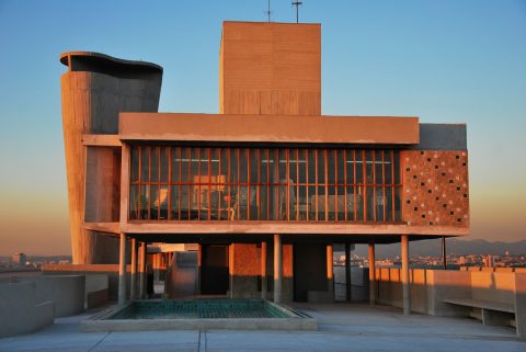
L’Unite d’Habitation – roof terrace 1952

He was working on several projects simultaneously when invited to join the scheme for a new United Nations headquarters in New York. He jumped at the chance, assuming that he would be its lead architect, even though he did suggest that Alvar Aalto, Walter Gropius, and Mies van der Rohe should join the team. The American venture boosted his already supercharged reputation – and ego. It enabled him to re-establish contact with his lover Tjader Harris; and it left his wife back home sinking deeper and deeper into alcoholism.

From time to time he flew back to check on the Marseille project which was coming under criticism from local bureaucrats for what they considered its outlandish design. They objected to kitchens in the same space as dining areas – something considered revolutionary at the time. As soon as he was absent in France, other people took over his design for the UN building, which was eventually attributed to the American architect Wallace K. Harrison.

But Corbusier had compensations – notably a commission to design a new mini-city in the Colombian capital, Bogota, and a new lover in the shape of journalist Hedwig Lauber. There was also an offer to design a new government headquarters in Chandigarh, India, a project personally endorsed by its leader, Pandit Nehru. This was his dream of total urbanisation come true. He was in his element, travelling first class between three continents.

Le Corbusier

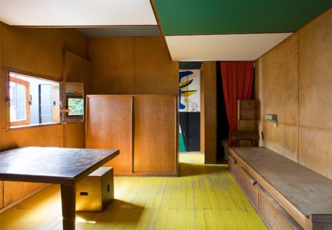
Le Cabanon 1951

Whilst he was building a city for a government, he constructed for himself a holiday home in the south of France. It was a simple and box-shaped structure that on the outside looked like a log cabin. But the interior was lined with coloured plywood, which created a modernist statement. The single room construction was even made contiguous with the local restaurant whose owner he had befriended. This provided Yvonne with company during his many absences.

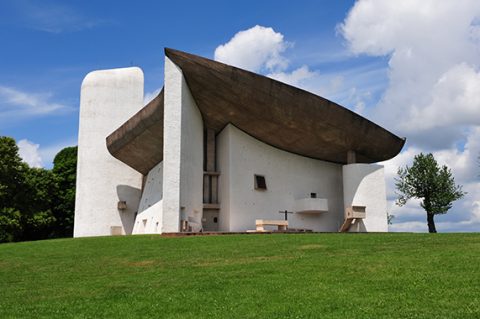
His national masterpiece, L’Unite d’Habitation was finished and opened in 1952. It housed three hundred families, had built-in shops and recreational areas, and a roof garden with nursery and swimming pool. A Second version was commissioned for Nantes, and he began work on what was to become one of his signature buildings – the chapel at Ronchamps.

This was a project designed to replace a simple church that had been destroyed by German bombs during the very last days of the war. It has become famous for its stark simplicity and its bizarre roof that has been described as ‘ a mix of partially crushed sombrero, a ram’s horn, and a bell-clapper’.

Le Corbusier

Notre Dame du Haut 1955

His wife continued to neglect her health, continued drinking, and eventually died in 1957. Shortly afterward Corbusier developed a multi-media installation for the Universal Exhibition at Brussels. This involved projected films and avant gard musical scores by Edward Varese and Iannis Xenakis, who at that time was working in Corbusier’s practice as an architect.

When his mother died at the age of ninety-nine, Corbusier had lost the two women underpinning his emotional life. He soldiered on alone, supported by a plethora of public accolades. He was showered with so many honorary degrees, he started turning them down.

Yet there continued to be professional frustrations and setbacks. Two major developments in Paris and New York came to nothing. In the face of these setbacks he fought back even more cantankerously than he had done before – until he eventually died doing what he had done all his adult life – swimming in the sea at his beloved gite at Roquebrune-cap-Martin.

Since then his longer term reputation as an architectural genius has been somewhat mixed. Open any architectural or interior design magazine today and you will see that his visual style is ubiquitous. The new norm is for minimalist decoration and open plan living. But some of his ideas on urbanisation now seem to smack dangerously of social engineering – and just as a by-the-way, the roofs on many of his buildings leaked.

© Roy Johnson 2018

Buy the book at Amazon UK

Buy the book at Amazon US


Nicholas Fox Weber, Le Corbusier: A Life, New York: Alfred A. Knopf, 2009, pp.848, ISBN: 0375410430


More on architecture

More on biography

More on design


Filed Under: Architecture, Biography, Design Tagged With: Architecture, Cultural history, Design, Le Corbusier, Modernism

Left to Right

June 13, 2009 by Roy Johnson

the cultural shift from words to pictures

This is a dream production in terms of graphic design – a lavishly illustrated and beautifully produced book which cuts no corners in delivering a luxury product. But it also has a serious argument explored in the text. The thesis is that the modern world has witnessed a shift away from the written word towards the visual image as a form of communication. In other words a shift from left to right of the cerebral cortex in our way of thinking.

graphic designThe book takes a historical survey from the early years of the last century to the present to prove the point, and the theoretical claims are supported by quotes from cultural theorists such as Susan Sontag, Roland Barthes, and Marshall McLuhan. It’s a very lavish production, with thick matte paper; huge page margins; full colour; acres of blank space; colour-coded chapter dividers; and well-selected graphics given all the breathing space they need.

However, I’m not sure that David Crow’s central argument is proven. We communicate a great deal these days with logos, symbols, and icons it’s true, but compared with the daily avalanche of words, the proportion is trivial.

He’s arguing that visual culture is replacing literary culture, but the examples he cites are of magazines which have merely increased the percentage of graphics they use. Commercial companies have to make their advertising act quickly – hence the use of pictures rather than words – but that is not the same as graphics replacing language as a cultural influence.

Lots of bold theoretical claims are made, in a way which somehow don’t need to be made. The examples shown are simply new and interesting visual images: they are not displacing words as an influence or introducing new cultural paradigms: they are simply fresh visual inventions.

The second part of the book deals with the history and development of writing systems – though his source for this is the rather self-confessedly lightweight Story of Writing, rather than the far more scholarly Henri-Jean Martin’s The History and Power of Writing or Walter Ong’s Orality and Literacy. This leads into an encomium on the work of Otto Neurath, who proposed a ‘language’ of symbols, then the work of Charles K. Bliss doing a similar kind of thing.

Next he moves on to typographic experimentation on 1970s and 1980s UK. There are some interesting details on the way new effects were created technically, and we’re introduced to graphically innovative designers of the digital age such as Neville Brody, Peter Saville, and Malcolm Garrett. All the left-cortex right-cortex nonsense is left behind, and the study really comes to life. I would be happy to read a book-length study of this period alone if he chose to write one.

The latter part of the book is a celebration of digital possibilities – for as he rightly claims, the computer is

at once a typewriter, a retrieval device, a page layout engine, a photo retouching tool, an edit suite, a recording studio, a television and a radio.

The same is increasingly true of the mobile phone, with which he concludes. I was quite relieved to leave all the left-brain right-brain and language/visuals dichotomy argument behind and concentrate on graphic design and digital technology, which is where his heart obviously lies – and where he would be best employed concentrating his attention in future publications of this quality.

© Roy Johnson 2006

Left to Right   Buy the book at Amazon UK

Left to Right   Buy the book at Amazon US


David Crow, Left to Right: the cultural shift from words to pictures, Lausanne: AVA Publishing SA, 2006, pp.192, ISBN: 2940373361


More on design
More on media
More on web design


Filed Under: Graphic design Tagged With: Design, Design theory, Graphic design, Theory

Mediterranean Architecture

May 26, 2009 by Roy Johnson

glamorous contemporary European house designs

If you like looking at examples of beautiful mediterranean architecture, designer homes overlooking the sea, and experiments with shapes, materials, and domestic organisation – then this new book from Thames & Hudson is worth your consideration. It’s like A Place in the Sun on steroids. Dominic Bradbury has assembled mini-essays on twenty-five of the best in modern architect-designed houses.

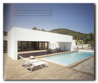
Mediterranean Architecture They differ in their styles, but are united by their clean lines, open plan living, and a serious commitment to integration with their surroundings. The overall style, which might reflect the editor’s taste or might represent the movement of the current decade, is for buildings that are minimalist, rectangular, and low-rise. They must also blend sympathetically with their surroundings. Their materials have some relationship to the area in which they’re built, large plate-glass windows feature prominently, if possible reaching to the floor, and an infinity pool is a desirable extra.

A high proportion of the examples come from Spain. There’s quite a lot of cantilevering, flat roofing, sharp-edged, rectilinear profiles, and all the example shown rise to a maximum of three floors. There’s also a recurrent theme of contrasting textures – mahogany against raw concrete, polished steel and plate glass, water features and carefully arranged gravel pathways.

I liked the inclusion of small architectural plans, which help you to gain an overall perspective of the building in its geographical location. And visually, the book is a treat, with excellent photographs – even though their relatively small format made me hanker after something more grand.

bradbury_1

Of course, it has to be said that most of these buildings are situated in completely idyllic locations, set amidst rolling pine forests, overlooking sun-drenched harbours, and untroubled by any neighbours or industrial blots on their landscapes. But having said that, they represent what’s possible when an architect is commissioned by a client with enough money and sufficient confidence to allow free imaginative rein.

The locations range from Morocco in the west, via Spain and the Balearics, through Greece, to Turkey in the east. Yet many of the designers of these buildings come from places as far away from the Mediterranean as Paris and Brussels – though I suppose any architects worth their salt must have their practices located in big cities.

This is part way between a coffee table book, the text of which nobody (except design anoraks) will ever read, and a serious review of modern architecture. Dominic Bradbury seeks to point out what the designers are doing that’s original, and he has a sensiitive regard for his subject. Full contact details of the architects are listed, and a trawl through their web sites is like getting a trip through another book for free.

© Roy Johnson 2006

Mediterranean Modern Buy the book at Amazon UK

Mediterranean Modern Buy the book at Amazon US


Dominic Bradbury, Mediterranean Modern, London: Thames & Hudson, 2006, pp.256, ISBN 050034227X


More on architecture
More on technology
More on design


Filed Under: Architecture, Lifestyle Tagged With: Architecture, Design, Interior design, Lifestyle

MTIV: New Media Design

June 14, 2009 by Roy Johnson

new media design principles, plus tips on inspiration

Hillman Curtis is one of the new generation of multi-media designers – with a background in writing and rock music rather than art college. This is his credo on the process of professional new media design – which is centred on listening carefully to what clients want, and helping them to articulate their ideas. It’s a glamorous production, with big margins, glossy paper, and double-spread photos.

New Media Design In the first part of the book he spells out his approach to designing and managing projects. He gets his stimulus from magazines, movies, and other people’s Web sites, collecting examples of good design for inspiration. One of the main purposes of this book is to communicate this personal enthusiasm – which he does very well.

You feel as if you’re only a couple of steps away from your own award-winning designs. The down side is, he doesn’t go into any technical detail on how to do it. In the central section of the book he gives examples of the people whose work has inspired him – graphic designers Saul Bass, Kyle Cooper and Joseph Müller-Brockman, painter Mark Rothko, plus film directors David Mamet and Sydney Lumet.

I’ll visit a gallery, buy or borrow a few CDs, see a couple of movies, and study my favourite movies on DVD. I’ll read art history, film theory … and of course I immerse myself constantly in design books and magazines.

It’s interesting to note how the possibilities of motion and the Web has led to these Flash designers thinking of themselves as directors of sixty second movies which must deliver a theme, plus a coherent and complete experience.

When it comes to the technical matters discussed in part three, he hands over the baton to other writers, so what we get is a series of essays from experts. These are on colour theory, design with grids, font construction, and Web page layout. These are quite useful primers, particularly if you want a quick introduction to HTML and XML. He also includes a chapter on usability from Steve Krug’s excellent Don’t Make Me Think, and a there’s a finale encouraging would-be movie makers to try their hands at digital video.

© Roy Johnson 2005

New Media Design   Buy the book at Amazon UK

New Media Design   Buy the book at Amazon US


Hillman Curtis, MTIV: Process, Inspiration and Practice for the New Media Designer, Indianapolis (IN): New Riders, 2002, pp.240, ISBN: 0735711658


More on digital media
More on technology
More on theory


Filed Under: Media Tagged With: Design, Media, New media, Web design

Nina Hamnett biography

November 30, 2010 by Roy Johnson

artist, modernist, and the Queen of Bohemia

Nina Hamnett (1890-1956) was born in Tenby, south-west Wales. She endured a largely unhappy childhood, but her skill at drawing enabled her to escape her miserable life at home (rather like her near-contemporary Dora Carrington). She studied at the Pelham Art School and the London School of Art between 1906 and 1910.

Nina Hamnett biographyIn 1911 she launched herself into the London art world on the strength of a fifty pound advance on an inheritance from her uncle and a stipend of two shillings and sixpence a week from her aunts. There she socialised in the Cafe Royal with the likes of Augustus John, Walter Sickert, and Henri Gaudier-Brzeska. She became very popular as a result of her high spirits, her devil-may-care attitude, and her sexual promiscuity. Like other women at the time revelling in a newfound independence, she had her hair cut short in a ‘crophead’ style (what we would now call a basin cut) and she wore eccentric clothing:
I wore in the daytime a clergyman’s hat, a check coat, and a skirt with red facings … white stockings and men’s dancing pumps and was stared at in the Tottenham Court Road. One had to do something to celebrate one’s freedom and escape from home,

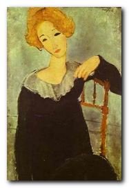
It was said that at this phase in her life Nina Hamnett had the knack of being in the right place at the right time. In 1914 she went to live in Montparnasse, Paris, immediately meeting on her first night there the Italian painter Amedeo Modigliani. He introduced her to Picasso, Serge Dighilev, and Jean Cocteau, and she went to live at the famous artist’s residence of La Ruche which housed many other Bohemian artists and modernist writers. It was there that she met the Norwegian artist Roald Kristian, who became her first husband.

She rapidly established herself as a flamboyant and unconventional figure. She was bisexual, drank heavily, and had liaisons with many other artists in Bohemian society, often modelling for them as a way of earning a (precarious) living. She established her reputation as ‘The Queen of Bohemia’ by such antics as dancing nude on a cafe table amongst her drinking friends.

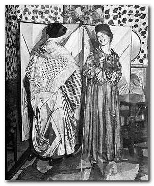
Her reputation as a Bohemian and an artist eventually filtered back to London, where she returned to join Roger Fry and his circle working on the application of modernist design principles to fabrics, furniture, clothes, and household objects as part of the Omega Workshops. She acted as a model for the clothes along with Mary Hutchinson, Clive Bell‘s mistress, and she mingled with other members of the Bloomsbury Group, such as Vanessa Bell and Duncan Grant.

Nina Hamnett in Omega clothes

Nina Hamnett (left) and Winifred Gill (right) in Omega dresses

Her paintings were exhibited at the Royal Academy and the Salon d’Automne in Paris. She also taught at the Westminster Technical Institute in London. Around this time she divorced her first husband and lived with the composer and fellow alcoholic E.J. Moeran. They were part of a circle that included the composer Peter Warlock (Philip Heseltine) who who established a very bohemian circle in Eynsford in Kent, along with other composers such as Constant Lambert and William Walton.

During the 1920s (and for the rest of her life) she made the area in central London known as Fitzrovia her home and stamping ground. This new locale for arty-Bohemia was centred on the Fitzroy Tavern in Charlotte Street which she frequented along with fellow Welsh artists Augustus John and Dylan Thomas, making occasional excursions across Oxford Street to the Gargoyle Club in Soho.

After this glittering debut into the glamorous world of modernism and the artistic avant-garde, the remainder of her life was a no less spectacular descent into poverty, squalor, and alcoholism. She lived in a sleazy bed-sit in Howland Street, which was infested with lice and littered with rat-droppings. The flat was furnished only with a broken-down chair, a piece of string for a clothes line, and newspapers instead of proper bedding.

Dolores Courtney

Dolores Courtney by Nina Hamnett

In 1932 she published a volume of memoirs entitled Laughing Torso, which was a best-seller in both the UK and the USA. Following its publication she was sued by Aleister Crowley, whom she had accused of practising black magic. The ensuing trial caused a sensation which helped sales of the book, and Crowley lost his case.

Her success in this instance only fuelled her downward spiral, and she spent the last three decades of her life propping up the bar of the Fitzroy trading anecdotes of her glory years for free drinks. She took little interest in personal hygiene, was incontinent in public, and vomited into her handbag.

Her ending was as spectacular as had been her previous life. Drunk one night she either fell or jumped from the window of her flat and was impaled on the railing spikes below. She lingered miserably in hospital for three more days, where her last words were “Why don’t they let me die?”


Nina Hamnett


Bloomsbury Group – web links

Bloomsbury Group - web links Hogarth Press first editions
Annotated gallery of original first edition book jacket covers from the Hogarth Press, featuring designs by Vanessa Bell, Roger Fry, and others.

Bloomsbury Group - web links The Omega Workshops
A brief history of Roger Fry’s experimental Omega Workshops, which had a lasting influence on interior design in post First World War Britain.

Bloomsbury Group - web links The Bloomsbury Group and War
An essay on the largely pacifist and internationalist stance taken by Bloomsbury Group members towards the First World War.

Bloomsbury Group web links Tate Gallery Archive Journeys: Bloomsbury
Mini web site featuring photos, paintings, a timeline, sub-sections on the Omega Workshops, Roger Fry, and Duncan Grant, and biographical notes.

Bloomsbury Group - web links Bloomsbury: Books, Art and Design
Exhibition of paintings, designs, and ceramics at Toronto University featuring Hogarth Press, Vanessa Bell, Dora Carrington, Quentin Bell, and Stephen Tomlin.

Bloomsbury Group - web links Blogging Woolf
A rich enthusiast site featuring news of events, exhibitions, new book reviews, relevant links, study resources, and anything related to Bloomsbury and Virginia Woolf

Bloomsbury Group - web links Hyper-Concordance to Virginia Woolf
Search the texts of all Woolf’s major works, and track down phrases, quotes, and even individual words in their original context.

Bloomsbury Group - web links A Mrs Dalloway Walk in London
An annotated description of Clarissa Dalloway’s walk from Westminster to Regent’s Park, with historical updates and a bibliography.

Bloomsbury Group - web links Women’s History Walk in Bloomsbury
Annotated tour of literary and political homes in Bloomsbury, including Gordon Square, University College, Bedford Square, Doughty Street, and Tavistock Square.

Bloomsbury Group - web links Virginia Woolf Society of Great Britain
News of events, regular bulletins, study materials, publications, and related links. Largely the work of Virginia Woolf specialist Stuart N. Clarke.

Bloomsbury Group - web links BBC Audio Essay – A Eulogy to Words
A charming sound recording of a BBC radio talk broadcast in 1937 – accompanied by a slideshow of photographs of Virginia Woolf.

Bloomsbury Group - web links A Family Photograph Albumn
Leslie Stephens’ collection of family photographs which became known as the Mausoleum Book, collected at Smith College – Massachusetts.

Bloomsbury Group - web links Bloomsbury at Duke University
A collection of book jacket covers, Fry’s Twelve Woodcuts, Strachey’s ‘Elizabeth and Essex’.

© Roy Johnson 2000-2014


More on art
More on biography
More on the Bloomsbury Group
Twentieth century literature


Filed Under: Art, Biography, Bloomsbury Group Tagged With: Art, Bloomsbury Group, Bohemians, Cultural history, Design, Nina Hamnett

  • « Previous Page
  • 1
  • 2
  • 3
  • 4
  • 5
  • Next Page »

Get in touch

info@mantex.co.uk

Content © Mantex 2016
  • About Us
  • Advertising
  • Clients
  • Contact
  • FAQ
  • Links
  • Services
  • Reviews
  • Sitemap
  • T & C’s
  • Testimonials
  • Privacy

Copyright © 2025 · Mantex

Copyright © 2025 · News Pro Theme on Genesis Framework · WordPress · Log in