Mantex

Tutorials, Study Guides & More

  • HOME
  • REVIEWS
  • TUTORIALS
  • HOW-TO
  • CONTACT
>> Home / Archives for HTML

HTML Tutorial 07 – page anatomy

November 23, 2009 by Roy Johnson

1. Let’s look at each section of a typical HTML page. We’ll see what the code means and what it does.

2. Much of this might seem pretty boring at first – but you will realise later why it can be important.

3. First of all, here is the absolute basic minimum HTML page.


<HTML>

        <HEAD>

                <TITLE>

                Page title

                </TITLE>

        </HEAD>

        <BODY>

                Here is the page content

        </BODY>

</HTML>


4. You can see that the structure of the page is a HEAD section, which contains the TITLE, and a BODY section, which contains the contents of what will appear on the page.

5. The first item is actually the <HTML>. This tells the browser “What follows is going to be an HTML page”. Like all the other tags, it is enclosed in angled brackets.

6. The next item is the <HEAD>. This section of the page can contain all sorts of technical data – which we’ll come to in a moment. For now, we’ll notice that it contains the TITLE of the page.

7. The <TITLE> does not appear on the page – so don’t look for it there. It appears at the top of your browser window – saying something like “Page title – Mozilla Firefox” or “Page title – Windows Internet Explorer”.

8. Next comes the <BODY> section. This contains the information you wish to appear in your page. It could be text, graphics, audio files, or even movie clips.

9. Note that each one of these tags must be opened – then closed. Otherwise, the page will not show up in your browser.

10. And that’s it! Those are the basic elements of a web page. But now let’s look at some of the additional features which might appear. For this we go back to the top of the page.

11. The other item which commonly appears in the HEAD section of the page is META data. That is, information about the content of the page. This is usually a DESCRIPTION of the page, and KEYWORDS which summarise its most important topics.

12. This information does not appear in your browser window. It is intended for search engines. They visit your pages [maybe] and want to know how to categorise them and what they contain.

13. Another thing you might see at any point in a web page is COMMENTS.

<!– these are comments –>

14. Anything which appears between <! and > will not show up when you view the page in a browser.

15. What use are these? Many designers use comments to mark special sections of their pages – as in the following example. They make editing easier at a later date.

<!– ######## START OF MAIN TOPIC ######## –>

16. There are many other elements you might find in a typical HTML page – but these are the most basic. Just remember that unless you open and close all your tags correctly, the page may not show up in your browser.

See the page of common problems for examples.

© Roy Johnson 2002
previousnext


Filed Under: How-to guides, Study Skills Tagged With: HTML, HTML tutorial, Technology, Web design tutorial

HTML Tutorial 08 – questions of taste

November 23, 2009 by Roy Johnson

1. Too much text
Some people put far too much text into their pages, and often don’t have margins or breaks between paragraphs. The result is a screen full of text – which is difficult to read. Use plenty of space around your text. It will look more attractive and be easier on the eye.

2. Bad colours
Combining coloured backgrounds with coloured text is dangerous. It can work if it is done with restraint – but many people are attracted to colours which clash and vibrate. For good results – ‘less is more’ is often the case so far as color is concerned.

3. Tiled backgrounds
Background graphics can often make text difficult to read. When a .gif file is tiled across a page, the resulting pattern often creates an effect which is visually disruptive. Use only very pale graphics.

4. Large graphics
These take up a lot of space, and can take a long time to download. People viewing your pages will switch off and go elsewhere. Shrink your pictures in a graphics editing package.

5. Long pages
Most people dislike scrolling through very long pages. They will often not read beyond 2-3 screens of text. The solution is to create separate pages, and put links between them.

6. Hit counters
These make any web site look very amateurish. If your web site is a hobby, you don’t need them. If it is commercial, you will not want to reveal this information. If you are determined to have one, it’s possible to make it invisible. You can record the ‘hits’ – but other people don’t see the results.

7. Animated graphics
These usually distract attention from what you have to say, and they generally look tacky. Unless they are very small, very subtle, and in non-conspicuous positions – leave them off your pages.

8. Garish colours
Your site will look cheap, amateurish, and vulgar if you use too many bright colours. The same is true of bad clip art and animated graphics. Yellow and blue starbursts against a speckly purple background will look naff. Leave those for the funfair.

9. To see a very funny and truly awful collection of bad taste designs, visit the following web site:

Budugllydesign.com

10. Well-designed web sites are often based on one of the most memorable slogans to come from the design profession – “Less is more”.

© Roy Johnson 2002

previousnext


Filed Under: How-to guides, Study Skills Tagged With: HTML, HTML tutorial, Technology, Web design tutorial

HTML Tutorial 09 – text and graphics

November 23, 2009 by Roy Johnson

1. Once you have managed to produce a web page full of text, the next thing you usually want to do is add some graphics.

2. You add the graphics using the simple tag –

<IMG SRC=”filename.gif”>

This is inserted into the page at the place where you want the graphic to appear. And the graphic file would need to be saved into the same folder as your filename.htm page.


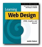
Learning Web Design - Click for details at Amazon
3. But the graphic will simply appear on the page with text before it and after it. You would probably prefer the text to wrap round the graphic, in the same way that the text is doing here – wouldn’t you? This makes for a neater and more interesting page. Incidentally, your graphic can also be a link. If you click the book cover here, you will be taken to Amazon, where you can order the book. Here’s how to wrap the text around the graphic.

4. Add the following INSIDE the tag

align=”left” [or right]

hspace=”x” [where x=number of pixels]

vspace=”x” [where x=number of pixels]

So the tag should look like this:

<IMG SRC=”filename.gif”align=”left” hspace=”10″ vspace=”5″>

5. This creates a 10 and 5 pixel gap around the side and the bottom of the graphic – to stop your text bumping into the picture.

6. Experiment with the x=number to see the effect.

7. If you want to add another refinement, you can add a border.

border=”x” [where x=number of pixels]

8. And you should set x=0 for no border.

9. You can also add a title:

alt=”Picture courtesy of Media-Pics plc”

10. This will show up on screen when you move your cursor over the graphic. It is NOT a caption to the picture.

11. And you might wish to add the size of your graphic file.

width=”x” [where x=number of pixels]

height=”x” [where x=number of pixels]

12. You find these dimensions by opening the graphic file in your graphics editor and looking at the size or dimensions.

13. Adding the dimensions will help your page download faster – because the browser knows how big a space to leave for the picture before it starts loading.

14. So – here’s an example of all these features in one tag. The items are on separate lines to make them easier to read.

<IMG SRC=”../graphics/hafner.gif”

align=”left” hspace=”7″ vspace=”5″ border=”0″

alt=”The Origins of the Internet”

width=”90″ height=”140″>

© Roy Johnson 2002

previousnext


Filed Under: How-to guides, Study Skills Tagged With: HTML, HTML tutorial, Technology, Web design tutorial

HTML Tutorial 10 – adding tables

November 23, 2009 by Roy Johnson

1. You can add tables to your web pages. This is usually done for two quite different reasons:

  • to put data in columns and rows
  • to control layout on the page

2. This is a simple table containing data:

Size Description
1 Red, size – large, fully boxed
2 Blue, size – medium, unboxed

3. The table borders can be removed to use the same coding for controlling graphics, by setting border=”0″. Here is the same table with its borders removed – actually, hidden.

Size Description
1 Red, size – large, fully boxed
2 Blue, size – medium, unboxed

4. What follows is the basic code for a simple table. COPY this code into one of your template pages. You can then experiment by changing the size of the table and the alignment of data in it.

5. Your data goes inside the table data tags:

<TD>your data goes here</TD>


<TABLE>

<TR>

<TD></TD>

<TD></TD>

</TR>

<TR>

<TD></TD>

<TD></TD>

</TR>

</TABLE>


6. The width of each table data cell can be controlled by adding WIDTH=”X”, where X is the number of pixels:

<TD WIDTH=”150″></TD>

7. The position of data within each cell can be set at LEFT, RIGHT, or CENTER

<TD ALIGN=CENTER></TD>

8. You can use the <P> and <BR> tags within the table data, as you would in a normal page. I have added some colour to the top row, which is technically known as a table header <TH>

Size Description
1 Red, size – large, fully boxed and inflatable.
This product comes with a full set of attachments.
Free delivery.
2 Blue, size – medium, unboxed, and non-inflatable.
This model is only suitable for use indoors.
Not available in UK.

9. In order to control the vertical position of data within the cell, you need to add the VALIGN coding – which can be TOP, MIDDLE, or BOTTOM. [Note – this is ‘Middle’, not ‘Center’.]

10. The coding for the cells containing numbers in the example above is as follows:

<TD ALIGN=”center” VALIGN=”top”>2</TD>

11. The structure and the appearance of tables can become a much more complex issue. You can add colour to the cells, shading to the borders, and put tables within tables.

12. Many web designers arrange the text on their pages by placing it inside tables – and lots of fancy effects are possible. But these and many other design tricks are gradually being replaced by the use of style sheets.

© Roy Johnson 2002

previousnext


Filed Under: How-to guides, Study Skills Tagged With: HTML, HTML tutorial, Technology, Webdesign tutorial

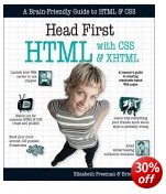
HTML with CSS and XHTML

June 19, 2009 by Roy Johnson

web design using style sheets and the latest standards

This is an unusual guide to HTML and web design, because it teaches via chat and fun, not boring routines. It’s aimed at beginners who want to get web pages up on to a site, but who don’t want to be bored rigid with long lists of ‘elements’, ‘attributes’, and ‘selectors’. The authors use instead just about every printable device for getting their lessons across: explanations, diagrams, screenshots, cartoons, bulleted lists, quizzes, dialogues, crosswords, tests, and downloadable templates. They also teach predominantly via pictures, which is one reason the book is so long (658 pages). The other reason is that it’s so comprehensive.

HTML CSS XHTMLThey cover basic HTML, then XHTML, interactivity, and style sheets. In fact they take the unusual step of introducing style sheets right at the start. This approach of multiple instruction produces quite a lot of repetition and redundancy – but I’ve no quibble with that. It’s based on the sound pedagogic principle the when you are learning, several approaches are better than one.

Geared towards both Mac and Windows users, they show you how to design pages, how to insert graphics, how to validate your pages to check for problems and make the pages compliant with W3C standards.

I still find the language of stylesheets over-abstract and hard to grasp, but they explain it all very carefully, and most importantly they show you both what to type into your text editor and how it will look in a browser.

There are a couple of easier chapters on styling with fonts and colours, then it’s back to the harder stuff with CSS elements and the box mode – which is similar to HTML tables. Here there are some very useful detail on how browsers deal with the information coded into your pages, some of which explains why you can’t always get things to appear on screen how you want them to look.

They end with chapters on tables and forms – still urging readers not to fall back on old HTML 4.0 tricks for layout and appearance, but to stick with style sheets all the way.

So – truth be told, it’s a book which starts off quite easily, but then gradually becomes more advanced. But if you do all the exercises and tests along the way, this gradual acceleration should be hardly noticeable.

© Roy Johnson 2005

Buy the book at Amazon UK

Buy the book at Amazon US


Elisabeth Freeman and Eric Freeman, Head First: HTML with CSS and XHTML, Sebastopol: CA, 2005, pp.658, ISBN 059610197X


More on technology
More on digital media
More on web design
More on computers


Filed Under: HTML-XML-CSS Tagged With: CSS, HTML, Web design, XHMTL

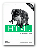
HTML: The Definitive Guide

July 11, 2009 by Roy Johnson

the encyclopaedia of HTML coding and web design

Most people in the academic and business world are still using HTML Standard 2.0 browsers – partly because of corporate lethargy and partly because upgrading is so costly and disruptive in big organisations. At least these people have had the good fortune to miss out the Standard 3.0 phase, which was something of a dog’s breakfast. Designers however (the people who actually create the Web pages for our consumption) are always keen to make the screen more attractive and escape the confine of earlier standards. In fact they have a doubly difficult job. They might wish to adopt the latest features, but if their sites are to be viewable by people still lumbered with older browsers, they are also under constraint to make their pages ‘backwardly compatible’. This is no easy task.

HTML: The Definitive Guide The first edition of Musciano and Kennedy’s book on HTML was rather boldly entitled The Definitive Guide. However, many of the predictions they made then have been substantiated by subsequent meetings of the W3C committee, which decides on these standards. [It’s recently been rumoured that both Microsoft and Netscape try to pack this committee with their appointees.]

The third edition of their reference manual offers an update which includes the latest additions to Standard 4.0 of the official HTML code. They claim that this is a ‘clearer and cleaner standard’ than any previous, but they also admit that Netscape and Microsoft incorporate features not included in the present standard. Fortunately, they take a realistic view of this browser war and make clear which standards are adopted (or not) by the Big Two. So what’s really new here?

The answer is ‘Quite a lot’. The Forms, Tables, and Frames chapters have all become bigger, and JavaScript and DHTML make an appearance. They also cover Layers, Multiple Columns, and creating white space. The big new item of course is a whole chapter on Cascading Style Sheets – a development which has come about precisely because of the shortcomings in standards 1.0, 2.0, and 3.0 – and they recognise in this respect that print publications just can’t keep up with Web developments (which is a brave and honest admission for authors of computer manuals). A section on image formats (.gif and .jpg) is also new – but beware! there are Netscapisms at every turn.

I still find it difficult to remember what is an attribute, a physical style, and why some tags are ‘deprecated’. They even include some which are now obsolete (for historical reasons) which just goes to illustrate their thoroughness. However, you still have to be prepared for a rather abstract manner of expression:

like most other tagged segments of content, user-related events can happen in and around the BLOCK QUOTE tag

But having used the first edition regularly over the last year or two, I can confirm that their manner of writing is amply compensated by the reliability of the advice they offer.

Obviously you should buy this latest edition, but it’s reassuring to know that Musciano and Kennedy continue to offer a guide which stays within the limits of the latest HTML standard, whilst recognising that you will want to go beyond it. In this regard the publisher generously offers an online update.

The usual high quality O’Reilly production values obtain: good quality paper, clear print, consistent layout, and their elegant house font of ITC Garamond. Multiple indexes include HTML grammar, quick tag reference, CSS quick reference, the HTML 4.0 document type definition, character entities, and colour names and values. To a newcomer these might seem like boring technical catalogues – until you see the horror of your Web pages in a browser you don’t normally use. Then you’ll be glad of the reassurance of safe colours and the correct ASCII number for that ampersand or angled bracket.

© Roy Johnson 2006

Buy the book at Amazon UK

Buy the book at Amazon US


Chuck Musciano & Bill Kennedy, HTML: The Definitive Guide (sixth edition) Sebastopol: O’Reilly, 2006, pp.678, ISBN 0596527322


More on technology
More on digital media
More on web design
More on computers


Filed Under: HTML-XML-CSS Tagged With: Computers, HTML, HTML: The Definitive Guide, Technology, Web design

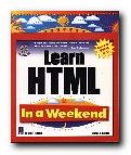
Learn HTML in a Weekend

June 3, 2009 by Roy Johnson

step-by-step tutorials in HTML page design

Can you really learn HTML in a weekend? Well, Steve Callihan doesn’t make any rash claims. He only sets out in this beginner’s guide to cover the basics – leaving you to fill in the finer details with later practice. The book is written with the assumption that you have a relatively free weekend. You do some preliminary reading on Friday evening with some basics about hypertext and the basics of a web site. Saturday morning is devoted to the elements of HTML tags, how to create headings, paragraphs, and breaks. It’s organised to teach you what each code does and to give you an overview of HTML.

Learn HTMLSaturday afternoon is described as optional. It deals with some of the refinements of aligning text on the page, wrapping text round images, and dealing with font sizes, colours, and faces. If you have the stamina to keep going, Saturday evening is a ‘bonus’ session covering tables. Don’t take this timetable too seriously. Anyone who can master tables in one evening should apply immediately to the Nobel Prize Foundation.

Sunday morning is devoted to frames – perhaps a section which beginners can skip, because frames are no longer even thought to be a good idea by most web design theorists. The afternoon session on forms is likely to be far more useful, and the evening ‘bonus’ session on graphics will be even more popular. I followed this in detail, since I’ve never been strong on graphics, and it proved to be a straightforward tour through making 3D buttons with Paint Shop Pro.

The book is well illustrated, and there’s a CD with the usual array of free and shareware editors and browsers, so you have all that’s required here to make a start. It truly could be done in a weekend – but why not take a little more time and get it right.

© Roy Johnson 2000

Buy the book at Amazon UK

Buy the book at Amazon US


Steve Callihan, Learn HTML in a Weekend, Rocklin, CA: Prima Publishing, 1999, pp.425, ISBN 0761518002


More on technology
More on digital media
More on web design
More on computers


Filed Under: HTML-XML-CSS, Web design Tagged With: HTML, Learn HTML in a Weekend, Technology, Web design

Learning Web Design

July 12, 2009 by Roy Johnson

Illustrated and comprehensive introduction to HTML

Jennifer Niederst is a specialist trainer in web design. Her last book, Web Design in a Nutshell, is a best-selling reference guide to the subject. Learning Web Design is her latest – a manual that covers all the basis of HTML design – from a detailed explanation of coding to the principles of good navigation and information design. So what makes this introductory guide any different to the dozens of others that are available?

Learning Web DesignWell, it’s a very handsome production, with every point well illustrated by screenshots and the appropriate code. She also shows how to achieve each major effect using three popular editors – Dreamweaver, GoLive, and FrontPage. But the main strength here is the attractive balance she has struck between tuition and visual presentation.

Her pages are surrounded by indented notes, sidebars, and pull-out boxes offering tips and special workarounds. This form of presentation makes learning lighter and easier. And she’s especially strong on explaining graphics.

I particularly like her approach of explaining details which don’t get mentioned in more official guides. For instance, if you wish to colour a link, the font colour tag must be placed inside the link, otherwise it won’t work.

She also reveals lots of tips, tricks, and workarounds for overcoming some of the frustrating limitations of HTML. I was very glad to pick up a neat trick for creating pop-up windows using a small JavaScript – which answered a current problem on quiz answers I have been designing.

The book ends with a very brief glimpse at advanced techniques using style sheets, and streaming audio and video files. This is one which will appeal to beginners and trainers. Work your way through the tutorials, and you could have a reasonable site up on the Web within a few days.

© Roy Johnson 2002

Buy the book at Amazon UK

Buy the book at Amazon US


Jennifer Niederst, Learning Web Design: A Beginner’s Guide to HTML, Graphics, and Beyond, Sebastopol (CA): O’Reilly, 2001, pp.388 ISBN: 0596000367


More on web design
More on digital media
More on technology


Filed Under: Web design Tagged With: Computers, CSS, HTML, Learning Web Design, Web design

Making Knowledge Visible

July 13, 2009 by Roy Johnson

practical information architecture – projects and policies

Elizabeth Orna is a big hitter in the field of information architecture and design. Her previous studies – Information Strategy in Practice, Practical Information Policies, and Managing Information for Research have all been very well received. This latest study Making Knowledge Visible sets out her ideas for making information more accessible and more useful. It is based on practical research projects conducted at institutions as diverse as the Co-Operative Bank, Essex County Council, The Tate Gallery, the National Health Service, and the Inland Revenue.

Making Knowledge Visible In the first two chapters she sets out her terms and definitions, then presents an overview of her arguments. Her central idea is a distinction she makes between knowledge and information. Knowledge resides in people’s brains: it is transformed into information when they express it in some form and make it available to someone else. That second person inverts the process by absorbing the information and transforming it into personal knowledge. She uses the term ‘Information Products’ to describe the medium in which these transformations take place: these could be books, reports, data bases, or web sites.

In any organisation these information products constitute a very valuable asset, and they ought to be complete, up to date, documented, and searchable. So much should be quite obvious, but anybody who has worked in industry, commerce, or government knows that this is often not the case. Orna is quick to observe:

I gave up being surprised a long ago by how often those essential products look as if they had been designed to repel all boarders, drive users to distraction, dissuade potential customers from purchase of goods or services, and impede staff in their work.

Fortunately, she goes on to give examples of organisations who have profited from making their own IPs explicitly to themselves. Those who have taken the trouble to value their information have profited from doing so.

But she doesn’t shy away from negative examples There’s an excruciating account of trying to bring rationality and coherence to the Department of Trade and Industry which makes you feel glad you don’t work there.

A lot of the discussion of information is often abstract, but she does make the interesting point that the value of information and knowledge are unusual compared with other commodities:

  • Transactions in them among people can benefit all parties
  • They don’t wear out from use
  • Information can be used in multiple ways by many people simultaneously

Most of the ‘black museum’ cases she exposes result in financial losses inefficiency, and employee frustration; but she also includes the example of the Cambridge police mishandling of public records which resulted in the employment of Ian Huntley as a school caretaker, even though he had a police record for attempted rapes. The result was the tragic murder of two children.

She also deals with some interesting examples which come to light as a result of the Freedom of Information Act. Institutions are obliged to comply with the new requirements to make certain of their information publicly available – but how can they do so accurately unless they have a complete and up-to-date inventory of their own data?

The main lesson which emerges is very simple and quite obvious – but it is seldom implemented. That is, there needs to be an organisational overview and a coherent approach to the management of information within an organisation – and the strength of Elizabeth Orna’s approach is that she does show how it is possible.

One other feature of her work I found attractive is that she moves easily between the world of print and the web, seeing the benefits of both. For those who want to pursue these issues at a more advanced level, she also considers metadata and the Dublin Core.

Information design is a subject which spins out in all directions to include other subjects – information architecture; typography and graphic presentation; usability; web design; systems analysis; and organisational structures. One of the strong features of Orna’s work is that she takes them all into account.

All her claims are meticulously documented, and each chapter carries its own bibliography and list of relevant URLs. It’s also worth noting that the book itself is very elegantly designed by her usual collaborator Graham Stevens.

This is a book aimed at information and systems analysts and managers, web designers, communication specialists, plus teachers and students of business management. I think librarians, project managers, and business consultants would also have a lot to learn from what she has to say.

© Roy Johnson 2005

Making Knowledge Visible   Buy the book at Amazon UK

Making Knowledge Visible   Buy the book at Amazon US


Elizabeth Orna, Making Knowledge Visible, Aldershot, UK: Gower, 2005, pp.212, ISBN: 0566085631


More on information design
More on design
More on media
More on web design


Filed Under: Information Design Tagged With: Data management, HTML, Information architecture, Information design, Making Knowledge Visible

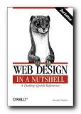
Web Design in a Nutshell

July 12, 2009 by Roy Johnson

comprehensive manual, plus tips and explanations

Web site design manuals are often all screen shots and little substance. These can be quite useful for beginners, who might be intimidated by too many technicalities. At the other extreme there are the dense catalogues of coding definitions issued by the standards authorities which only an expert would ever need to consult. In between are all the rest, which need to present something original or at least interesting to distinguish themselves from the mass. Web Design in a Nutshell manages to combine the best of the intermediate and advanced worlds.

Web Design in a NutshellThey feature a compressed mixture of instruction and reference which cuts out all dross, and offer their usual excellent value. Jennifer Niederst explains that she felt the urge to produce yet another book on Web design for the simplest of motives – her own use.

I was becoming frustrated with the time I was spending on the Web tracking down the answers to little questions: ‘Which tag does that attribute go in?’, ‘Does this browser support that technology?’, ‘What’s the best way to put audio on the Web?’ And I’m not ashamed to admit that I’ve been reduced to tears after hours of battling a table that mysteriously refused to behave, despite my meticulous and earnest efforts. You just can’t keep all this stuff in your head any more.

Niederst is one of their former staff writers and designers [see her recent Learning Web Design]. She explains HTML in a clear and sensible manner, starting with what she calls ‘the web environment’ – how it all works, why you should keep different browsers in mind, and what ‘screen resolution’ really means.

Then there is a very thorough coverage of all the basic elements: HTML coding, text formatting, links and images, tables, frames, and forms; then graphics in .gif, .jpg and .png formats; colours, audio, video, and javascript. The latter part of the book is devoted to what she calls ‘the emergent technologies – cascading style sheets, dynamic HTML, XML, and font embedding.

All the way through, she throws out tips, hints, and warnings which give you confidence that she knows whereof she speaks, and as you would expect in a work of this kind, there are a full range of reference tables – the complete HTML 4.0 specification, ‘deprecated’ and proprietary tags, a glossary of terms, and even an extended table of the latest support for style sheets in a wide range of browsers.

The latest edition has been substantially revamped and extended. Additions include more on printing pages from the Web, using Flash and Shockwave, using SMIL for multimedia presentations, and designing for the wireless web using WML.

At the risk of sounding like an O’Reilly groupie, I have to say that their productions are almost always a bibliographic joy to behold. They are well written, elegantly designed, meticulously edited, and flawlessly printed. This one is no exception.

© Roy Johnson 2001

Buy the book at Amazon UK

Buy the book at Amazon US


Jennifer Niederst, Web Design in a Nutshell: A Desktop Quick Reference, 2nd edition, Sebastopol: O’Reilly & Associates, 2001, pp.640, ISBN: 0596001967


More on web design
More on digital media
More on technology


Filed Under: Web design Tagged With: Computers, CSS, HTML, Web design, Web Design in a Nutshell

  • « Previous Page
  • 1
  • 2
  • 3
  • Next Page »

Get in touch

info@mantex.co.uk

Content © Mantex 2016
  • About Us
  • Advertising
  • Clients
  • Contact
  • FAQ
  • Links
  • Services
  • Reviews
  • Sitemap
  • T & C’s
  • Testimonials
  • Privacy

Copyright © 2025 · Mantex

Copyright © 2025 · News Pro Theme on Genesis Framework · WordPress · Log in