Mantex

Tutorials, Study Guides & More

  • HOME
  • REVIEWS
  • TUTORIALS
  • HOW-TO
  • CONTACT
>> Home / Archives for Web design

Using Drupal

June 2, 2009 by Roy Johnson

Configuring Modules to Build Dynamic Websites

Drupal is the most powerful, industrial-strength option amongst the open source content management systems (Drupal, Joomla, and WordPress). But it’s notoriously difficult to configure and manipulate. Hence the up-front sub-title to this publication. The answers to the problems have been supplied by designers creating plug-in modules which deliver separate functions. These all sit on top of the Drupal core.

Using DrupalThe user is left with ‘only’ the task of getting these modules to work together. And as anyone who has tried it will tell you, it’s no mean task. That’s where this guidance manual comes in. It takes you through a selection of the most basic add-on modules you’ll need to get a site up and running.

It’s written with the latest version of Drupal in mind (6.0) and you should be warned that modules written for other versions (5.0 and earlier) are not compatible with the latest version, and visa versa.

The other warning which needs to be flagged up as a major hazard and frustration is that configuration settings in one module might have a global effect, affecting your tweakings in another module, or even wiping it out altogether.

Fortunately there’s a very useful introduction which explains how a content management system works and the differences between first, second, and third generation web sites. You need to get used to lots of the specialised terms which are employed in this form of technology – modules, themes, and nodes – and you’ll have to let go of comforting terms such as folders and pages, because they just don’t apply any more.

In my experience of CMS systems, these naming conventions can be very confusing. Articles become stories, and features become modules or blocks. So you need to grit your teeth and just take on the new language.

The good thing about this book is that there are full instructions on adding and configuring modules that add functionality to a site. The creation of basic content is quite a complex business – partly because it’s assumed that a site will be fully interactive, and its materials can be tagged, commented upon, and served up in different forms. That’s why you end up arranging the content from a control panel with lots of options and settings.

There’s another reason why this approach to development by configuring modules is important. That’s because, rather surprisingly, the basic Drupal core does not include such fundamentals as a text editor and image manipulation tools. These have to be bolted on as extras. But free open source solutions are listed at the end of every chapter.

Separate chapters of the book have been written by open source evangelists, and the success of their approach is reflected in several five-star reviews for this book at Amazon. They concentrate on a wide range of third party modules which have been created by the Drupal community. This means the modules have been devised to solve real life problems and requirements.

The book is also arranged as a series of projects, showing how Drupal can be used to build a commercial web site; a job postings notice board; a product reviews site; a Wiki; a photo gallery; and an event management site. They explain how to use the most important modules, the content creator’s kit (CCK), categorise materials with Taxonomy, and use the Views module to arrange the display of content in a variety of user-selected forms.

The range and scope of sites built with Drupal in this book is truly impressive – from multi-language sites to eCommerce shopping sites using the Ubercart module. Full details of the all the software used is listed for every chapter, and there’s a very strong sense throughout that you are taking part in a community activity – where ideas, work, and results are shared.

O’Reilly took quite some time getting this, their first Drupal manual onto the shelves, but the wait has been worth it. I wonder when they will do the same thing for Joomla?

© Roy Johnson 2009

Using Drupal   Buy the book at Amazon UK

Using Drupal   Buy the book at Amazon US


Angela Byron et al, Using Drupal, Sebastopol (CA): O’Reilly, 2008, pp.464, ISBN: 0596515804


More on technology
More on digital media
More on online learning
More on computers


Filed Under: CMS, Open Sources, Web design Tagged With: CMS, Drupal, Technology, Using Drupal, Web design

Visual Language for the Web

June 27, 2009 by Roy Johnson

Visual Language for the Web is a book about the language of icons, buttons, and navigational aids used in the design of graphical interfaces of computer software programs. The first chapter deals with Mayan hieroglyphs and Chinese ideograms – writing with pictures. This establishes how much information can be conveyed semiotically. Paul Honeywill then looks at how graphical icons are used in interface design – and how well we understand them, particularly on a multi-national level. Some, like the folder icon, have been successful and are now widely used.

Visual Language for the WebOthers seem to be understandable only within the context of the program for which they are designed. Next comes an explanation of the design of icons, taking account of the psychology of visual perception and the technology of rendering images on screen. He explains for instance why colours and font sizes are rendered differently on PCs and Macs.

He offers an introduction to digital font technology which will be useful for anyone who doesn’t already know how serif and sans-serif fonts are used for quite different purposes.

To illustrate the principles on which graphic icons best operate, he presents two case studies of designing business logos. He considers pictographic languages ranging from the natural Mayan hieroglyphics and Sumerian cuneiform, to recent experiments such as Elephant’s Memory. But he seems reluctant to acknowledge their limitations in telling anything but simple narratives.

However, the very absence of any individual authority on the Internet means that any graphic icons which become generally accepted will be those which are commonly understood.

The last part of the book looks at testing recognition of icons – and comes to the unsurprising conclusion that the most effective and best known are those such as the magnifying glass ‘Search’ icon which appears in lots of different programs.

It has to be said that all this is sometimes discussed at a very theoretical level:

the day sign for Manik when it appears without the day sign cartouche in a non-calendrical context is chi

But this will be of interest to anybody concerned with the study of writing systems, as well as graphic designers, usability experts, and information architects.

© Roy Johnson 2000

Visual Language for the Web   Buy the book at Amazon UK

Visual Language for the Web   Buy the book at Amazon US


Paul Honeywill, Visual Language for the World Wide Web, Exeter: Intellect, 1999, pp.192, ISBN: 187151696X


More on information design
More on design
More on media
More on web design


Filed Under: Information Design, Theory, Web design Tagged With: Computers, Product design, Theory, Web design

Visualizing Data

June 19, 2009 by Roy Johnson

explaining data with the Processing environment

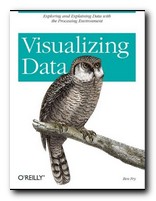
The doyen of data presentation is Edward Tufte, but even he has (so far) only dealt with the display of static information. Ben Fry’s new book combines similar aesthetic principles with the technical knowledge of how such presentations can be made dynamically. He uses a simple programming environment and API called Processing (which he developed as part of his PhD research). This is a free downloadable open source program based on Java (processing.org).

Visualizing DataHe’s an excellent communicator, and introduces his topics in gradual stages. The first few chapters are a gentle introduction to presenting data, and then gradually he presents more technically advanced approaches. What he proposes embraces a number of disciplines – statistics, data mining, graphic design, and information visualization – but he insists at the outset that the most important thing is to ask interesting questions. It’s all very well having huge amounts of data, but you need to ask ‘What is meaningful about it?’.

The process of creating a visual presentation is a logical series of steps. First the data is acquired: (he uses the US system of zip codes as an example). Then the data is parsed: that is, changed into a format that tags each part with its intended use. Next, any unwanted data is filtered out, then the data is mined – in this case to show its maximum and minimum values.

The next stage is deciding how to present the results – as a table, bar chart, graph, or diagram. Then the results can be refined. And finally, because this entire process is conducted digitally, drawing on processing power which is now available on even a standard computer, the data can be interrogated interactively. We can zoom in on maps, or refine searches by name or size.

In the next part of the book he offers an explanation of how to use the Processing software to create your own displays and visualize your own data. This is done in a straightforward manner that even someone without programming skills could follow. He also provides guidance on the philosophy of designing this type of software. Keep your designs as small and re-usable as possible. Work with samples of your data to begin with. Don’t start by trying to build a cathedral.

Subsequent chapters deal with different types of exercise – showing data as a physical map (the population of the US in states) then a time series (national consumption of tea and coffee 1910-2000). Next comes data with complex inter-relations (national results of all baseball teams in a single season).

As he says in his introduction, he is not offering a series of ready-made programs for presenting data. Instead, he is demonstrating the general principles by which such design problems can be solved, and leaving you to create your own.

Tree maps and network graphs are shown displaying word usage in a literary text (Mark Twain) and he even shows examples of results which are not useful – in order to emphasise the point he makes over and over again: you must ask the right questions of the data you are interrogating.

He ends by returning to the earliest stages of his thesis with some quite advanced level guidance on the acquisition and parsing of data. If by this time you’re not convinced (as I was) that he knows exactly what he’s talking about, have a look at his stunning personal web site at www.benfry.com.

© Roy Johnson 2007

Visualizing Data   Buy the book at Amazon UK

Visualizing Data   Buy the book at Amazon US


Ben Fry, Visualizing Data, Sebastopol (CA): O’Reilly, 2007, pp.366, ISBN: 0596514557


More on information design
More on design
More on media
More on web design


Filed Under: Information Design Tagged With: Data presentation, Information design, Visualization, Web design

Web 2.0 – A Strategy Guide

July 17, 2009 by Roy Johnson

successful Web 2.0 implementations

People who read Chris Anderson’s enormously influential The Long Tail will know that Web 2.0 has revolutionised eCommerce. Companies make more money by lowering their prices; they get rich by giving things away free of charge; and they invite their competitors to share information for mutual benefit. What is Web 2.0 exactly? And how does all this work? Well – Web 2.0 is the latest manifestation of web applications which allow its users to upload information and interact with each other, as well as downloading it, which we did with Web 1.0. And it is a technology which builds on economies of scale.

Web 2.0 - A Strategy GuideIf your web site makes 1% profit from 250,000 visitors a week, imagine what happens if you start giving things away and get a million visitors. The chances are your profits will increase by 400%. Amy Shuen’s new book examines this phenomenon from a business point of view. She presents a series of case studies which illustrate the novel forces at work – and you don’t need to know the technical details of modern Internet technology to understand how it all operates.

Flickr, for instance, the photo-sharing service, rapidly generated a user base of two million users who uploaded 100 million photos. The setup costs for this business were very low (no shop, no physical stock) the service was free (Flickr made money from its premium services) and the customers were not only providing the inventory free of charge, but giving it added value by tagging the photos. Flickr was eventually bought by Yahoo! for $40 million, and it continues to prosper.

Shuen also draws on the strategic lessons from these entrepreneurial success stories. It doesn’t matter if you are a big time Web business or just running a one-person site, she asks “Do you allow your visitors to participate in your site? Can they share their own questions and ideas there?”

She has a chapter on Google that provides an interesting example of what’s called a ‘tippy market’. That’s when a company corners a certain percentage of the market which proves fatal for the competition. (The VHS/Betamax rivalry was a case in point). To reach this point Google paid a lot of money to AOL, but it tipped them over in active users to become the dominant search engine – a position which still holds today.

Next she looks at the social networking sites and explains how they establish their phenomenal growth rates. They all have features in common: they’re free; they grow by one subscriber recommending to friends; and as soon as they reach the tipping point they can generate huge incomes from advertising and selling web services. I also noticed that they tend to identify niche markets. Facebook is largely for college graduates keeping in touch; MySpace is for bands and artists publicising their work; and LinkedIn is for business people who want to find useful contacts.

Finally, she offers a five step approach to using Web 2.0 strategic thinking on your own business. This means applying the principles, rather than spending a fortune on complex software. She reminds us that a single extra line at the end of each Hotmail message – “Get your free email at http://www.hotmail.com” – was enough to give them a huge success in viral marketing.

And if all that’s not enough, she also provides two comprehensive bibliographies which list the key texts and resources – including papers from the Harvard Business School, where they practice Web 2.0 strategies by putting all their published research papers online at prices anybody can afford.

© Roy Johnson 2008

Web 2.0   Buy the book at Amazon UK

Web 2.0   Buy the book at Amazon US


Amy Shuen, Web 2.0 – A Strategy Guide, Sebastopol (CA): O’Reilly, 2008, pp.243, ISBN: 0596529961


More on eCommerce
More on media
More on publishing
More on technology


Filed Under: e-Commerce Tagged With: eCommerce, Enterprise, Web 2.0, Web 2.0 - A Strategy Guide, Web design

Web Design in a Nutshell

July 12, 2009 by Roy Johnson

comprehensive manual, plus tips and explanations

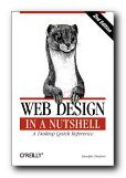
Web site design manuals are often all screen shots and little substance. These can be quite useful for beginners, who might be intimidated by too many technicalities. At the other extreme there are the dense catalogues of coding definitions issued by the standards authorities which only an expert would ever need to consult. In between are all the rest, which need to present something original or at least interesting to distinguish themselves from the mass. Web Design in a Nutshell manages to combine the best of the intermediate and advanced worlds.

Web Design in a NutshellThey feature a compressed mixture of instruction and reference which cuts out all dross, and offer their usual excellent value. Jennifer Niederst explains that she felt the urge to produce yet another book on Web design for the simplest of motives – her own use.

I was becoming frustrated with the time I was spending on the Web tracking down the answers to little questions: ‘Which tag does that attribute go in?’, ‘Does this browser support that technology?’, ‘What’s the best way to put audio on the Web?’ And I’m not ashamed to admit that I’ve been reduced to tears after hours of battling a table that mysteriously refused to behave, despite my meticulous and earnest efforts. You just can’t keep all this stuff in your head any more.

Niederst is one of their former staff writers and designers [see her recent Learning Web Design]. She explains HTML in a clear and sensible manner, starting with what she calls ‘the web environment’ – how it all works, why you should keep different browsers in mind, and what ‘screen resolution’ really means.

Then there is a very thorough coverage of all the basic elements: HTML coding, text formatting, links and images, tables, frames, and forms; then graphics in .gif, .jpg and .png formats; colours, audio, video, and javascript. The latter part of the book is devoted to what she calls ‘the emergent technologies – cascading style sheets, dynamic HTML, XML, and font embedding.

All the way through, she throws out tips, hints, and warnings which give you confidence that she knows whereof she speaks, and as you would expect in a work of this kind, there are a full range of reference tables – the complete HTML 4.0 specification, ‘deprecated’ and proprietary tags, a glossary of terms, and even an extended table of the latest support for style sheets in a wide range of browsers.

The latest edition has been substantially revamped and extended. Additions include more on printing pages from the Web, using Flash and Shockwave, using SMIL for multimedia presentations, and designing for the wireless web using WML.

At the risk of sounding like an O’Reilly groupie, I have to say that their productions are almost always a bibliographic joy to behold. They are well written, elegantly designed, meticulously edited, and flawlessly printed. This one is no exception.

© Roy Johnson 2001

Buy the book at Amazon UK

Buy the book at Amazon US


Jennifer Niederst, Web Design in a Nutshell: A Desktop Quick Reference, 2nd edition, Sebastopol: O’Reilly & Associates, 2001, pp.640, ISBN: 0596001967


More on web design
More on digital media
More on technology


Filed Under: Web design Tagged With: Computers, CSS, HTML, Web design, Web Design in a Nutshell

Web Design: Start Here

July 11, 2009 by Roy Johnson

from zero to web design hero in easy lessons

ILEX are in the business of producing very high quality books which offer beautiful page layout and graphic design, elegant fonts, and a crisp approach to digital production. Their latest volume on web design is an excellent example of putting computer technology onto the printed page with no loss of visual aesthetics. This guide assumes that you are going to use a web editor to do all the coding for producing a web site. It concentrates therefore on the general principles.

Web Design: Start HereThere’s very little detail – and that’s the weakness of this approach. The strength is that it provides an excellent overview of what’s required in web design. Obviously there are lots of different skills required, and Nick Nettleton sketches out the basics for each phase of the design process. He also tells you what freeware is available for each stage in the process – even for graphics editing and FTP programs for uploading. He covers fonts, colour, graphics, and links – in which I liked his idea of creating a web page of links to sites whose appearance you prefer, which is something I have started doing on my Mantex Blog.

There’s also plenty on the use of tables to control the layout of the text on the page, and he warns (quite rightly) about the problems of browser versions – now thankfully receding.

Next comes creating graphics and fonts, including the sort of special effects that are available in most programs – gradients, fills, drop shadows, distortions, and textures.

He discusses the creation of buttons and designing the overall look and feel of a web site, and there’s a section on optimising and compressing graphics to minimise download times. This leads naturally enough into the graphic images which are a central feature of many web sites these days, increasingly exploited in an era of increasing band width.

He includes guidance on how to use digital cameras, editing photos with software such as Photoshop, and treating the results so that they look good on the screen.

This is followed by the conceptual art of organising the structure and navigation of a good site – a the part which many designers neglect. He shows the basics, then demonstrates how to create navigation bars, image maps, and rollovers.

He finishes with more advanced techniques such as nested tables, use of frames, and animated rollovers.

This is a guide which gives quick glimpses of what is possible in web design. It’s classy, well presented, and good value. You’ll need to look at any given topic in more detail, but this is a good place to start.

© Roy Johnson 2003

Buy the book at Amazon UK

Buy the book at Amazon US


Nick Nettleton, Web Design: Start Here, Lewes, Sussex: ILEX, 2003, pp.192, ISBN 1904705030


More on web design
More on digital media
More on technology


Filed Under: Web design Tagged With: HTML, Web design, Web Design: Start Here

Web Design: Tools and Techniques

July 1, 2009 by Roy Johnson

design with emphasis on graphics and advanced effects

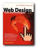
This is the second edition of a very successful Web design manual. It spells out the basics of good design, but then concentrates on the graphic design elements of building good pages and effective sites. Peter Kentie begins by outlining the principles of HTML and Web design. Then he explains the basics of coding – starting from text and graphics, then forms and tables, frames and style sheets. Those who wish to take the route of using a text editor will be glad to know that he discusses Front Page, HotMetal, BBEdit, PageMaker, and even Word. The later two thirds of the book are taken up with what is obviously his forte – ‘creative Web design’.

Web Design: Tools and TechniquesThis involves using intermediate graphics techniques and ‘advanced’ multimedia effects such as Flash, sound, video, 3-D, and Java Programming. All of which makes it very much a book which will appeal to graphic designers. He deals with colour adjustment, Gif and Jpg image manipulation, background effects, image maps, shadows, and 3-D effects. There’s lots of use of Adobe Illustrator and Photoshop, as well as the Macromedia Web tool programs.

The advanced section deals with making animated Gifs. He’s very enthusiastic about Flash, which allows you to create animations which are amazingly small in terms of file size. And if you feel very adventurous, you can even try his suggestions for Shockwave movies, Virtual Reality, or streaming video. He ends with the advanced possibilities now possible using XML, WAP, Java, and Active Server Pages.

These effects are explained clearly but quickly – so this book is most suitable for intermediate users. I think it will be most useful for those people with an existing web site who want to improve and develop it using the latest technologies. Those who are in the beginner stages of web design should try checking out a free website at webstarts.com. The book is very elegantly produced, and packed with both coding and screen shots, showing you what can be done.

© Roy Johnson 2002

web design   Buy the book at Amazon UK

web design   Buy the book at Amazon US


Peter Kentie, Web Design: Tools and Techniques, Berkeley (CA) Pearson/Peachpit Press, (second edition) 2002, pp.485, ISBN: 0201717123


More on design
More on media
More on web design


Filed Under: Graphic design, Web design Tagged With: Graphic design, Web design, Web graphics

Web Navigation

June 18, 2009 by Roy Johnson

navigation, structure, and usability for web design

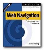
Web sites have sometimes been described in terms of ‘generations’. David Siegel for instance describes how first generation sites were rapidly thrown together with no greater ambition than to get pages of HTML code onto the Web. The second generation added graphics, started to be concerned with page layout [even though HTML code is not designed for that purpose] and often added eye-popping special effects. Third generation sites have brought some of these excesses under control, and are designed to make the user experience more meaningful. Web Navigation is emphatically third generation.

Web NavigationThere’s no doubt that clever designers have managed to produce some visually stunning Web pages – but many information architects are now beginning to ask questions such as “Can visitors find their way around the site?” and “Is this site achieving its purpose?” The eye candy effects of flashy graphics often mask a lack of content and an incoherent maze of links which visitors are glad to leave quickly via the nearest exit. Jennifer Fleming’s Web Navigation is a serious and articulate plea for intelligent Web site design, and it is based on principles which owe more to information theory and coherent structure than to the luminous-glamour school of graphics-based design.

Like most good designers, she insists on a user-centred rather than client-centred approach to web design. What’s the difference? you might ask. Well, intelligent designers are now beginning to realise that web sites are often created to impress the commissioning clients, rather than the people who will be using them. Men in suits will applaud spiffy graphics when a new site is revealed at a presentation – but they will probably never need to log on again.

The book’s structure reflects the clarity of her purpose. There are six chapters on the foundations of navigation design, then in the second part an analysis of successful sites. There are four appendices: technical tips, a glossary of navigational terms, a list of web resources, and a bibliography. The accompanying CD comes with trial versions of software (including the highly praised Dreamweaver) and it has a marvellous ‘netography’ with listings of articles, web sites, and online resources covering navigation, usability and testing, organisation of information, information design, document markup and scripting. [I loaded the disk, browsed the sites she recommends, and all the links were working.]

Her advice is to provide clear, simple, and consistent navigational aids – and she offers a particularly strong warning against using metaphors such as the office or the supermarket [though curiously, the CD uses icons]. Navigation that works should:

  • be easily learned
  • remain consistent
  • provide feedback
  • appear in context
  • offer alternatives
  • be economic in action and time
  • provide clear visual messages
  • use clear understandable labels
  • be appropriate to site’s purpose
  • support user’s goals and behaviour

Now that’s an important free lesson for you! She is in favour of any interactivity, such as rollovers (‘OnMouseOver’) which provide feedback, and is sceptical of the ‘Back’ button on the grounds that users might enter a site at any page. Where would they be going ‘back’ to? She also raises other interesting navigational questions, such as ‘where will you be when you’ve finished reading a page, and where will you wish or need to go?’

She recommends multiple navigational routes and aids, plus guidance. For instance, a site might have a framed and ‘no-frames’ version, a graphics and no graphics version. It will certainly have navigation hot spots at the top and bottom of every page, maybe a contents list in left-hand frame, plus icons, labels, and anything else which helps users find their way around.

One of the interesting features of her approach is that she illustrates her argument with detailed reference to the work of other ‘information architects’ such as Jakob Nielsen, Clement Mok, Edward Tufte, and David Siegel. The reader is thereby presented with a range of approaches to this relatively new subject. There are lots of bibliographic suggestions and URLs in side-bars on the page – and those I checked were all up-to-date, which is an important feature in such a fast-changing medium.

It’s a book aimed at professionals. For instance, her descriptions of the site design process assume that there will be teams of designers in sessions at a corporate level using flipcharts, video recordings, and even team-working software. There’s lots on brainstorming and chunking in what are now called ‘focus groups’. But these principles could be followed by what I suspect is more likely to be the average reader – somebody working in a spare room at home.

This is a book for people who want to take web design seriously. It’s significant that she spends so much time discussing the thoughtful planning, research, and testing of a site, rather than the creation of flashy effects and animated gimmicks which adorn so many KEWL sites. She has powerful and revealing arguments in favour of a consistent design process (so that the arbitrary element of success or failure can be removed). This is fairly obvious when you think about it – but that’s true of many good ideas.

She includes a full account of professional designers at work, with pointers to the resources they use – such as David Siegel’s free downloadable ‘profiling’ materials at www.secretsites.com for instance.

This is the business studies version of web design manuals, packed with thought-provoking information on determining user goals and expectations. She describes the use of personal interviews, people ‘shadowing’ users throughout the working day, and ‘disposable camera studies’ where users record what they find interesting. Not many individuals will have the resources to be so thorough, and sometimes the ‘feedback-usability-testing’ approach makes this all seem like a science rather than the sales-pitch that it is – as if we can predict how many people will come to our site to buy widgets.

In the second half of the book her notions are put to work analysing the navigational methods and structure at sites built for shopping, entertainment, learning, and community services. This struck me as slightly less interesting than the first part, but still worth reading for the revealing tips and guidance notes embedded in her analysis. The observations, as before, are that successful sites are customer-oriented, and that they give extra consideration to online customers because they lack the navigational support provided during comparable user experiences in libraries, airports and shopping malls.

If there is a weakness in her examinations, it’s that these are often not much more than descriptions of sites – though they are nevertheless well-illustrated mini-lectures, with plenty of screen captures. For instance, she heaps praise on Amazon.com for their search facility and one-click ordering system. However, this doesn’t take into account that the company, despite its multi-million dollar turnover, hasn’t actually made a profit so far.

It’s worth noting that a lot of what she says about helping users through the layers of a site is based on the US-centred assumption that people are going to spend a lot of time browsing – because they have free local telephone calls. But European (certainly UK) users will not have such luxuries. They’ll hit a site, search for what they’re looking for, then disconnect quickly. This economically-driven difference in user behaviour should be taken into account by anyone theorising about navigation, browsing, and web design.

But there are many good tips offered en passant – including some which might seem obvious, but which are often ignored by site designers. For instance, I’ve noticed that in the UK, quangos and government departments are very often reluctant to display their postal address [possibly reflecting the arrogant nature of these organisations].
But she insists that

Making your street address, phone number, and email address easily available is not only about completing an online sales pitch…It’s about other elusive qualities: trust and community.

Similarly, many UK universities would do well to heed her advice on making themselves more accessible and well-presented. How many times have you visited a university site and found no lists of courses on offer or staff who teach them? She points to the short-sightedness of this approach:

A large percentage of visitors to a university site are applicants for admission, or are thinking of becoming applicants…If a university can answer their questions fairly easily, it bodes well for the entire process. A positive experience on the Web – especially for college applicants, who tend to make decisions on gut feelings – is a powerful factor in decision-making.

It’s good that she chooses different (and challenging) types of sites to analyse. Searching for information is quite a different matter to being entertained or pushing round a virtual shopping trolley. The section on information sites [Lycos, Computers.com] is particularly interesting, because she forces us to think about different types of questions which might be asked of a site, and the different approaches to searching users develop.

Until recently, just providing information via the Web was a laudable pursuit. It was enough to be one of the forward-thinking few who recognised the power of the Web for mass communication. Those days are gone, replaced with a new challenge: providing increasingly complex layers of information, and making it all seem simple.

Very near the end of the book she presents a simple formula for successful sites. Aspirant site designers would do themselves a favour by writing her tips on Post-It notes and sticking them on their monitors:

  • keep every page below 20K
  • recycle headers
  • keep graphics small and simple

Jennifer Fleming has a background in library and information science, and her advice and observations strike me as more seriously well-founded than most of the web design manuals I have ever seen. This is a wonderfully rich and thought-provoking study which anybody analysing or building web sites should put on their list of essential reading.

© Roy Johnson 2000

Web Navigation   Buy the book at Amazon UK

Web Navigation   Buy the book at Amazon US


Jennifer Fleming, Web Navigation: Designing the User Experience, Sebastopol: O’Reilly, 1998, pp.253 plus CD-ROM, ISBN: 1565923510


More on information design
More on design
More on media
More on web design


Filed Under: Information Design, Web design Tagged With: Experience design, Information architecture, Information design, Navigation, Usability, Web design, Web Navigation

Web Pages that Suck

June 18, 2009 by Roy Johnson

principles of good design – shown by critiques of bad sites

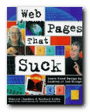
This is a web design guide with a twist: it teaches by negative example. Yet it works – and has become a best-seller. The subtitle tells all: ‘Learn good design by looking at bad design’. The idea of learning how to make a nice website by looking at naff aspects of existing websites, and avoiding their sucky techniques, is a good one. The book is fun to read, but you get a lot out of it too. Flanders and Willis have no wish to impress you with their understanding of difficult, techie aspects of web design. Their line is that you should avoid getting carried away and keep things simple

Web Pages that SuckThis book shows that you can start a website yourself and watch it grow into a big and successful thing – because that’s exactly how Web Pages That Suck came to be a best-selling book. It’s based on a website made by Vincent Flanders that got listed as a Yahoo! Pick of the Week and became very popular. For that reason, it’s very well illustrated – and the idea of critical analysis of bad examples is one which has also been proved to be effective by Web guru Jakob Nielsen in his recent Designing Web Usability.

But be warned – it doesn’t set out to teach you HTML from scratch, if that’s what you want. It comes with a free CD full of useful things – but then so do lots of magazines. You also have to put up with lots of photos of the authors in ‘comic’ poses. But as writers, they are what the cover says: ‘Funny, opinionated, and always to-the-point [with] a reputation for being the Web’s leading critics’.

© David Gauntlett 2000

Buy the book at Amazon UK

Buy the book at Amazon US


Vincent Flanders and Michael Willis, Web Pages That Suck, San Francisco (CA): Sybex International, 1998, pp.384, ISBN 078212187X


More on web design
More on digital media
More on technology


Filed Under: Web design Tagged With: Graphic design, HTML, Web design, Web Pages that Suck

Web ReDesign: Workflow that Works

June 19, 2009 by Roy Johnson

managing large scale web site makeovers

This is a book about managing Web re-design projects – but in fact the general principles could be applied to any large project. And the details could be applied to any first time Web design. The authors make it clear that they are not offering a Web design manual. It’s about project management. But the issues of what makes an efficient site can’t help keep cropping up again and again in the advice they offer. The main import of their strategy is to suggest timelines, planning schedules, and checklists for project teams involved in big site re-designs.

Web ReDesign: Workflow that WorksIt’s all fairly logical and obvious when you see it written down, but of course many businesses don’t work in this manner. There’s a relentlessly detailed approach to identifying and documenting every smallest feature of the client’s business and requirements. The problem with this approach is that it would cost an enormous amount in person-hours just to gather the information, irrespective of how useful it proved to be. I wonder how many consultancies could afford to factor in such workloads without fear of pricing themselves out of the contract.

The book is packed with worksheets and checklists, most of which are downloadable from the book’s own Web site. They even show examples of how to set charges and create a commercial agreement. There are useful definitions of the roles undertaken by various members of a project team – from the manager to designers and ‘backend engineers’.

There’s a good chapter on designing the structure of a site, naming its parts, and labelling its contents. They also deal with colour as a navigational and design aid, then finish with advice on preparing for and delivering a site launch, before maintaining it.

Almost every page has a screen shot or a diagram, and there are plenty of pullout boxes with tips and advice on everything from style sheets and file sizes, to testing, upgrading, and evaluation. It’s a bit like looking at a Web site in print form.

Two of the nicest features of the book are that their chapters and interspersed with examples of site makeovers, and there are mini essays from design and usability gurus every few pages. These make excellent reading.

This is all very thorough, and it will be of most use to designers and consultants working on big sites – but many of the detailed points of advice will be just as useful to serious small and home-based site designers.

© Roy Johnson 2003

Buy the book at Amazon UK

Buy the book at Amazon US


Kelly Goto and Emily Cotler, Web ReDesign: Workflow that Works, Indianapolis (IN): New Riders, 2002, pp.253, ISBN 0735710627


More on web design
More on digital media
More on technology


Filed Under: Web design Tagged With: Information design, Project management, Web design, Web ReDesign: Workflow that Works

  • « Previous Page
  • 1
  • …
  • 5
  • 6
  • 7
  • 8
  • 9
  • Next Page »

Get in touch

info@mantex.co.uk

Content © Mantex 2016
  • About Us
  • Advertising
  • Clients
  • Contact
  • FAQ
  • Links
  • Services
  • Reviews
  • Sitemap
  • T & C’s
  • Testimonials
  • Privacy

Copyright © 2025 · Mantex

Copyright © 2025 · News Pro Theme on Genesis Framework · WordPress · Log in