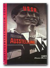
Mantex

Tutorials, Study Guides & More

  • HOME
  • REVIEWS
  • TUTORIALS
  • HOW-TO
  • CONTACT
>> Home / Design / Individual designers

Individual designers

graphic, typographical, and product designers

graphic, typographical, and product designers

Alexander Rodchenko Design

June 21, 2010 by Roy Johnson

design, modernism, and constructivism

Alexander Rodchenko (1891-1956) was one of the most influential artists to emerge from the explosion of Russian modernism which took place between 1915 and 1923. Initially working as a painter, he stripped bare the canvas and worked with ruler and compasses to devise minimalist pictures which he described as ‘subjectless’. But then given the opportunities presented by the early years of the revolution, he went on to become a designer in furniture and fabrics, ceramics, posters, typography, stage and film design, exhibition display, and radical innovations in photography. He was a central figure in the movement of Russian constructivism, a radical activist, a theorist, teacher, and a pioneer of photo-montage. Alexander Rodchenko Design is an elegantly illustrated introduction to the full range of his work.
Alexander RodchenkoAfter the early abstract designs he moved on to public artworks – kiosks, posters, and theatre designs which you could say provided him with a subject – yet he continued to create what he called ‘spatial compositions’, many of which look like bicycle wheels distorted into three dimensional sculptural arrangements.

He worked alongside and sometimes in collaboration with Malevich, Kandinsky, and Tatlin, developing his abstract work into three-dimensional paintings, product designs, and constructions that were half way between art works and domestic objects. It was in the spirit of the new communism to produce an art that aimed to be useful, classless, and practical. This was the aim of what came to be called ‘Constructivism’, even if its results were what we would now call modernist art.

Alexander Rodchenko - poster design

In the early 1920s he produced the work for which he is best known – the combinations of collage images, new typography, and asymmetric graphic design which created the hallmark of Russian modernism. It is this brief period of state-sponsored radical designs that still have an influence today – as you can see in the work of Neville Brody and his many imitators.

His work in the late 1920s and 1930s centred largely on photography, much of it featuring objects shot from unusual angles – street scenes from overhead, trees and chimneys from ground level, all objects highlighted wherever possible by dark expressive shadows.

The illustrations are very well chosen to avoid some of the better-known images. Instead, they draw on quite rare materials from the Rodchenko and Stepanova archive in Moscow, the Burman Collection in New York, and the David King collection in London.

It’s amazing that such an original and gifted artist survived the Stalinist purges (unlike so many others) but then he did produce propaganda work which glorified the regime – including even such projects as the construction of the White Sea Canal in 1933 which cost the lives of 100,000 GULAG prisoners.

Alexander Rodchenko - magazine coverIn fact the depictions of his subjects become more and more heroic, almost in inverse proportion to the degree of social and political misery in the Soviet Union under Stalin. There is very little evidence (anywhere) of his work beyond 1940, even though he lived until 1956 – although there is one astonishing image in this collection dated 1943-44 which you would swear was a Jackson Pollock painting. But it seems quite obvious that the creative highpoint of his career is the 1920s, when he was free to experiment and theorise with his fellow pioneers, and even (dare one say it) when the state encouraged and supported such experimentation.

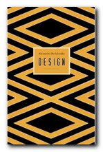
The series of design monographs of which this volume is part feature very high design and production values. They are slim but beautifully stylish productions, each with an introductory essay, and all the illustrative material is fully referenced. Even the cover design is taken from Rochenko’s work. It’s from a 1923 poster advertising Zebra biscuits.

Alexander Rodchenko Buy the book at Amazon UK

Alexander Rodchenko Buy the book at Amazon US

© Roy Johnson 2010


John Milner, Rodchenko: Design, Suffolk: Antique Collectors Club, 2009, pp.98, ISBN: 1851495916


More on art
More on media
More on design

Filed Under: Art, Design, Graphic design, Individual designers Tagged With: Alexander Rodchenko, Design, Graphic design, Modernism, Russian modernism

An Essay on Typography

June 19, 2009 by Roy Johnson

classic study of the aesthetics and morals of good design

This is Eric Gill’s memorable and engagingly dogmatic work on unchecked commercialism, moral living – oh, and on typographic design too. An Essay on Typography is where Gill firmly established what he believed type design should be, what it should do, and how it should be done. I read Gill’s Essay from cover to cover, then I immediately read it again. It’s short, (133 pages, plus an introduction and afterword) but quite enjoyable.

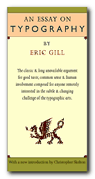
An Essay on Typography The unassuming size of the book does not affect its flow as it is set in Gill’s own face, Joanna. Although the use of some odd contractions and word breaks may take a little warming up to, the book is a testament to book design and layout concerns as discussed in sections The Procrustean Bed and The Book.

In the section entitled Lettering, Gill lends his views on letter form history and follows their evolution from Trajan’s Column in Rome to the printed page of the 1930’s with his own engravings presented to illustrate the walk-through.

At times Gill is somewhat idealistic but many of the arguments he makes are timeless and most of his advice is practical- consisting of basic truths which will apply to the craft no matter what tools or level of technology are employed in the creation and implementation of letter forms.

In Typography, a clear line is drawn between mechanized industry, seen as the work of many as opposed to fine craftsmanship, being the work of the individual. With his focus more on the social aspect of these ‘two worlds’ of typography, Gill explores and defines the limits inherent to each:

…the commercial article at its best is simply physically serviceable and, per accidens, beautiful in its efficiency; the work of art at its best is beautiful in its very substance and, per accidens, as serviceable as an article of commerce

The exceptions to its usefulness are the occasional segue into what seems a little like preaching (this essay is thoroughly peppered with religious references) and some ideas he proposes, such as letter-spaced italics for emphasis, that have thankfully fallen by the typographic wayside. Or perhaps when he coyly proposes to abolish lettering as we know it in favor of what he calls ‘Phonography’ (a form of shorthand), in But Why Lettering. I would equate this to today’s practice of flame-baiting online.

© Delve Withrington 2000

An Essay on Typography   Buy the book at Amazon UK

An Essay on Typography   Buy the book at Amazon US


Eric Gill, An Essay on Typography, David R. Godine [1993], pp.144, ISBN: 0879239506


More on typography
More on design
More on media
More on web design


Filed Under: Individual designers, Typography Tagged With: An Essay on Typography, Eric Gill, Fonts, Graphic design, Typography

Carrington: A Life of Dora Carrington

June 19, 2009 by Roy Johnson

Art, love, and Bohemian life in Bloomsbury

Dora Carrington was a painter, an early feminist, and a figure who flits in and out of the lives of several members of the Bloomsbury Group, of which she was a significant member. This is the (so far) definitive biography of her troubled existence, which covers her day-to-day life in great detail – much of it based upon her voluminous correspondence. She grew up in a stiflingly conventional home in Bedford, loving her father and hating her mother.

Carrington: A Life of Dora Carrington With a talent for art, she was glad to get away from home at seventeen and spread her wings at the Slade, living in Gordon Square, right in the heart of Bloomsbury. Her style of painting and drawing was firmly traditional, and it fitted with the aesthetic of the Slade.

She was unaffected by the craze for Post-Impressionism which followed Roger Fry’s famous 1910 exhibition at the Grafton Galleries which Virginia Woolf claimed changed human nature that year. She cut her hair short in a style which became famous (‘crop head’) and two of her fellow students, ‘Chips’ Nevinson and Mark Gertler, promptly fell in love with her. This resulted in the first of her many love triangles, plus a form of unhappiness for all concerned. Although she behaved in a provocative manner, she refused to choose between them, or to have a sexual relationship with either of them.

In 1914 she met D.H. Lawrence and David Garnett, joined Roger Fry’s Omega Workshop, and was moderately successful in her decorative art work. Then in 1915 she spent a weekend amongst the Bloomsbury Group at Asheham which was to change her life. Lytton Strachey (who was in love with Mark Gertler) made a sexual pass at her, and she immediately fell in love with him.

Although she had kept Gertler at bay for five years, she gave herself to Strachey from the outset – then ended up having a sexual relationship with both men at the same time, even though Strachey was really a homosexual. [Remember – this is Bloomsbury.] Eventually she set up home with Strachey at Tidmarch Mill House and found her first sustained period of happiness.

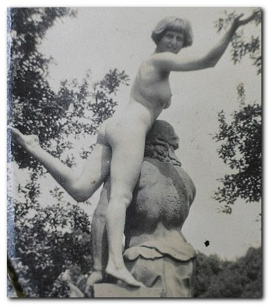
Dora Carrington nude

Yes – that’s Dora Carrington

However, with a twist which typifies relationships in the Bloomsbury Group, they moved Ralph Partridge in to live with them. Carrington shared his bed, and Strachey fell in love with him. She then moved to live with Partridge in Gordon Square when he was given a job at the Hogarth Press, and then married him in 1921, even though she claimed she was still in love with Strachey – who with characteristic generosity paid for their honeymoon, and even joined them on it.

Not long afterwards she started an affair with her husband’s best friend, Gerald Brenan – around the same time that Partridge moved his new lover Valentine (actually Gladys) Dobree into their family home at Tidmarsh.

It is commonly assumed that Carrington sacrificed her artistic possibilities to the effort of looking after Strachey and Partridge, but Gretchen Gerzina argues that on the contrary, she was at her most productive when her domestic and personal life were settled and untroubled by romantic entanglements.

But the level of emotional masochism in her life is remarkable. Whilst her husband took his new lover Frances Marshall on holiday to Paris, he forbade her to even write to Gerald Brenan. She distracted herself from this humiliating position by starting an affair with Henrietta Bingham, the daughter of the American ambassador, a foray into Sapphism which made her regret she hadn’t started earlier. And this didn’t stop her sleeping with Gerald Brenan as well – so by this time she had certainly got rid of her earlier sexual reluctance.

Almost all the evidence for this personal narrative comes from letters. These people were super-communicative on paper. But the correspondence needs to be carefully interpreted – because they often wrote knowing that third parties might read what they said. Partridge not only banned Carrington from writing to Brenan, but insisted on reading all her correspondence. So she developed the strategy of inserting personal messages into secret addenda – which were nevertheless sometimes intercepted. And she was much given to reading other people’s private mail too.

As the menage she helped to create with Strachey and Partridge began to fall apart, she consoled herself with Bernard (Beakus) Penrose [brother of Sir Roland] in one last romance. But it was Strachey who remained her most lasting affection, and when he died (of undiagnosed stomach cancer) in 1932 she felt that she could not live without him. So she shot herself – aged just thirty-nine.

© Roy Johnnson 2012

Dora Carrington Buy the book at Amazon UK

Dora Carrington Buy the book at Amazon US


Gretchen Gerzina, Carrington: A Life of Dora Carrington 1893-1932, London: Pimlico, 1995, pp.342, ISBN 0712674209


More on art
More on biography
More on the Bloomsbury Group
Twentieth century literature


Filed Under: Art, Biography, Bloomsbury Group, Individual designers Tagged With: Art, Biography, Bloomsbury Group, Cultural history, Dora Carrington

David Carson: 2nd Sight

June 8, 2009 by Roy Johnson

Grafik Design After the End of Print

There is a product which food companies use to make their products thicker. It’s the gum agent you can read about on an ordinary bottle of syrup or a jar of not-so-authentic salsa. The thickener doesn’t really have a flavor, it’s just there to add content when all other things fail to blend or aren’t full enough to make that product enticing. No one likes to have thin and runny syrup on their waffles or salsa that doesn’t stick to their chips. David Carson: 2nd Sight: Grafik Design After the End of Print is a mouthful and more of what you’d expect from a graphic designer on a quest to clarify his methods and intentions, though it seemed spicier the first time around.

David Carson: 2nd SightThere’s a sea of graphic designers who either love Carson’s methods or dislike them. For those who love his methods, you have another book to smile about. Another book to discuss with your fellow designers, another book to justify your methods. In fact, you now have another book that tells you why you do the things that you do. For those who dislike his methods, this is another book to mock. Another book to further your own theories on design.

Intuition played a key roll in the development of the second book by Carson and Blackwell. Those four syllables seem to be the reason behind a lot of what David Carson does in life. Unlike The End of Print, 2nd Sight is more about text than it is about pretty images (although there are plenty of images). There are no popups, but there are a few quotes which serve as some sort of artistic justification or reasoning behind what he and others in the decontructionalist movement supposedly feels deep within.

2nd Sight isn’t trying to intellectualize anything – well it is, but it doesn’t succeed. It’s kind of like a second course in an eight course meal. It’s handing out a little bit of insight into the designers’ creative explorations and it’s putting David Carson’s life into yet another round of syndication. How many times do we need to read about the fact that he was a surfer and has no classical training in graphic design or typography?

In fact, if I had to make a guess, I’d say that by the end of this book Carson was a little bored. The popularity of this subject has dwindled and much of the content of 2nd Sight should have been said in Carson’s first book, The End of Print.

But laying all of that aside, the book hits upon an important point – that intuition plays a crucial role in what any good designer or artist does. You can be classically trained, but if you haven’t got the intuition to go along with that training, then you’ve got nothing. To put it bluntly, you’ve got skills in desktop publishing rather than skills in graphic design.

Visually, 2nd Sight is appealing. There are vistas from hotel rooms at sunset, Carson expounding at workshops, chic and trendy warehouse gigs, and yet more over-populated lectures. The book hangs together well. Unfortunately, the text is not as fully baked. Carson, the pied piper of intuition, fails to realize that not all intuition is good, nor is it enough. In 2nd Sight there is plenty of scenery but no roadmap.

Nonetheless, I’m glad I read this book and am pleased to see its spine on my bookshelf. Anything bearing Carson’s name, whether chunky or smooth, thick or runny, is likely to stimulate your own creative juices. On that basis, I can recommend 2nd Sight to any designer or typographer.

© Tracy Pickle 2000

David Carson: 2nd Sight   Buy the book at Amazon UK

David Carson: 2nd Sight   Buy the book at Amazon US


Lewis Blackwell and David Carson, Carson, David: 2nd Sight: Grafik Design After the End of Print, Universe Publishing, 1997, pp.176, ISBN: 0789301288


More on typography
More on design
More on media
More on web design


Filed Under: Individual designers, Typography Tagged With: 2nd Sight, David Carson, Design, Graphic design, Typography

David Gentleman Design

May 17, 2010 by Roy Johnson

portfolio of illustrations, engravings, posters, and designs

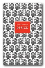
David Gentleman is a very English artist and designer. He studied with Edward Bawden and John Nash at the Royal College of Art, London, and has established an international reputation from his work in engraving, lithographs, book illustration, posters, and a number of high-profile public design commissions. This monograph comes from a new series on individual designers published by the Antique Collectors Club. David Gentleman Design is a beautifully designed and well illustrated portfolio of his work from the 1950s to the present, with an introductory biographical and critical essay that outlines the wide range of his work. The rest of the book is devoted to showing examples which range from small private designs to large scale public commissions.

David GentlemanHe was just too young to make a major contribution to the Festival of Britain in 1951, but well-enough connected with its major graphic designers to help him launch a successful career.

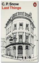
His work for the covers of Penguin Classics in the 1950s and 1960s will be very recognisable to anyone who remembers the originals or who has haunted second-hand bookshops since. He is particularly good at capturing the texture and details of buildings, even in small scale watercolour drawings – from humble rural cottages to grand country houses.

The engravings and woodcuts cling somewhat unappetizingly to a sort of late-Victorian attitude to design, whereas his watercolour drawings (executed at the same time) all seem modern and fresh. There is usually more blank space left in the design, which lets the object breathe, and there is more contrast between fine lines and washes of colour.

David Gentleman - book cover designThere’s an overall feeling of softness and a deep feeling for English traditions. But this isn’t to say that his work is feeble or nostalgic. Indeed, some of his most striking graphics are the posters designed to support radical social causes, such as his opposition to the war in Iraq.

It’s interesting to note that as a young artist he set himself the twin goals of ‘never to teach and never to commute’ – and to his credit that he managed both. Instead, he seems to have accepted commissions from all and sundry. These range from designs for coins and postage stamps, book illustrations, lithographs, designs for fabrics and crockery, book dust-jacket covers, illustrated travel books from France, Italy, and India, commercial logos, colophons, and even the covers of company reports,

It might be a matter of personal taste, but it seems to me that his finest works are the architectural studies and the coloured landscape drawings. Certainly this attractive little selection generates the taste for seeing more.

The series of design monographs of which this volume is part feature very high design and production values. They are slim but beautifully stylish productions, each with an introductory essay, and all the illustrative material is fully referenced.

David Gentleman Design   Buy the book at Amazon UK

David Gentleman Design   Buy the book at Amazon US

© Roy Johnson 2010


Brian Webb and Peyton Skipwith, David Gentleman: Design, Suffolk: Antique Collectors’ Club, 2009, pp.96, ISBN: 1851495959


More on design
More on media
More on web design


Filed Under: Graphic design, Individual designers Tagged With: Art, David Gentleman, Design, Graphic design, Illustration

E McKnight Kauffer Design

June 24, 2010 by Roy Johnson

Anglo-American modernism and graphic design

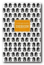
Edward Kauffer (the McKnight was added later) was an American artist from a relatively poor background in Montana USA who compensated for a lonely childhood by his interest in drawing and art. He was fortunate enough to see the famous 1913 Armory Show of contemporary European art in Chicago and shortly afterwards he left for a brief version of the Grand Tour in Munich and Paris. This was curtailed by the outbreak of war – so he ended up in England. Via a series of very fortunate connections he secured a position working for London Underground, and produced a series of posters advertising the pleasures of suburbia and the countryside at the end of the line. E. McKnight Kauffer Design is an elegantly illustrated introduction to the full range of his work.

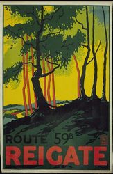
E. McKnight KaufferThese images made him famous, and the style he developed is now reproduced as exemplars of both good design and instant nostalgia. He was influenced by his studies of Toulouse-Lautrec, Alphonse Mucha, and the Sachplakat style he had seen first hand in Germany. Strongly shaped design, flat colours, and bold outlines were the hallmarks of these works.

He was also influenced by geometry (“We live in a scientific age, an age of T-squares and compasses”) plus Cubism and Orphism (as propounded by Robert Delauney). Following the establishment of his reputation in England, he also produced bibliographic designs for the Nonesuch Press and the Hogarth Press.

E. McKnight Kauffer - British Rail posterWith the outbreak of the second world war however, these commissions dried up, so he returned to America. But because his reputation by that time was an English designer, he found it difficult to become established again in his homeland. As Peyton Skipwith explains in his introductory essay to this collection of Kauffer’s work, “Like many another expatriate, his reputation seems to have got stuck somewhere in mid-Atlantic”

But he designed book jackets for Alfred Knopf, Harcourt Brace, and Random House and his career did finish on something of a high note with a series of posters for American Airlines which definitely do have a more national style.

E. McKnight Kauffer - Hogarth Press book jacketSome of the English book illustrations become slightly bucolic and whimsical, but wherever he asserts his appreciation of modernism (and the influence of The New Typography and Russian constructivism) the results are very powerful. Kauffer lived at a time when the term used to describe such work was the rather slighting ‘commercial art’ – but we would now call it ‘graphic design’.

The series of design monographs of which this volume is part feature very high design and production values. They are slim but beautifully stylish productions, each with an introductory essay, and all the illustrative material is fully referenced.

E. McKnight Kauffer Design   Buy the book at Amazon UK

E. McKnight Kauffer Design   Buy the book at Amazon US

© Roy Johnson 2010


Brian Webb and Peyton Skipwith, E. McKnight Kauffer: Design, Suffolk: Antique Collectors Club, 2007, pp.96, ISBN: 1851495207


More on design
More on media
More on web design


Filed Under: Graphic design, Individual designers Tagged With: Design, E. McKnight Kauffer, Graphic design, Hogarth Press, Modernism

Edward Bawden design

December 4, 2016 by Roy Johnson

modern romantic design and illustrations

Edward Bawden (1903-1989) was a graphic designer and illustrator of the English romantic-nostalgic school. He is best known for his book jacket designs and murals in public buildings, but he worked in a number of different visual media – ranging from advertising posters to wallpaper design and the labels for beer bottles.

Edward Bawden

He was born in Braintree in Essex, going from local education to Cambridge School of Art. From there he went on a scholarship to the Royal College of Art where he met his lifelong friend and fellow illustrator, Eric Ravilious. They both studied under the supervision of painter Paul Nash.

Shortly after graduation he was fortunate enough to receive a number of commissions. First for decorative tiles for the London Underground, then a mural for the refectory at Morley College. He began to work one day a week as an illustrator (along with Ravilious and Nash) at the Curwen Press, which produced high-quality colour lithography and short runs of specialist publications. Bawden designed decorative borders, endpapers, and illustrations – a foundation which he continued into his later life with work for Faber and Faber.

Following his marriage to a fellow RCA student Charlotte Epton, he moved from London back to Essex, where he developed a strong attachment to the countryside and began to produce watercolour paintings. This led to one-man exhibitions at both the Zwemmer and the Leicester Galleries.

Edward Bawden

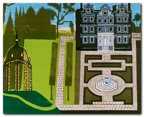
The Queen’s Garden – Kew

During the Second World War he served with the British army as an official war artist – first in France, then in the Middle East. Returning from Cairo, his ship was torpedoed and he spent several days in an open lifeboat before being picked up by the (Vichy) French navy. This resulted in his being held prisoner in an internment camp in Casablanca.

After the war he designed fabrics and murals for cruise ships, and he participated actively in designs for the Festival of Britain. These led to big public commissions for the BBC, the British Council, and London Transport.

It has to be said that part of Bawden’s success was his ability to work in any number of different visual media — linocuts, engraving, lithographic prints, watercolour, or line drawing. This supported his willingness to undertake the most humble commissions. His work includes not only large-scale public works, but dust jackets and illustrations for recipe books, and promotional materials for Fortnum and Mason – even down to the design for biscuit tins.

© Roy Johnson 2016

An Essay on Typography   Buy the book at Amazon UK

An Essay on Typography   Buy the book at Amazon US


Brian Webb and Peyton Skipworth, Edward Bawden Design, Suffolk: ACC Art Books, 2015, pp.96, ISBN: 1851498397


More on design
More on media
More on web design


Filed Under: Graphic design, Individual designers Tagged With: Design, Edward Bawden, Graphic design

El Lissitzky Design

June 26, 2010 by Roy Johnson

design , modernism, and Russian Suprematism

El Lissitzky (1890-1941) was one of the pioneers of the modernist movement in Russian art which flourished in the period 1915-1925. He was one of the most graphically radical of his era, and yet only a few years earlier he was painting rather conventional landscape paintings in the tradition of Russian realism. El Lissitzky’s earliest creative period was spent at Vitebsk working with Mark Chagall and Kasimir Malevich. With the latter he spearheaded to Suprematist movement. His geometric constructions developed from two to three dimensions and became a sort of theoretical architecture – shapes which float in space. He called the works ‘Proun’ – an invented word which means ‘Project for asserting the New’. El Lissitzky Design is an elegantly illustrated introduction to all this work.

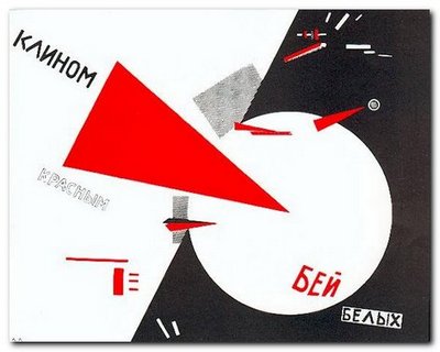
El Lissitzky He is best known for his propaganda painting ‘Beat the Whites with the Red Wedge’ of 1919 – a work which very typically for its time was geometric in form, non-representational, and included typographical elements in the same style as his contemporaries Alexander Rodchenko and Malevich. At the same time he also started producing abstract constructions in two and three dimensions which were (like Rodchenko’s) geometrically based, but more mature and developed than any works of this kind that had emerged up to this date.

El Lissitzky: Beat the Whites with the Red Wedge

His finest work seems to have been produced in an amazing creative outburst between 1917 and 1925 – just at the point where unfettered Russian modernist art theory was taking off alongside the political revolution in its positive and expansive phase.

When El Lissitzky crossed the line between art and work after 1917, he became an international social activist promoting a political message. Like the Russian Constructivists that he admired, he sought to use his creative energy to help design a new social structure in which the new engineer-architect-artist could erase old boundaries.

El Lissitzky was fortunate to be at his creative peak at a time when foreign travel was still possible in the USSR. He took exhibitions to Germany and mixed with other modernists such as Laszlo Moholy-Nagy and Kurt Schwitters. He had connection with the De Stijl group in Holland, and he taught at the Bahaus.

El LissitzkyBut it’s amazing to realise in how short a creative lifespan artists like El Lissitzky (and Rodchenko) had when they exerted such a powerful influence on the modernist movement. The images, paintings, typography, and ‘designs for projects’ illustrated in this collection are almost all from the 1920s. By the following decade El Lissitzky had become little more than an exhibition organiser. He was working for the State – but by the 1930s the dead hand of totalitarian control had stifled all originality from the arts, and his interesting designs for the Kremlin were replaced by the sort of drab architecture that became the norm under Stalin.

He lived until 1943, but there is very little that he produced after the mid 1920s that stands up to any degree of scrutiny today. What he produced before then was awe inspiring – and remains so to this day.

El Lissitzky Buy the book at Amazon UK

El Lissitzky Buy the book at Amazon US

© Roy Johnson 2010


John Milner, El Lissitzky – Design, Suffolk: Antique Collectors Club, 2009, pp.96, ISBN: 185149619X


More on art
More on media
More on design


Filed Under: Art, Design, Graphic design, Individual designers Tagged With: Design, El Lissitzky, Graphic design, Modernism, Russian modernism

Milton Glaser: Art is Work

June 19, 2009 by Roy Johnson

graphic design, interiors, objects and illustration

Don’t be put off by the cover design – this is a wonderful book. Milton Glaser is one of the most influential design and illustration gurus of the late 20th century in the USA. He was responsible for the “I love NY” logo and the poster of Bob Dylan with psychedelic hair which became a symbol of the 1980s. This is one of the few design books I have come across where the text is just as interesting as the graphics. Milton Glaser has thought a lot about the fundamentals of good design, and his ideas come through here via a series of interviews, plus his own commentary on the work illustrated.

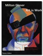
Milton Glaser: Art is Work And there’s a big bonus. He doesn’t just show his finished designs, but includes his preliminary drafts and early attempts which lead up to a successful outcome. So it’s like being invited to sit in his studio whilst he thinks and works out loud. He’s astonishingly versatile. The book contains examples of poster design, record covers, freehand drawings (amazingly similar to David Hockney in style) book illustrations, interior design, product design, typography, and publicity materials.

His observations focus on the aesthetics of creativity – and yet he keeps his eye on the commercial and professional aspects of his work. He’s frank enough to admit that if the client’s budget is not big enough, he is prepared to discriminate between a ‘one hour’ idea and a ‘six hour’ design.

He’s a great believer in the idea that designers must continue to draw to develop their ideas, and he believes in creation as a form of work and process:

When you’re thinking you do a sketch and it’s fuzzy. You have to keep it fuzzy so that the brain looks at it and imagines another iteration that is clearer. Then you do another sketch that advances it again. It may take a number of these intermediate solutions before you arrive.

It’s a very instructive experience to see his rough sketches develop as he stretches and changes an idea until he comes up with what looks a fresh and spontaneous picture. That’s what he means by his book title. These designs do not just happen spontaneously: they are the result of hard work

He is very aware of modern painters – Klee, Mondrian, the much under-rated Sonia Delauney, Klimt, and Max Ernst. There’s also a portrait of Duke Ellington which has elements of Francis Bacon in its colouring and handling of paint, and a series of posters for the Venice Biennale which combine images of the city’s emblematic lion with ink spattering reflecting his appreciation of the work of Jackson Pollock

I found his book illustrations less successful, his restaurant designs inspired in terms of lighting, and his product design superb. There’s a whole page of sketches for a cocktail glass, any one of which you would be pleased to hold. But the finished product – complete with double-sided conical bowl with a vacuum to keep your Martini cold, fluted stem, and Art Deco collar uniting the two – well, my knees went weak when I turned the page, and I would pay substantial money to own a set.

© Roy Johnson 2003

Milton Glaser Buy the book at Amazon UK

Milton Glaser Buy the book at Amazon US


Milton Glaser, Art is Work, London: Thames and Hudson, 2000, pp.272, ISBN 0500510288


More on art
More on media
More on design

Filed Under: Art, Individual designers, Product design Tagged With: Art, Graphic design, Milton Glaser, Milton Glaser: Art is Work, Product design

Paul Rand

June 26, 2009 by Roy Johnson

illustrated study of influential graphic designer

Paul Rand (1914 -1996) was one of the most successful figures in corporate American graphic design. He is best known for his IBM logo, which helped to resurrect the company in the 1970s, and led to its dominant position in computer manufacture. His early success in New York was founded – quite apart from his natural talent as an illustrator – on his appreciation of European modernism. He absorbed its influences quickly and, combining them with his precocious technical skills, produced a distinctive ‘American’ style. His basic approach is founded on photo-montage, collage, and elements of surrealism. But it’s a style which manages to look permanently modern.

Paul RandHe seems to have been particularly strongly influenced – as were many others at that time – by Jan Tschichold’s classic study of the relationship between politics and design in Die Neue Typografie. By the 1940s and 1950s, his combination of simple, abstracted forms contrasted with handwritten text came to be the template for many US book jacket and LP albumn designers – such as Milton Glaser and David Stone Martin. He coined the phrase ‘less is more’ – perhaps a summary of modernism in graphic design. He worked seven days a week, did all his own technical work, and he even designed his own house.

This beautifully illustrated biography traces his early work, which still looks fresh today; it covers the book jackets which set design pace in the 1950s and 1960s; and then the centre of the study is taken up with the development of the IBM corporate image and its famous Venetian blind logo. The conclusion is an illustrated gallery tour of his best commercial contracts – Westinghouse, United Parcels Service, ABC, and even re-designs such as Ford for which he was not actually awarded the contract.

Steven Heller, his biographer, is art director of The New York Times and the author of several influential books on graphic design. His account is even-handed on the whole, though it becomes a little whimsical in places – such as when describing Rand’s illustrations for children’s books written by his wife Anne. However, this book is exquisitely designed and elegantly printed from first page to last – which is why it is already a best-seller. The new paperback edition should help to bring the vivacity of Rand’s work to a wider audience.

© Roy Johnson 2002

Paul Rand   Buy the book at Amazon UK

Paul Rand   Buy the book at Amazon US


Steven Heller, Paul Rand, London: Phaidon, 2000, pp.255, ISBN: 0714839949


More on design
More on media
More on web design
More on typography


Filed Under: Individual designers, Typography Tagged With: Design, Graphic design, Paul Rand, Typography

  • 1
  • 2
  • Next Page »

Reviews

  • Arts
  • Biography
  • Creative Writing
  • Design
  • e-Commerce
  • Journalism
  • Language
  • Lifestyle
  • Literature
  • Media
  • Publishing
  • Study skills
  • Technology
  • Theory
  • Typography
  • Web design
  • Writing Skills

Get in touch

info@mantex.co.uk

Content © Mantex 2016
  • About Us
  • Advertising
  • Clients
  • Contact
  • FAQ
  • Links
  • Services
  • Reviews
  • Sitemap
  • T & C’s
  • Testimonials
  • Privacy

Copyright © 2025 · Mantex

Copyright © 2025 · News Pro Theme on Genesis Framework · WordPress · Log in