Mantex

Tutorials, Study Guides & More

  • HOME
  • REVIEWS
  • TUTORIALS
  • HOW-TO
  • CONTACT
>> Home / Design

Design

design history, graphic design, information design, product design

design history, graphic design, information design, product design

design history, graphic design, information design, product design

Bauhaus

June 16, 2009 by Roy Johnson

Design history: Weimar, Dessau, Berlin 1919-1933

The Bauhaus was a major landmark in the development of modernism in the early years of the last century. In concept it grew out of the German desire to form its own version of the English Arts and Crafts movement, but it quickly became influenced by constructivism and expressionism. As a movement it grew rapidly in Weimar, despite the economic recession in Germany in the 1920s – and it embraced all forms of design – typography, ceramics, furniture, architecture.

Bauhaus Its principal teachers and movers are now household names in their respective disciplines – painters Wassily Kandinsky, Paul Klee, and Lionel Feininger; architects Walter Gropius and Mies van der Rohe; designers Joseph Albers and Laszlo Moholy-Nagy. What made them different to earlier design movements was that they wished to make their products available for industrial production.

This is the first full-length study of the movement and its participants to be based on the papers of the Bauhaus archive – many of which are reproduced in this elegantly designed book which does its subject proud in terms of page layout and typographic design. Magdalene Droste traces both the artistic policies which were constantly changing as key personnel came and went, as well as the political and economic difficulties of keeping the institution afloat – most of which was achieved in its first phase by Walter Gropius.

The structure of the book follows the policies under its three directors – Gropius, Mayer, and van der Rohe on its three sites, Weimar, Dessau, and Berlin.

I hadn’t realised before that the curriculum also included drama, which produced mechanical ballet and abstract theatre which still seems quite avant garde now, eighty-odd years later. There are some wonderful pictures of the products of the institute: the first really modern furniture; stained glass, pottery, and rugs; plus some exquisite tableware by Marianne Brandt, who for me is the outstanding discovery of this collection.

brandt_02
Gropius presciently observed: “Much of what we today consider luxury will tomorrow be the norm” – and its true that looking at the (for then) ultra-modern chairs, tables, and kitchen cabinets is hardly any different to thumbing through a contemporary IKEA catalogue. Some of their designs were commercially successful, particularly their best-selling wallpaper designs, many of which are still in production today.

The Bauhaus is perhaps known best for its influence on modern architecture, and yet strangely enough that subject was not taught there until a demand for it was made by students and then implemented by Mies van der Rohe. Droste’s detailed accounts of the classes taught there and the examples of work produced make you wish you could sign up as a student.

The latter part of her story deals with the intense battles which went on between left and right-wing political forces over the future of the Bauhaus. These ended in 1933 with the victory of the Nazis and the closure of the institution.

If there is a weakness in this scholarly piece of work, it’s that the story is not taken beyond there. For we know that many of the principal figures involved emigrated to America and continued their work in the New World . But you have to stop somewhere, and any shortfall is made up for by the quality of the illustrations,

I spotted this book in a display on modernism at Waterstone’s, selected it as the best on offer, and was amazed when I saw the price. It’s another in the astonishingly cheap and high quality publications from Taschen

© Roy Johnson 2007

Bauhaus Buy the book at Amazon UK

Bauhaus Buy the book at Amazon US


Magdalene Droste, Bauhaus, London: Taschen, 2006, pp.256, ISBN 3822821055


More on architecture
More on technology
More on design


Filed Under: Architecture, Design history, Graphic design, Product design Tagged With: Architecture, Bauhaus, Design, Product design

Bauhaus 1919-1933

October 22, 2009 by Roy Johnson

modernist design movement

Bauhaus was a design movement which sprang up in Germany in post 1914-1918 as a reaction to the efflorescent curlicues of la Belle Epoque. It emphasised (particularly in theory) rectilinear practicality, function over form, and a political element of art for the masses rather than a privileged few. Most of its designers were of course middle-class artists who were caught up in the revolutionary fervour of the Weimar Republic – but its greatest strength in terms of enduring design is that many of its creations are still in production today. Wallpapers are still in print, vintage retro table lamps are either being reproduced at exorbitant prices, or are trading on eBay for not much less.

Bauhaus 1919-1933This is an excellent presentation of the work done there – for a number of reasons. First, it shows a wide range of products – from paintings, furniture, and architecture, to photography and household effects. Second, the illustrations are fresh and well researched. There are illustrations here I have never seen before in books on the subject. And third, there is plenty of historical depth and context, including original photos of the Bauhaus studios and the people who taught there.

The staff list is like a roll call of modernism at its highest – architects Walter Gropius and Mies van der Rohe, designer Herbert Bayer, painters Wassily Kandinsky, Paul Klee, Joseph Albers, and Lionel Feininger, artists El Lizitsky and Moholy-Nagy, plus the constructivists Vladimir Tatlin and Alexander Rodchenko. I was also glad to see that the book included work by the wonderful and much under-rated product designer Marianne Brandt.

marianne brandt

The format of the book is simple and effective. Double page spreads are arranged with explanatory text on the left and colour illustrations on the right. Just the right sort of proportion for this type of book. Full details of each item are provided, and there are links to further information in the appendices.

The range of items is quite astonishing. There are buildings (the Bauhaus workshops themselves) designs and photos of completed architectural projects, furniture, wall hangings, paintings, advertising posters, household objects such as electric lamps and tea sets, rugs, children’s toys, and photographs.

However, form and function were not always harmonised as successfully as they might have been. It has to be said that even a design ‘classic’ such as Gerrit Ritvelt’s armchair (1918) looked as modern as modern could be in 1918 – but as design critic Victor Papanek observes

These square abstractions painted in shrill primaries were almost impossible to sit in; they were extremely uncomfortable. Sharp corners ripped clothing, and the entire zany construction bore no relation to the human body

But the overwhelming impression one takes from a collection like this is of design inventiveness working at all levels – from architecture, interior and furniture design, through fabrics and furnishings, down to graphics and typography.

In fact much of today’s architectural design is directly attributable to the influence of the Bauhaus designers. Rectilinear buildings, minimalist interiors, walls made from glass bricks, bentwood furniture, ceiling to floor windows, uncarpeted hard surface floors. Moreover, the spirit of Bauhaus functionality lives on in the products and styles of stores such as Habitat and IKEA.

I got an email only the other day offering copies of the famous Barcelona chair (Mies van der Rohe 1929) for a mere $3000 – only they called it the ‘Madrid’ chair just to cover themselves. So the spirit of the Bauhaus is definitely alive and doing commercially well today thank you very much.

Bauhaus Buy the book at Amazon UK

Bauhaus Buy the book at Amazon US

© Roy Johnson 2009


Andrew Kennedy, Bauhaus, London: Flame Tree Publishing, 2005, pp.384, ISBN 184451336X


More on architecture
More on technology
More on design


Filed Under: Architecture, Design history, Graphic design, Product design Tagged With: Architecture, Art, Bauhaus, Cultural history, Design, Graphic design, Interior design

Blood, Sweat and Tears

June 25, 2009 by Roy Johnson

comic book illustrations and dark-souled graphics

Die Gestalten Verlag are curious publishers. They produce books of high-spec contemporary graphics and computer animations such as 72dpi and Anime – yet at the same time they come up with this curiously disembodied publication of assorted illustrations and sketch book entries. It’s quite difficult to understand its purpose, except as a sample portfolio of one designer’s work.

Blood, Sweat and Tears Benjamin Guedel is I suppose an illustrator. He draws pictures of a kind which seem to evoke a comic book retro feel of the 1970s and 1980s. The pictures are largely close-ups of people shown in reaction to dramatic situations. You will have to imagine scenes from pulp fiction or ‘adult’ comics. It’s the sort of work you would expect to find in something called Raw Comix or Naked Truth.

The images are largely nightmarish, with lots of the violence, anguish, and suffering to produce the blood, sweat, and tears of the title. The book is bizarre in that it has not a single printed word except its title – so as you flick through the pages there’s a very strong urge to construct a narrative from the sequence of images. Whether you can make a logic or narrative is up to you. I gave up after a couple of attempts.

In fact the illustrations are extracted from dark, violent, and surreal comic books to which he has contributed. And yet I was driven on to make the attempt for an oblique reason. It’s because this guy has got such an interesting web site. It features some of the same images, but there’s much more in his digital presence.

All of which is a shame – because the book could be a great advert for the site if the images were put into some sort of context, and if his web site was listed. But at the moment it’s the wrong way round.

© Roy Johnson 2005

Blood, Sweat and Tears   Buy the book at Amazon UK

Blood, Sweat and Tears   Buy the book at Amazon US


Benjamin Guedel, Blood Sweat & Tears, Die Gestalten Verlag, 2005, no page numbers, ISBN: 3899550749


More on design
More on media
More on web design


Filed Under: Graphic design Tagged With: Art, Graphic design

Carrington: A Life of Dora Carrington

June 19, 2009 by Roy Johnson

Art, love, and Bohemian life in Bloomsbury

Dora Carrington was a painter, an early feminist, and a figure who flits in and out of the lives of several members of the Bloomsbury Group, of which she was a significant member. This is the (so far) definitive biography of her troubled existence, which covers her day-to-day life in great detail – much of it based upon her voluminous correspondence. She grew up in a stiflingly conventional home in Bedford, loving her father and hating her mother.

Carrington: A Life of Dora Carrington With a talent for art, she was glad to get away from home at seventeen and spread her wings at the Slade, living in Gordon Square, right in the heart of Bloomsbury. Her style of painting and drawing was firmly traditional, and it fitted with the aesthetic of the Slade.

She was unaffected by the craze for Post-Impressionism which followed Roger Fry’s famous 1910 exhibition at the Grafton Galleries which Virginia Woolf claimed changed human nature that year. She cut her hair short in a style which became famous (‘crop head’) and two of her fellow students, ‘Chips’ Nevinson and Mark Gertler, promptly fell in love with her. This resulted in the first of her many love triangles, plus a form of unhappiness for all concerned. Although she behaved in a provocative manner, she refused to choose between them, or to have a sexual relationship with either of them.

In 1914 she met D.H. Lawrence and David Garnett, joined Roger Fry’s Omega Workshop, and was moderately successful in her decorative art work. Then in 1915 she spent a weekend amongst the Bloomsbury Group at Asheham which was to change her life. Lytton Strachey (who was in love with Mark Gertler) made a sexual pass at her, and she immediately fell in love with him.

Although she had kept Gertler at bay for five years, she gave herself to Strachey from the outset – then ended up having a sexual relationship with both men at the same time, even though Strachey was really a homosexual. [Remember – this is Bloomsbury.] Eventually she set up home with Strachey at Tidmarch Mill House and found her first sustained period of happiness.

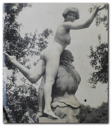
Dora Carrington nude

Yes – that’s Dora Carrington

However, with a twist which typifies relationships in the Bloomsbury Group, they moved Ralph Partridge in to live with them. Carrington shared his bed, and Strachey fell in love with him. She then moved to live with Partridge in Gordon Square when he was given a job at the Hogarth Press, and then married him in 1921, even though she claimed she was still in love with Strachey – who with characteristic generosity paid for their honeymoon, and even joined them on it.

Not long afterwards she started an affair with her husband’s best friend, Gerald Brenan – around the same time that Partridge moved his new lover Valentine (actually Gladys) Dobree into their family home at Tidmarsh.

It is commonly assumed that Carrington sacrificed her artistic possibilities to the effort of looking after Strachey and Partridge, but Gretchen Gerzina argues that on the contrary, she was at her most productive when her domestic and personal life were settled and untroubled by romantic entanglements.

But the level of emotional masochism in her life is remarkable. Whilst her husband took his new lover Frances Marshall on holiday to Paris, he forbade her to even write to Gerald Brenan. She distracted herself from this humiliating position by starting an affair with Henrietta Bingham, the daughter of the American ambassador, a foray into Sapphism which made her regret she hadn’t started earlier. And this didn’t stop her sleeping with Gerald Brenan as well – so by this time she had certainly got rid of her earlier sexual reluctance.

Almost all the evidence for this personal narrative comes from letters. These people were super-communicative on paper. But the correspondence needs to be carefully interpreted – because they often wrote knowing that third parties might read what they said. Partridge not only banned Carrington from writing to Brenan, but insisted on reading all her correspondence. So she developed the strategy of inserting personal messages into secret addenda – which were nevertheless sometimes intercepted. And she was much given to reading other people’s private mail too.

As the menage she helped to create with Strachey and Partridge began to fall apart, she consoled herself with Bernard (Beakus) Penrose [brother of Sir Roland] in one last romance. But it was Strachey who remained her most lasting affection, and when he died (of undiagnosed stomach cancer) in 1932 she felt that she could not live without him. So she shot herself – aged just thirty-nine.

© Roy Johnnson 2012

Dora Carrington Buy the book at Amazon UK

Dora Carrington Buy the book at Amazon US


Gretchen Gerzina, Carrington: A Life of Dora Carrington 1893-1932, London: Pimlico, 1995, pp.342, ISBN 0712674209


More on art
More on biography
More on the Bloomsbury Group
Twentieth century literature


Filed Under: Art, Biography, Bloomsbury Group, Individual designers Tagged With: Art, Biography, Bloomsbury Group, Cultural history, Dora Carrington

Charleston Saved 1979-1989

May 25, 2010 by Roy Johnson

restoring a Bloomsbury decorated house

Charleston is a farmhouse near Lewes, Sussex which was once the home of Clive Bell, his wife Vanessa, and her lover Duncan Grant. Leonard and Virginia Woolf were frequent visitors from their own country property at Monk’s House in nearby Rodmell. Other members of the Bloomsbury Group such as Lytton Strachey, David Garnett, and Maynard Keynes were regular visitors.

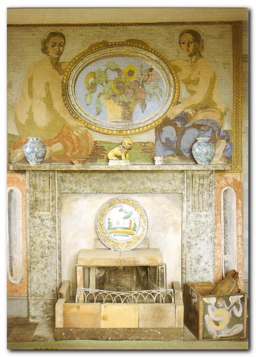
Charleston savedIt is most famous for the fact that Vanessa Bell and Duncan Grant covered the entire surface of the house – walls, fireplace, cupboards, tables, chairs – with their decorations and paintings, an impulse that was also part of the Omega Workshops movement initiated by Roger Fry around the same time during the first world war. [A subsidiary purpose of the house was to act as a refuge for conscientious objectors to the war.]
The house was famously damp and rather uncomfortable, but Duncan Grant went on living there until his death in 1978 – at which point it was in a state of neglect and dilapidation. This book is an account of the restoration project made to bring the hopuse back to life – ‘from the Broncoo toilet paper to the Bakelight electrical fittings’. Indeed throughout the whole project there was a constant debate over the relative merits of re-creating the original or saving what was left, which was a very expensive option.

There’s a great deal of fund-raising by the great and the good, but the real interest of Anthea Arnold’s account is in how a decaying over-decorated farmhouse can be pulled back from the brink of disintegration whilst preserving its spirit and integrity. There was much to be done against death watch beetles, mold, dry rot, and general decay.

At some points the narrative becomes a somewhat bizaare mixture of raffle prizewinners at fundraising events sandwiched between detailed technical accounts of replastering walls using goat’s hair bonding agents.

Charleston - fireplace and overmantle

Chapters are ordered by the objects and materials being restored – furniture, ceramics, fabrics, stained glass, pictures, the garden – and most problematic of all, the original wallpaper. Yet desite all the nit-picking over minor details of wallpaper pattern repeats and curtain fabrics, the house was re-opened to the public without the fundamental problem of rising damp having been solved. Plaster had to be cut back to the bare wall more than once.

There was quite a lot of disagreement over the wisdom and accuracy of the restoration. Why spend tens of thousands of pounds preserving rotting wallpaper when the original designs could easily be reproduced? In the end, the argument for authenticity prevailed – so long as there were sufficient US-funded endowments to sustain it.

Anyway, the project finally succeeded, and Charleston is now a thriving visitors’ centre, and the location of an annual arts festival. So – Bloomsbury fans apart, this is a book that could appeal to public relations buffs and fundraisers, or to fans of Grand Designs or property restoration specialists.

Charleston Buy the book at Amazon UK

Charleston Buy the book at Amazon US

© Roy Johnson 2010


Anthea Arnold, Charleston Saved 1979-1989, London: Robert Hale, 2010, pp. 144, ISBN: 0709090188


More on art
More on design
More on biography
More on the Bloomsbury Group
Twentieth century literature


Filed Under: Architecture, Art, Bloomsbury Group, Design, Design history Tagged With: Bloomsbury, Charleston Saved, Design, Duncan Grant, Modernism, Omega Workshops, Vanessa Bell

Charleston: Past and Present

May 23, 2009 by Roy Johnson

official guide to one of Bloomsbury’s cultural treasures

Charleston is the country house in Lewes, Sussex which was established as a family home by Vanessa Bell and Duncan Grant. She was married to Clive Bell at the time and had children by both men, but this was how things were done in the Bloomsbury Group. They lived in the house for over fifty years, covering the walls and furniture with their paintings, designing ceramics, making rugs and wall hangings, cultivating the gardens – and generally forming what became a unique collection of domestic and interior design.

Charleston: Past and Present The house also became the country retreat for many of the Bloomsbury Group. Vanessa raised her children Julian, Quentin and Angelica there, and she was visited by her sister Virginia Woolf, as well as by her ex-lover Roger Fry, and at weekends her husband Clive Bell and his lover Mary Hutchinson. These people in turn brought their friends such as John Maynard Keynes, Lytton Strachey, E.M.Forster, and David Garnett. Their personal lives and relationships were rather complicated, but this joint artistic venture was one that helped cement their common interests in design, decoration, painting, and domestic arts.

The Bloomsberries were great supporters of modern art, and many of them had made judicious purchases long before the artists became well known. Consequently, the walls of the house came to be decorated not only with their own paintings, but with works by Picasso, Matisse, Derain, Vlaminck, and Modigliani.

The main part of the book is the official guide to the house and gardens, written by Bloomsbury expert Richard Shone. This contains details of the contents of all the main rooms, and is well illustrated by colour photographs of their principal features and objects.

The latter part of the book is a collection of letters and memoirs, written by Quentin Bell and Angelica Garnett, who was his sister but who didn’t know that her father was Duncan Grant until she was eighteen. Quentin Bell’s memoir is of an idyllic childhood, spent with his brother Julian, largely unsupervised by semi-absent parents. He gives a Swallows and Amazons type of account.

His sister Angelica’s is more seriously thoughtful and reflective. It combines observations on Vanessa Bell’s fabric designs with psychological analyses of her relationship with Charleston and its other inhabitants. She captures the spirit and the development of the house as if it were a living being. She also draws an interesting socio-political contrast with her Christmas visits to the conservative house at Seend, which was the home of Clive Bell’s parents:

Even though it was at Seend that I celebrated my birthday – a birthday that belonged by rights to Charleston…the atmosphere of Victorian constraint could not have been tolerated for longer than the three or four days we spent there … it did not contain, as Charleston seemed to, the secret of creativity and renewal.

It’s also a paean of appreciation for her mother, as the presiding spirit of generosity and creativeness that permeated the house. This chapter is an interesting addendum to the account of her childhood that she provides in Deceived with Kindness.

Miraculously, the house survived the second world war and was kept in more or less its original condition. Quentin Bell (who grew up there) describes the practical difficulties and strategic frustrations of restoring the property. Fortunately for the historical records of English modernism, the house was completely refurbished, then purchased from its original owners, and is now governed by The Charleston Trust.

© Roy Johnson 2000

Charleston Buy the book at Amazon UK

Charleston Buy the book at Amazon US


Quentin Bell et al, Charleston: Past and Present: The Official Guide to One of Bloomsbury’s Cultural Treasures, London: Harvest Books, 1988, pp.180, ISBN 0156167735


More on art
More on design
More on biography
More on the Bloomsbury Group
Twentieth century literature


Filed Under: Art, Bloomsbury Group, Lifestyle, Product design Tagged With: Bloomsbury Group, Charleston, Decorative arts, Interior design, Lifestyle

Communicating in Style

June 30, 2009 by Roy Johnson

how to present text and data for publication

This is a style guide for writers who have produced the basic text but who need help laying it out effectively on the page – or on screen. It will be of particular interest to technical writers and those dealing with business documentation. Communicating in Style covers the basics of document design such as headings and subheadings; how to present dates, times, and email addresses; and how best to control spacing, indentation and margins to create effective pages.

Communicating in StyleThere are lots of small but important details: acronyms first, followed by the full version; no full stops after contractions; headings closer to body text which follows than that which precedes. He also suggests that abbreviations should be explained anew in each chapter of a book – especially if they deal with different topics. Yateendra Joshi is good on the punctuation and spacing of lists; the kerning of small caps; (symbols have no plurals); and how to use the numeric keypad to produce special symbols and characters.

On tables there’s lots of good advice on alignment in columns and rows to simplify and clarify the presentation of data. Like Edward Tufte he believes in reducing any unnecessary lines, rules, and ‘chart junk’.

He deals with questions such as ‘Is the symbol for hour ‘h’ or ‘hr’?’ and ‘Are thousands separated by commas or with a space?’ plus lots of details on abbreviations, acronyms, contractions, and symbols.

There’s a section on OHP and PowerPoint presentations and how to lay out the display for maximum effectiveness; how to submit manuscripts to journals; and how to integrate charts, diagrams, maps, and photographs into documents; citing and referencing sources of information, including web pages and electronic documents.

The feature of the book I liked best was the use of quotations from other well-known style guides to illustrate the main points of his arguments. These are placed on almost every left-hand page, along with a picture of the jacket cover and bibliographic details of the book itself.

I can confirm his claim that the book has been extensively field-tested with earlier drafts. Many versions have been made available to the Information Design email discussion group in the past couple of years.

He finishes off with advice on spelling, fonts, and formats for postal addresses and telephone numbers. This is in fact very detailed and sophisticated advice on the presentation of information on screen and page. It encourages us all to be more attentive.

It’s good to see that this book has now found its way to Amazon.co.uk – but you might find it difficult to locate elsewhere. Be persistent however: it’s well worth the effort.

© Roy Johnson 2004

Communicating in Style   Buy the book at Amazon UK

Communicating in Style   Buy the book at Amazon US


Yateendra Joshi, Communicating in Style, New Delhi: The Energy and Resources Institute, 2003, pp.250, ISBN: 8179930165


More on information design
More on design
More on media
More on web design


Filed Under: Information Design, Publishing, Writing Skills Tagged With: Communicating in Style, Communication, Publishing, Style guides, Writing skills

Complete Guide to Digital Design

June 19, 2009 by Roy Johnson

This is a beautifully designed and an elegantly produced book. It’s an excellent counterpart to Bob Gordon’s other recent publication – Making Digital Type Look Good. First he offers a brief introduction which illustrates contemporary digital design in a variety of media – print, packaging, signage, exhibitions, Internet, and Multimedia. The rest of the book is in four sections. The first deals with basic design principles. That is, issues such as shape, line, colour, type, layout, images, and the dynamics of emphasis, contrast, and shade.

Complete Guide to Digital DesignThe next sections look in detail at the latest developments in design for print publications, public signage, exhibitions, for the computer screen, and for multimedia. If any of this sounds rather abstract, it has to be said that these principles are illustrated in a wonderful series of double-page spreads, orchestrated in a beautifully rhythmic series of variations on a five column grid. The book itself lives up to the high design values it is presenting.

The supposition is that many designers will be migrating from the world of print to that of the digital interface – and I think that is reasonable – since the Web gets some of its most efficient and elegant designs from the influences of print design.

There’s an account of the best software programs [QuarkXPress and PageMaker] and how they are used in print preparation. This is followed by a series of illustrated case histories and interesting details of what is now called ‘surface design’ used in instances as varied as cardboard engineering and multimedia exhibitions.

On designing for the screen, there are useful tips on coping with the frustrations of Web page composition – such as browser download times and display uncertainties. There’s an introduction to Flash, Web editors, and graphics packages such as Fireworks.

The section on multimedia concentrates on designing for CD-ROM and DVD using software such as Macromedia Director and Adobe After Effects – all of which are now within budget price range. The big advantage of this increasingly popular form of delivery is that the author can control the appearance of the finished design on screen.

This is a very elegant production which is worth owning as a stunning example of graphic design in its own right. But it will also form an excellent overview of what is current in the field of digital graphics.

© Roy Johnson 2003

Digital Design   Buy the book at Amazon UK

Digital Design   Buy the book at Amazon US


Bob Gordon and Maggie Gordon, The Complete Guide to Digital Graphic Design, London: Thames and Hudson, 2002, pp.224, ISBN: 050028315X


More on design
More on media
More on web design


Filed Under: Graphic design Tagged With: Complete Guide to Digital Design, Digital design, Graphic design, Typography

Cradle to Cradle

July 8, 2009 by Roy Johnson

re-thinking the way we make things

Cradle to Cradle is the programme for a philosophy of ecological design principles based on a consciousness of the global environment. IT raises fundamental issues about sustainability, well-used resources, and sensitivity to eco-systems. The authors are an architect and a chemist who between them tackle issues from major construction projects, to the design of shampoo and re-cyclable running shoes. It’s a work whose primary purpose it to make you think about design issues. Don’t expect glamorous colour photographs or examples of slick kettles and toasters – but be prepared to have your notions of ‘waste’ and ‘re-usability’ challenged in a radical manner.

Ecological DesignTheir stated aim is to re-think the way in which everything is made. And though they posit a very radical philosophy of using design intelligently, they are not reactionary when it comes to modern industry. In fact the book starts with an account of the Industrial Revolution which focuses on many of its good intentions – before listing its contemporary weaknesses in terms of the world’s ecology. They make their case for eco-consciousness using the very book itself:

It is printed on a synthetic ‘paper’…made from plastic resins and inorganic fillers. This material is not only waterproof, entirely durable, and (in many localities) recyclable by conventional means; it is also a prototype for the book as a technical nutrient’, that is, as a product that can be broken down and circulated indefinitely in industrial cycles – made and remade as ‘paper’ or other products

Good you might think: but the book is surprisingly heavy, and (though most people don’t know this) the biggest part of the cost of getting printed books to the public is transportation costs, based on weight.

They are also critical of what they see as shortsighted attempts to solve ecological waste by recycling:

your [recycled] rug is made of things that were never designed with this further use in mind, and wrestling them into this form has required as much energy – and generated as much waste – as producing a new carpet

The solution often proposed for these problems is called eco-efficiency – ‘doing more with less’. But they suggest that this just gives the appearance of social concern without changing the basic systems of industrial production. As they put it, ‘Being ‘less bad’ is not good: it is to accept things as they are.’

Examining the relationship of human beings to the planet at a very fundamental level, they come up with an interesting concept – that there is really no such thing as ‘waste’. Because when we throw things away, they do not go away. Indeed there is and can be no ‘away’. These things stay with us even if they are dumped in landfills, and even if they are incinerated we are still left with the by-products of combustion (including the CO2).

There is no need for shampoo bottles, toothpaste tubes, yogurt and ice-cream cartons, juice-containers, and other such packaging to last decades (or even centuries) longer than what came inside them

Some of the ideas they propose as alternatives seem rather fanciful. Recyclable televisions for instance: could their internal parts really be cost-effectively extracted and re-used? Running shoes with replaceable soles? But they do claim to have had a success with an upholstery fabric which is bio-degradable.

They are very much in favour of using local materials (think how wasteful it is transporting them from afar) and encouraging the use of local labour, which promotes the local economy.

It’s a book crying out for graphic illustration – particularly when they come to describing the ecologically positive buildings they have designed – with grass-carpeted roofs and tree-lined interiors. Nevertheless, I think this may well be one of those modern design classics which will find its way alongside Donald Norman’s The Design of Everyday Things and Viktor Papanek’s Design for the Real World as a standard text on every design curriculum.

© Roy Johnson 2002

Cradle to Cradle   Buy the book at Amazon UK

Cradle to Cradle   Buy the book at Amazon US


William McDonough and Michael Braumgart, Cradle to Cradle, New York: North Point Press, 2002, pp.193, ISBN: 0099535475


More on design
More on media
More on web design
More on information design


Filed Under: Product design Tagged With: Design, Design theory, Product design, Theory

David Carson: 2nd Sight

June 8, 2009 by Roy Johnson

Grafik Design After the End of Print

There is a product which food companies use to make their products thicker. It’s the gum agent you can read about on an ordinary bottle of syrup or a jar of not-so-authentic salsa. The thickener doesn’t really have a flavor, it’s just there to add content when all other things fail to blend or aren’t full enough to make that product enticing. No one likes to have thin and runny syrup on their waffles or salsa that doesn’t stick to their chips. David Carson: 2nd Sight: Grafik Design After the End of Print is a mouthful and more of what you’d expect from a graphic designer on a quest to clarify his methods and intentions, though it seemed spicier the first time around.

David Carson: 2nd SightThere’s a sea of graphic designers who either love Carson’s methods or dislike them. For those who love his methods, you have another book to smile about. Another book to discuss with your fellow designers, another book to justify your methods. In fact, you now have another book that tells you why you do the things that you do. For those who dislike his methods, this is another book to mock. Another book to further your own theories on design.

Intuition played a key roll in the development of the second book by Carson and Blackwell. Those four syllables seem to be the reason behind a lot of what David Carson does in life. Unlike The End of Print, 2nd Sight is more about text than it is about pretty images (although there are plenty of images). There are no popups, but there are a few quotes which serve as some sort of artistic justification or reasoning behind what he and others in the decontructionalist movement supposedly feels deep within.

2nd Sight isn’t trying to intellectualize anything – well it is, but it doesn’t succeed. It’s kind of like a second course in an eight course meal. It’s handing out a little bit of insight into the designers’ creative explorations and it’s putting David Carson’s life into yet another round of syndication. How many times do we need to read about the fact that he was a surfer and has no classical training in graphic design or typography?

In fact, if I had to make a guess, I’d say that by the end of this book Carson was a little bored. The popularity of this subject has dwindled and much of the content of 2nd Sight should have been said in Carson’s first book, The End of Print.

But laying all of that aside, the book hits upon an important point – that intuition plays a crucial role in what any good designer or artist does. You can be classically trained, but if you haven’t got the intuition to go along with that training, then you’ve got nothing. To put it bluntly, you’ve got skills in desktop publishing rather than skills in graphic design.

Visually, 2nd Sight is appealing. There are vistas from hotel rooms at sunset, Carson expounding at workshops, chic and trendy warehouse gigs, and yet more over-populated lectures. The book hangs together well. Unfortunately, the text is not as fully baked. Carson, the pied piper of intuition, fails to realize that not all intuition is good, nor is it enough. In 2nd Sight there is plenty of scenery but no roadmap.

Nonetheless, I’m glad I read this book and am pleased to see its spine on my bookshelf. Anything bearing Carson’s name, whether chunky or smooth, thick or runny, is likely to stimulate your own creative juices. On that basis, I can recommend 2nd Sight to any designer or typographer.

© Tracy Pickle 2000

David Carson: 2nd Sight   Buy the book at Amazon UK

David Carson: 2nd Sight   Buy the book at Amazon US


Lewis Blackwell and David Carson, Carson, David: 2nd Sight: Grafik Design After the End of Print, Universe Publishing, 1997, pp.176, ISBN: 0789301288


More on typography
More on design
More on media
More on web design


Filed Under: Individual designers, Typography Tagged With: 2nd Sight, David Carson, Design, Graphic design, Typography

  • « Previous Page
  • 1
  • 2
  • 3
  • 4
  • …
  • 11
  • Next Page »

Reviews

  • Arts
  • Biography
  • Creative Writing
  • Design
  • e-Commerce
  • Journalism
  • Language
  • Lifestyle
  • Literature
  • Media
  • Publishing
  • Study skills
  • Technology
  • Theory
  • Typography
  • Web design
  • Writing Skills

Get in touch

info@mantex.co.uk

Content © Mantex 2016
  • About Us
  • Advertising
  • Clients
  • Contact
  • FAQ
  • Links
  • Services
  • Reviews
  • Sitemap
  • T & C’s
  • Testimonials
  • Privacy

Copyright © 2025 · Mantex

Copyright © 2025 · News Pro Theme on Genesis Framework · WordPress · Log in