Mantex

Tutorials, Study Guides & More

  • HOME
  • REVIEWS
  • TUTORIALS
  • HOW-TO
  • CONTACT
>> Home / Design

Design

design history, graphic design, information design, product design

design history, graphic design, information design, product design

design history, graphic design, information design, product design

David Gentleman Design

May 17, 2010 by Roy Johnson

portfolio of illustrations, engravings, posters, and designs

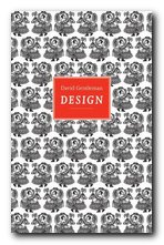
David Gentleman is a very English artist and designer. He studied with Edward Bawden and John Nash at the Royal College of Art, London, and has established an international reputation from his work in engraving, lithographs, book illustration, posters, and a number of high-profile public design commissions. This monograph comes from a new series on individual designers published by the Antique Collectors Club. David Gentleman Design is a beautifully designed and well illustrated portfolio of his work from the 1950s to the present, with an introductory biographical and critical essay that outlines the wide range of his work. The rest of the book is devoted to showing examples which range from small private designs to large scale public commissions.
David GentlemanHe was just too young to make a major contribution to the Festival of Britain in 1951, but well-enough connected with its major graphic designers to help him launch a successful career.

His work for the covers of Penguin Classics in the 1950s and 1960s will be very recognisable to anyone who remembers the originals or who has haunted second-hand bookshops since. He is particularly good at capturing the texture and details of buildings, even in small scale watercolour drawings – from humble rural cottages to grand country houses.

The engravings and woodcuts cling somewhat unappetizingly to a sort of late-Victorian attitude to design, whereas his watercolour drawings (executed at the same time) all seem modern and fresh. There is usually more blank space left in the design, which lets the object breathe, and there is more contrast between fine lines and washes of colour.

David Gentleman - book cover designThere’s an overall feeling of softness and a deep feeling for English traditions. But this isn’t to say that his work is feeble or nostalgic. Indeed, some of his most striking graphics are the posters designed to support radical social causes, such as his opposition to the war in Iraq.

It’s interesting to note that as a young artist he set himself the twin goals of ‘never to teach and never to commute’ – and to his credit that he managed both. Instead, he seems to have accepted commissions from all and sundry. These range from designs for coins and postage stamps, book illustrations, lithographs, designs for fabrics and crockery, book dust-jacket covers, illustrated travel books from France, Italy, and India, commercial logos, colophons, and even the covers of company reports,

It might be a matter of personal taste, but it seems to me that his finest works are the architectural studies and the coloured landscape drawings. Certainly this attractive little selection generates the taste for seeing more.

The series of design monographs of which this volume is part feature very high design and production values. They are slim but beautifully stylish productions, each with an introductory essay, and all the illustrative material is fully referenced.

David Gentleman Design   Buy the book at Amazon UK

David Gentleman Design   Buy the book at Amazon US

© Roy Johnson 2010


Brian Webb and Peyton Skipwith, David Gentleman: Design, Suffolk: Antique Collectors’ Club, 2009, pp.96, ISBN: 1851495959


More on design
More on media
More on web design


Filed Under: Graphic design, Individual designers Tagged With: Art, David Gentleman, Design, Graphic design, Illustration

Design for the Real World

July 14, 2009 by Roy Johnson

human-centred and ecological design principles

Design for the Real World is often tipped in design circles as one of the best overall guides to ethical design theory and practice, along with Donald Norman’s The Design of Everyday Things. Victor Papanek takes a radically user-centred approach to design, with a very strong emphasis on social and ecological consciousness. It’s obvious to see why a book like this becomes a standard text – because all his questions are very fundamental. Essentially, he bases his design judgements on political criteria. What does this object do? Who is it for? What is it made of? And do the answers to these questions have any social consequences for the rest of society?

Design for the Real WorldHe is quite uncompromising in his approach. No objects are too humble to be considered in terms of good or bad design – a hammer, a teacup, even a simple cardboard box. He is amusingly critical of famous design objects such as de Stijl and Macintosh chairs:

These square abstractions painted in shrill primaries were almost impossible to sit in; they were extremely uncomfortable. Sharp corners ripped clothing, and the entire zany construction bore no relation to the human body … The thronelike Glasgow chairs designed by Charles Rennie MacIntosh in 1902 – with six-and-one-half-foot ladderbacks [had] all the soft comforts of an orange crate.

You won’t get lots of ideas for fancy new designs, but you will get a radical method and a critical approach to design which means you will never look at a spoon or a sports car in the same way again.

En route he offers scathing analyses of multinational corporations such as fast food chains and motor car manufacturers for their often selfish and profligate policies. There’s a detailed critique of MacDonald’s packaging waste, and a clear link argued between gas-guzzling car design and US foreign policy in the middle-East. These ideas will appeal to anybody who wishes to combine design with an ecological conscience.

He also comes up with rather witty observations on ‘fashion’ and false aesthetics from time to time:

Because in any reasonably conducted home, alarm-clocks seldom travel through the air at speeds approaching five hundred miles per hour, streamlining clocks is out of place.

As an educationalist, he advances several useful problem solving techniques which could be applied in other disciplines, as well as design. But this book doesn’t let you off the hook. Whatever is being designed, he wants to know ‘Is it useful?’, ‘Does it do the job for which it is intended?’, and ‘Is it cost effective?’

If there’s a weakness, it’s that he spends a lot of time spelling out the problems of people with physical and social disabilities and calling for design solutions to them. We would all agree that these issues need attention, but personally I would rather he explained the principles of good design.

He gives plenty of examples of ‘alternative’ cheap and cheerful design solutions pioneered by his design studio and students

He’s fairly unrelenting in his argument for ecologically sound, labour-saving devices to help the underprivileged of the third world, but few of them seem entirely convincing, even when they pass prototyping.

The latter part of the book takes on the issue of design and education. Here he makes an argument for what he calls integrated design – working in teams, tackling real problems (not fashion-related) and keeping an ethical vision in mind.

The main trouble with design schools seems to be that they teach too much design and not enough about the ecological, social, economic, and political environment in which design takes place.

If you are serious about product design, put this book on your reading list. It’s full of attitude, full of ideas, and uncompromising in its approach. And it’s got a very good series of bibliographies on all topics related to the issues he discusses.

© Roy Johnson 2000

Design for the Real World   Buy the book at Amazon UK

Design for the Real World   Buy the book at Amazon US


Victor Papanek, Design for the Real World, London: Thames & Hudson, 1985, pp.394, ISBN: 0500273588


More on design
More on media
More on web design
More on information design


Filed Under: Product design Tagged With: Design, Design for the Real World, Ecological design, Product design, Theory, Viktor Papanek

Design in the USA

July 9, 2009 by Roy Johnson

Product design in America 1800-2000

Design in the USA is much more interesting than its rather plain title suggests. It’s a very scholarly approach to the subject, incorporating both the economic and social history of design in America from its revolutionary origins to the present day. Jeffrey Meikle’s first chapters deal with America’s ambiguous relationship with Europe (and England in particular) before native designers begin to emerge towards the end of the nineteenth century in the form of Charles Eastlake (furniture) and Tiffany (lamps) – though I was glad to see that the novelist Edith Wharton got a mention for The Decoration of Houses (1897). Then there’s something of a leap from the end of the nineteenth century to the arrival of art deco in the 1920s.

Design in the USASince the art deco designers were influenced by the motifs they picked up from “automobiles, airplanes, zigzag bolts of electricity, and Manhattan’s skyscrapers”, one wonders why the engineers and architects who produced them are not given more consideration.

He claims that “The profession known as industrial design emerged during the Great Depression of the 1930s”, and he certainly provides a very detailed account of the design consultancies set up by Norman Bel Geddes, Raymond Lowey, and Henry Dreyfuss.

He’s particularly good at documenting the sociology of his subject – the movement of designers within their profession, and the effect on design of economic and political changes in society.

The good part of this survey is that issues of design are firmly placed within the context of American history, economics, and social change. It’s almost like reading an account of the social development of the USA in the last two centuries.

His account ends, quite tantalisingly, just as more-or-less universal access to the personal computers makes designers of us all. Now with the proliferation of web sites and blogs – plus the additional tools of digital photography and software to personalise everything from page layout to typography – the arts of design are truly democratised, which he points out is where they began in the USA two centuries earlier.

The book is very well illustrated, and there’s also a full scholarly apparatus – references, further reading for each chapter and its principal topics, a timeline matrix of design and related subjects; and a list of museums and websites.

© Roy Johnson 2005

Design in the USA   Buy the book at Amazon UK

Design in the USA   Buy the book at Amazon US


Jeffrey L. Meikle, Design in the USA, Oxford: Oxford University Press, 2005, pp.252, ISBN: 0192842196


More on design
More on media
More on web design
More on information design


Filed Under: Product design Tagged With: Design, Design history, Design in the USA, Product design

Design Management

May 24, 2009 by Roy Johnson

managing design strategy, processes and implementation

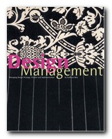
This new title from publishers AVA deals with the business aspects of design projects. I imagine the ideal readers would be students of design who were taking a serious interest in applying their theoretical skills to the practical demands of applying them in the world of commerce and manufacturing. The structure of the book follows that outlined in its sub-title – one section each on design strategy, then managing the design process, and finally design implementation. Each section is split into the knowledge required, a selection of case studies, and an outline of the skills needed for implementation. There is an underlying supposition that in addition to aesthetics, good design management will also take into account profitability, functionality, and even ecological issues.

Design ManagementSo it’s design with very much a practical business slant in mind. There’s an illustrated timeline of design which starts at 1759 with Josiah Wedgwood, then takes in most of the best-known names in design – from Peter Behrens, Moholy-Nagy, Raymond Loewy, Charles Eames, and Viktor Papanek, to the establishment of the design standards which have blossomed in the last ten years.

Although design is approached in the text as if it were a science or even a branch of sociology, it’s quite clear that a lot of it is connected with marketing and publicity – though at least Kathryn Best admits this by discussing such issues as ‘audience’, ‘market’, and ‘product life cycle’.

The case studies are interesting, well illustrated, and up to date – including for instance the Oyster smartcard for travel in London which eliminates the need for paper tickets, reduces queues, and keeps cash off the buses. She also has no problem illustrating all the positives of a company brand such as Apple with its iconic iPod (designed by UK’s Jonathan Ives).

The extended analysis of real-world examples range from thermal imaging devices (heat cameras) to Camper shoes, and from ecological architecture to a new Honda motor scooter. There are also interviews with leading designers from companies such as Yahoo and the National Health Service.

There’s a certain amount of idealisation in all this. Only projects launched by huge companies like AEG, Phillips, and Sony could afford such comprehensive planning of its developments. I’m sure that the majority of design projects have to make do with fewer staff and resources, and a shoestring budget compared with the methods being proposed here.

However, there are plenty of flow diagrams showing the stages of these ideal procedures – so anybody can see the models of good practice and adapt them for their own circumstances. There are also guidance sections on team working and managing creative designers. These include non-hierarchical systems of working and, it would seem, working conditions and design studios straight from the pages of Architecture Today.

The last section on project management in practice is closer to ‘management studies’ than to design. It reinforces the ideas mapped out recently by Chris Anderson in his influential essay The Long Tail – that manufacturers today are reducing their costs and increasing their performance by carrying the minimum of stock, delivering within hours instead of days or weeks, and responding instantly to the customer’s needs. If you were wondering why some shops in the clothing trade only stock what’s on display, that’s the reason why.

It’s an amazingly thorough production. It even finishes with practical suggestions for communication skills, based on the notion that designers need to be able to write effective reports and good business letters. There’s a bibliography, a webliography, suggested design journals, and a glossary. It’s also stylishly designed and produced, printed on thick matte paper stock with colour-coded pages, bound in an attractive paperback A4 format, and elegantly laid out throughout.

© Roy Johnson 2006

Design Management   Buy the book at Amazon UK

Design Management   Buy the book at Amazon US


Kathryn Best, Design Management: Managing Design Strategy, Process and Implementation, Lausanne: AVA, 2006, pp.215, ISBN: 2940373124


More on design
More on media
More on web design
More on information design


Filed Under: Product design Tagged With: Design, Design Management, Product design, Project management

Design of the 20th Century

June 18, 2009 by Roy Johnson

pocketbook guide to major modern designers

These Taschen pocketbooks are very well produced, with high quality print, full colour illustrations, and they are amazingly cheap. I’ve bought several of them, both in the UK and abroad, and always been surprised at the integrity of the writing and the scholarship. But I have not been surprised at the quality of the illustration and the graphic design. It’s always been first rate.

Design of the 20th CenturyThis one is a collection of major designers and design companies in the twentieth century, arranged in A to Z format. Each entry consists of a biographical sketch or a historical account of a company or movement, with well-chosen colour illustrations of typical products. The authors are both experts in industrial design, both ex-Sotheby’s, and now running their own consultancy in London.

It’s amazing how many of the people represented were teachers, students, or felt the influence of the Bauhaus – Walter Gropius (architect) Marcel Breuer (furniture) Moholy-Nagy (photography) – though there are plenty from other sources – Le Corbusier (France), Charles and Ray Eames (USA), Charles Rennie Mackintosh (Scotland). Entries run from Alvar Aalto (Finland) to Frank Lloyd Wright (USA) and Marco Zanuso (Italy).

Lots of other well known names are represented: Lalique (glass) Mies van der Rohe (architecture) and Paul Rand (graphics). The one new discovery (for me) was Raymond Loewy, though I wondered why they chose to illustrate his work with a ceramic tea-set when he is renowned principally for streamlining automobiles and Greyhound coaches.

This volume is a very comforting mix of interior design, consumer products, teapots, chairs, and other domestic objects. But the main thing to say about such a high-quality yet low-price product is that it’s terrific value for money.

© Roy Johnson 2003

Design of the 20th Century   Buy the book at Amazon UK

Design of the 20th Century   Buy the book at Amazon US


Charlotte and Peter Fiell, Design of the 20th Century, Taschen, 2003, pp.190, ISBN: 3822855421


More on design
More on media
More on web design
More on information design


Filed Under: Product design Tagged With: Cultural history, Design, Design of the 20th Century, Product design

Design Since 1900

June 30, 2009 by Roy Johnson

encyclopedia of modern design and designers

This is a comprehensive guide to all aspects of modern design. It covers graphics, consumer products, interior decor, furniture, print, advertising, plus industrial and architectural design. Entries run from the Finnish designer Alvar Aalto (who for obvious reasons always comes first in such listings) through Rene Lalique (glassware) and the multi-talented Hungarian Laszlo Moholy-Nagy, to typographist Hermann Zapf and Piet Zwart (who for the same reason always comes last).

Design Since 1900Most entries are illustrated by thumbnail graphics. It’s a shame they are not in colour, but you can’t expect everything in such a good-value production. The entries are either brief biographical sketches of individual designers (Saul Bass, Charles Eames, Raymond Loewy, Alexandr Rodchenko) with notes on why they have been so influential. There are also short histories of companies famous for their emphasis on design (Bauhaus, General Motors, Olivetti, Wiener Werkstatte).

Others include influential artistic movements (art deco, constructivism, neo-plasticism, and post-modernism) and individual products which have become icons of modern design (the Citroen DS19, Dyson vacuum cleaners, Tatlin’s Monument to the Third International).

There are notes on materials of manufacture (aluminium, formica, MDF, polyurethane) movements and schools (Deutsche Werkbund, Omega, and Black Mountain College) and explanations of technical terms such as anthropometrics, bit mapping, deconstruction, and third age design (which isn’t quite what you might think).

He even includes individual shops such as Biba, Habitat, and the Body Shop; typographists such as Neville Brody, Eric Gill, and Jan Tschichold. The only thing missing is Information Technology. There are a couple of mentions of computer games, but curiously enough not a single reference to Web design.

The text incorporates extensive cross-referencing, suggestions for further reading, and a chronological chart of design highlights since 1900.

© Roy Johnson 2004

Design Since 1900   Buy the book at Amazon UK

Design Since 1900   Buy the book at Amazon US


Guy Julier, Design Since 1900, London: Thames and Hudson, 2004, pp.224, ISBN: 0500203792


More on design
More on media
More on web design

Filed Under: Design history, Graphic design, Product design Tagged With: Decorative arts, Design, Design Since 1900, Graphic design, Product design

Design Without Boundaries

July 15, 2009 by Roy Johnson

visual communication in transition

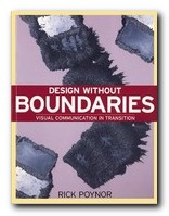
Design Without Boundarie is a collection of articles on visual communication produced between the 1980s and the mid-1990s. That was a period that saw an unprecedented development in graphic design in the USA and Europe, but Rick Poyner observes that there was no corresponding critical analysis of what was going on. This is his contribution to rectifying the matter. The pieces are exhibition and book reviews, profiles of designers, essays, and interviews. He is energetic and passionate about his subject, which is the relationship between design, illustration, and art – all of which he treats at both a theoretical and commercial level. And he’s truly international in his reach of vision. He interviews April Greiman in America, reports from Dutch and Swiss design studios, and searches out UK designers in their workshops and even their homes.

Design Without BoundariesHis approach is combative and challenging. He doesn’t give up looking for theoretical rigour and method, and he certainly doesn’t pull any punches with quite well-established figures. Jan Tschichold and Paul Rand both come under fire in the early pages of the book. It’s a pity there aren’t more illustrations (and some colour) because he spends a lot of time describing designers’ work which would come alive better with graphics. However, there is an up side to this. Because of his pursuit of rigour and clear analysis, he’s forced to describe works in a way which (where there are illustrations) turn out to be accurate and objective – certainly not the sloppy, self-oriented impressionism which passes for much of art criticism.

He really comes into his own on the ground of UK-based design. There are not one but two articles on Neville Brody in which he characteristically praises him for his design and challenges his theoretical assumptions. [In my experience, graphic artists are rarely gifted in articulating ideas about their own production. Go to any art school finals show to see the pretentious nonsense they write about their work.]

Peter Saville has interesting revelations to make about surviving early celebrity. It’s amazing how insecure these famous designers can still feel beneath their apparent success. This might be caused by the rapidly changing styles of the businesses that employ them – music, fashion, popular magazines, and the arty end of commercial advertising.

Other designers he discusses include Vaughan Oliver, Why Not Associates, Cartlidge Levene, Tomato, and Jonathan Barnbrook. Then he does the same thing for a group he classifies as illustrators – Russell Mills, Dan Fern, Andrzej Klimowski, and the American Milton Glaser.

There’s a section on magazines covering Nova, Oz, Modern Painters, David Carson’s Ray Gun, and Emigre. These analyses are very impressive indeed. For Poynor not only captures the graphic spirit of these publications; he offers as well their background commercial histories, their successions of editors, changes of policy, and in most cases the reasons for their demise.

I liked the fact that the essays were fairly short – three or four pages at most. Because he gets straight down to business with no padding. And yet it’s a huge book. If you’re looking for a survey of contemporary design issues written by an extremely well-informed insider – this is it.

© Roy Johnson 2002

Design Without Boundaries   Buy the book at Amazon UK

Design Without Boundaries   Buy the book at Amazon US


Rick Poynor, Design Without Boundaries, London: Booth-Clibborn, 1998, pp.296, ISBN: 186154006X


More on design
More on media
More on web design


Filed Under: Graphic design Tagged With: Design Without Boundaries, Graphic design, Rick Poynor, Theory

Design Writing Research

July 5, 2009 by Roy Johnson

illustrated essays on design, graphics, and typography

Design Writing Research is the name given to the combined work of Ellen Lupton and Abbott Miller, who are curator at Cooper-Hewitt design museum and director of a New York design agency. This elegant compilation brings together their writings on a wide variety of design-related topics – from the graphic presentation of numbers; contemporary hieroglyphs; the choice of body text in printed books; advertising; racial presentations in journalism; the seductiveness of commercial advertising; and newspaper layout and design – to a brief history of graphic design in America. This splendid variety in content is also matched by the design of the book itself.

Design Writing ResearchThey start with an essay on Deconstruction in design history – tracing the influence of French critical theory in the US and eventually settling on notions of typographical presentation. There’s also an essay on the history of punctuation and spacing which is wittily illustrated with a visual paraphrase of punctuation styles – from Latin monumental inscriptions to email emoticons in one short essay. This is a perfect use of the print medium, and an excellent fusion of form and content.

Some of the essays are no more than a sketch over a double page spread, but all of them are interesting – even one on the representation of numbers in print which inexplicably comes to an abrupt stop after the abacus.

They ambitiously tackle structuralist typography – an attempt to apply cultural theory to the realm of type design. Whilst this is not altogether convincing, it’s consistently thought-provoking and like all the other essays in the compilation, skillfully illustrated in a manner which is reminiscent of the work of Edward Tufte.

There are some indications of old-fashioned political correctness. They use the term ‘progressive’ as a blanket marker of approval reminiscent of the Old Left. When this is combined with an essay extolling the technical skills of Andy Warhol, the effect seems naive and rather whimsical. And yet the essay itself, a study of the relationship between advertising and graphic design, is essentially quite interesting. It looks at the work of illustrators such as Ben Shan, Paul Glaser, and David Stone Martin – pointing out that many of their works ‘were sold in galleries soon after they were published’.

The essays in the centre of the book are longer, detailed, and well researched, looking at the practice of graphic design in the context of twentieth century art. A study of McLuhan’s The Medium is the Message argues the case for the groundbreaking contribution of his co-author, Quentin Fiore. This is followed by an in-depth study of the relationship between race and advertising; then the use of stock photographic archive materials in journalism; and subliminal messages in advertising.

The book ends with a synoptic account of graphic design in the USA between 1829 and 1993 – which just stops short of the Internet explosion. If they ever get round to analysing Web pages in the way they treat their material here, it will be truly something to look out for.

This is a beautifully designed and exquisitely illustrated book which is a Must for anyone interested in graphics, information design, typography, or media studies – and it’s amazingly cheap. I bought my copy at full price, just in case the bookshop had made a mistake.

© Roy Johnson 2000

Design Writing Research   Buy the book at Amazon UK

Design Writing Research   Buy the book at Amazon US


Ellen Lupton and Abbott Miller, Design Writing Research: Writing on Graphic Design, London: Phaidon, 1996, pp.211, ISBN: 0714838519


More on design
More on media
More on web design


Filed Under: Graphic design Tagged With: Design Writing Research, Graphic design, Research, Theory, Typography

Design: A Short Introduction

June 27, 2009 by Roy Johnson

themes, principles, and categories of design

John Heskett kicks off this brief study by defining the term ‘design’ and shows fairly convincingly that it can cover a wide range of activities which affect “the forms and structures of the immediate world we inhabit”. There follows a quick gallop through historical attitudes to design problems, before getting under way with a look at the relationships between ‘form’, ‘function’, and ‘utility’. His focus is on design theory considered by categories (objects, communications, environments) rather than looking at the work of individual designers – though plenty of these are considered en passant.

Design: A Short IntroductionBy ‘communication’ he means the vast array of two-dimensional materials that play such an extensive role in modern life. For this read advertising, print, television, street signs, and web sites, plus hybrids such as the online promotional video. Once again he looks at general principles, but gives mention to individual designers such as David Carson, Milton Glaser, and Paul Rand.

On environment (interior and exterior design) he makes some interesting comparisons between America and Japan. Homes are much bigger in the USA, and the domestic appliances tend to be bigger and more old-fashioned. In Japan space is at such a premium that everything tends to be miniaturised, computerised, and designed to be stacked vertically, not horizontally

I was surprised he didn’t follow the logic of his own arguments here to consider the design of external environments such parks, airports, and other public spaces.

The design of ‘identities’ considers the sort of total corporate makeovers of the kind which Peter Behrens invented for the German electrical giant Allgemeine Elektrizitäts Geselschaft (AEG). He also considers disastrous examples, such as BA’s badly-judged, sixty million pounds re-launch of its visual identity with the much-mocked multicolour tailfins

Image is a projection of how a company would like to be understood by customers; identity is the reality of what a company delivers as experienced by customers. When the two are consonant, it is possible to speak of corporate integrity. If a gulf opens up between the two however, no amount of money flung at visual redesigns will rebuild customers’ confidence.

There’s a chapter on the relationship between design and business management and the politics of design in a national context which will be of particular interest to anyone with serious career ambitions.

He concludes with a glimpse into future possibilities, which gives him the chance to raise the issue of social responsibility in design – at which point I was delighted to note that he gave mention to Trevor Bayliss’ clockwork-powered radio.

This book was first issued as Toothpicks and Logos three years ago, and I have to say that placing it in the context of these ‘very short introductions’ has probably enhanced its value.

© Roy Johnson 2005

Design: A Short Introduction   Buy the book at Amazon UK

Design: A Short Introduction   Buy the book at Amazon US


John Heskett, Design: A Very Short Introduction, Oxford: Oxford University Press, 2005, pp.148, ISBN: 0192854461


More on design
More on media
More on web design
More on information design


Filed Under: Product design Tagged With: Communication, Design, Design: A Short Introduction, Product design, Theory

Designing Instructional Text

June 26, 2009 by Roy Johnson

how to create effective documentation

This is a practical guide for designing instructional texts. It describes each stage in the process very thoroughly – from the selection of paper size and page layout, through composition of clear text, to the use of diagrams and illustrations. Although a number of these issues might seem straightforward, what makes James Hartley’s treatment of them interesting is the persuasive psychological reasons given for making one choice rather than another on vocabulary, line length, or paragraph spacing.

Designing Instructional TextThe third edition has been produced with the advances in word-processors in mind, and Web users might be particularly interested in the section dealing with electronic text and some of the tips for producing screen layouts which people will actually read. There is a comprehensive analysis of the visual presentation of information – with subtle distinctions noted between pie charts and bar charts.

A couple of chapters dealing with writing for the elderly and those with impaired sight reinforce the psychological importance of good layout and spatial coherence in writing. There are also some interesting details offered en passant – such as the fact that most readers ignore questions posed after instructions, the psychological advantage of the bulleted list, and the fallibility of Flesch Reading Ease scores.

On questionnaire design, it deals with the danger of ambiguity, citing the example of a job application with the question ‘Give previous experience with dates’ which was answered by ‘Moderately successful in the past, but I am now happily married.’ Each chapter has a full bibliography and suggestions for further reading, and on the whole it bears all the hallmarks of work which is now a standard text. No wonder it’s in its third edition.

© Roy Johnson 2001

Designing Instructional Text   Buy the book at Amazon UK

Designing Instructional Text   Buy the book at Amazon US


James Hartley, Designing Instructional Text, London: Kogan Page, (3rd edn) 1994, pp.183 ISBN: 074941037X


More on information design
More on design
More on media
More on web design


Filed Under: Information Design Tagged With: Communication skills, Designing Instructional Text, Information design, Instructional text, Writing skills

  • « Previous Page
  • 1
  • 2
  • 3
  • 4
  • 5
  • …
  • 11
  • Next Page »

Reviews

  • Arts
  • Biography
  • Creative Writing
  • Design
  • e-Commerce
  • Journalism
  • Language
  • Lifestyle
  • Literature
  • Media
  • Publishing
  • Study skills
  • Technology
  • Theory
  • Typography
  • Web design
  • Writing Skills

Get in touch

info@mantex.co.uk

Content © Mantex 2016
  • About Us
  • Advertising
  • Clients
  • Contact
  • FAQ
  • Links
  • Services
  • Reviews
  • Sitemap
  • T & C’s
  • Testimonials
  • Privacy

Copyright © 2025 · Mantex

Copyright © 2025 · News Pro Theme on Genesis Framework · WordPress · Log in